Read all about Sherwin Williams Alpaca, plus see 23 real homes that use it!
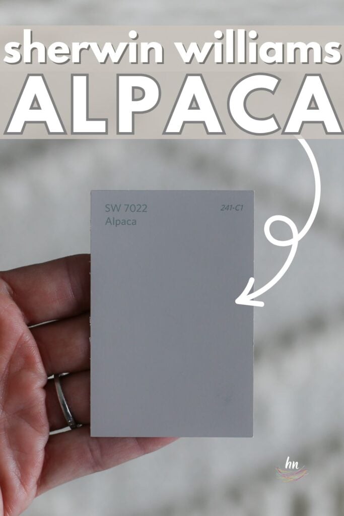
Sherwin Williams Alpaca (SW 7022) is a warm neutral color that can either be described as a warm gray or cooler, taupe-leaning greige. Like its namesake, it can appear soft, cuddly, and sweet on interior walls, trim, or even exteriors, but watch out – at times, it can bite!
Alpaca has strong undertones that can pop out in the right (or wrong) conditions, so let’s discuss the best way to use Alpaca paint and then snuggle up to 23 real homes that use it.

FAQs About Sherwin Williams Alpaca
What color is Sherwin Williams Alpaca? What are the undertones of Alpaca?
SW Alpaca is a warm gray or greige with pretty strong undertones that can either lean towards brown, taupe, or even violet if you’re lucky (or unlucky). Because of its violet undertones, it does have a cooler quality than most greiges (there are no yellow or orange undertones here!).
Alpaca paint is certainly warmer than your run-of-the-mill warm grays, but it will morph depending on its lighting environment.
For example, in north-facing rooms, the cooler light can make it appear grayer, whereas in southern-facing rooms, its taupe tendencies will be revealed, showing its warmer, browner side.
Is Sherwin Williams Alpaca a warm or cool color?
This is a little bit of a trick question because the definition of warm or cool really depends on a lot of different factors. If you’re thinking of Alpaca paint as a gray, then it’s a warmer gray. However, its violet undertones definitely pull it cooler.
As a greige, it’s a cooler greige, but it’s also a bit taupe-y. I would call it a soft taupe, which is warmer than a gray but cooler than a brown.
What’s the best way to use Sherwin Williams Alpaca?
This paint color looks great in interior spaces but can sometimes work for exteriors and even (gasp) trim! More on this in a bit.
When working with Alpaca paint, the decision you’ll need to make is: do you want to minimize its violet undertones or play them up? While the thought of violet undertones can sound scary, there are definitely situations where this can work really well in a room!
Spaces with cooler palettes and purple decor (even if it’s a small pop of color) can bring out the hidden violet shades in Sherwin Williams Alpaca. Warmer, earthier decor styles with browns in the color palette (such as natural stonework) will bring out more taupe in the paint color.
As you’ll see shortly, Alpaca is a popular choice for nurseries. It’s soft, neutral, and soothing.
On exteriors, Alpaca could certainly work well. Just be aware that during certain times of the day, the light could bring out that purple undertone. So be sure to test some swatches at all hours.
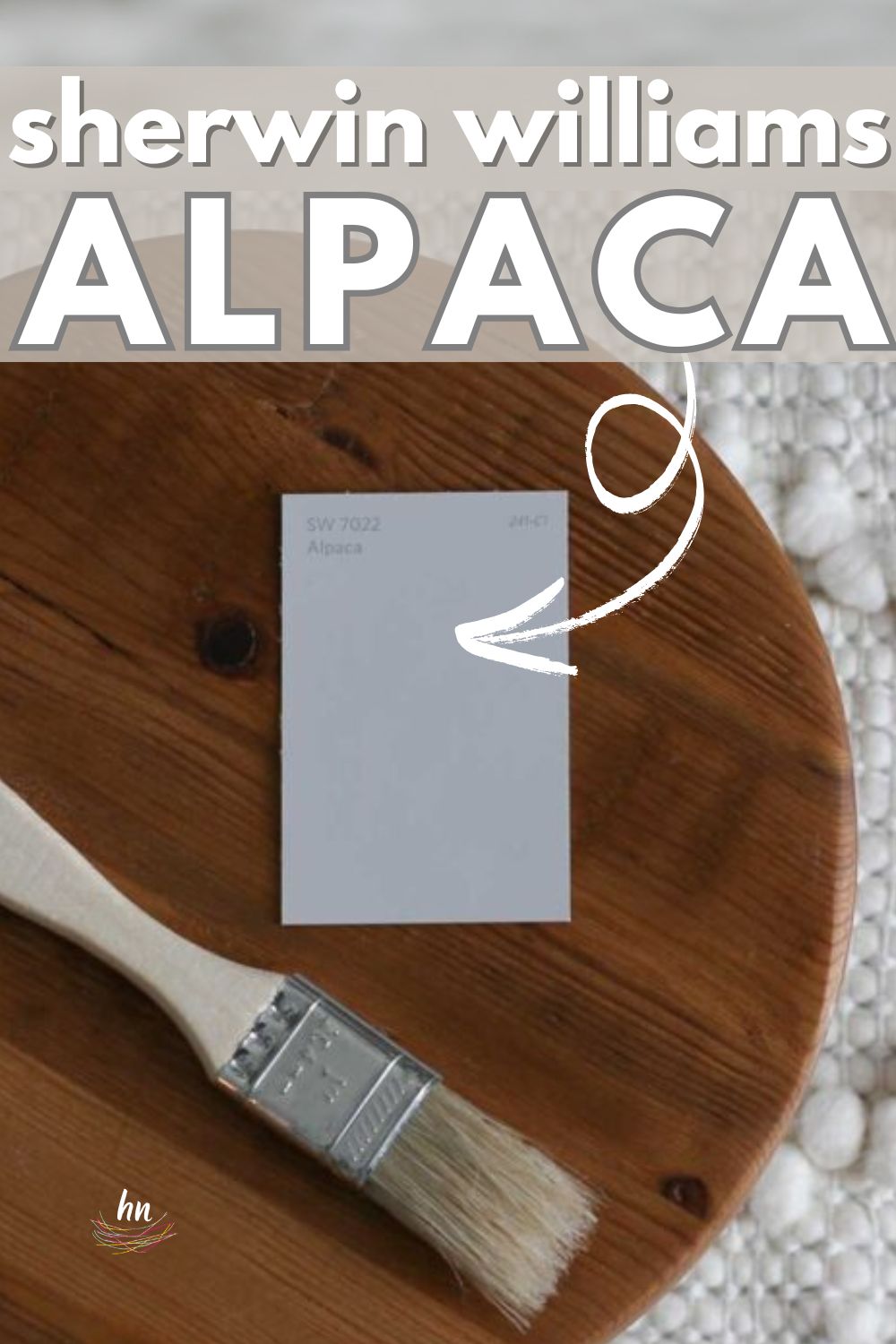
My favorite type of paint sample? These re-usable, re-positionable peel and stick samples.
What paint colors pair well with SW Alpaca?
When it comes to pairing trim with Alpaca as a wall color, be sure you don’t go with a creamy white as it could accidentally bring out too much of those violet undertones. Instead, Sherwin Williams Pure White is a good bet.
Interestingly, Alpaca can even make a great trim color when paired with a lighter wall color, creating a traditional look that looks great in historic and Victorian-style homes.
If undertones make your head hurt, you’re not alone! Grab your free copy of 5 Biggest Paint Choice Mistakes Click here or enter your email below. I’ll send the tips right away!⤵️
LRV of Sherwin Williams Alpaca Paint (SW 7022)
Let’s get into the “numerical” details, or the LRV of Alpaca.
ALPACA LRV = 57
LRV = Light Reflectance Value: Rated 0-100 with 0 being pure black, and 100 being pure white. Lighter paint shades REFLECT more light from them and therefore have a HIGHER LRV, and vice versa for darker shades. For example, see Alpaca (57) side by side with pure white (100) below:

Alpaca Paint Compared to Other Colors
Alpaca’s LRV of 57 means it’s not necessarily a light, bright and airy color. Instead, it’s rich and has a bit of body to it. Personally, I prefer colors with an LRV lighter than 60 in my own home.
While that’s certainly a personal preference, I do strongly encourage you to fully immerse yourself into a color’s world before you take the plunge. Let’s take a deep dive into Alpaca’s color profile and stack it next to a few similar colors.

Sherwin Williams Alpaca vs Repose Gray
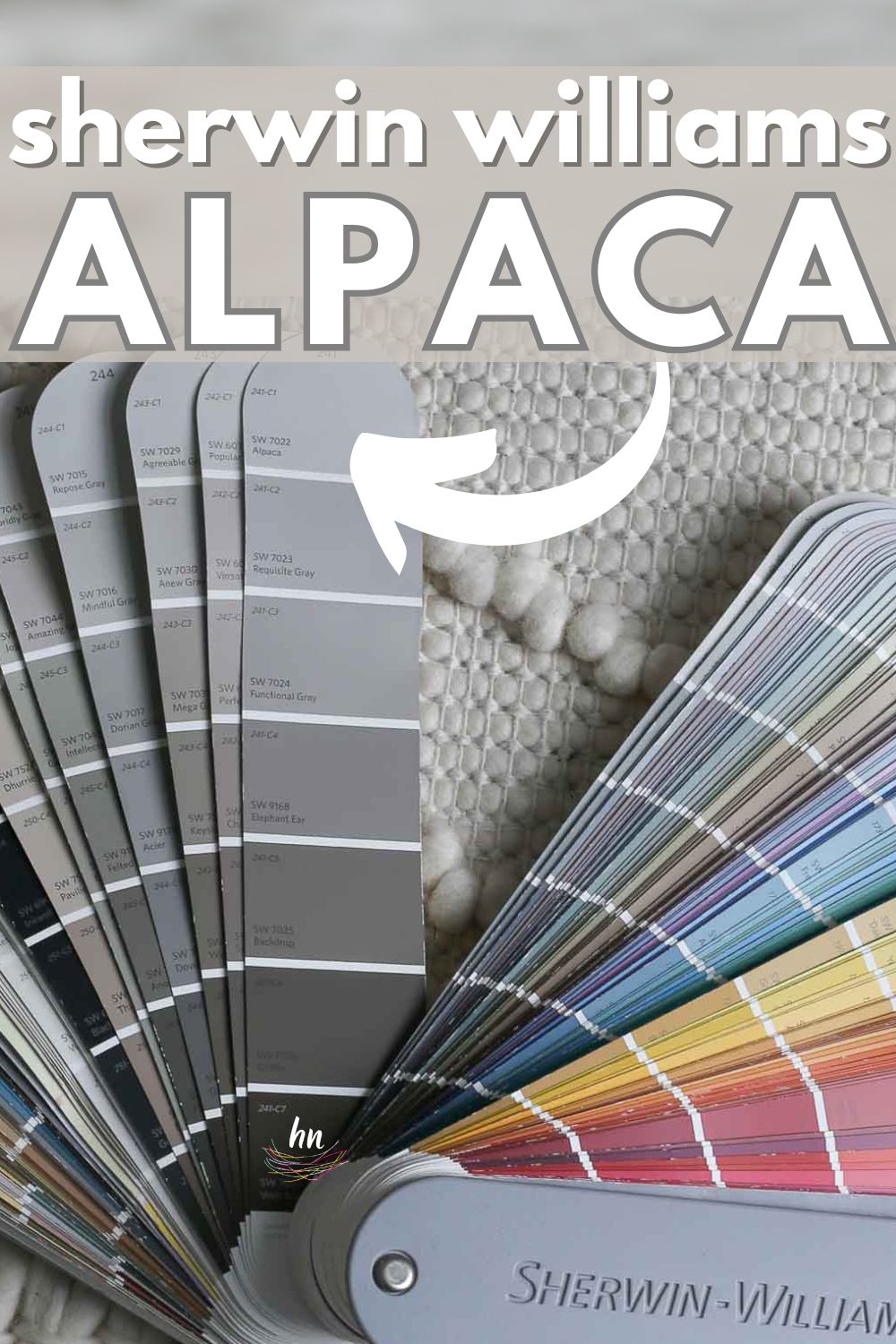
Repose Gray is like Alpaca’s brother or childhood BFF. They’re both pretty close in LRV (Repose Gray is 58, while Alpaca is 57), and they look good together.
As you might have guessed, Repose Gray is grayer than Alpaca and thus a touch cooler. There may be more green in its undertone makeup.
While it does show a hint of subtle purple, it’s not nearly as obvious as it is with Alpaca. Repose Gray is a more popular color choice because of its versatility and warm gray quality that’s not warm enough to be considered a greige.

Sherwin Williams Alpaca vs Popular Gray
Interestingly, Popular Gray is less gray than Alpaca. There’s more taupe and brown in it, giving it a creamy, chocolate ice cream kind of look.
As such, it’s considered a warm greige, and like the name, it’s a popular neutral shade. With an LRV of 61, it’s a few shades brighter than Alpaca, making it a soft, warm choice for home interiors of any decor style.

Sherwin Williams Alpaca vs Accessible Beige
Accessible Beige is a pretty rich, warm paint color. It certainly has enough brown in it to not be considered a gray or even greige.
Its LRV of 58 puts it right at the top of the range of mid-toned neutrals. This shade is popular because it doesn’t have the overwhelming yellow or golden undertones that many beige shades have (which can make them appear dated).
Rather, it favors taupe, giving it enough coolness to stay neutral, but its characteristic warmth makes it incredibly versatile and one of the favorite beige shades on the market right now.
When placed next to Accessible Beige, Alpaca appears decidedly grayer and cooler.

Other Paint Colors to Consider:
There are so many (too many) awesome colors out there. If you’re intrigued by this shade, you may want to take a look at some of these other greige paint colors, too:
- Oyster Bay by Sherwin Williams – a pigmented gray-green with a hint of blue
- Passive by Sherwin Williams – a slightly cool crisp, clean gray
- Agreeable Gray by Sherwin Williams – a serene, soothing warm gray
- Stonington Gray by Benjamin Moore – this historic shade is trendy yet timeless
- Rainwashed by Sherwin Williams – as the name suggests, this is a moody blue-green shade
- Kilim Beige by Sherwin Williams – a warm beige with just a hint of an orange undertone
- Revere Pewter by Benjamin Moore – a very warm shade of gray that reads more beige
- Light French Gray by Sherwin Williams – a popular shade of gray, this paint has a very slight violet undertone
Feeling lost? I gotcha, boo! Grab a FREE copy of my new guide to avoid the paint color picking mistakes people make! Click here or enter your email below. I’ll send the tips right away!⤵️
Real Life Homes Using Sherwin Williams Alpaca
Okay, let’s get to the fun stuff! Let’s see this shade in action IRL.
Alpaca Bathrooms
Sheen note: Picking the right color is only winning the battle, not the war. Remember to pick the right paint finish, or sheen, also! Read up on what you need to know about picking the perfect paint sheen.
In bathrooms, don’t go for flat. Choose something that works better with higher moisture and higher traffic such as eggshell or satin. For trim, consider using high-gloss or semi-gloss paint.
1. Bathroom Wall Color in SW Alpaca
The multiple shades of brown in this bathroom vanity countertop are a challenge, but Alpaca was a good bet for the wall color.
It adds just the right amount of warm, soft color, while the white trim and cabinetry help brighten up this space from Driven by Decor.

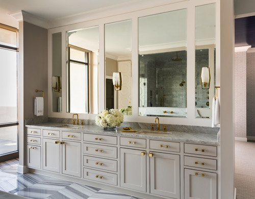
2. Alpaca Vanity Cabinets
This lovely bathroom from Tobi Fairley Interior Design shows how Alpaca swings back to the other side of the equator, where it’s considerably warmer.
The wall color is a complementary warm hue with hints of blush and rose, while SW Alpaca paint has a deliciously creamy effect on the bathroom cabinets.
The gold hardware keeps the color feeling warm, and overall, the violet undertones really work well in this space.
Sherwin Williams Alpaca Bedrooms
In general for bedrooms, and low-traffic areas, flat paint is fine. If you like something with a bit of shine (and more ease of cleaning) opt for eggshell or satin.
3. Cozy but Cool Color
@cozywithcassie chose Sherwin Williams Alpaca for her bedroom hue, and a happy hue it is. In this space, it reads greige, rather than cool gray. And looks lovely as an anchor for a neutral decorating palette.
4. Paint the Entire Room, or Just a Portion
Sherwin Williams Alpaca is a pretty, pretty choice for board and batten! I love the way it looks as a backdrop for the colorful dresser.
5. Warm Neutral Bedroom Wall Color
It’s hard to believe this soft and cozy bedroom used to be so cold and foreboding! The dark gray from the before picture was NOT working.
Alpaca is showing its warm undertones here, and you can see that it was a perfect neutral choice for creating a calming environment – a must in any bedroom.
6. Beautiful in a Boho Bedroom
I love the modern minimalism of this space. The neutral, cooler colors bring out the gray side of Alpaca, but it still feels soft with a touch of warmth.
7. Alpaca Painted Nursery
Sherwin Williams Alpaca plays the part of a soothing neutral in this gender-neutral nursery from Emily at Table and Hearth. I’d say it’s a perfect backdrop for lullabies and nap time!

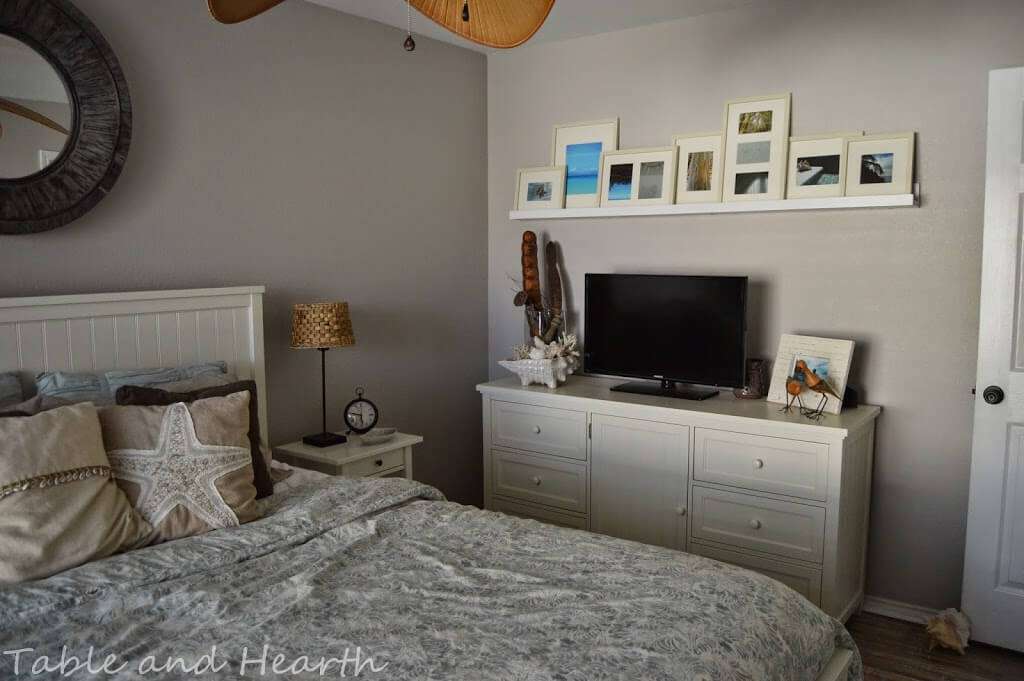
8. Coastal Guest Bedroom in SW Alpaca
A great example from Table + Hearth of how warm, southern exposure can bring out Alpaca’s taupe tendencies. The golden cast of the sun practically eliminates any chance of purple tones popping out.
Here, the wall color plays well with both the brown tones and blue bedspread.
9. Bedroom Wall in Alpaca Paint
Here’s Alpaca looking totally different on the other side of Emily from Table and Hearth‘s nursery that we shared above. Now, the bright light from the window definitely washes out the hue, but but its such a great color combo in here, right?
With Peppercorn as a shiplap accent wall color, Alpaca plays the role of a supporting neutral on the adjacent wall.

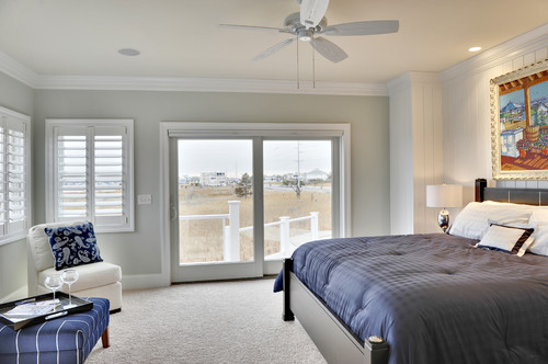
10. Sherwin Williams Alpaca Beach Style Bedroom
I do love the chameleon quality of gray paint colors. In this beach-style bedroom from Schell Brothers Custom Homes, Alpaca plays it cool as a gray wall color – but not too cool.
It’s still soft and warm enough not to look icy with the white trim and navy accents.
11. A Neutral Nursery Painted Alpaca
This pretty nursery from designer Sarah at Room for Tuesday is so sweet, it gives me all the feels!
Alpaca has proven time and time again to be the perfect soft neutral color for a nursery. I love the way the color looks on this dresser/changing table with gold hardware. The other colors in the space are SW Extra White (trim) and SW Pure White (walls).

12. Popular Paint Color Choice in a Nursery
Is this the third example of Sherwin Williams Alpaca in a nursery? Why yes! Here in this space from Charleston Crafted you can see that the color’s soft, neutral tendencies make it a perfect color for these rooms.
Next to a dark shiplap accent wall, Alpaca looks like a pale, warm gray with that slight lavender undertone peeking through.

Living Rooms Painted Alpaca
13. Bridge between warm and cool
SW Alpaca makes a great pairing with this cool toned woodgrain wallpaper accent wall, and also works with the taupe/tan carpet.
14. Gray Living Room Walls
The palette of this midcentury modern-inspired living room from The Julian Home (link removed as site is no longer active) is decidedly neutral but anything but basic.
Alpaca wall paint brings a touch of character to the gray couches and gold and white finishes.

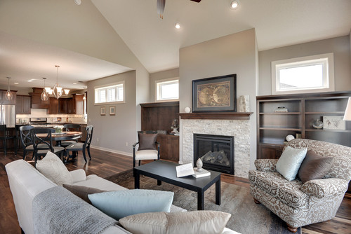
15. SW Alpaca Living Room with Vaulted Ceilings
Alpaca takes on a soft, neutral role in this large living space from Iverson Homes via Houzz.
It looks great on the walls next to the vaulted ceiling, and the cherrywood cabinets play well with the color, bringing out subtle taupe undertones that work for the space.
18. Alpaca Painted Contemporary Living Room
What a warm and pretty space from Allard + Roberts Interior Design! The bold shades of the eclectic-bohemian decor look amazing against a rich, taupe backdrop of SW Alpaca.

17. Sherwin Williams Alpaca Home Interior
This breathtaking space from Intentional Designs (link removed as site is no longer active) with its unique, angled ceiling is certainly a stunner.
Alpaca is showing its violet undertones here, and I have to admit, it looks pretty cool. It’s incredibly complimentary with the yellow curtains.

SW Alpaca Dining Rooms + Kitchens
For kitchens, eggshell or satin are popular finish choices for walls. For cabinets consider semi-gloss or high gloss for the most durable finish (and a gorgeous glow).
18. SW Alpaca Dining Room
In this uniquely angled dining room from Kadlik Homes, Alpaca looks equally pleasing but certainly more taupe. The look is creamy, and the effect is calming.

19. Alpaca Painted Kitchen Cabinets
Alpaca is a gorgeous, soft color for kitchen islands in bright and airy spaces such as this one from LunDev Homes, Interior Design by Jamie Gernert. I love how it complements the pale blue tile backsplash and has a creamy, inviting look to it.

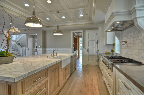
20. Warm Gray Alpaca Painted Walls
Warm gray walls in Sherwin Williams Alpaca make this large space (via Houzz) feel cozier and is a neutral middle ground between the cool marble and golden wood.
21. Sherwin Williams Alpaca Kitchen Cabinetry
Having trouble deciding on a kitchen cabinet color? Why not mix them up? The softness of Sherwin Williams Alpaca paint balances the bold blue in this cheery, coastal-inspired kitchen shared by Color Snap.

SW Alpaca in Other Spaces and Places
22. Sherwin Williams Alpaca SW 7022 Hallway
Isn’t this modern hallway just STUNNING? I love the way the color of the wall paint plays with the golden wood tones of the floors and ceilings.
You can certainly detect the violet undertones here, but the effect is sophisticated, creamy, and warm instead of tacky.
23. Alpaca Trim, Alabaster Walls
If I’m being honest, to me, this is one of my favorite uses of Alpaca, as a trim color…especially on chunky, substantial trim that demands attention!
In this project, Megan chooses the very popular, light and bright SW Alabaster on the walls. And the pair is a stunner. Alabaster really allows Alpaca to shine on the trim.
24. Alpaca Doors
Last but not least, check out what an impact Alpaca has on this hallway as the door color. It’s an unexpected, and awesome look.
What do you think of Sherwin Williams Alpaca?
Could it be the best paint option for your own home? It’s certainly a unique color with a name to match that’s soft and neutral with a typically warm feel in natural light. But as you’ve seen, this one can be tricky in different lights.
And if this is a color you’re seriously considering, remember paint-sampling is better than ending up paint-sorry! I highly recommend these peel and stick samples because they are inexpensive, re-usable and re-positionable…
Pin this paint color for later! And if you use this paint shade, leave a comment on the pin! That helps others decide if they want to try this color, too!
Pssst…before you go, I sure would love to hang out with you again really soon! And before you’re on your way, make sure you grab your free copy of the 5 Biggest Mistakes People Make When Picking Paint, so you can avoid the heartache (and hole in your wallet) when your paint choices don’t quite work out! Click here, and I’ll send your free copy right now!





Leave a Reply