
Read all about Sherwin Williams Oyster Bay, plus see 20+ real homes that use it!
Sherwin Williams Oyster Bay is a medium-toned, grayish-green with a hint of blue. The Joanna-Gaines approved color is in the same coastal family as the wildly popular Sherwin Williams Sea Salt, but with a deeper intensity that makes it great for built-ins and cabinets in any room of the house.
While it is a darker green shade than many we’ve featured on this blog, it has enough gray mixed in to give it that neutral feel. Some people love using it in bedrooms and bathrooms for that highly coveted, cozy spa vibe.
Oyster Bay paint color reminds me of Nantucket during the summertime. I’ve never actually been there, but I get that vibe from some of the books and movies set there. You know, summertime soirees with women in white sundresses and men with seersucker pants, sipping breezy cocktails. You catch my drift, right?
So, is Oyster Bay paint the right shade for your next project? Read on to find out!

What Color Is Sherwin Williams Oyster Bay?
Part of the Sherwin Williams Living Well – Recharge color collection, SW Oyster Bay is a mix of green, gray, and blue that recalls a moody, cloudy day on the coast. While there’s more green and gray than blue, in some environments, more blue can come out.
It’s an ideal shade when you’re going for that serene spa vibe, but there’s enough depth and intensity to keep it grounded, so it will never lean too bright.
There’s enough gray in it to keep it muted in a decidedly soothing way. It is considerably darker than the beloved light neutral-green, SW Sea Salt, so you’ll want to proceed with caution when considering it as a wall color. More on this in a bit.

Is Sherwin Williams Oyster Bay A Warm Or Cool Color?
Oyster Bay (SW 6206) is earthy enough to pair with a number of taupe, tan, and beige shades. However, it is definitely a cool green, due to its gray and blue undertones.

Feeling lost? I gotcha, boo! Get a zero-cost copy of my new guide to avoid the paint color picking mistakes people make! Click here or enter your email below. I’ll send the tips right away!⤵️

LRV Of Sherwin Williams Oyster Bay (SW 6206)
To understand my warning against using Oyster Bay as a wall color, let’s first discuss the “numerical details,” or the LRV of SW Oyster Bay paint:
OYSTER BAY LRV = 44
LRV = Light Reflectance Value: Rated 0-100 with 0 being pure black, and 100 being pure white. Lighter paint shades REFLECT more light from them and therefore have a HIGHER LRV, and vice versa for darker shades. Below see Oyster Bay (44) side by side with pure white (100):

As a general rule, when considering any paint shade darker than 60 on the LRV scale, you’ll want to really analyze it before taking the plunge. Why? In rooms lacking bright, natural light (typically Northern-facing rooms or rooms without a lot of windows), colors start feeling dark and gloomy pretty fast.
That’s not to say you should never use Oyster Bay; you’ll just want to proceed with caution.
How to Make the Color Feel Lighter
As you’ll see in a moment, there are some gorgeous rooms using SW Oyster Bay as a wall color. The trick is, these examples typically have a few things in common.
One, the rooms tend to be roomy enough to not feel claustrophobic and have lots of bright, natural light. And two, the wall paint is usually paired with bright white trim or even wainscoting to minimize the percentage of wall using darker paint.
Another trick you can use if you absolutely love the shade is to mix the color at 50% intensity, so that it doesn’t come on too strong when on the walls. Some homeowners or designers even play with mixing two different shades together.
Whatever you decide to do, be sure to use paint samples in the room you intend to paint. Observe the color carefully as the light changes throughout the day!
As far as sampling goes, I highly recommend these non-messy, re-usable, re-positionable peel and stick paint samples ⤵
Now that I’ve done my part to warn you about darker paints, let’s compare Oyster Bay with a few similar colors to better understand its color profile and undertones.

LRV…what? Don’t worry, I’ve got you! This no-cost guide will help you avoid the paint color picking mistakes most people make! Click here or enter your email below. I’ll send the tips right away!⤵️
Oyster Bay Paint Compared To Other Colors
Oyster Bay paint color is highly complementary to a range of shades, including lighter shades that have pretty much the same undertone makeup.
It really helps to compare similar shades when considering a paint color, so let’s dive in!
Oyster Bay vs Sea Salt
Sherwin Williams Oyster Bay paint is a deeper, more dramatic color than Sherwin Williams Sea Salt. In fact, I would say that Sea Salt is the same color, just a few shades lighter.
Oyster Bay has an LRV of 44 and SW Sea Salt (not to be confused with Ben Moore’s paint of the same name, which is a completely different color) is at 63.
Since SW Sea Salt is so light, it’s often used as a neutral paint color. Oyster Bay has the same composition of undertones (cool gray and blue), but it’s a lot more pigmented. So, although it still plays a somewhat neutral role, it will have a much more dramatic/intense effect.

Silver Mist vs Oyster Bay
Benjamin Moore Silver Mist is a beautiful blue-green blend that leans slightly blue but has enough green and gray to keep it in the muted green playing field.
Side by side, Oyster Bay looks a lot more gray, whereas Silvermist is a pretty saturated greenish-blue by comparison.

However, Oyster Bay has more sage green characteristics since it lacks some of the obvious blue shades that Silvermist has.
In terms of brightness, they are pretty close: Silvermist has an LRV of 47 and Oyster Bay is 44. So when it comes down to these two shades, it’s really about how much blue you’re looking for in a shade.
Comfort Gray vs Oyster Bay
On its own, Sherwin Williams Comfort Gray can certainly look like a gray with green undertones, with maybe a wee bit of blue peeking through.
If Oyster Bay is too intense or pigmented for you, Comfort Gray might be a good option. It has enough green to keep it feeling warm and earthy (as opposed to an icy blueish gray), but it’s lighter with an LRV of 54 and considerably less dramatic than Oyster Bay.
However, if you like that obvious, deeper green, Oyster Bay has those characteristics cornered.

More Mid-Tone Paint Colors to Consider
Here are some more paint colors to consider…
- Sherwin Williams Agreeable Gray – an unassuming warm gray that’s happy to fade into the background
- Sherwin Williams Passive – a crisp, clean gray that reads lightly cool
- Benjamin Moore Stonington Gray – a historic gray that’s a fan-favorite on Pinterest boards everywhere
- Sherwin Williams Rainwashed – this moody blue-green shade is reminiscent of the ocean on a stormy day
- Repose Gray by Sherwin Williams– dubbed “the perfect shade of gray” this shade has taken the internet by storm
- Sherwin Williams Accessible Beige – this creamy, warm shade never comes off icy or stark
- Sherwin Williams Kilim Beige – this warm beige has a slightly orange undertone but reads like a light tan shade
- Benjamin Moore Revere Pewter – classified as a gray, this hue is decidedly warm
- Sherwin Williams Light French Gray – a popular shade of gray, this paint has a very slight purple undertone
- Farrow & Ball Pigeon – a cozy, calming blue-gray paint color
Real Life Homes Using Sherwin Williams Oyster Bay
Alright, time to dig into the good part: all that eye candy! But first, a warning. Do NOT fall in love with one of these rooms, run out and buy 4 cans and start painting your space! Remember the cardinal rule of painting: sample before you swipe that paintbrush!!!
Bedrooms with Oyster Bay
Sheen note: Picking the right color is only winning the battle, not the war. Remember to pick the right paint finish, or sheen, also! Read up on what you need to know about picking the perfect paint sheen.
In general for bedrooms, and low-traffic areas, flat paint is fine. If you like something with a bit of shine (and more ease of cleaning) opt for eggshell or satin.
1. Leaning Green
The lighting in this lovely bedroom from @peaceandpinedesigns on Instagram makes the Oyster Bay paint color lean green, while still retaining its beautiful neutral/gray characteristics.
It also looks great paired with the wooden bead chandelier and natural woven basket wall decor.
2. Oyster Bay Bedroom
In this featured home from Kristie at Decorologist, she repainted all rooms in the house except the master bedroom, pictured below.
Coincidentally, she already loved the paint color, and Oyster Bay paint (Sherwin Williams) worked perfectly with the decor. The only thing she didn’t like was the stripe between the crown molding and lower ceiling.

3. Cool Blue Oyster Bay
This bedroom from @designingthedillons doesn’t shy away from color. Oyster Bay is a stunning backdrop for the jewel tones in this space, which really pull this color toward its blue-sy personality.
4. Sage Appeal
Compared to above where Oyster Bay was feeling a little blue, check out how sage it looks in this design from @nish.onlineinteriordesign.
Guess the phrase “true blue” doesn’t apply to this paint (and let’s face it, that goes with most paints…they aren’t just “two-faced” they are usually way more complicated than that!)
5. Built-In Beauties
Check out Oyster Bay on these bedroom built-ins from Ashmore Builders. This shade is such a great choice for spaces where calmness is king.
Coupled with the wall color, SW Shoji White, it’s a really relaxing (and winning) combo.
Oyster Bay Bathrooms
Don’t forget the finish! For bathrooms the perfect sheen is either an eggshell or satin. Why? We’ll tell you in this post about paint sheen.
6. Beautiful Oyster Bay Bathroom
Oyster Bay paint is a perfect candidate for bathrooms (powder rooms, guest baths, en suites…you name it). In bathrooms where moisture can be an issue, many choose to use it on a half wall over tile, or PVC beadboard, and the combo is gorgeous.
The bright white accents and dark wood vanity help keep this paint color a bit muted. It is certainly a gorgeous look in this bathroom renovation from @desmonddesignstudio – you get all the green-gray and blue characteristics blending seamlessly together.
7. SW Oyster Bay Bathroom Cabinets
As a cabinet or bathroom vanity color, Sherwin Williams Oyster Bay paint takes on the role of a gray…but with a subtle-spa-like kick.
In this bathroom from Heather at @creekside.designs, uses this color on the vanity where it has a subdued and sophisticated effect, and it reads as a gray with a hint of baby blue. The wall color in this space? The ever popular SW Snowbound.
Living Rooms with Sherwin Williams Oyster Bay
8. Modern Farmhouse Family Room
Ooof, I may be in love with this sweet sitting room. Oyster Bay paint works great as an accent wall color, especially when broken up by an off-white fireplace.
Since the fireplace comes out from the wall quite a bit, the accent wall has an almost recessed effect, allowing Oyster Bay to provide a pop of color without being too prominent in the room.
As for the other wall color in this room…it’s SW Crushed Ice.
9. Sherwin Williams Oyster Bay Cabinetry
Take a good moment to inspect this photo from The Creativity Exchange, as it’s an incredibly unique way to treat built-ins. The cabinetry and adjoining molding/baseboards match the wall color exactly, though when the wall bends, it’s paired with bright white trim.
Overall, Oyster Bay takes on a gorgeously soft effect and looks more like a pale green than anything else.

10. Relaxed Oyster Bay Living Space
In her early 1900’s vintage home, Brianna uses Oyster Bay as the wall color in her parlor (i.e. living room). It’s a sweet hue for an even sweeter space.
Mudrooms and Laundry Rooms Painted Oyster Bay
11. Sherwin Williams Oyster Bay Laundry Room
This light-filled laundry room from Chris Loves Julia is gorgeous! Against a soft gray and white palette, Oyster Bay is stunning as a cabinet color, looking rich and noticeably green with blue undertones. It’s a fantastic pairing with brushed gold accents.

12. Oyster Bay SW Laundry Cabinets
This laundry room from Urban Grace Interiors also has Oyster Bay cabinets, but here, the color looks completely different.
The beige walls and softer, golden lighting bring out a hint of yellow undertones in the green paint.
13. Marvelous on Mudroom Cabinets
Mudrooms and laundry room are usually not spaces for all the beautiful things. But when you see a mudroom or laundry room with a little bit-o-loveliness, doesn’t it make you smile? Life would be much happier if these spaces were always pretty, and this one certainly is, thanks in part to this great cabinet color.
14. Who Loves Laundry?
Whoever owns this laundry room, that’s who! Oyster Bay goes a long way in helping create this peaceful space to do…what else? Laundry! But heck, I wouldn’t mind too much here, would you?
Want to know that wall color coupled with the Oyster Bay cabinetry? It’s the crowd-pleasing, SW Creamy.
Dining Rooms Featuring Oyster Bay Paint
15. Dining Room in Oyster Bay
The beige and neutral-toned palette with rustic wood accents brings out the sage green characteristics in Oyster Bay, which separates this semi-open dining room from the beige walls in the entryway of this cozy home.
Diners are treated to hints of blue and gray in the otherwise green space from Details and Danielle.

16. SW Oyster Bay Dining Room
Medium-toned, semi-saturated paint shades can be tricky in open-concept spaces, but it works very well here in this space from Shoreline Construction.
Heavy, bright white trim and wainscoting help break up the color, and the beige/neutral palette plays nicely with Oyster Bay.

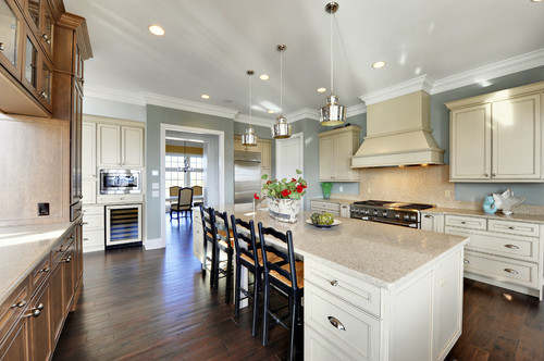
Oyster Bay Kitchens
For kitchens, eggshell or satin are popular finish choices for walls. For cabinets consider semi-gloss or high gloss for the most durable finish (and a gorgeous glow).
17. Modern Coastal Marvel
Is it possible for a kitchen to feel colorful and neutral at the same time? This one from Keri Malafa of ESD Interiors (here on Instagram) sure does.
Believe it or not, the walls in this kitchen are white, but the room has the cool glow from the greenery outside flowing in, making the whole room looked bathed in beautiful Oyster Bay color.

18. Kitchen Cabinets in Oyster Bay
Let’s face it, white may be classic…but it can also get kinda boring. I love SW Oyster Bay used as a kitchen cabinet color…it’s neutral, but a little bit spicier and more interesting than plain vanilla, you know?
19. Kitchen Wall in Oyster Bay
I love the way Oyster Bay paint is used to create separation in this large kitchen from Echelon Custom Homes (via Houzz).
It works because there isn’t a whole lot of exposed wall space, so the green isn’t too overwhelming. It’s also a creative way to help beige cabinets and white ceiling and trim work together.
SW Oyster Bay Exteriors and Doors
20. Oyster Bay at Half-Strength
This interior door from Sand and Sisal uses a mix of 50% Oyster Bay and 50% Retreat – both Sherwin William paint colors.
Retreat is a few shades darker on the same color spectrum, so the result adds a little more intensity than Oyster Bay on its own.

21. Oyster Bay Interior Doors
By contrast, Oyster Bay as a standalone interior door paint color is soft and serene. I love it paired with the sweet printed wallpaper used in a girl’s bathroom.
22. Oyster Bay Front Door
Here’s another lovely example of Oyster Bay paint as an interior door color, this one from the foyer of Young House Love.
Paired with bright white walls and trim paint as well as gold accents, the result is a soft and glowing effect.

23. Oyster Bay Exterior Shutters
Because it works so well as an interior door and accent color, it’s no surprise that it works fabulously as an exterior accent color.
Here, it’s a perfect match with the lime-washed brick on this tall house, adding just a hint of subtle color to the shutters.
Final Thoughts
What do you think? Sherwin Williams Oyster Bay can transport you to another place and time – one that’s relaxing and cheerful. How would you use it in your home?
And if this is a color you’re seriously considering, remember paint-sampling is better than ending up paint-sorry! I highly recommend these peel and stick samples because they are inexpensive, re-usable and re-positionable…

Pin this post for later! And if you decide to use this color, leave a comment (or better yet, a photo) on the pin! That helps others know whether they want to try this color, too!

Pssst…before you go, I sure would love to hang out with you again really soon! And before you’re on your way, make sure you grab your free copy of the 5 Biggest Mistakes People Make When Picking Paint, so you can avoid the heartache (and hole in your wallet) when your paint choices don’t quite work out! Click here, and I’ll send your free copy right now!


Tommy Cook says
Excellent ideas and my wife and I are sure to use oyster bay with a white accent. What shade of white would you consider?
Kathy says
I have painted lower kitchen cabinets oyster bay and am thinking of doing uppers a lighter color. Countertops and tile just very light cream. Look white unless next to white. What color would you recommmend?