Read all about Sherwin Williams Comfort Gray, plus see 18 real homes that use it!
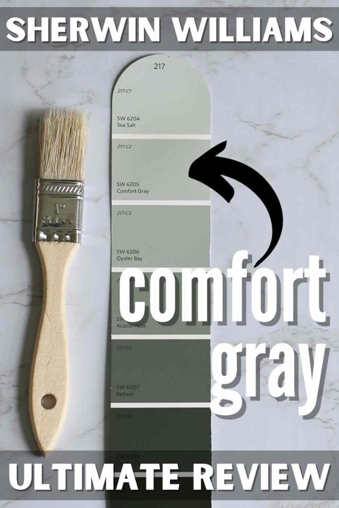
Sherwin Williams Comfort Gray (SW 6205) is a cool-leaning medium green-gray paint color that adds eye-catching sophistication to many homes.
You know that feeling when you crave a change in your home but don’t really want to commit to spending $$$ on new furnishings?
The easiest (and cheapest) way to give your home a “refresh” is by changing the paint color.
Okay, I use the term “easiest” loosely because although painting walls is more manageable than moving furniture, CHOOSING the new paint color can be tricky!
In this paint series, I’ve already covered many incredible shades to help give you pertinent information about each one (along with photos of each shade in action in real homes). My goal is to take some of the “hard” out of picking new paint colors by helping you eliminate hues that won’t work so you can shorten your list of options.
Fewer options make for easier decisions, after all!
The latest addition to this paint post series is one I think you’ll love: Sherwin Williams Comfort Gray.

What color is Comfort Gray?
SW Comfort Gray is a medium green-gray paint that leans towards the cool side of the temperature scale.
A close relative of the very popular Sea Salt, Comfort Gray is popular, inviting, and gorgeous. This blend of green, gray, and blue effortlessly conveys bold serenity and sophistication.
Doesn’t the very name “comfort gray” inspire an instant sense of calm? If you love muted tones and pastels, this shade won’t disappoint!
Comfort Gray is a member of the gray family, so it acts neutral. But, it also offers a little bit of color through its green and blue undertones. If you want a paint that will shift throughout the day to provide constant visual interest, Comfort Gray might be the choice for you!

FAQs about Sherwin Williams Comfort Gray
What other colors are similar to Comfort Gray?
Unfortunately, switching between paint color brands makes matching paint colors difficult due to variations in color blending. Choosing a Benjamin Moore equivalent to Comfort Gray can be challenging, but I recommend checking out Benjamin Moore Gray Wisp.
Is Sherwin Williams’s Comfort Gray warm or cool?
Comfort Gray is a cool-toned gray with green and blue undertones. It won’t feel overly cool or make a room feel cold, but it will help balance out the sun’s warmth in a brightly lit room.
Where should I use Sherwin Williams Comfort Gray?
This is a sophisticated neutral that can shine anywhere. Comfort Gray can look fabulous in a large variety of areas, including:
Kitchen cabinets
Accent wall
Hallways
Laundry room
Home office
Bedrooms
Bathrooms
Living room
Kitchen
What’s more, Comfort Gray fits well with coastal, Caribbean, modern, traditional, contemporary, farmhouse, Scandinavian, and transitional styles of homes.
Sherwin Williams Comfort Gray Undertones
Comfort Gray is a soothing gray with green and blue undertones.
One thing to note about undertones is that they don’t always present themselves clearly in a particular shade. There may be times when you notice those blue tones more strongly, while at other moments, it may appear more gray or muted green.
What you see depends on the lighting and your surrounding decor.
I have a tool that will work wonders to prevent you from choosing a paint color you end up totally hating once it’s all over your walls. Utilize paint swatches (I love these peel-and-stick samples) to see EXACTLY how your lighting and decor will impact the way your paint appears.
They won’t damage your walls and make moving and repositioning them simple. In fact, they’re SO helpful that they help eliminate frustration and wasted money (a win-win in my book!).
If undertones make your head ache, you’re not alone! Grab your no-cost copy of “5 Biggest Paint Choice Mistakes” Click here or enter your email below. I’ll send the tips right away!⤵️
How Different Types of Lighting Affect Sherwin Williams’s Comfort Gray
Natural light exposure shifts throughout the day as the sun moves through the sky. Constantly shifting natural light means that paint will appear differently throughout the day.
In fact, natural lighting can (and does) change so much that I frequently say not to expect ANY paint color to look the same in two different areas or at various times of the day (even in the same room!).

In the case of Comfort Gray, you’ll notice that it’s a bit of a shape-shifter. Since it’s a great balance of gray, green, and blue, you’ll see it shift quite a bit between these colors, depending on the lighting and what’s nearby.
Here’s how you can generally expect Comfort Gray to look based on different types of natural lighting.
- North-facing light – blue-tinted, cool northern light will cause Comfort Gray to put its gray foot forward a little more strongly. You may also notice those blue tones show up more prominently.
- South-facing light – warm, yellow, southern light will make this shade appear lighter and less cool and make those green undertones “pop” forward.
- East-facing light – eastern light is warm and yellow in the morning and shadowy later in the day. Comfort Gray will appear less cool in the morning and shift toward a muted blue-green.
- West-facing light – with cooler light in the morning and very warm light later in the day, you’ll likely notice the opposite scenario (of eastern lighting) play out. Comfort Gray will begin the day showing off its gray tendencies and shift toward muted green with the warm lighting.
Great Coordinating Colors for Comfort Gray
Comfort Gray plays the neutral role well, and as such, it’s a versatile color. Try offsetting its coolness by pairing it with coral and sand colors. Or go for soothing, chill vibes by pairing it with similar shades (like Sea Salt) or a lovely indigo blue.
And it’s always a winner offset by a crisp white.
If you need a few ideas of colors that look terrific together, check out these shades to safely pair with Sherwin Williams Comfort Gray:
- Greek Villa
- Acacia Haze
- Spare White
- Red Cent
- Essential Gray
- Amazing Gray
- Snowbound
- Dover White
- Moody Blue
- Retreat
- Rain
- Balanced Beige
- Virtual Taupe
LRV of Sherwin Williams Comfort Gray (SW 6205)
LRV is an abbreviation for “light reflective value.” Why does it matter? It’s a helpful way of measuring how much light is reflected by a shade. It’s a reliable indicator of how washed out or saturated a color will appear in your home.
LRV ranges from 0 – 100. A color with an LRV of 0 is pure black. On the opposite end of the spectrum, an LRV of 100 is the brightest white you can imagine.
The LRV of Sherwin Williams Comfort Gray = 54
This LRV value means that SW Comfort Gray sits firmly in the middle range of paint color lightness. It can look equally amazing in brightly lit or dimly lit rooms.

LRV…what? Don’t worry, I’ve got you! This no-cost guide will help you avoid the paint color picking mistakes most people make! Click here or enter your email below. I’ll send the tips right away!⤵️
Comfort Gray Compared to Other Colors
It’s time to compare and contrast this hue with a few other popular shades to highlight the unique qualities of each one. Let’s dive in!
Sherwin Williams Comfort Gray vs. Sea Salt
Let’s compare Comfort Gray to the uber-popular Sherwin Williams Sea Salt (SW 6204) to kick things off. In case you haven’t noticed, Comfort Gray sits just one spot below Sea Salt on the color strip. Although they’re CLOSELY related, there are some differences between them.
A medium to light gray-green, Sea Salt’s LRV of 64 makes it quite a bit brighter than Comfort Gray. Although both of these shades have similar undertones, Sea Salt is paler and more delicate-looking – it’s the epitome of “pastel.”
Comfort Gray, on the other hand, offers more saturation with a hint of boldness.

Sherwin Williams Comfort Gray vs. Repose Gray
Sherwin Williams Repose Gray (SW 7015) comes in a bit brighter than Comfort Gray with an LRV of 58. Even though it’s also neutral, it’s warmer and reads greige. Repose Gray would be a shade to use when you want a clear neutral, but choose neutral Comfort Gray when you want a shade that also offers a touch of color.

Sherwin Williams Comfort Gray vs. Oyster Bay
Sherwin Williams Oyster Bay (SW 6206) has an LRV of 44, which means that it’s a more richly saturated shade that offers more depth than Comfort Gray does. What’s more, Comfort Gray is more muted, while Oyster Bay leans more into its green undertones, making it a little less versatile.

More Colors to Consider
Gah! Choosing new colors can take some work! If you just aren’t ready to dive headfirst into Comfort Gray with confidence at this point, check out these other popular options.
- Beach Glass (Benjamin Moore) – a darker muted blue-green.
- Snowbound (Sherwin Williams) – a slightly cool, yet very livable, white.
- Silver Satin (Sherwin Williams) – an off-white with a hint of gray.
- Silver Drop (Behr) – a pale and flexible greige.
- Smoke (Benjamin Moore) – a light-medium smokey blue.
- On the Rocks (Sherwin Williams) – a medium greige with slight green undertones.
- Shoreline (Benjamin Moore) – a light gray-leaning greige.
- Agreeable Gray (Sherwin Williams) – a popular, warm greige.
- Gauntlet Gray (Sherwin Williams) – a moody warm gray with subtle undertones.
- Gray Owl (Benjamin Moore) – a beautiful neutral color.
- Pigeon (Farrow & Ball) – a cozy, calming blue-gray paint color.
Feeling lost? I gotcha, boo! Get a zero-cost copy of my new guide to avoid the paint color picking mistakes people make! Click here or enter your email below. I’ll send the tips right away!⤵️
Real Life Homes Using Sherwin Williams Comfort Gray
Okay, the information download portion of this cruise is complete! Now that you’re armed with knowledge about this shade and how it behaves, it’s time to SEE it in real life. Here are more than 10 real-life homes and spaces using Sherwin Williams Comfort Gray for you to see!
A quick note here: don’t forget to consider picking the right paint finish…it’s not only about getting the color right! We have an in-depth explanation of choosing sheens here.
SW Comfort Gray Bedrooms
In general for bedrooms, and low-traffic areas, flat paint is fine. If you like something with a bit of shine (and more ease of cleaning) opt for eggshell or satin.
1. A Classic Gray with Hints of Blue
Going for beachy vibes? As On Better Living shows in this bedroom, Comfort Gray provides the perfect backdrop for all those gorgeous and relaxing beachy colors (see the green undertones and hint of blue in the shady areas?).
2. Green Undertones Shine
I Can Teach My Child has the right idea here! Comfort Gray is a gray with just enough green to make a room feel serene, like a spa getaway. That is exactly the vibe I want in my bedroom!
3. Cozy Contrast in Casual Master
This bedroom from Home Stories A to Z has cool-toned light, which makes Comfort Gray read a little more blue. The paint is also showing its saturation range by looking a little washed out.
Living Rooms Painted Comfort Gray
4. Perfect against Creamy Whites
The Nester delights us with just a hint of muted blue-green color that’s perfectly offset with creamy whites and sandy colors for the perfect coastal theme.

5. Gorgeous in Vaulted Room
Love! Comfort Gray provides that touch of color that this living room from @furniturefromscratch needed. Those adorable dogs are my favorite decor piece in the room!
6. Seeing Green – and Blue!
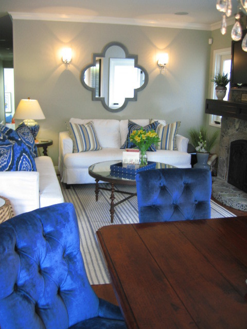
This lovely living room from Houzz shows those chameleon qualities of Comfort Gray. Notice the areas where it looks greener and other places where it looks more blue – all on the same wall. Talk about a cool color that never gets boring to look at!
Comfort Gray Kitchens
For kitchens, eggshell or satin are popular finish choices for walls. For cabinets consider semi-gloss or high gloss for the most durable finish (and a gorgeous glow).
7. A Kitchen Reno with Coastal Feels
Sand and Sisal shows off that pastel coastal feel that only Comfort Gray can deliver. In this lighting, it reads as foamy sea green and really “pops” against the gold and sand-colored accents!
Dining Rooms feat. Comfort Gray by SW
8. Bridges Cool and Warm Colors
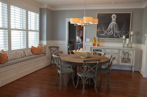
The cool lighting in this room from Houzz draws out the strong gray and blue qualities of Comfort Gray. It’s a completely different vibe but equally as gorgeous.
9. Leans Cool in this Dining Space
Thanks to artificial lighting and blue accents, Comfort Gray reads as pale, muted blue in this dining area from Sweet Chaos Home. I love the flexibility that this shade possesses!
10. A Balanced Gray
Although it can shift quite a bit between undertones, it’s an overall balanced (and fairly predictable) color, as you can see in this room from @bailey_benner.
Sherwin Williams’ Comfort Gray in Bathrooms
Don’t forget the finish! For bathrooms the perfect sheen is either an eggshell or satin. Why? We’ll tell you in this post about paint sheen.
11. A Chameleon in Changing Light
One thing I hate is monotony, which is something that you’ll never find with Comfort Gray! I love the color choice in this bathroom from @the_dani_design.
12. Reflecting Green Undertones
The yellow artificial lighting draws out the green undertones in this bathroom from Katherine Forbes. No matter what kind of lighting is on it, Comfort Gray stays muted and soft.
13. Nice Contrast with Dark Cabinets & Light Trim
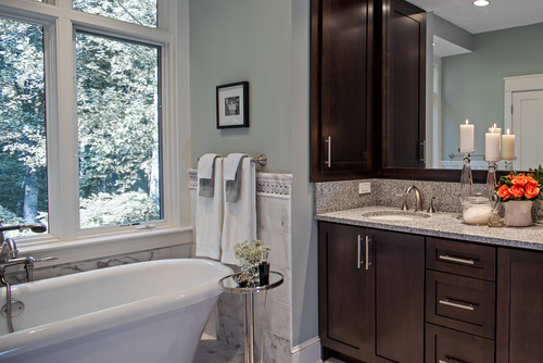
The neutral gray base of Sherwin Williams Comfort Gray allows this color to work with a variety of decor and accents. Watch it effortlessly bridge cool and warm colors as well as dark and light colors, like in this bathroom from Houzz.
14. Not Too Light, Not Too Dark
Given Comfort Gray’s medium saturation level, it works brilliantly (and equally) in small low-lit rooms as well as it does in large, spacious spaces. This bathroom from Painted on Spring Pond is a perfect example because there’s terrific saturation, but it doesn’t feel dark.
Home Offices using Comfort Gray Paint
15. Fun Backdrop for Design
If you want to change things up, add a playful design over your paint like @carmeniris_interiors did on this one accent wall. Comfort Gray has enough rich color to provide the necessary backdrop.
16. So Many Undertones in Sight
Keep your space playful, interesting, and eye-catching, as Leedy Interiors did with this home office. Comfort Gray is all you need to help you get there!
17. A Timeless Gray Interior Paint
This home by @miller_marriot (photo credit: @mkujphoto) shows just how classic Comfort Gray truly is. Beautiful!
Comfort Gray Spotted in Other Homes
18. Perfect Farmhouse Feel
I love the pairing of Comfort Gray, white, and wood tones in this mudroom from Houzz! It creates that perfect farmhouse vibe.
Now that you’ve had a chance to see Comfort Gray in action, have I convinced you to grab some re-usable, re-positionable paint samples and give it a shot? I hope you love the soothing zen-like atmosphere that Comfort Gray can help create!
Pin this paint color for later! And if you use this paint shade, leave a comment on the pin! That helps others decide if they want to try this color, too!

Ready to show those boring, bland walls who’s the boss at home? This no-cost guide will help you sidestep mistakes that almost everyone makes when it comes to picking paint! You’ll be on your way to perfect paint promptly…pinky swear.


Leave a Reply