


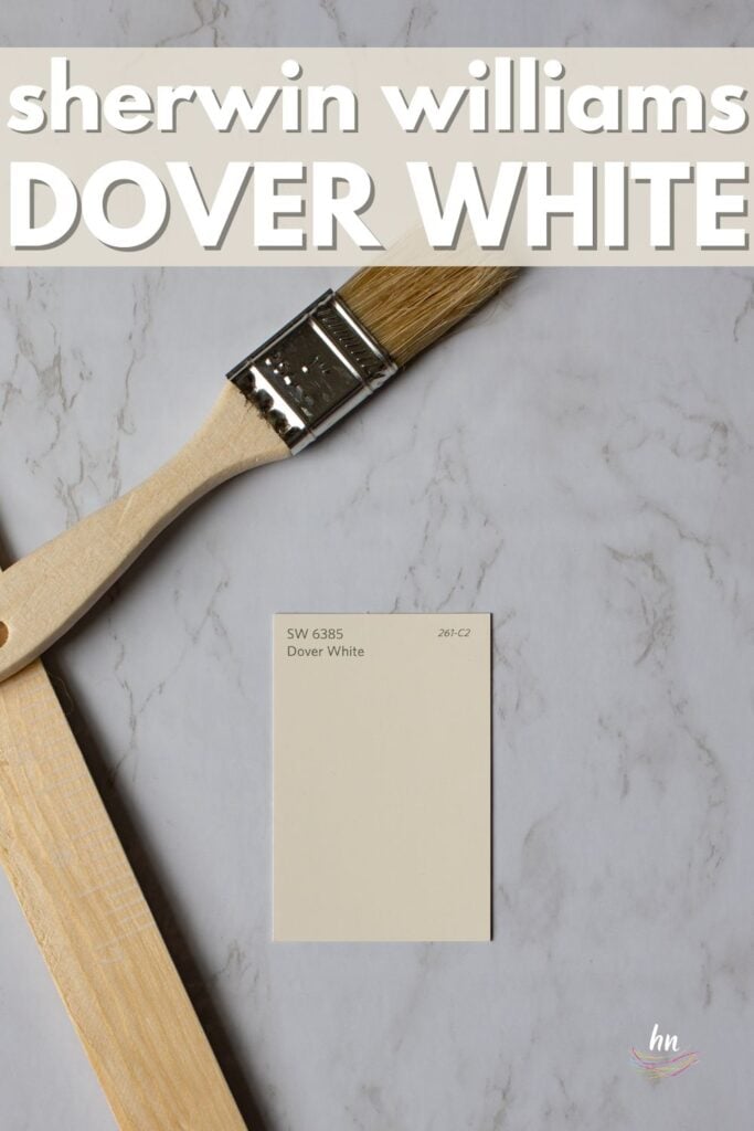
Read all about Sherwin Williams Dover White, plus check out over 20 examples of real homes that use it!
Sherwin Williams Dover White (#SW 6385) is a popular and beautiful creamy white that can be used for walls, trim, bookshelves, and kitchens.
Dover White is a similar shade to Sherwin Williams Creamy, another very popular off-white color. However, Creamy tends to read as much neutral creamy while Dover White has a little more obvious yellow in it.
Its yellow undertones can pull through very noticeably at times, which may or may not be desired.
That’s why I say it’s vital to test and sample your color with your permanent decor fixtures (flooring, counters, etc) as well as your furniture to determine if this color is right for your home before committing to it.
As far as sampling goes, I highly recommend these non-messy, re-usable, re-positionable peel and stick paint samples ⤵
Are you ready to learn all the ins and outs of this shade? By the time you reach the end of this post, you’ll have a clear idea as to whether Sherwin William Dover White is the right color for you. Let’s jump right in!

Is Dover White Warm or Cool?
When it comes to neutral colors, I would argue that whites are the most deceptively complex colors. White may seem like a simple choice, but trust me, it’s anything but simple.
White paints, perhaps more than any other color, are subject to big variances due to undertones.
The Impact of Undertones
Undertones are tints of other colors that are added to the white paint to change its overall look. When you look at it, you’ll still see primarily white…but you’ll also see a hint of another color coming through too.
And those undertones will determine whether a particular white paint is warm, cool, creamy, beige, gray, blue, or even slightly pink.
Pay attention to those undertones, because they have a huge impact on whether the color you think you like will actually look good in the area of your home where you want it.
With Dover White, you’ll find a warm, creamy neutral white that creates a soft, cozy atmosphere. This color works well with muted blues and soft browns.
Want the cliff notes for choosing the perfect color every time? Grab a FREE copy of my guide to help you avoid the paint color picking mistakes most people make!

LRV of Sherwin Williams Dover White
Ok, let’s chat about LRV for a moment, shall we? If you have been following our Paint Color Series posts, you have likely read about LRV. For those who haven’t, well, here’s a quick recap.
LRV stands for Light Reflectance Value, and it’s basically a numerical value designed to indicate how much light a color reflects (how light it appears) or absorbs (how dark it appears). The range goes from 0-100, with higher numbers indicating brighter colors.
Every paint color is assigned an LRV number, and I LOVE this system because it offers a guide and a starting point as you start choosing colors for your painting project.
Sherwin Williams Dover White has an LRV of 83, which puts it solidly in the light, off-white cream range.

A Quick Note About LRV of Neutrals
In general, I’m not a huge fan of beige or dark neutrals.
I think people tend to pick darker colors than they usually should. It’s not hard to do if you don’t have the experience behind you telling you it’s a big no-no.
Small color swatches of a too-dark paint can look amazing, making you think that your top choice color will look amazing. Until your entire room is painted in that color and suddenly feels very dark and small.
The good news for Dover White is that’s not even close to being a problem!
LRV…what? Don’t worry, I’ve got you! This no-cost guide will help you avoid the paint color picking mistakes most people make! Click here or enter your email below. I’ll send the tips right away!⤵️
Dover White vs Other Soft Whites
I’ve said it before but I’ll say it again: white paint can be one of the most deceptive shades out there!
You think a color is the right white until you hold it up against another shade, and end up a little confused. Here’s how Dover White stacks up against some of the other popular shades of paint.
Dover White vs. Alabaster
Sherwin Williams Alabaster is another popular creamy, soft white. With an LRV of 82, it’s just the teeniest bit darker than Dover White. But it reads more neutral, whereas Dover White reads slightly more yellow.
They both read more white than any other color, but the slightly higher creamy look of Dover White makes it pair better with warm colors. Alabaster, on the other hand, can pretty easily span that bridge between cool colors and warm colors.

Dover White vs. White Dove
Benjamin Moore White Dove is a go-to white for many people, and as a bright, warm, neutral white, it’s not hard to see why.
White Dove’s LRV of 85.38 makes it brighter than Dover White. And where Dover White reads as a very creamy (yellow) white, White Dove reads more neutral with a touch of greige.
While Dover White looks pretty white in bright light, it will still retain that soft, creamy quality. White Dove, on the other hand, will tend to read more true white.

Dover White vs. Agreeable Gray
Wait…what? Comparing Dover White to Agreeable Gray? You’re probably saying “Sherwin Williams Agreeable Gray isn’t white”, and you’re right!
However, I feel that Agreeable Gray is worth a mention here because the two colors pair very well together. They both read warm, and Dover White’s creamy undertones set off Agreeable Gray’s darker greige color in a way that makes both colors “pop” against each other.
If you like these colors, Dover White could be your trim (albeit a bit of a dark one) with Agreeable Gray on your walls.

Are you already feeling a little lost? Let me help you get back on track. Grab a free copy of my guide to help you avoid the same paint color picking mistakes most people always make!
More Colors Covered in our Paint Exploration Series:
If you still aren’t sold on this color, or just want more options – here are several other colors to choose from.
20+ Real Life Homes Using Sherwin Williams Dover White
Now it’s time to take a look at how Dover White looks in actual homes. It’s one thing to look at color swatches on a computer screen, but that alone is NEVER a good way to choose a paint color for your own home.
By seeing examples of how Dover White actually behaves in real life, you can get a better sense of whether it might be the color you want for your own home. Let’s take a look!
Bedrooms Using Dover White
The bedroom should be a place of relaxation. A cozy place that puts you at ease and helps to release the stresses from the day. A stark, cold white just won’t do in that area, but the creaminess of Dover White is perfect. Check out these examples of Dover White bedrooms.
A quick note here: don’t forget to consider picking the right paint finish…it’s not only about getting the color right! We have an in-depth explanation of choosing sheens here.
In general for bedrooms, and low-traffic areas, flat paint is fine. If you like something with a bit of shine (and more ease of cleaning) opt for eggshell or satin.
1. Cozy, Inviting Bedroom Color
If you are looking for a soft and cozy bedroom that’s also light and bright, consider Dover White. This example from Linda Burkhardt shows just how inviting and soothing this creamy white can be.

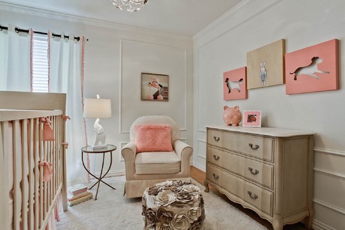
2. Beautiful in a Baby’s Room
In rooms with less natural light, like this nursery from RN Interiors, Dover White’s high LRV keeps the room bright while also giving it a soft vibe.
The yellow undertones are muted here thanks to the natural lighting and the other decor items in the room.
3. Stellar on Shiplap
The light and decor in this room bring out the creaminess of Dover White without feeling to yellow.
And that’s the beauty of this color. It can read yellow, but more often than not, the yellow undertones are perfect for simply giving this white a soft bit of COLOR so that it can contrast with other whites.
Love the shiplap? We’ve got more shiplap ideas here.
4. Beautiful on Board and Batten
Speaking of contrasting with other whites, here’s a perfect example.
The bottom half of the walls are painted Sherwin Williams Dover White which contrasts beautifully with the brighter whites in the furniture and wallpaper while still keeping the entire room bright.
Love the board and batten? Then definitely check out this article, dedicated to board and batten ideas!
Living Rooms in Sherwin Williams Dover White
If you seek a bright living space but want a bit of color to provide a simple background for the rest of your decor, check out these living rooms that use Dover White.
5. Soft Contrast
In this example originally seen on the Annie Selke blog (but the link is no longer live), Sherwin Williams Dover White frames out the very white kitchen in a lovely creamy frame. It’s a beautiful contrast that works well here and makes the small space feel more spacious.

6. Can Look Super White
Different lighting situations can make the same paint color look VERY different. Check out how pure white Dover White looks here!
But the magic of Sherwin Williams Dover White is that even in this lighting, it still reads soft – that’s the advantage of this white over other, less creamy, white choices.
7. Soft and Beautiful
I love how this white can add just a touch of color while taking a step back and letting the fixtures and other decor elements take center stage in this space from a website that is no longer active, called “Painted Nonsense”.

8. Welcoming, Warm Undertones
If you want a color that looks different even in different areas of the same room, look no further than Dover White to provide some visual interest. Here you can see the range from pretty yellow to fairly pure white, all depending on the amount of shadows there are.
Kitchens Using Sherwin Williams Dover White
Cooking in a dark kitchen is not appetizing at all. Check out how Dover White looks in various kitchens!
For kitchens, eggshell or satin are popular finish choices for walls. For cabinets consider semi-gloss or high gloss for the most durable finish (and a gorgeous glow).
9. Pretty White in Bright Light
How gorgeous is this kitchen? Sherwin Williams Dover White really shines here and shows off it’s soft, bright white qualities. I’m gaga for the gorgeous green cabinetry, how about you? Color: SW Pewter Green.
10. Warm White Cabinet Color
Sometimes Dover White may look too creamy on kitchen cabinets, but not here. The color provides the perfect amount of creaminess for this kitchen.
11. Pulls Yellow In Artificial Light
When asked, Lindsey of @immesaurablymorehomes said that Dover White definitely pulls yellow, and though it’s not super duper noticeable in this shot, she says it is more so in real life.
So if you want the look of WHITE cabinets, then you may want to think twice about this shade. But if it’s a creamy off-white you’re wanting, this one should still be one to consider! Wall color in this space is Accessible Beige.
12. Pulling Cool in the Evening
Light, bright, and soft. Dover White is a great color to bring together (and contrast against) the beautiful warm wood floors and the stainless appliances.
Pay attention to how this tone changes at night under all artificial light. The type of lightbulb you use will really make a huge impact under these conditions. Warm white bulbs will pull more of the yellow out, whereas daylight or cool white bulbs will give the paint more of a cool, almost warm gray look as you can see here.
13. White Kitchens Look Larger
The way that Sherwin Williams Dover White keeps this kitchen by Flourish Interiors light and interesting completely attracts your attention away from the small size (photography credit: @Jlynnephotography)
Dining Spaces Using SW Dover White
Dover White provides a nice environment for dining. Check out these examples!
14. Cozy Dining Room Color
In this beautiful space, the darker Collingwood was used above Dover White-painted board and batten.
15. Board & Batten in Dover White
In this example, the hutch and board and batten trim are painted Dover White, while the wall above is painted Repose Gray. The shade looks much brighter and more white than in the room above thanks to the cool tones throughout the rest of the room.
Real Life Bathrooms That Use Dover White
Bathrooms can be very small, dark rooms, which makes the need for a light color even more important. Check out how Dover White looks.
Don’t forget the finish! For bathrooms the perfect sheen is either an eggshell or satin. Why? We’ll tell you in this post about paint sheen.
16. Dover White Bathroom Walls
I love how Dover White pairs with the greige backsplash, white vanity, and dark accents to pull everything together and keep it from looking stark.
17. Off-White Bathroom Walls
Lovely and soft…and perfect for farmhouse decor!
Sherwin Williams Dover White in Other Spaces
Here are some other spaces (hallways and entryways) that have used Dover White.
18. Welcoming, Warm White Entryway
Bright, yet soft in areas with low light. You can see how the yellow undertones start to show even more in the corners where the light is just a touch darker.
19. Paired with Rich Gray
Check out the pairing of this warm, rich Dover White shiplap in a beautiful entryway with a Dutch door painted in Iron Ore. Love…
Sherwin Williams Dover White as Exterior Paint
House interior…check. What about the exterior? Check out how Dover White performs.
20. Dover White Exterior
Dover White with wood and brown-toned stone? A thousand times, YES!
21. Beautiful with Black Exterior Accents
Dover White’s creaminess pairs well with the dark accents on this home’s exterior to keep it bright but not blinding white. (Designer credit @brendadunn7 on Instagram).
22. Perfect with Muted Blues
An exterior example with muted blues paired with Dover White. It’s stunning. (Designer credit @brendadunn7 on Instagram).
23. Farmhouse Fresh
Shanty 2 Chic NAILS this exterior palette with a combo of Dover White + always popular SW Tricorn Black for the trim.
24. A Showstopper in the Snow
Lots of folks wonder what their white paint will look like against a snowfall, and Grit and Polish shows how gorgeous Dover White can look on a snowy day! This shade definitely reads cooler in the setting of snow, but that’s not really surprising. Bottom line, this shade is dreamy in almost any weather!
There ya go! Sherwin Williams Dover White’s creamy nature and versatility are the reasons behind its huge popularity.
As with ANY paint color, thoroughly vet it in the space you want to paint before fully committing. And these no-mess, re-usable, re-positionable, peel and stick samples are ones I highly recommend⤵
For the most part, however, if you love a creamy warm white with yellow undertones…go wrong with Dover White. Or at least add it to the list for consideration!
Pin this post for later! And if you decide to use this Sherwin Williams Dover White, leave a comment (or better yet, a photo) on the pin! That helps others know whether they want to try this color, too!

Pssst…before you go, I sure would love to hang out with you again really soon! And before you’re on your way, make sure you grab your free copy of the 5 Biggest Mistakes People Make When Picking Paint, so you can avoid the heartache (and hole in your wallet) when your paint choices don’t quite work out! Click here, and I’ll send your free copy right now!


Deb Stover says
Hello!
I am so pleased to have found your blog. We built a new home with an open floor plan and a large kitchen with custom cabinets painted Dover White. I love the color and had the 20 ft ceilings and trim in Dover. I do want to change it up now and paint my walls, less golden and more greige as they are painted SS Whole Wheat now. Another blog slammed DW to the point that I didn’t think greige or any color for that matter could go with it. I love it with Agreeable Gray! After putting it next to my counters and wood floors it’s perfect. I could hug you. :):)
Heather Thibodeau says
Yeah! So great to hear!
C Allen says
Stay away from SW DOVER WHITE. we have it on our trim and the yellow undertone is too strong. We painted the walls SW alabaster and they look good with it, but I’d definitely pick another trim color if I had the choice
Heather Thibodeau says
Thanks for chiming in! Dover White can definitely be a challenging color. No paint color is “easy” but some can be trickier than others, and that’s certainly the case w/ Dover White. That said, it can definitely be beautiful in the right space.