


Read all about Benjamin Moore Collingwood, plus see 20 real homes that use it!
Benjamin Moore Collingwood (Shade #OC-28), one of Benjamin Moore’s best-selling paint colors, might just be the balanced greige you’ve been searching for. It’s a true gray in that it lacks obvious green or red undertones, but it’s absolutely a warm, light gray (no icy blues here!) with some beige mixed in. OC-28 is right in the middle of light and mid-toned, so it will be noticeable on a wall but never too dark.
As a wall color, Collingwood lends a beautiful contrast with white trim. It’s not overly warm and is especially complimentary with warm woods, whitewashed furniture, and blue decor accents.
Curious if Benjamin Moore Collingwood Gray is the right shade for your home? Read on to learn more!

What Color is Benjamin Moore Collingwood?
You can either call Collingwood a light, warm gray, or you can call it a light greige. What’s “greige,” you might ask? Greige is a neutral that’s basically gray with enough beige or taupe mixed in to give it warmth.
What’s really neat about Benjamin Moore Collingwood Gray is that it’s not too warm. It doesn’t have any of the yellow-ness that many beiges tend to have, so it can play the role of a true gray without looking at all icy cold.

Benjamin Moore considers Collingwood part of their Off-White color collection, and always has a way with words: “Inherently sophisticated and endlessly versatile, the Off-White collection offers subtle nuances of whites that suit tranquil, serene environments as well as creates color-enhancing accents for dynamic spaces.”
Sounds nice, right? While Ben M. is spot on with this poetic description, I have to disagree with the off-white designation. It’s way too dark to be an off-white (I’ll talk more about Light Reflectance Value, or brightness, in a bit).
Personally, I wouldn’t paint any of the walls in my home with a shade much darker than Collingwood. It’s almost the line in the sand for me.
Want the cliff notes for choosing the perfect color every time? Grab a FREE copy of my guide to help you avoid the paint color picking mistakes most people make!

Benjamin Moore Collingwood Undertones
We’ve established that Collingwood is a true gray, which can be a bit confusing because it can lean toward greige. How can this be? I’m happy to tell you! It’s a true gray because it really doesn’t have any glaring undertones.
There’s no green or red, which a lot of light grays can reveal in certain lighting. There’s no yellow or blue either, which is often the determining factor in deciding whether a color is gray or beige.
But Heather, you might say…how can a gray have no undertones whatsoever? And to that, I’ll say you’ve been reading my Paint Color Series, so you get a fist bump! If I had to pick an undertone, I’d say this shade does have a slight hint of purple, to which Collingwood can attribute both its grayness and its warmth.
In summation, Benjamin Moore Collingwood Gray is an incredibly balanced neutral that will work well in virtually any space and with any decor style.

Which rooms look best with Benjamin Moore Collingwood Gray?
I’ve said it once, but I’ll say it again: Collingwood looks fabulous with bright, clean white trim. Why? It’s just dark enough to give it that lovely contrast without too much drama.
Since it’s the perfect match for warm woods, whitewashed furniture, and blue decor accents, it’s a terrific pick for coastal and some farmhouse decor styles. It’s really neutral enough to look great with any style, and we’ll explore a few later on.
It’s a lovely shade for bedrooms, setting the tone for a calm, relaxing color palette, but it’s also a flexible neutral that can work incredibly well in living spaces (family TV rooms and formal sitting rooms) and dining rooms.
LRV of Benjamin Moore Collingwood Gray
First, here are the “numerical” details, or the LRV:
COLLINGWOOD LRV = 62.14
LRV = Light Reflectance Value: Rated 0-100 with 0 being pure black, and 100 being pure white. Lighter paint shades REFLECT more light from them and therefore have a HIGHER LRV, and vice versa for darker shades). Below, see Collingwood (62.14) side by side with pure white (100):

Ok, now I’ll explain what I mean when I say Collingwood is pretty close to my line in the sand when it comes to the brightness or darkness of a paint shade.
Most white paint colors fall in the LRV 80-95 range, so with an LRV of 62.14, I really don’t consider Collingwood an off-white color. In fact, I personally would never go darker than a 60 on the LRV scale, and Collingwood sits riiiight above that.
Rooms with Northern exposure, or even eastern and western-facing rooms for that matter, will have significant darker periods during the day. In my opinion, any shade lower than 60 LRV will look just too dark. Collingwood is right on the cusp, but light enough to hold its own even in darker spaces.
LRV…what? Don’t worry, I’ve got you! This no-cost guide will help you avoid the paint color picking mistakes most people make! Click here or enter your email below. I’ll send the tips right away!⤵️
Benjamin Moore Collingwood Compared to Other Colors
Let’s see how Collingwood stacks against similar colors in the Ben Moore family.
Benjamin Moore Collingwood vs Revere Pewter
Compared side by side, Collingwood and BM Revere Pewter look pretty similar. Interestingly, Ben Moore considers Collingwood an off-white while describing Revere Pewter as a light gray with warm undertones.
Essentially, the two shades serve a similar purpose, but Revere Pewter (with an LRV of 55.51) is objectively darker. It’s important to note that Revere Pewter will noticeably morph into a true greige in many rooms where the lighting changes throughout the day, whereas Collingwood manages to retain its grayness.

Benjamin Moore Collingwood vs Edgecomb Gray
The first thing you’ll notice about BM Edgecomb Gray when placed next to Collingwood is that it’s warmer, creamier, and has a hint of green undertones. Collingwood is often considered a true gray in that it doesn’t have obvious green or red undertones.
There isn’t a huge gap in terms of Light Reflectance Value (Collingwood is 62.14 and Edgecomb Gray is 63.88), but the main difference between the two is that Edgecomb Gray has considerably more beige mixed in. Making it “greige-ier” (yes, I’m aware that isn’t a real word!) than Collingwood.

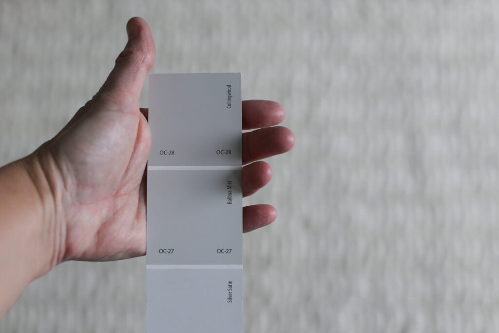
Benjamin Moore Collingwood vs Balboa Mist
Also part of the Ben Moore Off-White collection, Benjamin Moore’s Balboa Mist (LRV 67.37) is a touch lighter than Collingwood (LRV 62.14). It’s maaaaybe a little creamier and has some greenish undertones.
While it still lends some contrast with white trim, I’d say that Collingwood does it better with its purple-ish undertones and true gray characteristics.

More Colors Covered in our Paint Exploration Series:
If you still aren’t sold on this color, or just want a few more options – here some other grays and greiges to explore:
- Gray Owl (Benjamin Moore)
- Classic Gray (Benjamin Moore)
- Stonington Gray (Benjamin Moore)
- Repose Gray (Sherwin Williams)
- Agreeable Gray (Sherwin Williams)
- Perfect Greige (Sherwin Williams)
- Kilim Beige (Sherwin Williams)
- On the Rocks (Sherwin Williams)
- City Loft (Sherwin Williams)
Feeling lost? I gotcha, boo! Get a zero-cost copy of my new guide to avoid the paint color picking mistakes people make! Click here or enter your email below. I’ll send the tips right away!⤵️
20 Real Life Homes Using Benjamin Moore Collingwood
Alright, time to dig into the good part: all that eye candy! But first, a warning. Do NOT fall in love with one of these rooms, run out and buy 4 cans and start painting your space! Remember the cardinal rule of painting: sample before you swipe that paintbrush!!!
As far as sampling goes, I highly recommend these non-messy, re-usable, re-positionable peel and stick paint samples ⤵
Living Spaces Using Collingwood
Sheen note: Picking the right color is only winning the battle, not the war. Remember to pick the right paint finish, or sheen, also! Read up on what you need to know about picking the perfect paint sheen.
1. Benjamin Moore Collingwood for a Peaceful Living Room
Collingwood is the perfect neutral wall color for this living space from The Creativity Exchange that’s decorated with subdued earth tones.
The crown molding at the ceiling was built to be highlighted, and the contrast between Collingwood and the white moulding is absolutely stunning.

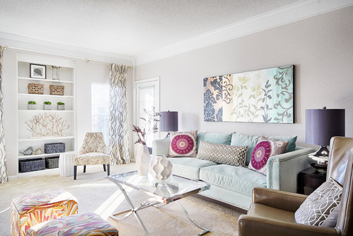
2. Collingwood Living Room
In this room by Lowery Design Group with bright, natural light, Collingwood appears very light, but not washed out. It’s also neutral enough to accommodate the colorful decor in this living room.
3. Gorgeous Neutral Family Room
This beautiful room from Citrine Living is a great example of how fantastically well Collingwood plays with white trim, wainscoting, and a blue decor scheme.
The gold chandeliers and matching accents help to warm up this relatively cool-feeling space.

4. Coastal Vibes
I love the subtly coastal feel of this light and bright living space!
The natural window treatments tie in perfectly with the coffee table and baskets, while the picture frames blend seamlessly with the white window trim. This leaves the blue couch to stand out, and Collingwood wall paint provides the perfect backdrop for the entire scene.
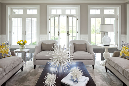
5. Formal Living Room with Collingwood
This stately sitting room from Sellars Lathrop Architects is filled with elegant accents, such as a classic chandelier, statement crown moulding, and wainscoting painted in White Dove by Benjamin Moore.
Since White Dove is an off-white instead of a bright white, the contrast between the trim and walls painted in Collingwood is more subtle.

6. Collingwood in a Farmhouse-Style Living Room
This farmhouse-inspired living room from Stevens Custom Homes manages to wow even with a completely neutral color palette.
Collingwood walls are soft enough to let the hardwood floors and ceiling beams shine, and light enough to keep this space feeling bright without being blinding.

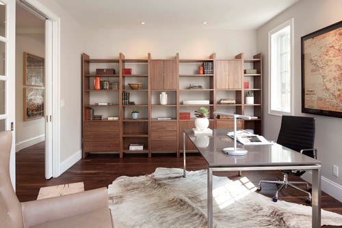
7. Collingwood Office
Collingwood walls help to soften this awesome modern office shared by Elevation Home Builders. The color looks great with the midcentury-inspired shelving unit and vintage framed map.
8. Collingwood in a Coastal Living Room
This bright living space from O’Hara Interiors uses cool neutrals in its decor palette. Collingwood takes on a warm gray role, complementing the neutral-colored upholstery nicely.
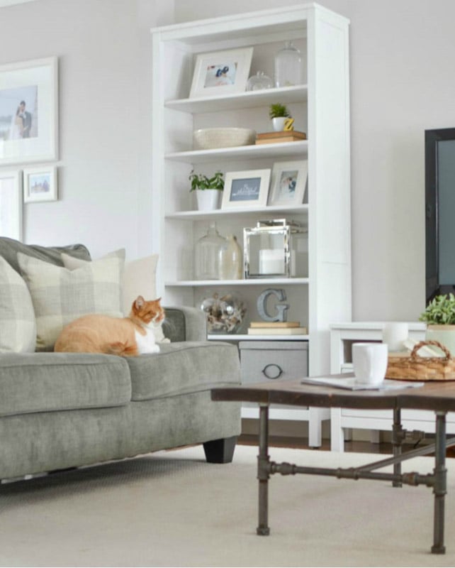
9. Modern Farmhouse Neutral Paint Color
Once again, Collingwood provides an unassuming backdrop for a room from Nick + Alicia that favors soft neutrals, as in this modern farmhouse-inspired space. The cat seems happy with it, too!
10. Benjamin Moore Collingwood with Contrast
Collingwood looks decidedly gray on the walls of this open concept living room and kitchen – and it works! There are some interesting architectural details here, and they’re nicely highlighted with a bit of contrast between the walls and trim.
The wood ceiling and stone offer beautiful contrast with the modern, but cozy wall color.
Kitchens Using Collingwood
For kitchens, eggshell or satin are popular finish choices for walls. For cabinets consider semi-gloss or high gloss for the most durable finish (and a gorgeous glow).
11. Just Enough Contrast
The recessed shiplap wall in this dining room is so unique, that it has to be done justice, which can be tricky. The decision to frame it with Collingwood walls added just the right amount of contrast while still feeling soft.
12. Works Well with White Cabinets
This open kitchen is almost all off-white, as the cabinets take up most of the wall space. In cases like these, it’s tricky to know what color to paint just a tiny sliver of wall. Enter Collingwood, for just a little bit o’ contrast.
13. Luxurious Look on Cabinetry
This color looks so posh on cabinets. Just enough depth to look “not-plain-white” and not so dark that it darkens the whole space. (Photo credit: Sarah Shields Photography)
Bedrooms Using Collingwood
In general for bedrooms, and low-traffic areas, flat paint is fine. If you like something with a bit of shine (and more ease of cleaning) opt for eggshell or satin.
14. Benjamin Moore Collingwood in a Bedroom
In this bedroom from The Creativity Exchange, Collingwood highlights the white trellis pattern on the wall.
There’s an abundance of natural light, making the wall shade lean cooler and look like a true, warm gray. It also plays exceptionally well with the muted turquoise decor accents.

15. Pretty Purple Undertones
Oooh la la! I love how the pale pink and blush tones bring out the purple undertones tucked into the paint color. Collingwood feels warm and creamy in this cozy, romantic bedroom.
16. Neutral Gray Bedroom
Ooh la la! The molding in this space is so sophisticated. And painted in Collingwood, it has a very posh, and dare I say tad bit masculine feel? This color looks pretty much true gray in this room with its natural lighting.
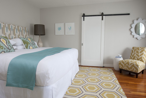
17. Collingwood in a Bedroom with Barn Door
Collingwood adds a soft contrast between the walls and white sliding barn door, wall art, and bedspread in this space from Cornerstone Construction.
Again, it definitely looks like a warm gray which plays well with both the turquoise and yellow decor accents.
Bathrooms Using Collingwood
Don’t forget the finish! For bathrooms the perfect sheen is either an eggshell or satin. Why? We’ll tell you in this post about paint sheen.
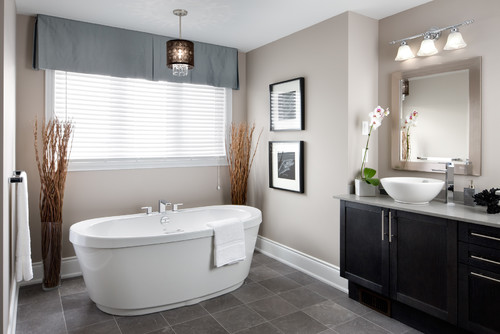
18. Chic Warm Gray Bathroom
I love how creamy this shade looks on the walls of this bathroom from Jane Lockhart Design. You can definitely detect the taupe and purple undertones here, but the color is still cool enough to feel serene and spa-like.
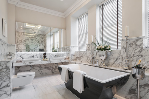
19. Sophisticated Bathroom with Collingwood
Collingwood looks warm in this light-filled bathroom from Alexander James Interiors, taking on a creamy beige or off-white role. It contrasts just enough with the dramatic marble backsplash to let it stand out without contradicting it.
More Spaces and Places Using Collingwood
20. Benjamin Moore Collingwood Furniture Flip
Jenn Cann uses Collingwood for a lot of her furniture makeovers. And it’s not hard to see why. Collingwood is such a great supporting actor. These pieces would look great in rooms with any number of color schemes. The greige qualities help it look great with warm and cool tones alike.
21. Collingwood Gray Laundry Room
Benjamin Moore Collingwood Gray is pretty in this laundry room from Hendel Homes.
It’s a small space, but filled with light, and the wall shade looks creamy and warm, with definite tones of beige peeking through.

22. Beautiful Basement
Paint made SUCH an impact in this bright, basement living space. Scroll through to see the before and afters.
This color looks very broadly appealing…like a potentially great choice for preparing a home to sell/home staging, doesn’t it?
And that’s it for Benjamin Moore Collingwood Gray! I hope you enjoyed seeing this paint shade in 23 real homes. What do you think? Does it make your short list of lovely warm grays to consider for your home?
And if this is a color you’re seriously considering, remember paint-sampling is better than ending up paint-sorry! I highly recommend these peel and stick samples because they are inexpensive, re-usable and re-positionable…
Pin this post for later! And if you decide to use this color, leave a comment (or better yet, a photo) on the pin! That helps others know whether they want to try this color, too!

Pssst…before you go, I sure would love to hang out with you again really soon! And before you’re on your way, make sure you grab your free copy of the 5 Biggest Mistakes People Make When Picking Paint, so you can avoid the heartache (and hole in your wallet) when your paint choices don’t quite work out! Click here, and I’ll send your free copy right now!


Leave a Reply