


Read all about Dorian Gray paint by Sherwin Williams, plus see 26 real homes that use it!
Sherwin Williams Dorian Gray (SW 7017) is a warm, neutral gray of medium darkness. It’s a great, neutral choice for those looking for a gray shade with a little bit more body than a light gray.
Like many grays, it looks awesome with bright, white trim. What makes this shade special is that it complements warm color schemes (think: red brick fireplaces, warm woods, warm decor accents, etc.). It also looks great with darker or medium-toned wood flooring.


FAQ’s: Dorian Gray
Dorian Gray paint is a warm, medium to dark neutral gray. Some might consider it a part of the greige family.
It has subtle purple undertones, and in some lighting, it can show a very slight hint of green undertones. Light beige, medium beige, and sage green are good coordinating colors.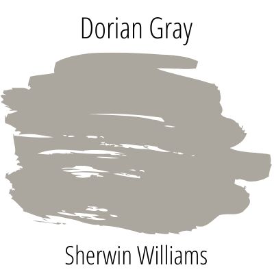
Is Sherwin Williams Dorian Gray a warm or cool color?
Warm colors tend to have brownish and/or yellowish undertones, whereas cool colors more often have blueish undertones. Since this shade lacks obvious blue undertones, it’s a warm, true gray.
For this reason, it’s a great choice for those who want to shy away from the iciness that many grays have. Also, since it’s a darker gray hue, it can create a cozy feeling in a room.
What colors coordinate with Dorian Gray?
Dorian Gray works well with many shades, but here are a few that it works particularly well with:
Alabaster (Sherwin Williams)
Pure White (Sherwin Williams)
Tricorn Black (Sherwin Williams)
Urbane Bronze (Sherwin Williams)
LRV of Dorian Gray Paint (SW 7017)
First, here’s the “numerical” details, or the LRV:
DORIAN GRAY LRV = 39
LRV = Light Reflectance Value: Rated 0-100 with 0 being pure black, and 100 being pure white. Lighter paint shades REFLECT more light from them and therefore have a HIGHER LRV, and vice versa for darker shades). Below see Dorian Gray (39) side by side with pure white (100):

This means that Dorian Gray is well on the darker side. In my experience, this shade falls into the “proceed with extreme caution” bucket, as anything with an LRV under 60 can feel too dark in my opinion. I’m not saying you can’t use this shade, but I am saying to make sure you swatch like crazy on your walls before committing.
LRV…what? Don’t worry, I’ve got you! This no-cost guide will help you avoid the paint color picking mistakes most people make! Click here or enter your email below. I’ll send the tips right away!⤵️

Dorian Gray Paint Compared to Other Colors
With an LRV of 39, this is definitely a darker gray shade. It’s not as dark as charcoal, but it’s definitely a medium to dark gray, so be mindful when using this paint in your home, particularly in darker, smaller rooms.
Gray is one of the most popular paint colors for homeowners, but it can be tricky to find the right shade. Grays tend to have sneaky undertones that morph with changes in natural light throughout the day. Sometimes warm, cool, green, or blue tones only make themselves known after a wall is already painted.
For this reason, let’s compare it with other similar grays that are also popular paint shades to help better understand its undertones and color profile.

Dovetail vs Dorian Gray
You’re definitely crossing into dark gray territory with Sherwin Williams Dovetail, which has an LRV of 26. It’s still not a super dark or charcoal gray, and there’s still a lot of warmth to it. There’s enough brown undertones to ensure it doesn’t get too icy.
However, Dovetail does appear to be somewhat cooler in certain lighting, with more intense purple undertones. Dovetail falls somewhere in between medium and dark as a warm gray.

Dorian Gray vs Chelsea Gray
Is Dovetail not dark enough for you? If you’re adventurous, you can venture even darker with Benjamin Moore’s Chelsea Gray. Its LRV is 22.16, but it’s still on the warmer side of the darker grays.
I always enjoy Ben Moore’s color descriptions, and this one does not disappoint: “Like a well-dressed gentleman, this gracefully urbane shade of gray adds a sophisticated, scholarly quality to a den or library.”
It almost seems as though Chelsea is a darker version of Dorian, and they’ve even been used together with Chelsea as a statement shade on a kitchen island and Dorian on the perimeter cabinets to add visual interest and depth to the space.

Dorian Gray vs Mindful Gray
These two colors are incredibly similar to each other. Sherwin Williams Mindful Gray has an LRV of 48, so it’s just nine points lighter than Dorian and comparable in warmth. Interestingly, Mindful Gray can sometimes have a sneaky hint of blue or purple in certain lighting.
Even though Dorian doesn’t have very obvious yellow undertones, when compared to Mindful Gray, it can show a little bit of yellow. For this reason, Dorian can warm up a room with northern exposure, which tends to cast blue or gray, sometimes icy natural light. Even as a warmer gray, Mindful might come off as gloomy in this kind of lighting.

More Colors in our Paint Exploration Series
If you still aren’t sold on this color, or just want a few more options – here are several other colors to choose from.
Want the cliff notes for choosing the perfect color every time? Grab a FREE copy of my guide to help you avoid the paint color picking mistakes most people make!
25 Real Life Homes Using Dorian Gray
Alright, time to dig into the good part: all that eye candy! But first, a warning. Do NOT fall in love with one of these rooms, run out and buy 4 cans and start painting your space! Remember the cardinal rule of painting: sample before you swipe that paintbrush!!!
As far as sampling goes, I highly recommend these non-messy, re-usable, re-positionable peel and stick paint samples ⤵
Bedrooms with Dorian Gray Paint
1. Master Bedroom Transformation
This bedroom space from Kiki Interiors looks cozy but not too dark. The paint shade on the wall is crisp enough to look clean and modern but warm enough to create a relaxing environment that’s in no way stark or icy.

2. Gray, but not Gloomy Bedroom Paint
Here again, in this trendy, relaxing bedroom, this paint shade adds interest without looking too dark.
The natural light keeps this bedroom looking bright but still cozy, wrapped in serene, neutral shades of gray and white. The dark ceiling adds extra depth and visual interest. Ceiling color is Tricorn Black, and the trim color is Eider White.
3. The Right Gray for a Great Bedroom
In this bedroom from Sweet Parrish Place, the wall shade looks like a cooler gray in contrast with the warm wood furniture, but complements it nicely. The delicate color palette of white, gray and purple bring out soft purple undertones in the paint.

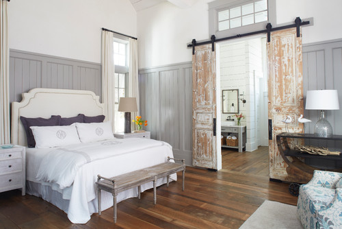
4. Dark Bedroom Perfect for Dreaming
Light accents like the rug, trim and other decor elements help brighten it up, but the goal is to turn down the light a bit in this bedroom, and make it a space perfect for snoozing. I think the goal has been achieved, don’t you?
5. Beachy Bedroom with Dorian Gray
Personally, I think Dorian Gray looks its best on exteriors, cabinetry, and like you see below…as a trim color paired with a lighter wall color. That pairing in this space is with the very popular Benjamin Moore White Dove (another personal favorite). You’ll see a bathroom from this beautiful home from TS Adams Studio below as well. And the results are equally as lovely.
Dorian Gray Bathrooms
Don’t forget the finish! For bathrooms the perfect sheen is either an eggshell or satin. Why? We’ll tell you in this post about paint sheen.
6. Clutch Color for Cabinets
You’ll see another space from this dazzling custom home from Wyrick Residential Design a bit later in the article, but here’s your first look at Dorian Gray in this home. You’ll spot it as the color of this beautiful bathroom’s cabinetry.

7. Dorian Gray Bathroom Vanity
Using this gray shade on the cabinets complements the warm floor tile, but also looks nice with the pale, sea foam green walls in this bath from 2 Cabinet Girls. This is a true testament to how versatile and neutral Dorian can be.

8. Gray Paint Tones in a Bathroom
Dorian Gray is used in this bathroom as a door color. A great way to use a darker shade in any room is as a trim or accent color, and that method is shown beautifully in this clean, inviting space. Wall color here is Sherwin Williams Alabaster.
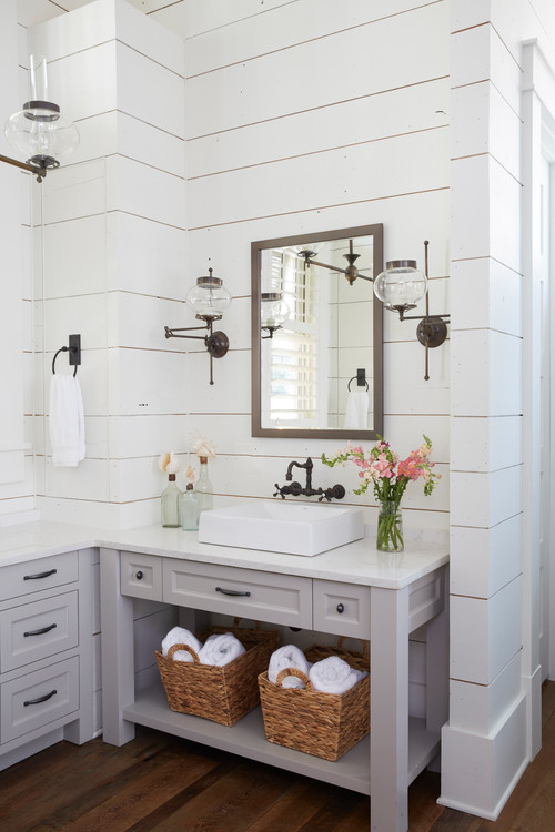
9. Home with Exposed Brick and Reclaimed Wood Interiors
The vanity and drawers in this bathroom from TS Adams Studio Architects looks so beautiful painted in gray against the lighter shiplap walls and vintage-looking hardware.
Dorian Gray Kitchens
For kitchens, eggshell or satin are popular finish choices for walls. For cabinets consider semi-gloss or high gloss for the most durable finish (and a gorgeous glow).
10. An Island That Won’t Be Deserted
This color is one that calls for all hands to hang out on deck. As an island color, it’s a nice choice as it won’t be one that will be easily deserted as fads come and go. It’s a neutral that will likely give your kitchen design a longer shelf-life, and if you’ve priced kitchen designs lately, you know that that’s what you want!
11. Gorgeous Beams, and Dorian Gray Dreams
Stop the presses. You’re about to get an eyeful of heavenly kitchen inspiration. This kitchen is a stunner from top to bottom…so many lovely textural elements here make this room interesting, but not overpowering or overdone. The wood beam tone plays perfectly with the cabinetry, all of which is painted SW Dorian Gray.
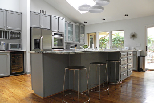
12. Sherwin-Williams’ Dorian Gray (SW 7017) Cool – But Not Icy
As a cabinet color in this large, open kitchen shared by Sarah Greenman on Houzz, this paint shade looks almost cool, but not icy. It pairs nicely with the lighter colored walls and marbled countertops.
13. Balances Warmer Tones
I happen to think this shade brings balance to almost any space. In this kitchen from Bella Tucker, it’s warm enough to go with any warm stonework with brownish undertones, but it has enough coolness to keep the overall color temperature from overwhelming the eye.
It’s also dark enough to add interest to kitchen cabinets without closing in the space and making it feel dim and gloomy.

14. Contrasting Island Color
A kitchen island is a brilliant use of the Sherwin Williams shade, especially in contrast with white perimeter cabinets. This kitchen from K Sarah Designs has a nice, neutral palette and just a touch of depth and interest.

15. Painted Kitchen Cabinets in Sherwin Williams Dorian Gray
Yet again, here is another winning use of Dorian as a kitchen cabinet color. In this kitchen from Evolution of Style, it contrasts both with the light backsplash tile and black appliances. The natural light absolutely brings out some soft, green undertones in the paint shade.

16. Modern Farmhouse Kitchen Island Color Inspiration
This kitchen from Wyrick Residential Design is GOALS. The blush-beige wall and ceiling color is creamy and gorgeous, letting the white cabinets and marble backsplash shine brightly.
Dorian is the perfect kitchen island shade as a contrasting color, and its purple undertones are able to peek through.

17. Dorian in the Details
So, so pretty. Dorian Gray used in many details in this special home. You can see it as the gray in the coffee nook cabinetry, command center and pantry, as well as a peek of it in the hallway. The gray on the island counter is the slightly darker, Gauntlet Gray.
Dining Rooms in Dorian Gray
If you’re on the hunt for a dining room paint color with some depth, Dorian Gray may be a good bet. Check out these dining spaces that have used it…
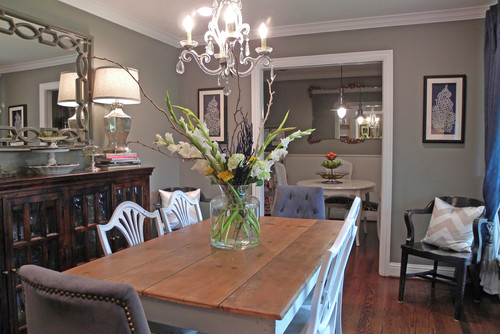
18. Sherwin Williams Dorian Gray in Dining Room
This paint shade is a great color for dining rooms, because it creates a cozy environment. And since it’s a darker shade of gray, it creates a great contrast against bright white trim and moldings (source: Design Guild Homes).
19. Sherwin Williams Dorian Gray for a Traditional Dining Room
Here’s another beautiful dining room with gray walls that contrast against white trim. There are several shades of warm wood that all work well with the wall color.
The darker wall shade works well with the white dining set, creating a subdued backdrop (shared by Sarah Greenman via Houzz.
20. SW 7017 as a Rich Dining Room Hue
Dorian is used in this space as a trim and ceiling paint, and it looks fantastic! It’s paired with Sherwin Williams Alabaster as the walls color. How do you like that shiplap ceiling feature?
Looking for more shiplap ideas? Check this article out, too!
21. In Sunbeams and Shadows
Check out how Dorian Gray changes in sunny spots and shadows in this dining room from Home on Springwood. Amara’s home is a great one to look more at if you’re thinking seriously about using Dorian Gray…she has it in multiple spots in her lovely home.
Dorian Gray Exterior and Doors
Exteriors are one of my top recommendations for using this paint color. I think that while Dorian Gray’s saturation can make it too dark for many interior applications, it looks great on exteriors almost without exception. See what you think.
22. Dorian Gray Front Door
Dorian Gray paint is a pretty, creamy and cheery gray shade for a front door on a white shingle house.
23. Looks Splendid on Siding Alongside Stone
This combo of the stacked stone fireplace with Dorian Gray siding looks great, I’d say.
24. Dorian Gray Shutters
It’s amazing how transformative just painting the shutters can have on the entire exterior of a house. Sherwin Williams Dorian Gray paint has a much softer look than the previous dark shutter color.
25. Light Gray Exterior
Sherwin Williams Dorian Gray paint as an exterior color looks surprisingly light! Bright sunlight, along with off-white trim (SW Eider White), and black-trimmed door make this medium gray shade look a lot brighter.
26. Dorian Gray Painted Brick
Check out the before and after on this brick-facade home turned painted beauty in Dorian Gray and SW Alabaster. Bold move, right? What do you think of the after?
Other Spaces with Dorian Gray
27. Gray Laundry Room Cabinets
Here’s our shade du jour being used as the cabinet color in a large laundry room.
28. Gray Accent Wall
Dorian Gray paint is the perfect color for an accent wall, adding visual interest next to classic white shiplap.
29. Board and Batten Beauty
Amara’s home uses Dorian Gray in many places, and here’s a great example…on the wainscoting molding in her hallway.
30. Awesome Office Accent Wall
Here’s a herringbone accent wall painted in Dorian Gray. A nice look in this sophisticated office space.
Final Thoughts
What do you think of Dorian Gray? Could this be the right paint color for your next painting project? I hope this paint review has helped you decide, one way or another!
And if this is a color you’re seriously considering, remember paint-sampling is better than ending up paint-sorry! I highly recommend these peel and stick samples because they are inexpensive, re-usable and re-positionable…
Pin this post for later! And if you use this paint color, leave a comment (or better yet, a photo) on the pin! That helps others know whether they want to try this color, too!

Pssst…before you go, I sure would love to hang out with you again really soon! And before you’re on your way, make sure you grab your free copy of the 5 Biggest Mistakes People Make When Picking Paint, so you can avoid the heartache (and hole in your wallet) when your paint choices don’t quite work out! Click here, and I’ll send your free copy right now!


Leave a Reply