


Learn all about Sherwin Williams Iron Ore, its undertones, coordinating shades, and see it used in more than 30 real homes!
Sherwin Williams Iron Ore (SW 7069) is a rich, very dark gray that is absolutely stunning (and popular) for ALL KINDS of paint applications, both inside and outside homes in 2025.
Iron Ore is very dark – almost black. It can sometimes read as a soft black with dark gray undertones or a deep charcoal. However you prefer to describe it, it’s a good candidate for those looking for a black paint that’s not too black.
Let’s take an in-depth look at Iron Ore paint to help you decide if it’s the right shade for your next home project!

Here’s a video preview of this dark and lovely shade being used in some real homes and spaces…

And quickly, before you delve any deeper…
If Picking Paint Make You Panicky
You’re definitely not alone! Choosing paint colors isn’t for the faint of heart! I know many, many people who have purchased more than a few gallons of paint that they now regret. That’s why I created Paint Perfect! This video course will teach you how to pick stunning colors, EVERY time in under one-hour! Over 700 happy customers (and their beautifully painted homes) can attest! 👇

Real Homes Showcasing Sherwin Williams Iron Ore
Time for the fun stuff! Let’s check out examples of this paint shade being used in the wild!
Exteriors Using Iron Ore
Sheen note: Picking the right color is only winning the battle, not the war. Remember to pick the right paint finish, or sheen, also! Read up on what you need to know about picking the perfect paint sheen.
Iron Ore is currently one of my favorite colors for a home’s exterior. If you’re considering a very dark color for your own home, this one should definitely be considered.
Let’s check out some gorgeous examples of this warm charcoal being used as an exterior paint color.
1. Dramatic and Dreamy Exterior Paint Color
You may just need to see this ONE example of SW Iron Ore on an exterior, and you’ll already be sold! This stunning example the dark, dramatic charcoal goodness that is Iron Ore (via Lauren Smythe Design) is just…everything.

2. Moody Modern Mountain Home
On this modern, mountain-style home from @minimal_nest, Iron Ore looks decidedly charcoal. It’s a nice contrast next to its natural stone and wood finishes but isn’t as stark as a pure black would be.
3. Moody Mid-Century Modern
This mid-century modern beauty got a moody makeover from owner @rebeccadodson.artist, and I’m loving the results!
This dark, dreamy paint shade brings this exterior into a more current portion of the 21st century, for sure.

4. Updated Traditional Beauty
Pinterest user and homeowner Kathleen @kathleendager posted her gorgeous exterior completed with Iron Ore as the main exterior color with accents of Tricorn Black (shutters) and Sherwin Williams Extra White trim. Makes for a lovely, traditional, yet dramatic trio of colors.
Feeling a little nervous to go all in? Try it on a smaller area first, like your garage doors.
Iron Ore looks great as both an all-over color, as well as a trim or exterior accent shade.

5. Stylish Split-Level Shade
Check out how Allison gave this split level home a new lease on life with a modern color palette.
SW Iron Ore is paired with SW Crushed Ice for the trim color. This dramatic color paired with the stained wood is striking, isn’t it?
6. Favorite Black Color For A Front Door
Shannon at Fox Hollow Cottage chose a classic palette for her home…SW Pure White for the siding, and Iron Ore as her front door color. And it looks like the right color to me!
Black is the most popular front door color, did you know? It’s always a great option because it looks good and provides contrast with almost everything.

Bathrooms Using Iron Ore
Don’t forget the finish! For bathrooms the perfect sheen is either an eggshell or satin. Why? We’ll tell you in this post about paint sheen.
7. Shiplap Takes a Dark, Dreamy Turn
Iron Ore on an interior shiplap wall from The Creativity Exchange gives farmhouse style a clean, modern edge, and will keep this bathroom feeling fresh and polished for years to come.
And if you want to see more amazing shiplap ideas, we’ve got them for you!

8. Basement Remodel with a Pop of Individuality
This bathroom from Carla Bast Design shows Iron Ore as a shelf and cabinet color, and I have to say, it’s a definite win. When paired with white subway tile and beige walls, the look is modern while also creating serene spa vibes. (Photo credit: @alyssaleephotography)
9. Say Yes To Drama
Who doesn’t love a little big of unexpected wow factor here and there in their homes, right? A powder room, or small bathroom is a GREAT place to add some drama.
The Spoiled Home does just that, using a bold wallpaper, and Iron Ore accent wall.
10. Jaw-Dropping En Suite
Once you’ve picked your jaw up off the floor, I’m betting you’ll be on your way to the paint store. Because this space is just THAT great, isn’t it?
11. Iron Ore Vanity with Va-Va-Voom
Here’s a glam-bath from @mindypaxton with some serious dramatic appeal thanks to the pairing of brass and SW Iron Ore on that lovely geometric accent wall, the vanity, and the interior door.

12. Awesome Accent Wall
Iron Ore is a great color choice for accent walls. Here, Christina Landsman adds dimension to an otherwise white and bright bathroom.
Looking for more accent wall ideas? Check these out, too.
Iron Ore in Kitchens
For kitchens, eggshell or satin are popular finish choices for walls. For cabinets consider semi-gloss or high gloss for the most durable finish (and a gorgeous glow).
13. Modern Farmhouse-Friendly Cabinet Color
A black and white kitchen is never a bad choice. And it works in almost any style of home, including modern farmhouse.
Look how beautifully SW Iron Ore lower cabinets pair with that apron sink, and upper cabinetry in SW Pure White.
14. Iron Ore Cabinet Update in a Traditional Kitchen
Here’s another example of Iron Ore used on cabinet surfaces paired with gold hardware from @asmallandsimplehouse.
The creaminess of the dark gray is very evident here.
15. Sleek Tuxedo-Style Shiplap Kitchen
Iron Ore definitely looks more like a soft black in this predominantly white shiplap kitchen from @25thandbrick. The barstools are an exact match of the shade of the kitchen island, creating a flat monochrome effect.
Ultimately, there are three main finishes/colors in this space: white, black, and natural wood, contributing to a clean and modern farmhouse-meets-Scandinavian style.
16. A Tuxedo Traditional Kitchen
Not sure about going completely dark, but like the look of a black and white kitchen? Consider just using a dark color on the island. It’s a beautiful effect, and here’s the proof!
Dining Rooms Using Iron Ore
17. Dark and Dramatic Dining
Interior accent walls are one (of many) spot(s) where Iron Ore can really shine…
And beyond the paint, the modern woodworking by Heritage Woodwork USA really brings this dining room accent wall to life!
Iron Ore looks like a soft black here, which lends the perfect amount of drama without looking too stark. The matte finish looks especially lovely in this space.
If you’re digging that accent wall, there’s more ideas for geometric goodness here.

18. Cozy Conversation Zone
This cozy home from @greensprucedesignshome uses light and neutral colors to keep everything feeling bright and fresh.
Painting just the dining room walls with Iron Ore adds a level of formality to the space and is an appropriate pairing with the crystal chandeliers.
19. Iron Ore Ceiling
Wowza. Check out the incredibly beautiful effect that Iron Ore has on the ceiling in this posh dining room from The Spoiled Home. Delightfully decadent. And that’s just what you want in a dining room, I’d say.
The wall color here is SW Agreeable Gray. Great combo, right?
Bedrooms Using Iron Ore
In general for bedrooms, and low-traffic areas, flat paint is fine. If you like something with a bit of shine (and more ease of cleaning) opt for eggshell or satin.
20. Dark and Dreamy Owner’s Suite
The way the light flows in this room from Within the Grove allows Iron Ore to take on a true black look.
The contrast between the accent wall and the white walls and ceiling is especially dramatic.

21. Dark and Moody Master Bedroom
In this post from Little House of Four, the title describes this bedroom as “dark and moody,” and I couldn’t agree more.
This wall is truly a creamy, dark gray, with the slightest hint of cool blue undertones. The cognac leather throw pillow, plant and brushed gold sconce add extra warmth and elegance.

22. Small Wall Sqaure Footage, Big Impact
Don’t want to commit to an entire accent wall? Steal a page from @plant_gal and paint just the top third of a wall, covering the rest with white wainscoting.
It adds such a nice level of dimension to this fresh, mostly-white bedroom!
23. Soft Black Board & Batten
This board and batten accent wall by @tiff_tackles adds a cool, sophisticated look to this classic, elegant bedroom. The way the light falls is so interesting, adding some subtle shade variation throughout.
Love board & batten? We do, too. Check out more board and batten ideas here.
24. Moody, Mellow & Marvelous Vibes
Rich but approachable. Earthy, but a little glam. This guest room’s got it all, thanks in no small part to that dramatic wall color.
Iron Ore in Living Spaces
25. Sophisticated Living Room
This is a great look from @inspire_me_snaphappy: soft black walls, a white brick fireplace, and deer taxidermy.
A wooden mantle and houndstooth pattern on the accent chair adds an extra touch of texture.
26. Family Room-Friendly Shade
In this living space by @alexandra_doeshair, the two different shades of wood and the black brick fireplace actually bring out some warm, brownish undertones in Iron Ore’s dark gray.
27. A Real Attention Getter
Style and Grace Interiors says “hello” to accents with Iron Ore. The choice of use brilliantly highlights exactly what you would want to feature in this stunning room: the gorgeous fireplace!
I love how the accent color is carried throughout the rest of the room as well.

Other Spaces & Places with Iron Ore Paint
28. Movie Room Magic
I mean, if this isn’t every family’s dream to have a home movie theater…and I’m all in if mine can look like Haylee’s (Home With Hay)!
Her DIY and paint-picking skills created a room that is next level amazing, and I’m guessing her entire family is pretty thrilled with the results!
29. Stunning Black Shiplap
Style and Grace Interiors masterfully used Iron Ore. Here it’s used on these built-ins and black shiplap combo…check out that under-cabinet lighting…wow.
I could see this palette working beautifully in a movie room, family room, basement, or even a home office.
30. Beautiful Brick Fireplace
Are you a fan of painted brick? I am. Here’s an option you may not have thought of. Instead of going light and bright when painting your brick, go the opposite direction like designer Allison Myer did in her own home!
31. Lovely Laundry Room Accent
If this was my laundry room, laundry would be my favorite chore, no doubt. SW Sea Salt cabinetry looks gorgeous with those big Iron Ore sliding doors.
32. More Dreamy Interior Doors
White interior doors can be, well, kinda boring. Give them a little more punch, like Haylee of Home with Hay did with her own.
She painted both the front door and adjacent interior doors Iron Ore (at 75% strength), and I think it’s a whole lot more visually interesting, how about you?
33. Fabulous on Furniture, Too
Katie uses Iron Ore all over her home at Little House of Four, including here in her lovely dining room where Iron Ore not only used on her interior doors, but she also painted her dining room buffet table with it.
Yes, it’s great as a wall color, but this shade also looks amazing on furniture!

Now that you’ve seen this paint color in action, let’s dig into some of the nitty-gritty details about this popular shade…
Sherwin Williams Iron Ore SW 7069 FAQs
What color is Sherwin Williams Iron Ore
As described above, ultimately Iron Ore is a dark, deep charcoal gray. Although it is very rich shade, it is softer than true black. This shade can vary in different lighting and when paired with various color palettes. 
Is Iron Ore warm or cool?
Iron Ore can play to both warm and cool at different times, depending on the lighting in the space it is in.
It doesn’t really read as having a strong temperature persuasion either way. It’s kinda right smack in the middle, or perhaps just a tinge cool.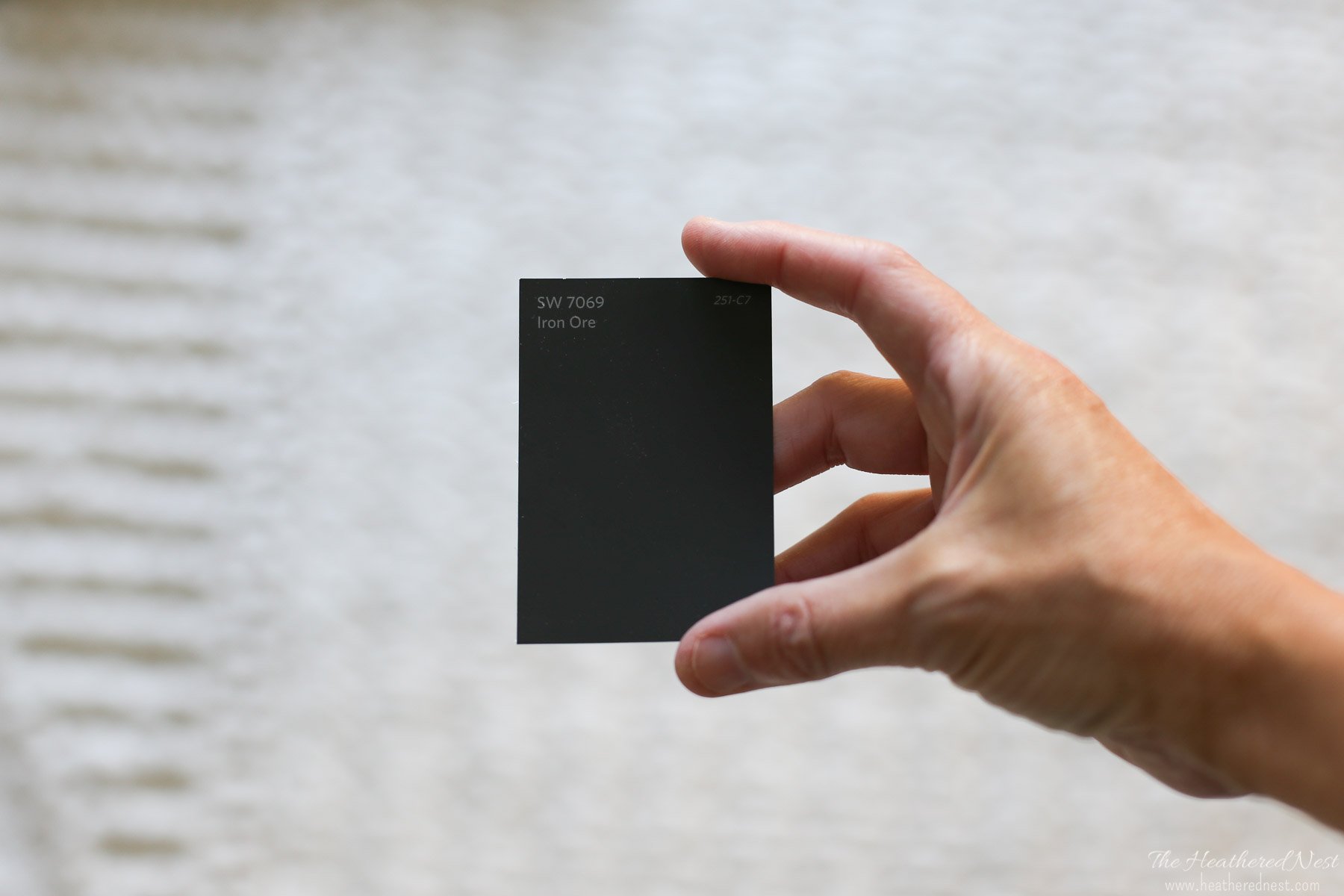
What are the Iron Ore undertones?
It tends to look like a soft black (and at some angles, almost a true black) when paired with pure white trim and light wood finishes.
In a room with a warm color palette, you’ll clearly see that it’s a gray. Most of the time, it looks like a true dark gray, and sometimes the pigmentation looks downright creamy.
Other times, some undertones might come out. Its undertones can vary greatly depending on the light.
Warm, artificial lighting can make this shade catch warm brown, purple, or even green undertones. Whereas natural light at mid-day can cause it to read cool, with slight blue-gray undertones.
I’ve rounded up examples of all of these within this post, so you’ll see what I mean.
Where can Iron Ore be used?
A shade like Iron Ore can be used to create visual impact.
This color can look great on exteriors, accent walls, kitchen cabinets, and bathroom shelving and vanities, especially if you’re looking for something a touch softer than black.
What trim color should be used with Iron Ore?
Iron Ore can actually make a great trim color itself if you want a dark shade. For a light trim pairing, look to the light, bright more neutral to slightly cool whites.
Some favorites would be SW Highly Reflective White, Benjamin Moore Chantilly Lace, or SW Extra White.
What is the LRV of Sherwin Williams Iron Ore?
First, here’s the “numerical” details, or the LRV.
Iron Ore LRV = 6
LRV = Light Reflectance Value: Rated 0-100 with 0 being pure black, and 100 being pure white.
Lighter paint shades REFLECT more light from them and therefore have a HIGHER LRV, and vice versa for darker shades).
The LRV of Iron Ore is 6. Yes, 6. That means it’s only a few shades lighter than pure black. However, it is enough that you can tell with the naked eye that it’s a charcoal or dark gray shade, and definitely not black.
Below see Iron Ore (6) side by side with pure white (100). The outside of the circle is in black (LRV 0).
What Colors Go Well With Iron Ore?
This dark, moody, dreamy hue pairs well with shades that provide it with contrast. That includes warmer whites/off-whites (cooler whites make Iron Ore feel a bit off-putting), and more saturated warm neutrals.
If you’re hoping to pair Iron Ore with another paint shade(s) to create a perfect palette, I’d look toward:
White and Off-White Paint Shades That Coordinate with SW Iron Ore

- White Dove (Benjamin Moore)
- Alabaster (Sherwin Williams)
- Creamy (Sherwin Williams)
- Snowbound (Sherwin Williams)
- Pure White (Sherwin Williams)
- Greek Villa (Sherwin Williams)
Rich, Neutral Paint Shades that Coordinate with Iron Ore

- Oyster White (Sherwin Williams)
- Dover White (Sherwin Williams)
- Agreeable Gray (Sherwin Williams)
- Balanced Beige (Sherwin Williams)
- Accessible Beige (Sherwin Williams)
- Worldly Gray (Sherwin Williams)
- Big Chill (Sherwin Williams)
More Paint Colors that Work with Iron Ore

- Clary Sage (Sherwin Williams)
- Sea Salt (Sherwin Williams)
- Silver Strand (Sherwin Williams)
- Evergreen Fog (Sherwin Williams)
Iron Ore Paint Compared to Other Popular Dark Paint Colors
Dark colors can be very difficult to compare. Let’s take a look at Iron Ore next to a few similar color in the dark gray, charcoal, and black families to get a better understanding of its color profile.
Iron Ore vs Peppercorn
While Sherwin Williams Peppercorn is considered by many interior experts to be a soft black paint color, it definitely falls in the dark gray and charcoal families.
Peppercorn’s LRV of 10 makes it noticeably lighter than Iron Ore, and might make it the right choice if black if too stark for you.
SW Peppercorn will give you a hearty level of drama but with a bit of softness.

SW Iron Ore vs BM Wrought Iron
Benjamin Moore Wrought Iron is often included in “best black paint” lists, though it’s truly a dark gray or charcoal. It is incredibly close to Iron Ore on the Light Reflectance scale.
At 6.16 LRV, it’s barely lighter than Iron Ore’s LRV of 6. It’s very difficult to distinguish them from each other with the naked eye, even when placed side by side.
In my opinion, along with being just a touch darker, Iron Ore is a tiny bit warmer and richer than Wrought Iron.

Iron Ore vs Tricorn Black
Sherwin Williams Tricorn Black is dark enough to be considered a true black. It has an LRV of 3, so it’s just a few degrees of separation from pure black.
SW Tricorn Black is very saturated, free of unanticipated undertones and is a popular pick for doors and accent walls.

Because it’s deeper, richer, and darker than Iron Ore (LRV 6), it may be a great choice for your next project if you’re looking for more punch than softness.
More Paint Colors To Consider
If you still aren’t sold on this color, or just want a few more options – here are several other colors to look at that we’ve covered in our expansive paint exploration series:
Iron Ore Sherwin-Williams Summary
It’s pretty easy to see why this shade is one of the Sherwin-Williams company’s most popular black paint colors. While we may not immediately think of dark charcoals and blacks as being versatile colors…they really can be, as you’ve seen!
I hope this paint color study and examples of Iron Ore paint in real homes have helped you decide whether you think that SW Iron Ore #7069 could be that perfect dark, moody charcoal gray paint color you’ve been looking for!
Using a very dark color like this one can be a great way to give a space a fresh look…and an inviting and dramatic one, at that!
And if this is a color you’re seriously considering, remember paint-sampling is better than ending up paint-sorry! I recommend trying the color out with these peel and stick samples because they are inexpensive, re-usable and re-positionable.
Pin this post for later! And if you decide to use this paint shade, leave a comment (or better yet, a photo) on the pin! That helps others know whether they want to try this color, too!

Ready to show those boring, bland walls who’s the boss at home? This no-cost guide will help you sidestep mistakes that almost everyone makes when it comes to picking paint! You’ll be on your way to perfect paint promptly…pinky swear.


Cpg says
Hi! What do you think of Paper White in a basement? Some natural light but not a ton?