

In this review, we’ll chat about Balanced Beige by Sherwin Williams (SW 7037). This greige paint color gives me cozy pj-day by the fireplace vibes…let’s see if it does the same for you!
Balanced Beige is part of Sherwin Williams’ Neutral Paint Color Collection. This sophisticated color has both warm and cool tones, which can work well many rooms. The balance of warm and cool tones likely inspired the person who named this color.
Because SW Balanced Beige is, of course, balanced, it works well to give contrast to off-white trims. But this color can swing gray and also beige in certain lighting situations.
SW Balanced Beige is kinda sophisticated, but at the same time down to earth. It’s classy yet chic. And maybe this color would be a beautiful addition to your home? Let’s see!

What Color is Sherwin Williams’ Balanced Beige SW 7037?
SW Balanced Beige is technically considered a greige color. What’s greige? Think tall dark and handsome gray got together with lovely, beautiful beige and made a baby who they named ‘greige.’

When you look closely, Balanced Beige is a noticeably taupe, making it appear to be a warm paint color. At first glance, you’ll probably think, “Yep, that’s definitely beige.”
However, with its undertones, it can merge into the gray family, making it a little cooler in color.

If Picking Paint Make You Panicky
You’re definitely not alone! Choosing paint colors isn’t for the faint of heart! I know many, many people who have purchased more than a few gallons of paint that they ended up regretting! That’s why I created Paint Perfect! This video-based course will teach you how to pick stunning colors, EVERY time in under one-hour! Over 700 happy customers (and their beautifully painted homes) can attest! 👇

Real Homes Using SW Balanced Beige
Let’s see how Balanced Beige looks in some real homes! This will give you an idea of what this color might look like in real life.
Balanced Beige Living Rooms
A quick note: Don’t forget to think about the right paint finish…it’s not only about getting the color right! We have an in-depth explanation of choosing sheens here.
1. Stunning “Second Fiddle” in a Family Room
Balanced Beige isn’t the headliner in this family room belonging to @fabi_m_nola. Nope. That job is left to SW Urbane Bronze on that scene-stealing fireplace.
The walls appear light and beige, and the dark wood floors bring out the colors in the abstract artwork on the wall. This acts as one big circle of contrasting colors, each emphasizing the unique tones in the room.
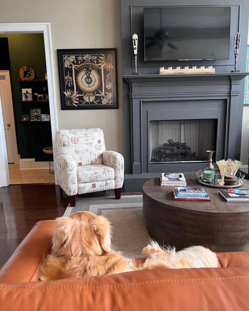
2. Shadow Play in a Living Room Space
Realtor Dawn Levy discusses the qualities of Balanced Beige here in her Instagram video. She calls out the perhaps overuse of SW Agreeable Gray in other homes, and how it’s nice to see a change.
This goes to show how Balanced Beige works well with grays and browns, specifically complementing the gray marble in the fireplace. I also love how she captured different lighting in the video, showing the differences in how this color acts in the shadowy areas of the living space. Thank you, Dawn, for this!
3. Model Home Vibes
Ever walk through model homes just to look at the lovely decorating and get ideas for your own home? That’s one of my favorite free activities on a rainy weekend day!
And to me, this family room looks like it stepped right out of one of these gorgeous model homes. The wall color is inviting, warm and welcoming…a perfect selling feature!
Compared to the previous couple of examples of Balanced Beige, the shade appears more toward the grayish side of the spectrum here. The vaulted ceilings make this space seem much larger, and the stained-glass windows add even more light.
The trim color chosen here was SW Alabaster, and this color pairing looks beautiful with the palette of leather, antique gold and creams in the room furnishing and finishes.
Balanced Beige Exteriors
4. SW White Duck Farmhouse With Balanced Beige Trim
Exterior use is where I think this color shows its best attributes. Many popular lighter colors for interior walls are simply washed out and kinda useless when used outside…but Balanced Beige has enough pigment to hold its own.
Here we have Giannina of Casa De Morris’ glorious modern-day farmhouse. She chose SW White Duck for the exterior paint and SW Balanced Beige for the trim.
And boy does that trim really pop against the much darker brown doors. And that stone accent wall…wow! Here’s another angle where you can see the trim detail against the White Duck and stone a little better…
5. Classic and Classy Exterior Color Combo
Your home should look and feel welcoming to you as you drive down the street…and doesn’t this home fit that bill perfectly? Classic and classy, this look (and paint color palette) can stand the test of time.
This farmhouse belonging to @ourplaceinthepines looks stunning with the Balanced Beige shutters against the custom siding color (color-matched the siding color that was previously on the home when it was time to repaint, so we don’t know the original color (but she did send me the color match formula if you’re interested…just leave a comment. It’s similar to SW Dover White).

Balanced Beige Dining Rooms
6. Comforting, Cozy Contrast
Rebecca’s dining room (River Oak Home) shows how ‘subtle and simple’ can be exactly what you’re looking for. This dining space appears open and bright with the Balanced Beige walls in natural lighting.
The dark china cabinet provides enough contrast to make a statement without screaming, ‘Here I am!’ Then you’ve got the area rug that gives this area some pizazz, which is a nice touch for this cozy, neutral dining room.

7. Stylish Dining Space
Here’s an exquisite dining area by Robbins Fink Interiors. The classy light fixtures provide enough mood lighting to cast dark shadows on the Balanced Beige walls, displaying how stylish this area can become.
Choosing a darker color for the cabinets (SW Black Fox) creates just the right amount of contrast against the bright living space across the way! (Photo Credit: Emily Lawrence Photography)
8. Terrifically Traditional Dining Room
Jennifer used Balance Beige in her sophisticated dining space. You can see how this paint shade changes in the shadows as well as closer to the lamp. There’s certainly variation, as there is with every paint color.
SW Extra White was chosen for the trim, and Balanced Beige provides a good amount of contrast with that gorgeous chunky crown molding.
9. Dining Room with a Dash of Drama
This sophisticated dining room is a space that is worthy of an “oooh-ahhh” moment upon entry. The tall, dramatic windows occupy much of the wall space, making this room exquisitely bright and elegant.
The soft, neutral floorboards are beautiful with the gray paisley-patterned area rug.
Balanced Beige Basements
10. Basement Bringing On Cozy Vibes
Balanced Beige can be a great color option for basements! Because natural lighting is limited in most basements, this color can create a cozy vibe…but sample first!
If your own basement doesn’t have much light, and you’re looking to lighten it up, this shade may have too much pigment for your taste.
Balanced Beige Kitchens
For kitchens, eggshell or satin are popular finish choices for walls. For cabinets consider semi-gloss or high gloss for the most durable finish (and a gorgeous glow).
11. Warm & Welcoming Cabinet Color
Honey & Liv Design Co. shows how absolutely warm and inviting Balanced Beige can look as a kitchen cabinet color in this space.
Going a bit darker on the cabinets provides a beautiful contrast with the light, bright, and white living space next to it painted in popular SW Alabaster (photo credit: @Pattiv.Photography)
12. Killer Kitchen Cabinet Color
Check out this kitchen makeover, highlighting the improved Balanced Beige kitchen cabinets.
This color appears more beige against the earth-toned marbled flooring and the island’s wooden countertop. The shiny tiled backsplash provides enough contrast to see the softness in the Balanced Beige cabinets without making this space too bright.
Throw together a few pretty kitchen knick-knacks and landscape artwork, and you’ve got yourself a killer, reimagined kitchen!
13. Sparkly and Vibrant Kitchen
Balanced Beige cabinets bring out the backsplash’s beautiful neutral colors, tying this entire kitchen together!
The dark cabinet knobs have impact, for sure. The white countertops add some brightness against the beiges and grays, and those kitchen pendants add some sparkle and shine!
14. 1950s Kitchen With Modern Flair
This 1950s kitchen was reimagined using simple, modest colors. Balanced Beige was chosen for the cabinets, which has become quite the trend for this color. It’s as if Balanced Beige belongs on kitchen cabinets! I absolutely adore the seemingly olive green color choice for the door (Ecological by Behr).
These two colors complement each other nicely, keeping that cozy essence. Of course, the white brick wall creates a dash of modern flair while opening up this small space.
Balanced Beige Bedrooms
In general for bedrooms, and low-traffic areas, flat paint is fine. If you like something with a bit of shine (and more ease of cleaning) opt for eggshell or satin.
15. Master Bedroom
This bedroom is sophisticated, but still cozy.
The bright, natural lighting brings out a touch of the gray undertones in the Balanced Beige walls, creating beautiful contrast against the rustic wooden flooring. Choosing white trim brings the entire room together, creating some pop!
16. Beautiful Barn Door
Shasta Davidson transformed a barn door using SW Balanced Beige into a beautiful bedroom feature. The dark accent wall here is SW Outerspace.
And the wall color/trim? It’s SW white paint…straight outta the can! No tint whatsoever. And YES, you can do that!! If picking a white stresses you out, this is one of my favorite paint hacks!
Balanced Beige in Other Spaces
17. Contrasting Entryway
This welcoming entryway by Little House of Four presents a stunning contrast of Balanced Beige walls against a much darker door color (Sherwin Williams Iron Ore). These lighting conditions make this entryway bright and inviting!
The contrast between these two very different colors showcases the decorative pieces in this entryway, making the entrance of this home inviting to arriving guests.

18. Farmhouse-Inspired Sunroom
Rebecca from River Oak Home takes us on a journey to this inspirational sunroom! The Balanced Beige walls in the natural light make this sunroom sunny and bright.
Don’t you love all the texture in this space? From the wood trim to the board and batten and exposed brick wall…it’s a place anyone would be happy to spend some time.
If you’re wondering what the paint color is used on the board and batten below the chair rail molding…it’s Sherwin Williams Accessible Beige.

That’s a wrap on our examples of this shade being used in the wild. And you may already be sold (or not) on this shade. But remember…finding the right color is not an easy task.
Colors often look different on screen than on a swatch. If you’re trying to determine whether Sherwin-Williams’ Balanced Beige is the best paint color for your home…

We’re going to keep trying to help you get to that answer. And here are some things that can help:
1. continue reading. Up next we’ll discuss more of the scinece-y paint details that are important to understand about this shade.
2. You can try a peel-and-stick sample to test this color (and others) on your walls! They’re reusable and won’t damage your walls.
3. Try Paint Perfect. In under one-hour, this video-based course will teach you a simple, 6-step method for choosing beautiful shades of paint. No more stress, and no more paint shade remorse! 👇
More Important Balanced Beige Details
LRV (Light Reflectance Value)
Now, let’s dive into some numbers related to Balanced Beige. “Paint by numbers?” you ask. No…not quite, although that would be fun. Paint colors have all kinds of numbers related to them. Ewww, math-y right?
But don’t worry. This math isn’t hard to follow. And understanding some numbers, like the Light Reflectance Value, or LRV (sometimes you’ll also hear this called the Light Reflective Value) can make all the difference when choosing a color.
LRV ranges from 0, pure black, to 100, pure white. Lighter paint shades reflect light, while darker paint shades absorb light.
The LRV of SW Balanced Beige is 46, meaning it’s actually a pretty dark paint shade. If that’s what you’re after, then great. But if you’re going for a more light, bright, airy beige, then this shade may NOT be your jam.

How Lighting Affects SW Balanced Beige
Lighting makes all the difference in how a color actually “shows up” in your home.
Have you ever noticed how different a single color looks in warm light versus cool light, artificial lighting versus bright sunlight, or in the morning versus the evening?

Because the sun moves around throughout the day, the multiple undertones whispering within Balanced Beige appear at some point.
Every hour of the day will radiate its own unique energy (and this is true with ANY paint color).
- South-facing rooms: Southern light appears warm and blush, so Balanced Beige exudes a cozy essence in this lighting. Because of this, Balanced Beige is an excellent option for south-facing rooms if warm and cozy is the ambiance you’re going for.
- North-facing rooms: In contrast, Balanced Beige will appear cooler in north-facing rooms because the lighting appears brisk and blue. With radiant, iridescent sunlight, you’ll notice the illuminating gray undertones, making the north-facing room lighter and brighter.
- East-facing rooms: Because SW Balanced Beige is considered greige, this color adapts nicely in east-facing rooms. With the sun rising in the East and setting in the West, there’s much variance in lighting. Mornings will appear bright and cheery from the warm, yellow luminescence, while the passive lighting in the afternoon will appear dim and cozy.
- West-facing rooms: The opposite lighting has a slightly different effect in west-facing rooms. Balanced Beige will likely appear passive and gray in the morning and warm in the afternoon.
Colors That Pair Well With Balanced Beige
Balanced Beige is pretty easy to get along with. Because this color dips into both gray and beige color family, it can work in lots of situations. And because it’s a darker beige, it gives a great pop of contrast when paired with bright whites.
Sherwin Williams Aesthetic White
If you’d like to make your room cooler, Sherwin Williams Aesthetic White (SW 7035) is a great option to pair with Balanced Beige. With its subtle violet undertones, this color will enhance the cool undertones in the Balanced Beige color.
SW Aesthetic White could be used as a color for trim or cabinets. Otherwise, if you need more brightness in your life, SW Balanced Beige would look radiant as an accent wall against SW Aesthetic White.

Sherwin Williams Pure White
SW Balanced Beige also complements well with Sherwin Williams Pure White (SW 7005). Don’t be fooled by the name. SW Pure White is not as bright as you may think.
This color has slightly yellow undertones, giving it an LRV of 84. Remember, the lightest you can possibly get is an LRV of 100. SW Pure White makes for a lovely trim when paired with SW Balanced Beige without looking too bright.

Comparisons with Similar Paint Shades
Let’s compare our color du jour with some other similar hues…
Comparison with: SW Accessible Beige
One of the most sought-after colors in the neutral color family is Sherwin-Williams Accessible Beige (SW 7036). Like SW Balanced Beige, SW Accessible Beige falls in the greige family.
Though these two colors are similar, Accessible Beige is visibly lighter than Balanced Beige with an LRV of 58. When you look side by side, you can tell the significant difference in their shades.
The undertones of Accessible Beige are gray and green, while Balanced Beige has passive undertones with a hint of taupe.

Comparison with: SW Agreeable Gray
Now we’re getting further from beige and leaning into gray. Comparing these two colors is like comparing apples to oranges.
They’re within the same neutral color family, but each leaves two completely different tastes in your mouth. Both tasty and sweet, just…different.
But first, I believe Sherwin Williams Agreeable Gray (SW 7029) deserves a proper introduction. This color is considered an “expert pick” among interior design professionals, and is rated as one of the top beige paint colors.
SW Agreeable Gray has an LRV of 60, making this color much lighter than SW Balanced Beige, yet gives off a subtle warmth with its beige undertone. The difference is not only in the light shade but also in the name: Balanced Beige vs Agreeable Gray. When you look at these colors side by side, the difference is remarkably clear.
This goes to show how powerful subtle differences can make in the overall presentation of a color. Neutral colors have an incredibly wide spectrum on the color wheel, so identifying the undertones and the LRV is key to choosing a color in your home.

Comparison with: SW Perfect Greige
Last but certainly not least, we have our final color comparison to Sherwin Williams Perfect Greige. This is a creamy, medium-greige color with subtle tones of red peeking through.
You may look at these two colors side by side and think, ‘I really don’t see much difference. I guess Perfect Greige is a little darker?’ You’d be right! Though nearly identical to SW Balanced Beige, SW Perfect Greige has an LRV of 42, making this color a wee bit darker.
If you look even closer, the eye can pick apart the two colors and see that Perfect Greige is a tad more on the gray side. Balanced Beige, at least compared to Perfect Greige, appears more beige.
So, if you’re on the fence about which of these two colors to choose from, consider what you’re looking for in a color. Which undertones do you want to accent – red, purple, taupe?
Do you prefer more gray to beige, or vice versa? Keep in mind, either of these two colors will change their appearance throughout the day in different lighting.

Other Paint Colors To Consider
If you’re unsure whether or not Balanced Beige is your must-have color in your home, that’s ok! There are many similar and (perhaps even better?) colors to consider.
Here are a few gorgeous neutral paint colors to take a look at, even if you’re leaning one way (or the other) on Balanced Beige:
- Kilim Beige (Sherwin Williams): a soft neutral color with a warm, inviting feel
- Manchester Tan (Benjamin Moore): best described as a light tan or khaki
- Natural Linen (Sherwin Williams): a light warm beige paint color
- Wheat Bread (Behr): a homey greige color with gray undertones
- Natural Choice (Sherwin Williams): a warm-leaning white paint color
- Anew Gray (Sherwin Williams): a mellow mid-tone greige color with warm stone undertones
- Revere Pewter (Benjamin Moore): a historical, neutral color with warm and cool tones
- Natural Tan (Sherwin Williams): a medium-tone khaki-tan paint with green-gray undertones
- 11 BEST Beige Paint Colors
- 9 BEST Greige Paint Colors
- Favorite Trim Colors
Beginning or the End for You and This Paint Shade?
After reading this full review and seeing some real-life examples, what are your thoughts about Balanced Beige? Balanced Beige isn’t as popular in the world of greige colors, but I find this color pretty versatile.
Now, having read this article, you have the ability to choose. Is this the new paint color you’ve been searching for?
Pin this paint color for later! And if you use this paint shade, leave a comment on the pin! That helps others decide if they want to try this color, too!

Pssst…before you go, I sure would love to hang out with you again really soon! And before you’re on your way, make sure you grab your free copy of the 5 Biggest Mistakes People Make When Picking Paint, so you can avoid the heartache (and hole in your wallet) when your paint choices don’t quite work out! Click here, and I’ll send your free copy right now!


Leave a Reply