
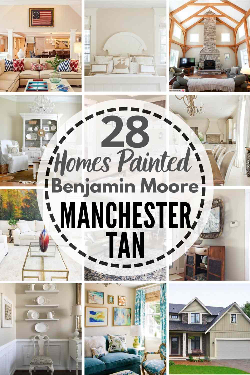
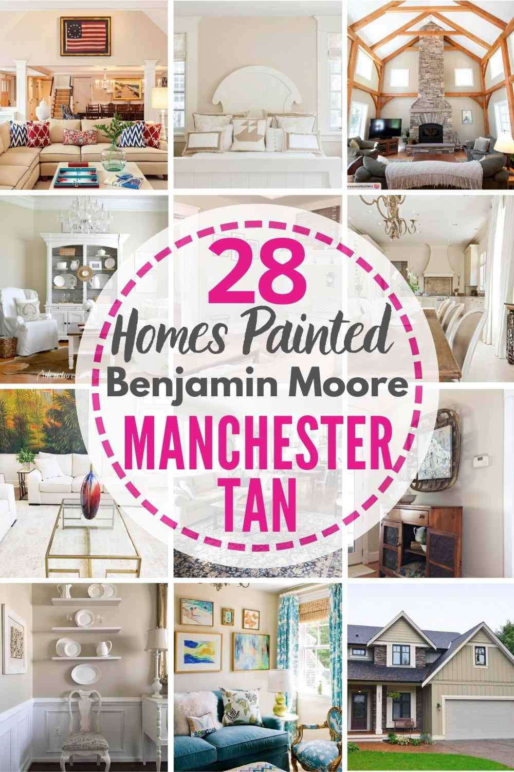
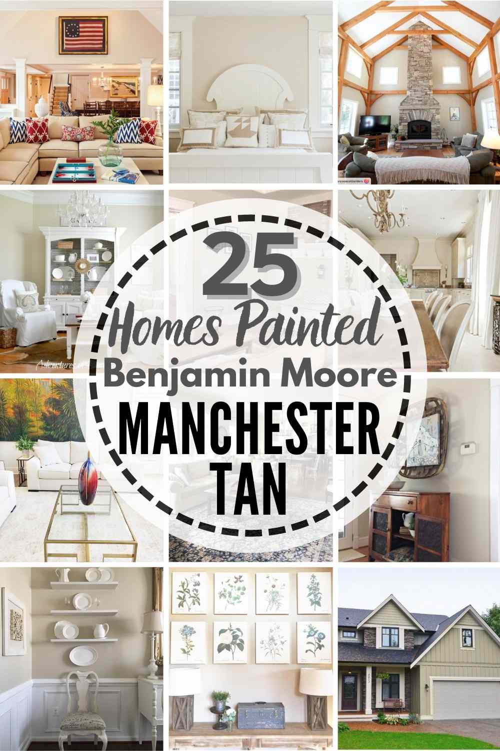
Read all about Benjamin Moore Manchester Tan, plus see 20+ real homes that use it!
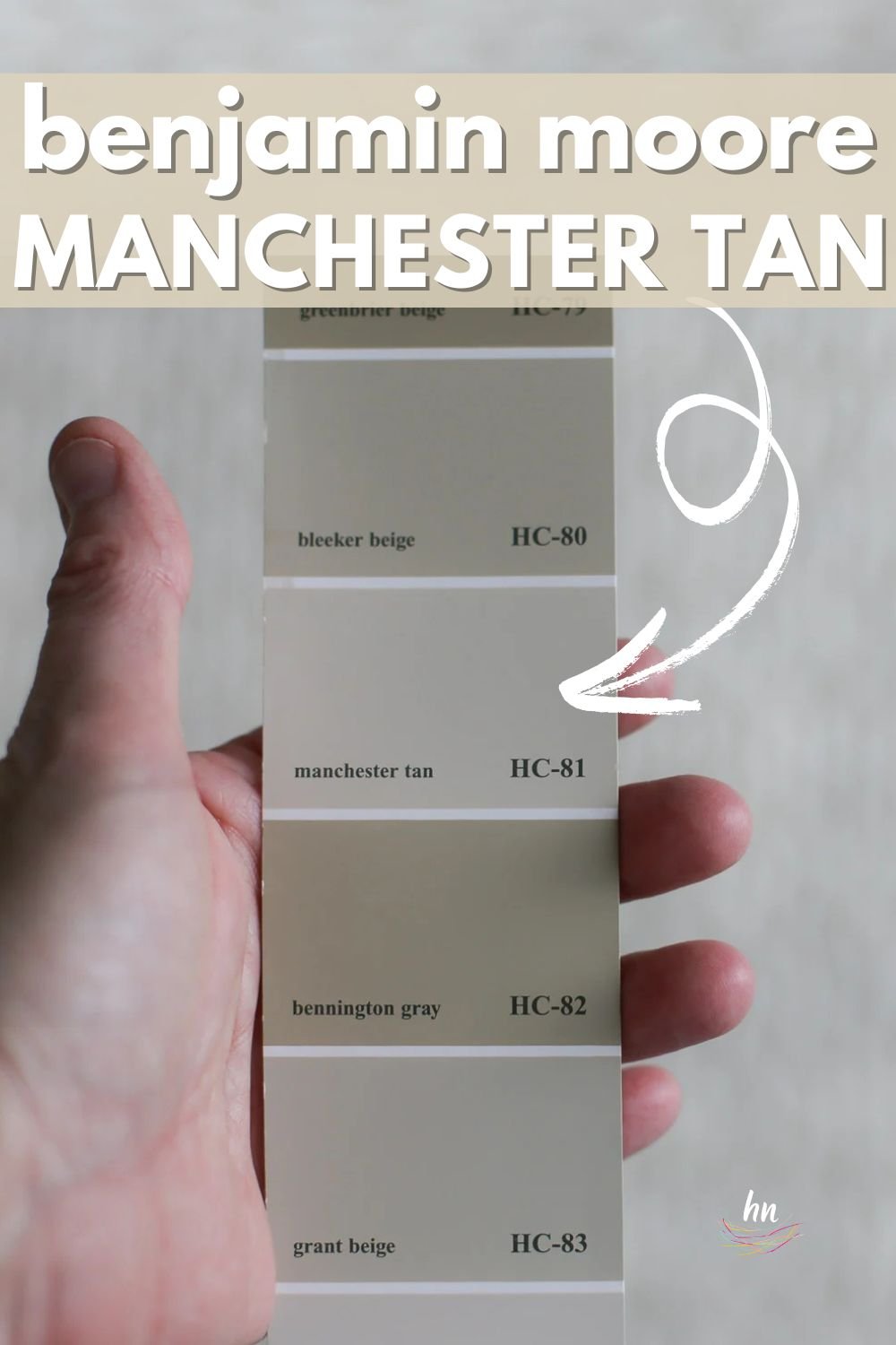
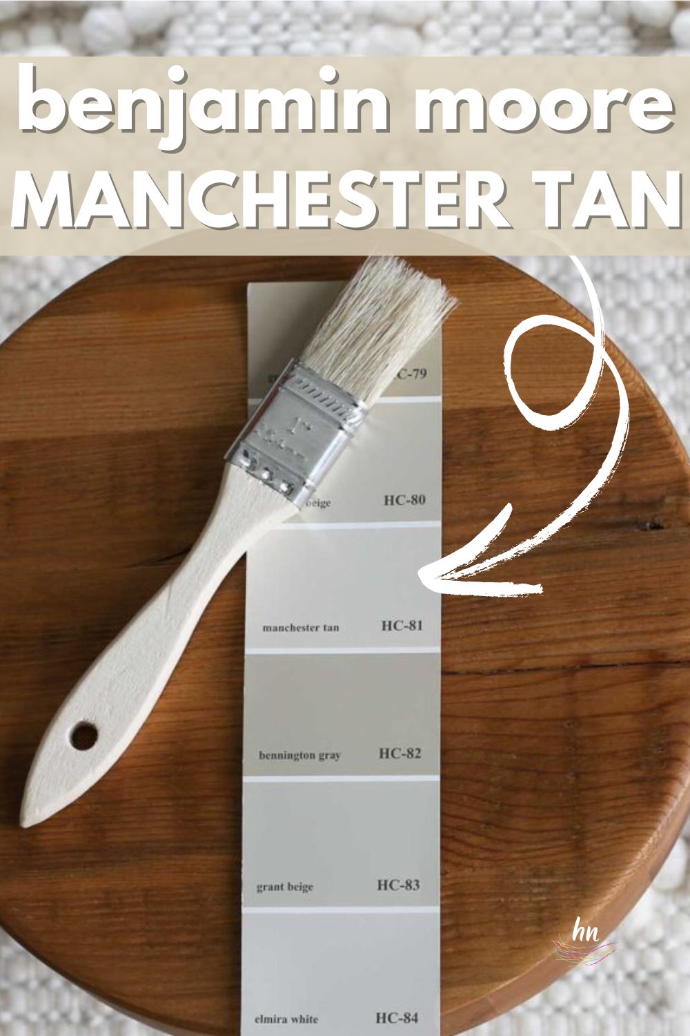
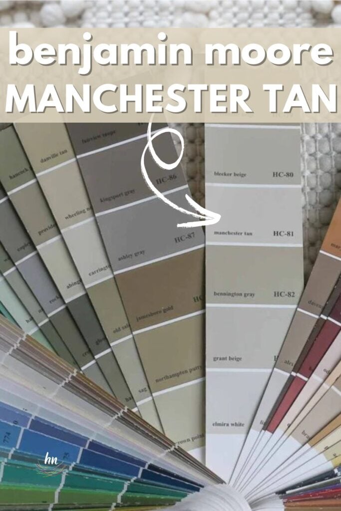
Benjamin Moore Manchester Tan (shade #HC-81) is part of the Benjamin Moore historical collection. It’s a classic neutral that appeases lovers of both warm and neutral light tan shades.
The way Ben Moore describes it is actually quite appealing: “Suggesting the striking sandstone façade and sculptural detail of historic Manchester Town Hall, this neutral on the khaki side is classic and elegant.” Historical, stately, and incredibly timeless, Manchester Tan could be the right shade for your traditional or classic home.
How can you know for sure? Let’s dive deep into the world of all things Manchester Tan and then see it in real homes. Ready? Let’s go!


Manchester Tan FAQ’s:
What Color is Benjamin Moore Manchester Tan?
Manchester Tan is a warm neutral that could be described as tan, khaki, or beige. As such, it has yellow or golden undertones traditionally found in these types of colors, which give it warmth.
However, compared to most typical beige shades, Manchester Tan paint has a touch of gray, making it quite a bit more muted.
What Colors Coordinate Well with Manchester Tan?
This shade looks best paired with a white that’s on the warm side. It also looks rich and dramatic with a dark shade of blue. Here’s a few favorite paint pairings for Manchester Tan:
• Simply White
• Cloud White
• White Dove
• Hale Navy
What Are The Undertones of Manchester Tan?
While BM Manchester Tan does have yellow and green undertones, you won’t be cringing once it’s on the walls. The undertones are very subtle, and in fact, they give the paint shade its characteristic color.
Compare this to beige colors containing a pinkish or red undertone, and you’ll find that Manchester Tan is a muted, neutral shade with subtle, understated undertones. 
The best way to be sure of any shade is…drumroll…to sample it! (Did you see that coming?) My recommendation for samples is using these re-usable, re-positionable, peel and stick samples that won’t damage your walls, and you can easily move around your room to see what the paint looks like on each wall ⤵
Feeling lost? I gotcha, boo! Get a zero-cost copy of my new guide to avoid the paint color picking mistakes people make! Click here or enter your email below. I’ll send the tips right away!⤵️

LRV of Benjamin Moore Manchester Tan
What are “numerical” details, you might ask? I got you! Here is the LRV of Manchester Tan:
MANCHESTER TAN LRV = 64.41
LRV = Light Reflectance Value: Rated 0-100 with 0 being pure black and 100 being pure white. Lighter paint shades REFLECT more light from them and therefore have a HIGHER LRV, and vice versa for darker shades).
Below, see Manchester Tan (64.41) side by side with pure white (100):
Manchester Tan has an LRV of 64.41, so it lives in the family of light tans/beiges. However, it’s not at all washed out – there’s definitely some color substance to it.

LRV…what? Don’t worry, I’ve got you! This no-cost guide will help you avoid the paint color picking mistakes most people make! Click here or enter your email below. I’ll send the tips right away!⤵️
Manchester Tan Compared to Other Colors
To understand Manchester Tan’s undertones and the overall color profile, let’s compare it to a few other similar Benjamin Moore colors in the beige, tan, and greige paint families.

Benjamin Moore Manchester Tan vs Muslin
Benjamin Moore Muslin is a bit lighter than Manchester Tan, with an LRV of 67.85. It has a wink less gray, making it appear brighter and more decidedly beige. Instead of the slight green undertones of Manchester Tan, Muslin has a soft, subtle pink undertone, which makes it appear creamier.

BM Manchester Tan vs Natural Linen
While BM Natural Linen (LRV 60.94) is a few shades darker than Manchester Tan, the difference really comes across in the undertones. When stacked side by side, Natural Linen just looks more like a true tan or beige than Manchester Tan does. Perhaps this is due to more of a golden warmth with a hint of orange undertones and a little bit of brown in its color makeup.
There may still be the slightest touch of green in Natural Linen, but it’s more muted, so the overall effect is considerably warmer than Manchester Tan.

Manchester Tan vs Edgecomb Gray
Edgecomb Gray is pretty close in brightness to Manchester Tan, with its LRV of 63.88. As the name suggests, it’s cooler, has a bit more gray, and as such, will likely appear more modern in most settings.
You still get those understated green undertones with Edgecomb Gray, but none of that golden yellow that puts Manchester Tan into the beige category. Edgecomb Gray is really a warm gray or greige.

More Colors to Consider
Not sold on Manchester Tan yet? Check out these other interesting tones, too:
- Chelsea Gray (Benjamin Moore) – a warm, dark gray
- Anew Gray (Sherwin Williams) – a light greige
- Dorian Gray (Sherwin Williams) – mid-toned warm gray
- Sea Salt (Benjamin Moore) – creamy khaki tones
- Mindful Gray (Sherwin Williams) – a warm gray that leans taupe
- Linen White (Benjamin Moore) – dreamy, creamy off-white
- Kilim Beige (Sherwin Williams) – think the shade of a yummy iced latte
- Creamy (Sherwin Williams) – a sophisticated off-white perfectly described by its succinct name
- Natural Choice (Sherwin Williams) – a warm-leaning white paint color
- Balanced Beige (Sherwin Williams) – a saturated, warm-tending greige
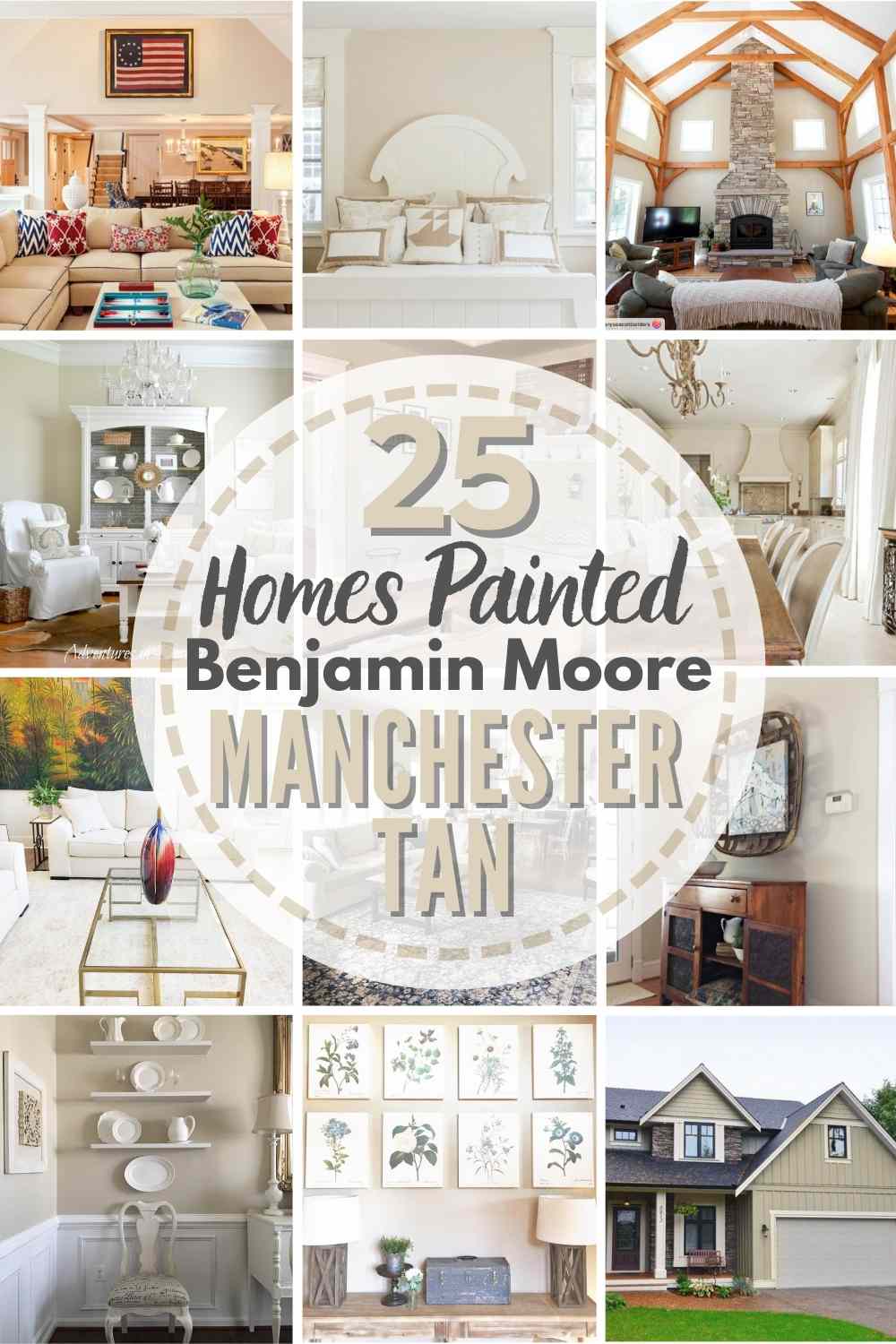
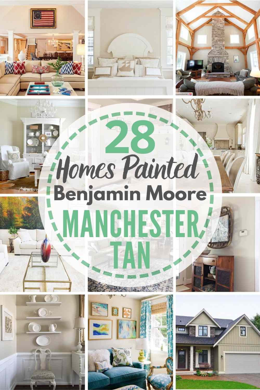
Real Life Homes Using Benjamin Moore Manchester Tan
Have you had enough color comparing? Ready to see Manchester Tan in action? Let’s see it being used in beautiful, real-life homes!
Manchester Tan Entryways
Sheen note: Picking the right color is only winning the battle, not the war. Remember to pick the right paint finish, or sheen, also! Read up on what you need to know about picking the perfect paint sheen.
1. Pops Against White Accents and Molding
This dining room used Manchester Tan as a grounded background color and played up the white china look as a decor statement to nail that traditional country-chic look.
They tie in well with the white wainscoting and furniture. The wall color creates great depth of color and keeps the all-white look from going overboard.
View this post on Instagram
2. Bridge Between Traditional and Modern
Manchester Tan is a great pick in homes with classic decor pieces and original fine art. It’s a historical paint color, and in homes like this, it really bridges the gap between traditional and modern.
3. Warm, but not too Yellow
Tall, vaulted spaces are tricky to get right, but Manchester Tan allows for bright airiness with a creamy look that isn’t overly yellow. Builder’s grade beige would not cut it in this space.
View this post on Instagram
4. Pair with White Board and Batten
Wondering how to create a warm, sunny vibe in your room? Go high with a white board and batten, but add a golden beige to the upper walls, as with this space.
View this post on Instagram
5. Marvelous Mudroom
Here’s our color du jour looking lovely as a wall and door color in a neutral, elevated mudroom. I think many of us have stone tile or even stone-look vinyl similar to what is seen here with the beige and tan tones, and as you can see Manchester Tan is very complimentary against this flooring.
Kitchens in Manchester Tan
A quick note here: don’t forget to consider picking the right paint finish…it’s not only about getting the color right! We have an in-depth explanation of choosing sheens here.
For kitchens, eggshell or satin are popular finish choices for walls. For cabinets consider semi-gloss or high gloss for the most durable finish (and a gorgeous glow).
6. Custom Manchester Mix for the Win
This kitchen designed by Cindy Hattersley uses a custom Manchester Tan mix. Her go-to with this color (that she loves and uses frequently) is to cut it by half! The results? Stunning, to say the least.
Wait, reduced what? Did you realize you could cut a paint color so that the tint was reduced a certain percentage? The overall effect is that the paint will have the same overall hue, but brighter. As is always recommended, make sure to sample before committing to a custom paint!
7. Manchester Tan Cabinets
HC-81 Manchester Tan is a great choice to give cabinets a sophisticated, fresh look that’s also not too dark.
8. Opulent Palette Perfection
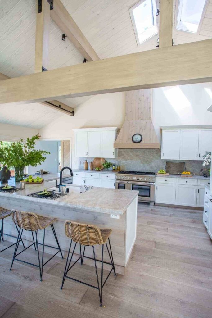
I mean…can you imagine a dreamier kitchen? BM Manchester Tan looks rich, sophisticated without those yellow-y tones that give so many the “ick” factor when it comes to tans and beiges. I think this is one of my favorite examples of this shade. And it looks so luxurious paired with those hickory-esque or possibly walnut hardwoods, and the bright white tile and countertops.
Manchester Tan Living Rooms
9. When you Love Browns, But Don’t Want it Too Dark
To spruce up a traditional space that’s suffocating with dark brown paint, try Manchester Tan. The paint shade keeps the temperature neutral and is quite a bit lighter yet still has some substance.
10. Brighter in Lots of Natural Light
This open-concept kitchen and living space use the principle of separation by paint, and it works! Notice that the kitchen is white and bright, and Manchester Tan in the living area adds another level of coziness.
Also pay attention to how much brighter the walls look in this example versus the one above. Manchester Tan can go pretty dark and cozy in rooms with lower levels of lighting, but it can also look light and bright in spaces that have lots of sun exposure.
View this post on Instagram
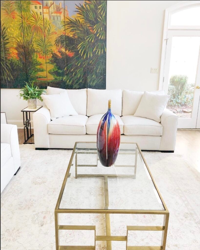
11. Shade that Works Well with Stone
Wow! The shape of the walls and ceiling in this vaulted living space must have been tricky to tackle, but this designer nailed it.
The white ceiling paint and stained wood beams keep everything feeling airy and bright, while wall color keep the space from feeling too big. And Manchester Tan works so well to support, but not overshadow the beautiful stone fireplace.
View this post on Instagram
12. Almost White in Lots of Sun
This light-filled space from Caldwell Painting certainly makes the Manchester Tan walls look pale, but there’s enough creamy pigmentation there to keep it from getting washed out.
13. Manchester Tan Wall Color
Manchester Tan is a perfect paint color for cozy rooms like this one from Adventures in Decorating with white/neutral decor palettes and blue accents.

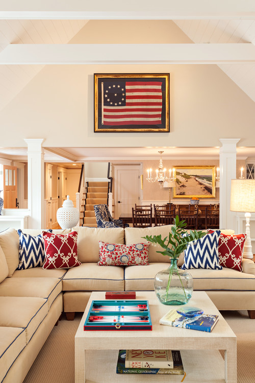
14. Cape Cod Cottage in Manchester Tan
How fun is this patriotic-colonial-inspired living space (via Violandi + Warner Interiors)? This home, filled with bright red, white, and blue decor accents, needed a warm, golden color to pull the look together. I think Manchester Tan was a great choice!
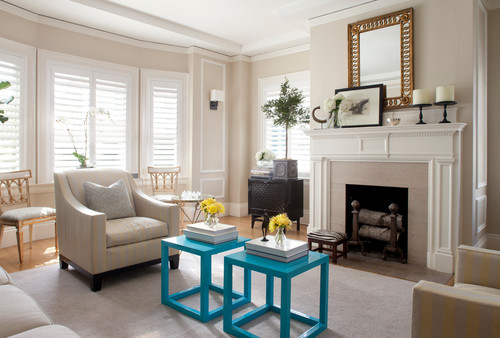
15. Benjamin Moore Manchester Tan Paint Sitting Room
This traditional sitting room from Lindsay Anyon Brier with Anyon Design & Atelier benefits from subtle light diffusing through the windows.
Manchester Tan takes on a soft, creamy feeling, complementing the white trim and fireplace and creating a neutral backdrop for the bold turquoise accent tables.
Manchester Tan Bedrooms
In general for bedrooms, and low-traffic areas, flat paint is fine. If you like something with a bit of shine (and more ease of cleaning) opt for eggshell or satin.
16. A Secret Formula for Paint Perfection
Cindy Hattersley is a designer who knows this color well and uses it often. But she has a secret for its steadfast success in many situations…cut it in half!
She swears by this formula, and you may too once you see some of her spaces where she’s used it like this dreamy bedroom. Manchester Tan is a great wall color choice for neutral color palettes.

17. Keep it Cozy
There’s no more denying it – wallpaper is back and hotter than ever. This cozy bedroom, filled with blue and neutral tones, looks amazing with the wallpapered accent wall and adjoining walls in Manchester Tan. Proof that navy + Manchester Tan is a great duo.
View this post on Instagram
18. Plays well with Neutrals
Here’s another example of how well Manchester Tan plays with neutral palettes and blue accents. Decorating really just can’t get any easier than this.
View this post on Instagram
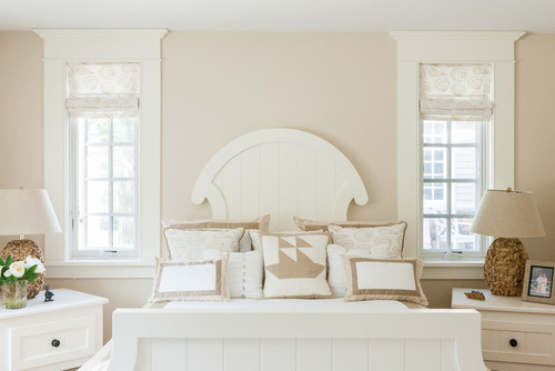
19. Ben Moore’s Manchester Tan Bedroom
Classic, sunny and cozy! Subtle seaside touches and a uniquely shaped off-white headboard call for a creamy, traditional color – and Manchester Tan is as good as it gets in this lovely bedroom from Spang Builders.
20. Model Home Moods
As you continue your research on BM Manchester Tan, you will find that home stagers consistently use it to help sell a house. It’s just a warm and crowd-pleasing neutral. I love how creamy it looks in this softly decorated bedroom shared by Chrissis & Company Interiors.

21. Coordinates with Chantilly Lace
Here in this beautifully simplistic, minimalist bedroom Manchester Tan is used with BM Chantilly Lace, one of their most popular shades of white. And the combo is lovely.
22. Paint Recipe For A Rich Room
Scroll through the before and after to see how much richness this deeper hue brings to this bedroom! It makes the palette a bit darker, but I’d argue more interesting, too.
Dining Rooms in Manchester Tan
23. BM Manchester Tan for a Kitchen
This traditional style kitchen and dining room by Tag Homes benefits from using Manchester Tan as wall paint because it’s classic but still has a modern twist.

So what’s the verdict? Is Benjamin Moore Manchester Tan the neutral paint color you’ve been searching for? I hope you enjoyed this round-up of wonderful homes using Manchester Tan paint!
And if this is a color you’re seriously considering, remember paint-sampling is better than ending up paint-sorry! I highly recommend these peel and stick samples because they are inexpensive, re-usable and re-positionable…
Pin this paint color for later! And if you use this paint shade, leave a comment on the pin! That helps others decide if they want to try this color, too!
Pssst…before you go, I sure would love to hang out with you again really soon! And before you’re on your way, make sure you grab your free copy of the 5 Biggest Mistakes People Make When Picking Paint, so you can avoid the heartache (and hole in your wallet) when your paint choices don’t quite work out! Click here, and I’ll send your free copy right now!


Leave a Reply