


Sherwin Williams Creamy is a dreamy, creamy off-white that both stands out and steps back in all the right ways. Living up to its namesake, this hue has gorgeous creamy undertones that can warm up a space in all the right ways.
That being said….even with all its lovely qualities, this color will not work in every home. So let’s dive into Creamy and see if it’s right for you!
If you’ve been following my posts in my paint color series, you know that I’m a big fan of neutrals. Especially off-whites. I’ve already done in-depth reviews of many, including SW Alabaster and Swiss Coffee.
Now, it’s time to check out one of my favorite colors in the off-white color arena: Sherwin Williams Creamy (SW 7012). This rich and, well, creamy hue can be used in many different ways and in many different places.
Since it’s off-white, it’s a neutral color that can be used anywhere, right? Unfortunately, that’s not the case. Whites and off-whites aren’t as simple as they sound.
In fact, they’re downright complicated colors. It all comes down to a shade’s undertones. When it comes to white hues, they can have a vast range of undertones, including yellow, red, pink, blue, gray, or green.
Although Creamy is a versatile shade, it definitely has undertones that will prevent it from working well in every space, depending on the lighting and your preferences.
That said, Creamy is a lovely shade and one of the Sherwin-Williams Company’s most popular colors for a reason. Let’s take an in-depth look at SW Creamy to determine if it might be a good fit for your home!

Creamy at a Glance
- Bright white with soft yellow undertones for the ultimate cream shade
- Warm and welcoming for both interiors and exteriors
- Transformative based on lighting conditions, ranging from off-white to gentle yellow
- A fan-favorite neutral, Creamy Sherwin Williams has a cult following
Sherwin Williams Creamy Undertones
When it comes to creams and off-whites, most people are worried about them appearing yellow. The irony is that these colors ARE yellows that have been toned way down in varying amounts by adding neutrals such as gray, beige, and black.
Creamy has been toned down enough to be a light off-white with just a faint reading of yellow in certain lighting situations. However, no matter what lighting it’s in, Creamy isn’t as yellow as Dover White is!

How Lighting Affects Sherwin Williams Creamy
- North-facing light – Creamy will infuse a cool, north-facing space with warmth. The yellow tones in creamy will be slightly canceled out by the cool light, making it almost neutral.
- South-facing light – In a room that faces south, the warm yellow undertones of the paint really start to peek out.
- East-facing light – In the morning, the east will be flooded with warm light and will look like a warm, pale yellow. This will change to a cool, neutral off-white in the afternoons and evenings.
- West-facing light – With a warm off-white like Creamy, the color will look off-white in the mornings and pale yellow in the afternoon.
If undertones make your head ache, you’re not alone! Grab your no-cost copy of “5 Biggest Paint Choice Mistakes” Click here or enter your email below. I’ll send the tips right away!⤵️

27 Real Life Homes Using Sherwin Williams Creamy
Alright, time to dig into the good part: all that eye candy! But first, a warning.
Do NOT fall in love with one of these rooms, run out and buy 4 cans and start painting your space! Always order samples before you swipe that paintbrush, because actual paint colors/real paint acts and looks differently than it does on a screen.

Living Rooms in SW Creamy
A quick note here: don’t forget to consider picking the right paint finish…it’s not only about getting the color right! We have an in-depth explanation of choosing sheens here.
1. Creamy Sherwin Williams in Casual Living Room
Creamy appears bright and neutral in this casual living room from @grey.snail.press. Its gentle warmth is the perfect compliment to a cozy gathering room like this.
2. Built-ins Painted Creamy White
One of my favorite ways to use Creamy is to pair it with beige and brown earthy colors.
The warmth of both colors complements each other, and they work together to make each other shine in this space by Kelley Nan.

3. Dramatic Navy Contrast
This living room from @imkarensb brings the drama with a deep navy fireplace and stunning blue accents. I love the balance of cool-toned focal features, creamy walls, and gold finishings. The results are ultra-luxe.
4. Creamy in a Living Room with Varying Light
Creamy was used in this stunning living space from @reganrealtydesigns for both the wall color AND the trim (yes, you can do that!).
As you scroll through these pics, you can see how different the paint looks in the areas that have a lot of natural light versus those that do not.
5. Creamy Sherwin Williams with Shabby Chic Furnishings
This family room from @bluebonnethome has cool-toned lighting, making creamy appear soft and barely off-white without any yellow in sight!
6. SW Creamy Living Room Walls
I’m not a fan of stark white paint colors, so I gravitate towards off-white and creamy colors. They might not be as crisp, but I prefer their welcoming vibe.
Prime example: Sherwin Williams Creamy in @kaycedeblanc’s home.
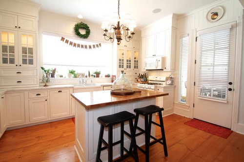
Sherwin Williams Creamy Kitchens
For kitchens, eggshell or satin are popular finish choices for walls. For cabinets consider semi-gloss or high gloss for the most durable finish (and a gorgeous glow).
7. Cabinets, Walls, Trim, and Ceiling in SW Creamy
When you have rich wood tones, it’s important to choose a warm shade that plays well with such warm tones.
Creamy on the cabinets (and ceiling trim and beadboard!) fits right in with the wood tones to highlight both colors to their advantage (space McReynold’s Designs via Houzz).
8. Kitchen with Warm Lighting
What color do you choose to complement yellow and warm wood tones in your decor? Creamy has just enough yellow so that it contrasts with yellow but doesn’t look cold against such a warm color.
I love these Creamy white cabinets shared by Robbin Fink Interiors blog.

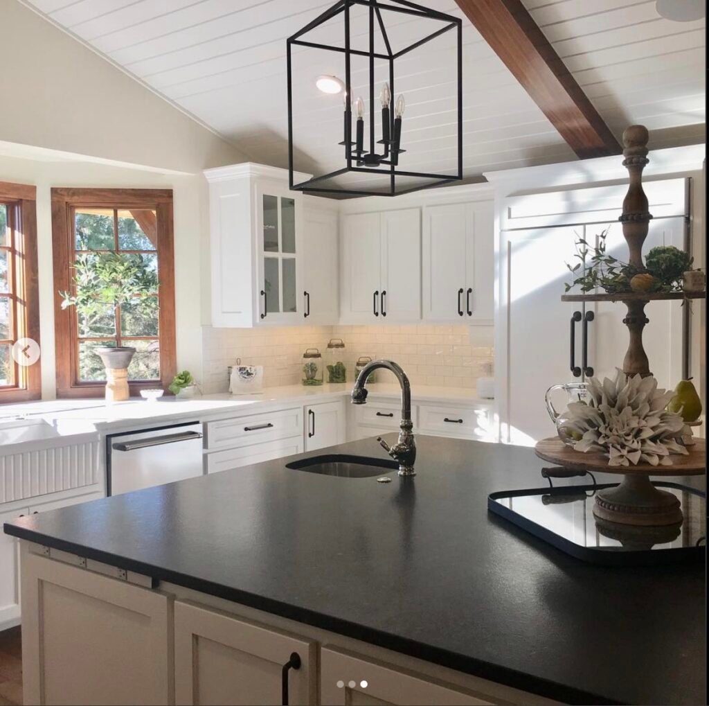
9. Creamy Kitchen with Dark Wood Trim
Ah, stunning! Sherwin Williams Creamy on the walls (like here in @cottage.inthe.cotton’s kitchen) works exceptionally well to soften large spaces and create a relaxing, comfortable vibe in nearly any home style.
10. Kitchen Cabinets in Creamy Sherwin Williams
This hue is just warm enough to soften the coolness of the countertops in this space from 2 Cabinet Girls and bridge the gap between the counters and wood flooring.

11. Creamy White Kitchen Cabinetry Close Up
The warm beige in the counters and backsplash, along with the warm lighting, pulls out the yellow in the cabinetry paint.
Creamy pairs seamlessly, as if the colors were made for each other in this kitchen from Bella Tucker.

Creamy Painted Bedrooms
In general for bedrooms, and low-traffic areas, flat paint is fine. If you like something with a bit of shine (and more ease of cleaning) opt for eggshell or satin.
12. SW Creamy Master Bedroom
Can you imagine this room from Plank and Pillow painted in stark white? You’d have to live in sunglasses!
Bright light will wash out the yellow undertones in Creamy so that it reads as soft off-white and make it look light and bright without being blindingly so.

13. Bedroom with Filtered Light
Creamy is nice and neutral. In low light, Creamy won’t flash pink, purple, or blue undertones. It just sits back and supports your decor, like in this calming space from @withsarale. 😉
14. Sherwin Williams Creamy Boy’s Room
Choosing warm neutrals is perfect for a child’s bedroom as it can easily grow with them, transformed by coordinating decor.
This boy’s room from @aprettycoollife offers a comforting base paired with wood accents and plenty of room for personal touches.
15. Master Suite with Off-White Shiplap
The low lighting and brown and green decor in this space from Tobi Fairley tone down the yellow undertones in Creamy. It reads very soft and welcoming but not overly warm or yellow.
Psst…Wanna see more shiplap ideas? We got more here!

16. Bedroom with Wood Floors and SW Creamy Walls
This bedroom from @simplyshelbystyle is lovely, thanks in no small part to Sherwin Williams Creamy on the walls. There’s just enough pigment in this off-white to make it contrast with the crisp white curtains and bedding.
Bathrooms in Sherwin Williams Creamy
Don’t forget the finish! For bathrooms the perfect sheen is either an eggshell or satin. Why? We’ll tell you in this post about paint sheen.
17. Bathroom with Low Natural Light
Sherwin Williams Creamy will look lovely in most home and decor styles. Here, @fashionwifeyx3’s bathroom manages to look both simple and chic.
18. Creamy with Wood Vanity
Check out how the color changes from one part of the picture to another in this bathroom. Yellow comes through where the paint reflects the warm wood tones.
The walls are neutral on the other side of the mirror. A solid, real home example from @sarah_greco_premierproperties.
SW Creamy Laundry Rooms
19. Creamy in Laundry Room with Pastel Cabinets
A laundry room should be a place where you want to spend time. Pair Creamy with pastels like @rosacollinshome did in her laundry space, and you have a winning combination!
20. Laundry Space Sherwin Williams Creamy
The cool light in this laundry room by Peyton Bryan tones down the warm yellow undertones in SW Creamy so that the painted cabinets (and trim and ceiling!) look perfectly neutral off-white.

Exteriors Featuring Creamy Paint
Exteriors are one of the places I think SW Creamy’s brilliance, depth, and beauty really shine through. See what you think!
21. Siding Painted SW Creamy
Creamy works well for really home exteriors, too! I love the way it looks on @joy.hope.home‘s house paired with earthy materials like bricks.
22. Creamy Painted Brick Color Choice
If you’re considering painting exterior bricks, put Creamy on your shortlist. It will brighten the facade but keep it feeling homey, too – just like it did for @cominguproses_home.
23. Creamy Painted Exterior with Black Trim
@brooksbuildsinc home provides another stunning example of SW Creamy as exterior paint against the bright green lawn.
24. Works Well with Wood
Doesn’t SW Creamy look gorgeous paired with wood elements on this exquisite modern farmhouse exterior from @offwhitefarmhouse? The warmth in the hue really works well to make exteriors come alive and look inviting, I think.
25. Pairs Well With Sage
You’ve seen this paint shade with black on the exterior. Here it is with a sage green shared by @knollwood_customs. Looks amazing, right?
26. Warm Off-White Paint Color for an Outdoor Fireplace
Exterior paint colors can often be a challenge because the pigments look much less saturated standing up to the sun.
So when I had to pick an off-white color for our new outdoor fireplace in our screen room, I ended up deciding between SW Greek Villa, and Creamy. In the end I felt like Greek Villa had a bit too much yellow, and we chose Creamy.

And Creamy turned out to be the perfect paint color here, I think. Other paint colors we used here include Benjamin Moore Chantilly Lace (ceiling) and Behr Padre Brown stain (ceiling beams).

Sherwin Williams Creamy in Other Spaces
27. Sherwin Williams Creamy Entryway
I love this entryway by Plank and Pillow! Creamy is just light enough to read as soft white, and the wood tones make the paint color feel balanced.

28. Inviting Office
Few other off-whites could pull off this delicate balance between cool black and warm brass like it does here in @carbonsundaystudio‘s space. Creamy is able to strike that neutral place and allow both ends of the color spectrum to shine.
Feeling lost? I gotcha, boo! Get a zero-cost copy of my new guide to avoid the paint color picking mistakes people make! Click here or enter your email below. I’ll send the tips right away!⤵️
Creamy Compared to Other Colors
In addition to looking at LRV values, another way to evaluate colors and their qualities is by comparing them side-by-side.
Note: side-by-side comparisons are a reliable way to determine a color’s undertones.
Here’s how Sherwin Williams Creamy looks when compared to other very popular but different shades.
Sherwin Williams Creamy vs. Dover White
These two shades are very similar. Dover White’s LRV of 83 makes it slightly brighter than Creamy, but it has stronger yellow undertones that can tend to look “too yellow” sometimes.

Sherwin Williams Creamy vs. Swiss Coffee
Swiss Coffee has an LRV of 83.93, making it look distinctly lighter than Creamy. Additionally, Swiss Coffee has lower amounts of yellow saturation and reads more neutral.

Sherwin Williams Creamy vs. Accessible Beige
Here are two colors that are more different than they are similar. For starters, they differ significantly in LRV values. Accessible Beige’s LRV of 58 is much darker than Creamy’s 81. Also, Accessible Beige is rich beige in contrast to Creamy’s off-white.
These two shades are more appropriate for using as coordinating colors rather than similar colors.

LRV of Sherwin Williams Creamy (SW 7012)
Visually looking at paint colors will yield very subjective results. In order to confidently choose a color for your home, you need more information, right? I like to supplement subjective information with objective color information.
Light Reflectance Value, or LRV (you may also hear it referred to as the Light Reflective Value) is a number ranging between 0 and 100. Each color has an assigned LRV number to indicate how much light a color reflects. Zero represents pure black because it doesn’t reflect ANY light, while 100 represents pure white because it reflects ALL the light.
The LRV of SW Creamy = 81
This value means that SW Creamy is firmly in the off-white range. It reflects a considerable amount of light, so it will look warm and bright against more saturated hues.

LRV…what? Don’t worry, I’ve got you! This no-cost guide will help you avoid the paint color picking mistakes most people make! Click here or enter your email below. I’ll send the tips right away!⤵️
Sherwin Williams Creamy FAQs
Is Sherwin Williams Creamy cool or warm?
SW Creamy is a warm white that will look white next to darker shades but will appear slightly yellow next to pure white.
Does Sherwin Williams Creamy look yellow?
Different lighting situations matter! In cool lighting, Creamy looks cooler, sometimes enough that you don’t notice any yellow. On the other hand, warm lighting tends to draw out the yellow, so it’s more noticeable. 
Where can you use Creamy?
You can use Sherwin Williams Creamy nearly everywhere!
Creamy is a great shade for exterior use as well as interior walls, or as a trim color. It looks great on cabinets, vanities, kitchen islands, window shutters, and even interior and exterior doors!
It’s undoubtedly a popular, and great option for your:
• bathroom
• dining room
• bedroom
And much more!
Great Coordinating Colors for Creamy
Sherwin Williams Creamy sparkles when paired with a large selection of other colors. Go monochromatic or bravely contrast deep hues – the possibilities are nearly limitless. Consider adding this shade to your color scheme.
If you’re searching for great colors to coordinate with Creamy, consider some of these:
- Tricorn Black
- Intellectual Gray
- Worldly Gray
- Clary Sage
- Swanky Gray
- Sea Salt
- Warm Stone
- Anew Gray
- Storm Cloud
- Krypton
- Reynard
- Mindful Gray
- Studio Taupe
- Anchors Aweigh
- Quietude
- Repose Gray
- Pavestone
- Silver Strand
- Cityscape
More Colors to Consider
Not yet feeling ready to commit to Creamy? I gotcha! Check out these neutral shades to see if they might be a better fit.
- Chantilly Lace (Benjamin Moore) – a crisp white that brightens any space
- Snowbound (Sherwin Williams) – a somewhat cool, yet very livable, white
- Dover White (Sherwin Williams) – a warm, creamy off-white
- Super White (Benjamin Moore) – a bright, neutral shade of white
- Simply White (Benjamin Moore) – a creamy white with yellow undertones
- Pure White (Sherwin Williams) – warm white that can lean slightly greige
- Alabaster (Sherwin Williams) – a bright, popular off-white
- White Dove (Benjamin Moore) – a teensy, tiny bit greige
- Eider White (Sherwin Williams) – a mysterious, off-white or light gray with complicated (but beautiful) undertones
- Ballet White (Benjamin Moore) – a light, neutral off-white paint color
- Oyster White (Sherwin Williams) – a pretty light greige paint
Pin this paint color for later! And if you use this paint shade, leave a comment on the pin! That helps others decide if they want to try this color, too!

Ready to show those boring, bland walls who’s the boss at home? This no-cost guide will help you sidestep mistakes that almost everyone makes when it comes to picking paint! You’ll be on your way to perfect paint promptly…pinky swear.


Susan says
Hello, I have BM White Dove painted cabinetry. Will that go well with
SW creamy walls ?
Thankyou!
Susan