Read all about Sherwin Williams Sea Salt, plus see 23 real homes that use it!
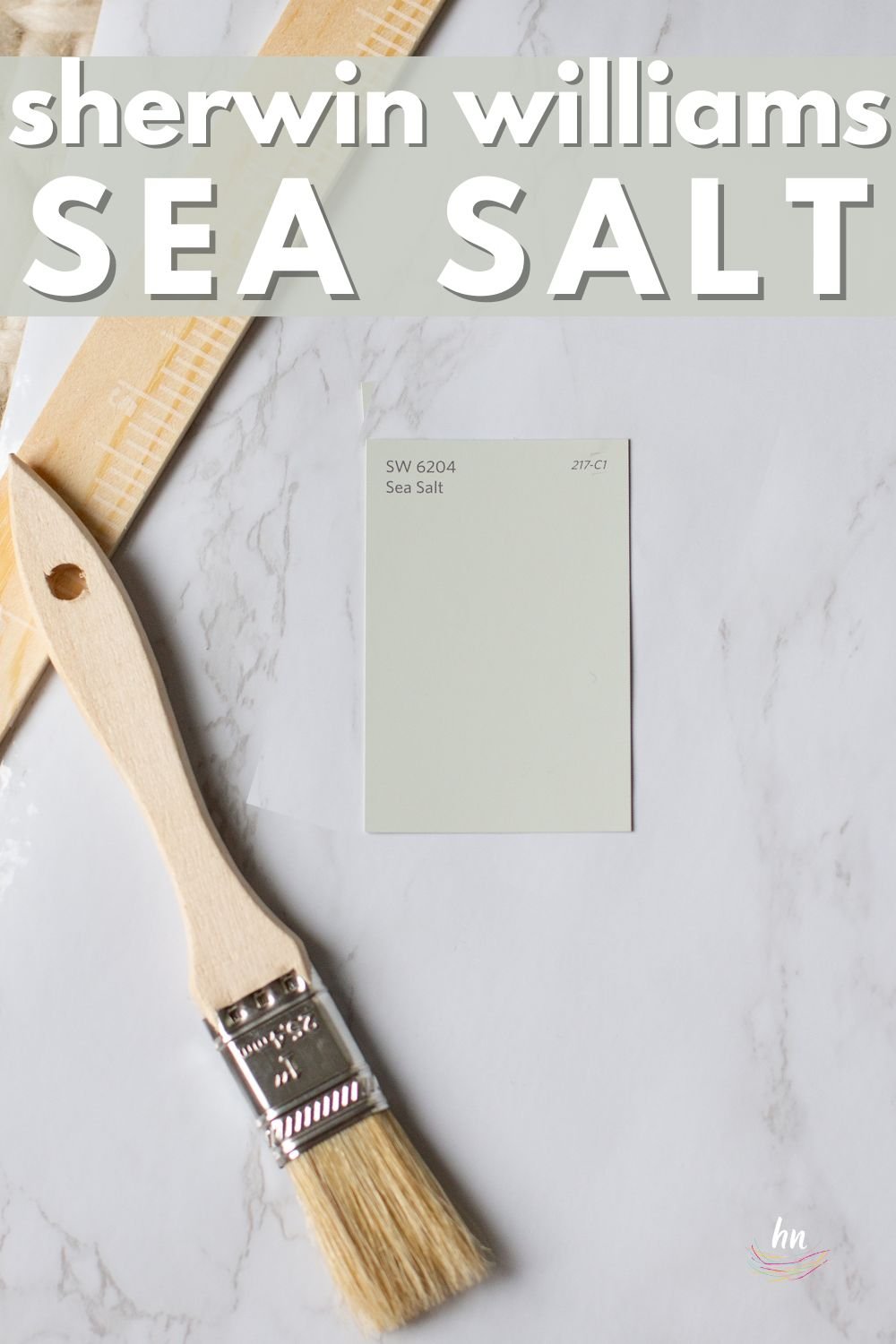
Sherwin Williams Sea Salt paint color (SW 6204) is currently one of the most popular color choices that SW has to offer. It’s easy to see why: SW Sea Salt has personality, yet it acts like a neutral.
Sea Salt, with its green and gray tones, is a very soothing, beautiful (and quite beachy) backdrop color that can effortlessly fit in with so many color schemes, lighting situations, and types of decor.
Inspired by a pale green sea with the sun shining on it, Sea Salt is gorgeous, chic, and timeless.
This paint color series is meant to be a helpful tool, gently guiding you toward the perfect new color(s) for your home by offering detailed information about the nuances that you need to be aware of for each shade.
My hope is that having some of that insider knowledge will make the challenging process of picking paint colors much easier.
To really help you understand more about Sea Salt, it is important to look at a few of its defining characteristics (like light reflecting value), compare its shade to other colors in its family, learn about great coordinating colors, and then see it in real-life homes.
So, pull up a chair, and let’s “sit by the sea” as we take an in-depth look at Sherwin Williams Sea Salt and see if it is the ideal new shade for your home!

Let’s take a closer look! First up? A video preview of this shade as seen in real homes!

FAQs about Sea Salt
What color is Sherwin Williams Sea Salt?
SW Sea Salt is a soft and muted color that’s a blend of green and blue.
Is Sherwin Williams Sea Salt a warm or cool color?
Greens, purples, and blues are cool-leaning colors, while red, orange, and yellow are warm-learning colors. Sea Salt has green and gray undertones, which means it leans cool.
Where should I use SW Sea Salt?
Consider this hue for ANY room in your entire house! It’s a seriously flexible shade that can enhance your:
‣ Kitchens
‣ Bedrooms
‣ Bathrooms
‣ Living rooms
‣ Dining room
‣ Kids’ bedrooms
‣ Playroom
‣ Basement
What’s more…this chic shade is endlessly versatile, which makes it perfect for any style of home and decor too!
Is Sherwin Williams Sea Salt more green or blue?
Sea Salt is a solid blend of green and blue but skews primarily green (although its gray and blue undertones make it a bit of a chameleon paint color depending on your lighting situation).
Is Sherwin Williams Sea Salt a neutral color?
SW Sea Salt is not technically a neutral paint color (it’s decidedly green) but is so versatile that it blends in almost anywhere.
This is why it’s the perfect happy medium–it still gives your room subtle color and personality while also blending humbly into the background to let your decor shine.
I’m not gonna lie – choosing the PERFECT paint color isn’t as easy as seeing what you like online and simply adding it to your space. There’s an entire science behind it! Grab a FREE copy of my new guide to avoid the paint color picking mistakes people make! Click here or enter your email below. I’ll send the tips right away!⤵️

What Are the Undertones of Sherwin Williams Sea Salt?
Undertones are sometimes seen as a challenge to overcome when choosing paint colors. However, since they are the direct result of the paint-mixing process, there’s no way to avoid them.
With that in mind, I think it’s important to “take the bull by its horns” and understand the undertones of any paint color you like. Having knowledge in hand makes the process of picking a new color for your home easier and more efficient since you won’t be dealing with any surprises after you’ve committed.
Let’s take a look at SW Sea Salt’s undertones. This hue lives in the green color family, but it has strong gray undertones. As a result, when you compare Sea Salt next to true gray paint colors, it’ll appear to be a muted green.

But Sea Salt will sometimes throw in a surprise. It will at times look very blue – often when you least expect it. If you don’t know to expect it, that is!
NOTE: NO paint colors will look the same at different times of the day or in two different places. But Sea Salt is even more of a chameleon than many paint colors are.
Use paint swatches (my favorites are these peel and stick samples) to help you know EXACTLY how your lighting and nearby decor will impact the appearance of your favorite colors.

If undertones make your head ache, you’re not alone! Grab your no-cost copy of “5 Biggest Paint Choice Mistakes” Click here or enter your email below. I’ll send the tips right away!⤵️
How Different Types of Lighting Affect SW Sea Salt
Different lighting conditions play with undertones in varying ways. Here’s a basic idea of how you can expect Sea Salt to read based on natural lighting.
- North-facing light – northern light is cool and blue-tinted, which will draw out the muted tendencies of Sea Salt. This type of lighting is also where you may see it flash some blue. If you want SW Sea Salt to feel like a neutral, try it in north-facing rooms.
- South-facing light – warm light from the south will draw out its green side.
- East-facing light – an east-facing room has warm yellow light in the morning and cool, passive light in the afternoon. That shifting light will cause Sea Salt to lean into its green side in the morning but shift to its cooler blue side later in the day.
- West-facing light – This is the warmest light you will encounter, and Sea Salt in this space will appear green pretty much all day long.
What Colors Complement Sherwin Williams Sea Salt?
Rather than asking, “what colors pair well with Sea Salt?” a better question might be, “what colors DON’T pair with Sea Salt?” This shade is hugely popular due to its shifting nature and versatility. Here are some specific colors that Sea Salt pairs particularly well with:
- Pure White
- Extra White
- Fieldstone
- Repose Gray
- Gossamer Blue
- Iron Ore
- Eider White
- Hale Navy
- Tricorn Black
- Mindful Gray
- Alabaster
- Light French Gray
- Chantilly Lace
- Agreeable Gray
- Jamestown Blue
- Chelsea Gray
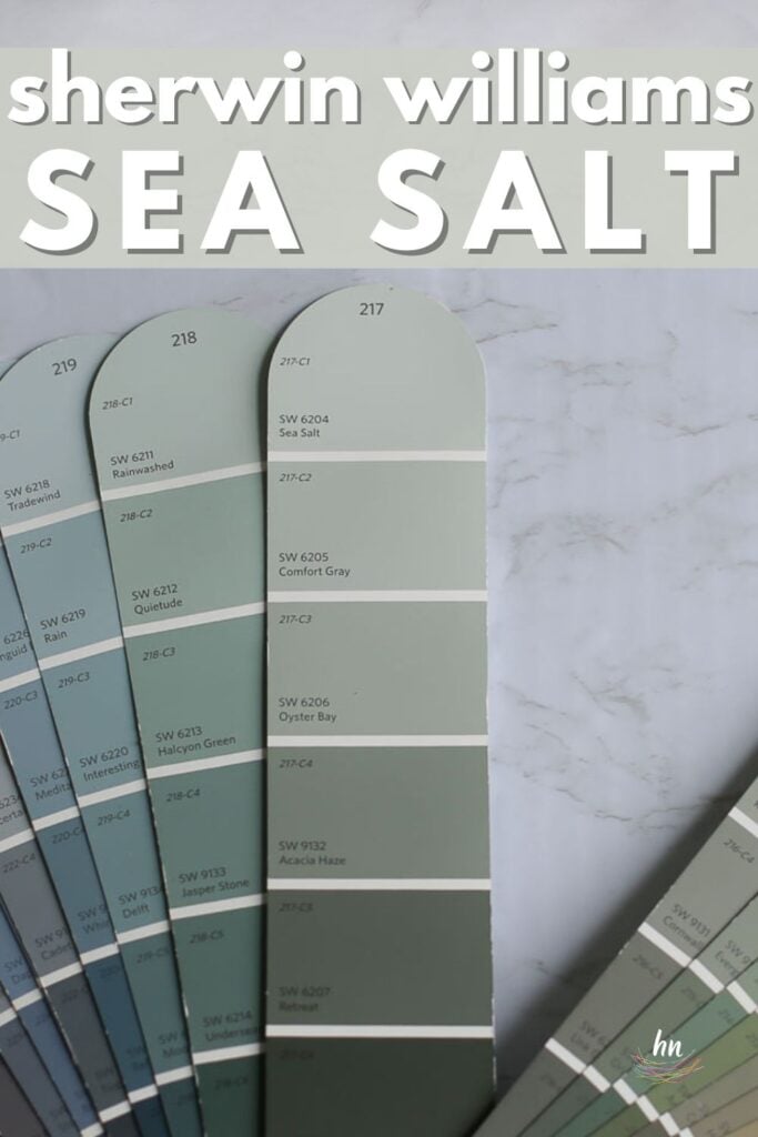
LRV of Sherwin Williams Sea Salt (SW 6204)
Looking at paint involves many subjective interpretations based on how shades change due to nearby influences. Let’s briefly go over a more objective method for evaluating paint colors.
Light Reflectance Value (LRV) is a number on a scale between 0 and 100 that each color has assigned to it based on how much light it REFLECTS. A lower number means the color reflects less light, while a higher number means it reflects more light.
The LRV of Sea Salt = 64
Sea Salt is a medium-light blue-green paint color. It will help a room feel large and airy, and it won’t completely wash out in a room with bright natural light.

LRV…what? Don’t worry, I’ve got you! This no-cost guide will help you avoid the paint color picking mistakes most people make! Click here or enter your email below. I’ll send the tips right away!⤵️
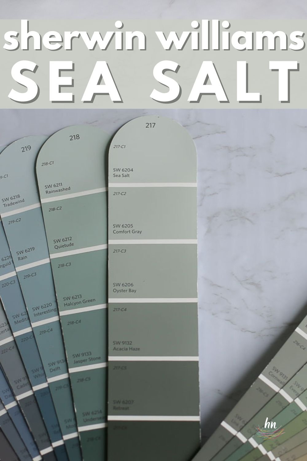
Sea Salt Compared to Other Colors
Comparing similar shades against each other is a reliable way to determine how undertones affect them. Here’s how Sherwin Williams Sea Salt behaves when we compare it against three other popular shades.
Also note: there is another popular paint shade with the same name (just to make choosing paint even more exasperating ;). Yep, Benjamin Moore Sea Salt is a popular shade of paint as well, but a TOTALLY different color, and one that I personally find to have a questionable name (check BM Sea Salt out here and see if you agree).
Sherwin Williams Sea Salt vs. Comfort Gray
Sherwin Williams Comfort Gray is a color we have evaluated before. With an LRV of 52, it will read much darker than Sea Salt will. Further, Comfort Gray has stronger gray undertones, so it will read gray with faint hints of green.
If Sea Salt has a hair too much color for you, check out Comfort Gray. It is just one notch up the color strip from Sea Salt and brings with it more depth of color.
It definitely has a little more saturation of color to it than Sea Salt, so if you want a little more drama, go with Comfort Gray. If lighter and brighter is your tendency, then Sea Salt may be just the paint color for you!

Sherwin Williams Sea Salt vs. Rainwashed
These two colors are so similar that the only way you can really tell the difference between them is to look at them side by side. Sherwin Williams Rainwashed not only has more saturation than Sea Salt (its LRV is 59), but it also has more color.
While Sea Salt is a very muted green that can lean a little blue, Rainwashed is a blue-green that can lean slightly gray.

Sherwin Williams Sea Salt vs. Healing Aloe
Like Sea Salt, Benjamin Moore Healing Aloe sits in the mid-light range on the LRV scale with a value of 69.66.
Although both colors are green-grays and similar in saturation, Healing Aloe has some yellow undertones that help it read warmer than Sea Salt’s blue undertones do.

Feeling lost? I gotcha, boo! Get a zero-cost copy of my new guide to avoid the paint color picking mistakes people make! Click here or enter your email below. I’ll send the tips right away!⤵️
More Colors to Consider
I know from experience how challenging choosing new paint colors can be! If you aren’t ready to jump on board with Sea Salt yet, check out these other shades:
- Beach Glass (Benjamin Moore) – a darker muted blue-green
- Gray Cashmere (Benjamin Moore) – a mid-light blue-green with gray undertones
- Silver Satin (Sherwin Williams) – a gray-tinted off-white
- Shoreline (Benjamin Moore) – a light gray-leaning greige
- Silver Drop (Behr) – a pale gray with a hint of beige
- On The Rocks (Sherwin Williams) – a mid-toned greige with light green undertones
- Snowbound (Sherwin Williams) – a slightly cool, yet very livable, white
- Smoke (Benjamin Moore) – a light-medium smokey blue
- Oyster Bay (Sherwin Williams) – a lovely medium-toned gray-green with hints of blue
- Pewter Green (Sherwin Williams) – a soft, dark muted green paint
23 Real Homes Using Sherwin Williams Sea Salt
Ok, let’s get to everyone’s favorite part and see Sherwin Williams Sea Salt in real homes.
We’ll check out how Sea Salt looks in some real spaces under lots of different lighting situations and with lots of other “things” in the rooms (furniture, countertops, etc.) that the paint can play on.
Remember that pics on a computer screen are in no way a substitute for seeing a real sample on your own wall, but I think it can be really helpful to at least rule colors “in” to buy samples for or “out” to just scratch completely.
When you’re ready to sample, I recommend re-positionable/re-usable peel and stick samples.
Sea Salt Kitchens
Sheen note: Picking the right color is only winning the battle, not the war. Remember to pick the right paint finish, or sheen, also! Read up on what you need to know about picking the perfect paint sheen.
For kitchens, eggshell or satin are popular finish choices for walls. For cabinets consider semi-gloss or high gloss for the most durable finish (and a gorgeous glow).
1. Boldness in Subtlety
Let’s just get this party started with an example of Sherwin Williams Sea Salt from Vintage South Development that will make your eyes pop straight outta yo head. Graphic, sorry…but this kitchen is O-to-the-M-to-the-G, right?
Cabinet color? Sea Salt, friends.

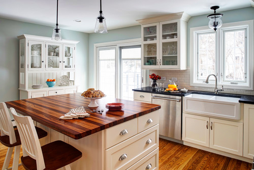
2. Works Well with Off Whites
This kitchen from Houzz highlights just how color-shifting Sea Salt can be.
Notice its green-leaning tendencies in the bright light and how that shifts to a muted soft blue above the window.
Sherwin Williams’ Sea Salt Dining Spaces
3. Beachy Dining Space
Well, hello, spring in a room!
Sea Salt lets the bright colors in the plates and flowers pop against it as it lends itself to be more neutral in this room by A Design Story.
And the teal goes so well with this color, which isn’t always the case with green-on-green tones.

4. A Relaxing Neutral
Seen here in a little breakfast nook area, this is a good picture of how Sea Salt looks against the pure white of the plantation shutters (lovely, btw) and the white molding in the shot.
It may not look like a super-saturated color on the swatch, but it is definitely a colorful paint on the wall!
5. Smoky Blue Green
Sherwin Williams Sea Salt is looking (perhaps) surprisingly at home in this mid-century modern dining room by West Hollar. Oh yes, this hue can make itself right at home nearly anywhere!

SW Sea Salt Living Rooms
6. Cozy Coastal Color
Why can’t I breathe whenever I look at this stunning living room? (Please sing along in your head with my updated Michelle Branch lyrics…Yes, that’s an early 2000’s throwback).
This room is absolute perfection with the color and decor choice.
We peeked at this space when we were checking out their kitchen and dining room, and I am just as in love with her Sea Salt living room!
7. A Bold Choice
You know what? I am getting a new perspective on orange and Sea Salt in this room by New Perspective Design. That new perspective is that I am LOVING it!
Pops of color in the pink, orange and red family really seem to shine along with Sea Salt.

8. Sea Salt for a Beachy Living Space
If coastal style is your cup of tea, then you definitely check out more of Sand & Sisal‘s spaces.
This living room is such a perfect example of the serene, seaside look and feel that this shade of paint can bring to your home.

Sherwin Williams Sea Salt Bedrooms
In general for bedrooms, and low-traffic areas, flat paint is fine. If you like something with a bit of shine (and more ease of cleaning) opt for eggshell or satin.
9. Serene Blue Green
Look at the natural light spilling into Two Twenty One‘s master bedroom, making Sea Salt show its blue tones. The bright fabrics on the bed also help keep the room looking fresh and bright.

10. A Rustic Retreat
Sea Salt with farmhouse flair here at Remington Ranch Farmhouse. Check out how soothing Sea Salt looks in this rustic retreat of a master bedroom.
Do you like the color paired with the raw wood tones that pull out the blue-gray?

11. Coastal Vibes Bedroom
Sarah of Life on Virginia Street has beautiful, but subtle coastal nods throughout her home, and Sea Salt in the master bedroom is just one lovely example.

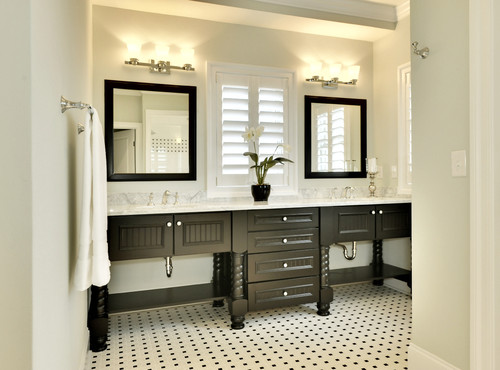
Sherwin Williams Sea Salt Bathrooms
Of all the ways to use this truly livable color, I think seeing it in bathrooms is my favorite.
Blue/green is a very popular color for bathrooms (keep that in mind if you’re thinking of putting your house on the market anytime soon).
A timeless blue/green hue reminds us of resorts. Vacations. Spas. All of which are GREAT things, am I right? Why wouldn’t anyone want that feeling as they enter their bathroom each day?
Don’t forget the finish! For bathrooms the perfect sheen is either an eggshell or satin. Why? We’ll tell you in this post about paint sheen.
12. Nice Pop of Color in a Guest Bathroom
I am loving the white + black + Sea Salt in this bathroom from Emily’s Project List. I think that is a great base to build a room upon!

13. Strong Green Undertones in a Master Bathroom
Don’t be fooled; the wall color is Sea Salt, but the vanity is NOT! Wow! They look very similar, don’t they?
The vanity is actually Opal Silk by Behr, but that doesn’t stop this color combination by Golden Boys and Me from winning!

14. Looks Great on Shiplap
Oh, a planked wall painted Sea Salt! I love this combination! I’ve always felt that architectural details and Sea Salt pair well together.
This bathroom is the first time we’ve seen Sea Salt painted on these details, and it’s giving me all the feels! But wait – were you fooled like I was?! Read her caption for your mind to be blown!
15. Traditional and Timeless
Sea Salt really hits its stride when paired with black and white, I think.
Sure, the owners could have gone with an off-white on the walls here, but Sea Salt brings in some visual interest, and gives the space more of a sophisticated, classy resort feel.
SW Sea Salt Laundry Rooms
16. Clean and Calming
This laundry room from Two Points for Honesty is lovely. Sea Salt not only pairs well with the details in the subway tile, but it makes this tiny room feel inviting and soothing at the same time.

17. Love Doing Laundry
I loathe doing laundry, but heck, I think I could grow to love it if this was my laundry room. Check out the Sea Salt cabinets in this amazing laundry room that I’d like to live in.
18. Luxury Laundry Room
OK, this laundry room is absolutely luscious. Check out these splendiferous sea salt cabinets from Farmhouse 4010 on Insta…yum.
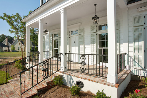
Sea Salt Exteriors
19. Exterior Versatility Too
Ok, ok, Sea Salt is not just for beach houses. Look at this stunning farmhouse with Sea Salt and black accents. This is spectacular!
Plus, it shows us that Sea Salt isn’t limited to beach living AND works as an exterior color.
20. Sea Salt on Shutters
Sea Salt looking beachy, but sophisticated here on some exterior shutters. It looks beautiful against the bright white trim and porch ceiling color, does it not?
21. Sea Salt Front Door
A farmhouse with an awesome pop of Sea Salt! Check out this amazing dutch door. #swoon
Other SW Sea Salt Sightings
22. Pairs Well with Natural Wood Tones
I personally love seeing Sea Salt paired with both raw and finished wood. Its timeless, versatile, and natural inspiration makes these two a perfect fit together.
Old Barn Company struck design gold by using a wood barn door in this office!

23. Playful Neutral for Kid’s Spaces
Soft pastels like this shade are a no-brainer for play spaces to help calm down high emotions and kids’ squabbles. Bring that zen-vibe to your play area by using Sea Salt like Living Letter Home did.

So what do you think? Can you envision a place to use Sea Salt in your home? Although this blue-green color may not be ideal for every single home, this chameleon color is incredibly versatile!
I hope this blog paint review has been helpful. And don’t forget to sample! Grab a re-usable peel and stick sample without heading to the paint store! Click the button below to have a sample sent to you right away!
Pin this paint color for later! And if you use this paint shade, leave a comment on the pin! That helps others decide if they want to try this color, too!
Ready to show those boring, bland walls who’s the boss at home? This no-cost guide will help you sidestep mistakes that almost everyone makes when it comes to picking paint! You’ll be on your way to perfect paint promptly…pinky swear.


Jen says
We just painted our pool patio in Sea Salt. Not my first choice but it is starting to grow on me. Question is the floor color. We currently have painted concrete and we need to repaint. What color would look best with sea salt on the walls?