

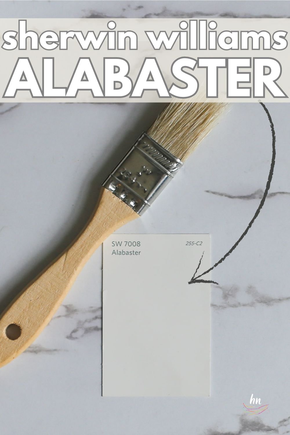
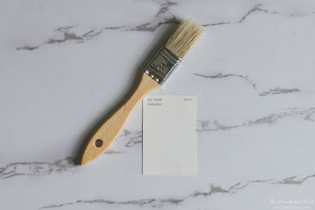
When people ask me about the best shades of white paint, Sherwin Williams Alabaster is one that always is top of mind…
But it’s not perfect everywhere. I’ll share all you should know about this popular SW shade to help you decide if it’s the right hue for YOUR house. Plus, see it used in 24 real homes!
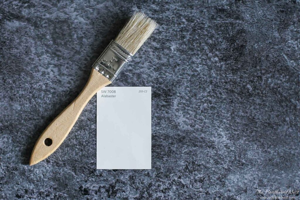
Sherwin Williams Alabaster (SW 7008) is one of the most popular colors out there, and for good reason. It’s a creamy, soft white that won’t look stark but is bright enough to look white on almost any surface and in practically any light.
In this post, I am doing a deep dive into this shade, and I’ll be answering all your burning questions about it. The goal for this post (and my entire paint color series!) is to help you decide whether or not this paint might be right for you before you head off to the paint store.
Let’s go!

Alabaster at a Glance
- True neutral that works well for any style of decor or accent colors.
- Slightly off-white shade with slight greige undertones that helps your home feel warm and cozy rather than stark and bland.
- Reads warm without looking too yellow, thanks to the neutral undertones.
- Awarded Sherwin-Williams 2016 Color of the Year and has remained popular ever since!
Here’s a quick video preview of this shade as seen in some real spaces…

If Picking Paint Make You Panicky
You’re definitely not alone! Choosing paint colors isn’t for the faint of heart! I know many, many people who have purchased more than a few gallons of paint that they now regret. That’s why I created Paint Perfect! This video course will teach you how to pick stunning colors, EVERY time in under one-hour! Over 700 happy customers (and their beautifully painted homes) can attest! 👇

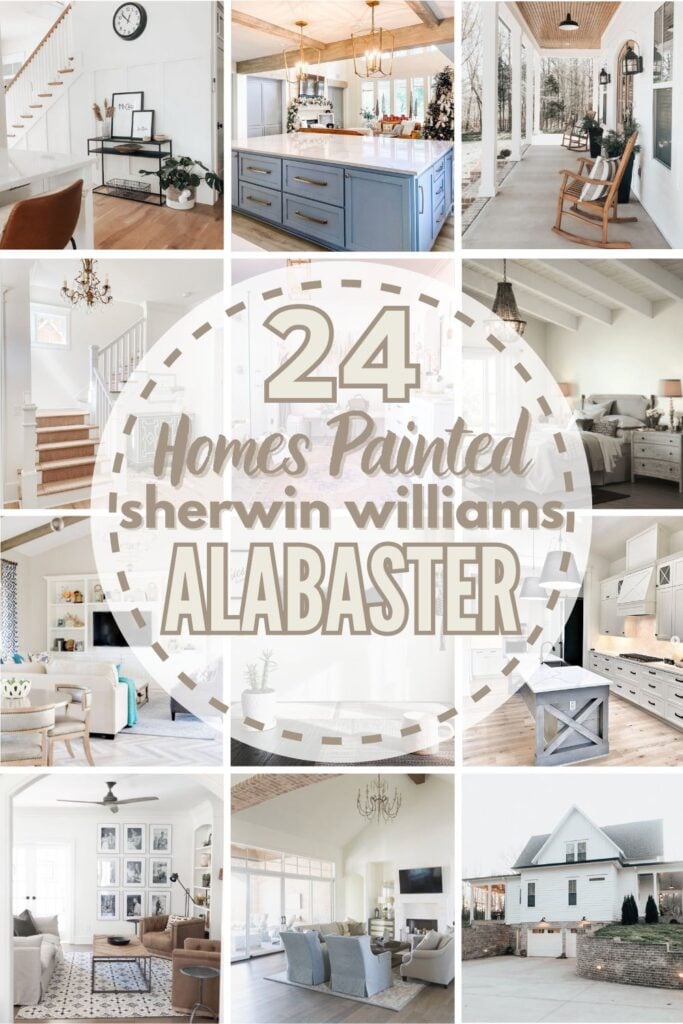
Real Homes Using Sherwin Williams Alabaster
Let’s jump into the fun part of this paint color tour and see how gorgeous Sherwin Williams Alabaster looks in real life. Here are 20+ houses that use Sherwin Williams Alabaster paint to their advantage.
Sherwin Williams Alabaster Kitchens
The kitchen is the heart of the home – the space where you spend time cooking, entertaining, and just hanging out. A versatile color like Alabaster can look amazing on the walls, the trim, or the cabinets. Here’s how Alabaster looks in a few different kitchens.
Quick note: Don’t forget the finish! Learn all about paint sheen here. For reference, in kitchens, I recommend eggshell or satin for walls and semi-gloss or high-gloss for cabinetry.
1. Alabaster Kitchen Walls + Dark Beige Cabinets
Sherwin Williams Alabaster white, seen on the kitchen walls here, pops against the gorgeous deep cabinets in SW Balanced Beige. It gives that perfect bright, neutral touch that keeps the space from getting too dark.
2. A Warmer Look at SW Alabaster Paint
Thanks to the warm wood floors and countertop, this kitchen from Perfecting Places shows the creamy, warm tones Alabaster can bring to a space.

3. Pairs Well with Rustic Decor
Love the modern farmhouse look? Me too!
Forever Six Acres uses Alabaster as the neutral backdrop in their kitchen, the wood, brick wall, barn door, mantle vent, and other rustic elements get the opportunity to be what they should be: eye-catching.

4. Perfect Perimeter Kitchen Cabinets
In this kitchen from @kaleighbullard_home, Alabaster perimeter cabinetry couples well with the gray island, wood range hood, and black accents. Clean. Classic. Simple. If you’re wondering what the island paint color is, it’s SW Dovetail Gray.
5. A Spectacular Shade for Ceiling and Trim
Alabaster cabinets, ceiling, and trim let the wood features and dark accents “do the talking” in this kitchen from Front Light Building Co. (Design credit: Blue Palm Staging & Design) It’s effortlessly chic.

6. A Paint That Doesn’t Steal The Spotlight
This kitchen by @kellyscasa is the perfect example of how Alabaster does its job of fading into the background to let decor items shine.
The beautiful wood beams and blue accent color get to be the stars in this while the wall paint hangs quietly in the back of the kitchen.
Alabaster White in Living Spaces
Alabaster can do a tremendous job of helping you let your personality shine in the hangout headquarters of your home. Here’s how SW Alabaster looks in some real-life living rooms.
Note: Different sheen = different look for your paint. Amping the glossiness of your paint (think satin) will increase the brightness as well. Looking to tone things down a bit? Lean toward less sheen, i.e., the flat and eggshell end of the sheen spectrum, either of which would usually work fine in a living or family room.
7. Great Gallery Wall + Great Paint = Happy Living Room
Because of the high LRV of Alabaster, it’s a good choice if your goal is to make a small room feel quite spacious and roomy, like this happy little living room from Sara Lynn Brennan.

8. White Paint: Simply Complicated
Here is an example that shows just how Alabaster reads warm yet neutral with just the slightest hint of color. The Alabaster walls in the shadowy corner read a bit cooler and grayer, while the areas hit by the sunshine give off more warmth.
And…it shows yet again how complicated white can be in this simple yet beautifully designed space from @sephanie.jane.cameron.
9. Creamy but not Yellow
This living room from Bless This Nest shows how Alabaster can read as soft and creamy without looking yellow. There’s no glaring white here!

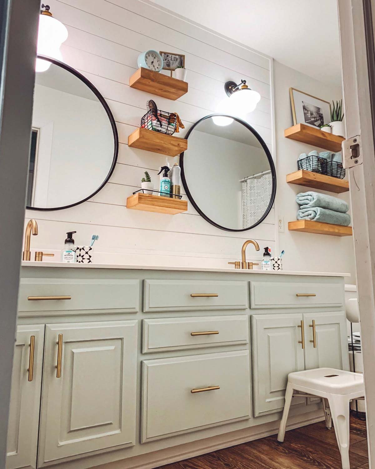
Sherwin Williams Alabaster White in Bathrooms
I don’t know about you, but the bathroom is definitely not somewhere I want to feel cold and sterile! My bathroom is my solace – sometimes even my escape for a “Mommy Time Out.” 😉 I want it to feel calming and comforting—and this creamy white can help do the job!
These real bathrooms show how Alabaster brings a soothing and timeless vibe to enjoy.
10. Stunning on Shiplap
Can white be rich? Sure it can!
Check out the depth and richness seen in this stunning bathroom remodel by Making it in the Mountains. The shiplap brings in texture, and the Alabaster brings in brightness, but in a very warm, refined way.

11. Modern yet Classic Paint Color
Clark and Aldine took a small bathroom and opened it right up simply by using Alabaster as the main paint color.
The shade is warm enough to pair well with the wood accents and yet neutral enough to also play nice with the black accents.

12. Alabaster + Sea Salt Bathroom
If you are looking for a gorgeous color combo, look no further than this spa-like bathroom from Cotton Stem. The bathroom cabinets painted SW Sea Salt, really pop against the neutral Alabaster shiplap and wall.
Real Bedrooms with Sherwin Williams Alabaster White
Ok, next to my bathroom, my bedroom is the next room that I don’t want to feel “cold.” Check out how Alabaster warms up these bedrooms.
In general for bedrooms, and low-traffic areas, flat paint is fine. If you like something with a bit of shine (and more ease of cleaning) opt for eggshell or satin.
13. Off-White, Not Off-Putting
Grey Snail Designs used Alabaster in a classic, timeless way by using it as the base and letting the darker, bolder colors take the spotlight.

14. A Predictable Paint Color Choice
Hello morning, noon, and night! This example shows that while some colors will change drastically depending on the angle and amount of light in a room, Alabaster stays more predictable, making it a really popular choice as a “whole home” paint color, as shown throughout Carissa’s gorgeous home @browneyedfox.
15. Great Partner for Noteworthy Trim
This lovely bedroom from Amara of @homeonspringwood shows Alabaster used in a really fun (and fabulous) way. In this restful bedroom, SW Alabaster is the wall color, while SW Light French Gray is used on the trim. The combo gives the space a really high-end look, I’d say.
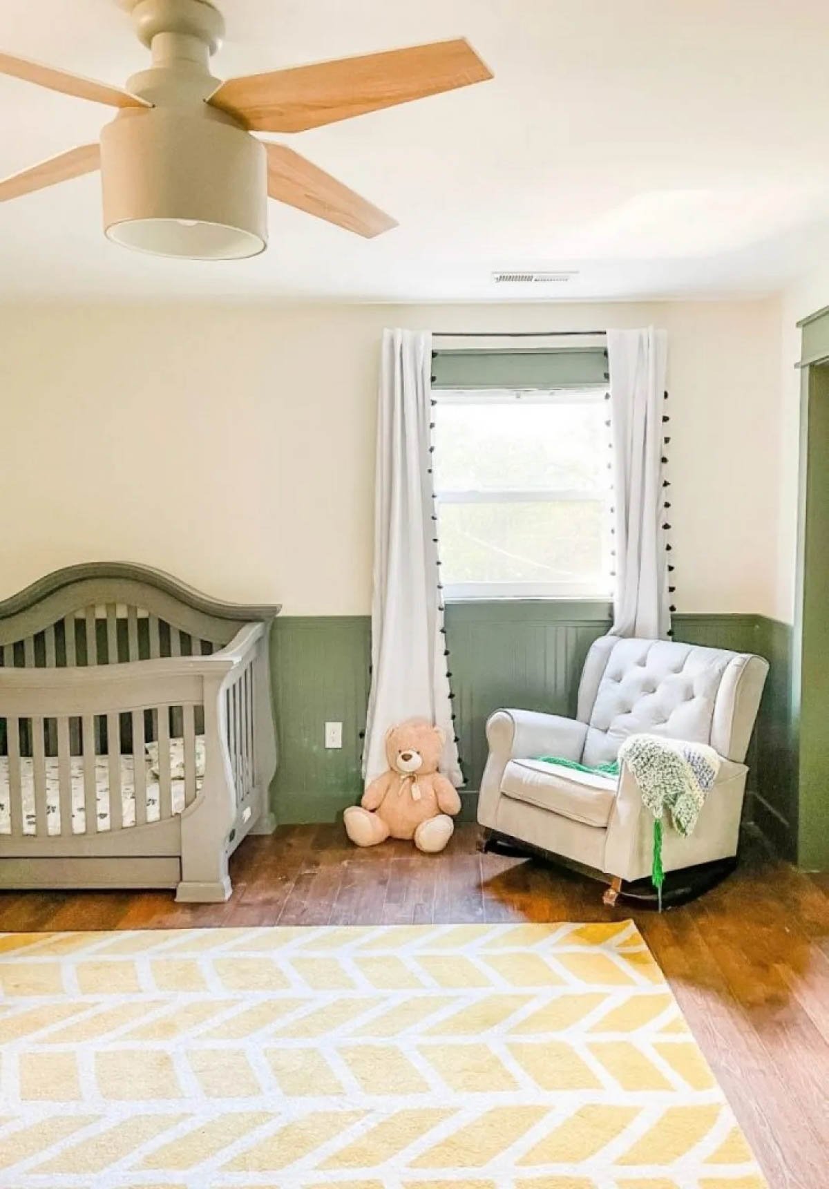
16. Classic Green & Alabaster White Nursery Design
How sweet is this space from Southern Yankee DIY? This nursery is a soothing space that feels warm and inviting. I love how Sherwin Williams Rosemary looks here with Alabaster!
Alabaster Spotted in Other Spaces
Other parts of the home need a coat of paint, too! Check out how Alabaster performs in these areas to see if your hallway, laundry room, or play space could use a refresh.
17. Subtle Richness in White Entry
This entryway from The Harper House is a terrific example of Alabaster’s rich quality. The color itself is understated yet elegant.

18. Simple Laundry Room Paint Job
I know everyone has an opinion about what color makes a space feel large, but I think Alabaster does a pretty great job here in this narrow laundry room from Chris Loves Julia. The cabinet color here is Lamp Room Gray by Farrow & Ball.

19. But Soft! What Light Through Yonder Window Breaks?
It’s Alabaster! On the stairs. Crisp and clean, but soft, not sterile…Alabaster makes this small stairway from @bellsheepstudio feel bright and anything but drab.
20. Inviting Hallway
The Rural Legend used Alabaster as a neutral backdrop to let the other decor pieces steal all the attention.
But make no mistake: the only reason they “shine” so well is because of all the heavy lifting that Alabaster is doing behind the scenes!

21. Calming Loft Play Space
Here’s another great example of how Alabaster can be warmed up slightly. This playroom from Pretty Real Blog uses the hue to create a neutral backdrop primed for hours of play!

SW 7008 Alabaster Exteriors
Alabaster’s versatility also makes it a great exterior paint! Check out these homes that use Alabaster as the exterior paint.
Sheen note: for exteriors, consider something with durability and cleanability – my favorites are satin and semi-gloss.
22. Southern Charmer
Doesn’t Alabaster give @downtownacres‘ traditional home such a warm, inviting appeal? A true neutral, the shade is looking like the perfect choice paired with those subtle green shutters.
23. Bright, not Blinding
I love Alabaster for exterior paint because it appears perfectly white without looking blindingly bright, as you can see on this spectacular modern farmhouse home belonging to @hestershomestead.
24. Crisp, not Cold
Last but not least, look at how Alabaster pops against wood and dark accents in a closer perspective from @hesterhomestead. It’s crisp while still exuding warmth.
Undertones of Alabaster
Undertones are sometimes seen as a challenge to overcome when choosing paint colors. However, since they are the direct result of the paint-mixing process, there’s no way to avoid them.
With that in mind, I think it’s important to arm yourself with knowledge so you understand the undertones of any paint color you like. Having knowledge in hand makes the process of picking a new color for your home easier and more efficient since you won’t be dealing with any surprises after you’ve committed.
Let’s take a look at SW Alabaster’s undertones. This shade lives in the off-white color family, but just barely because it’s bright enough to be white. However, when you compare it to a stark, crisp white, Alabaster has some beige and mild yellow undertones.
You won’t really notice them most of the time, though, because the paint will just look warm, soft, and slightly off-white.
How Different Types of Lighting Affect SW Alabaster
Different lighting situations play with undertones in varying ways. Here’s a basic idea of how you can expect Alabaster to read based on natural lighting.
- North-facing light – northern light is cool and blue-tinted, so it will balance out Alabaster’s warmth.
- South-facing light – warm light from the south will draw out its warmth even more, letting its creamy beige side out.
- East-facing light – east-facing rooms have warm yellow light in the morning and cool, passive light in the afternoon. That shifting light will cause Alabaster to warm and appear creamy in the morning but shift to its more balanced version later in the day.
- West-facing light – west-facing rooms have the opposite lighting situation of east-facing rooms since the light is cool and passive in the morning but very warm in the evening. Alabaster will likely read as a balanced off-white in the morning and shift to its creamier side in the late afternoon.
Alabaster Compared to Other Colors
White paints can be particularly hard to see differences in…white is white, right? That’s until you get them side by side. Then suddenly, white paint seems WAY more complicated than you ever imagined.
White paints are all about the undertones: warm undertones, cool undertones, creamy undertones, or yellow ones. And believe me, those subtle undertones make a huge difference in how your white paint looks!
Let’s compare Sherwin Williams Alabaster to other popular white paint colors and see how it differs.

Alabaster vs Snowbound
Snowbound by Sherwin Williams (SW 7004) has an LRV value of 82.56. Since Alabaster’s LRV is 82, these two paint colors are nearly identical in brightness.
Both Alabaster and Snowbound are timeless, crisp-looking whites with slight greige undertones, giving them both the perfect balance of warm and cool.
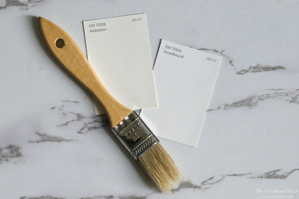
Alabaster reads as a creamy, crisp off-white that isn’t yellow, blue, or too beige. It looks like classic white and works in both interior and exterior lighting as a soft white.
However, where Alabaster is warm and creamy thanks to yellow and greige undertones, Snowbound is softened up thanks to pink and purple undertones.
Didn’t I mention that white paints are complicated? 😉

Alabaster vs Pure White
These two soft whites have many similarities between them – even looking at them side by side can be hard to tell the difference!
Sherwin Williams Pure White (SW 7005) has a higher LRV than Alabaster (value of 84), making it a slightly brighter white. And it is less creamy.
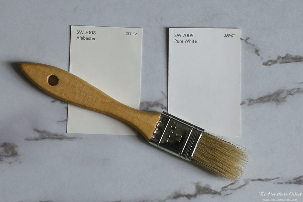
Both will read as soft whites, but Alabaster is a warmer white, while SW Pure White will be a little brighter, and cooler in hue. Pure White is a very popular pick for trim.

Sherwin Williams Alabaster vs Benjamin Moore White Dove
In terms of popularity, White Dove is the Benjamin Moore equivalent of Alabaster.
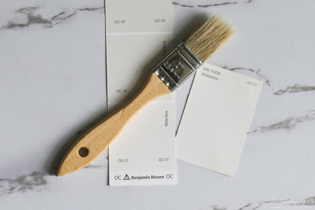
However, these two shades are not the same. White Dove has a higher LRV of 85.38 and is slightly creamier, while Alabaster has more greige undertones.

SW 7008 LRV
Alabaster is one of Sherwin Williams’s most popular whites. In fact, this long-time bestseller is so popular and versatile that when Sherwin Williams picked their 2016 color of the year, Alabaster white was the “chosen one”.
A big part of the reason for Alabaster’s popularity likely has to do with its Light Reflectance Value (LRV). The higher the LRV number, the more light is reflected and the brighter a color feels.
The LRV of SW Alabaster = 82

Alabaster reflects a lot of light and works well in rooms where you want to create a bright and relaxed but cheery ambiance without making your space seem washed out.
For comparison’s sake, Sherwin Williams Agreeable Gray – one of their most popular greige colors, has an LRV of 60. While Alabaster is a very light white, at LRV of 82, it won’t give you that harsh, sterile, stark white vibe.
Alabaster will look white in both interior and exterior lighting and is bright enough to pop against other colors without being glaring white.

Sherwin Williams Alabaster FAQ’s
What color is Sherwin Williams Alabaster?
Sherwin-Williams Alabaster is an off-white, but what sets it apart are the shade’s very subtle greige undertones. It reads as a bright, warm white paint color that’s clean and crisp but soft at the same time.
It will look white in both interior and exterior lighting and is white enough to pop against dark colors without being glaring.
If you haven’t heard of greige, it’s exactly what it sounds like—a color that has both gray and beige in it! Want to learn more? Check out this post with the best greige paint colors! 
Does Sherwin Williams Alabaster look yellow?
If you put Alabaster next to cool-leaning, crisp white paint colors or neutral whites like SW Pure White, it will tend to look more yellow than they will. But that’s not necessarily a bad thing—those yellow undertones lend warmth to this shade.
That being said, it’s not as yellow as Creamy and will read as a soft and creamy off-white. In real life, Alabaster warms up a space without looking yellow. 
Is Alabaster warm or cool?
Alabaster is definitely a warm white but in the most subtle and neutral of ways. As we’ll see in some of these real home examples, Alabaster is politician-esque. It’s a color that plays to its audience.
In any light, the shade reads white. But it does show some tendencies to change temperature depending on its environment.
In low natural light or spaces with cool accent colors, it appears more greige, even a smidge gray…but just barely. In artificial light or rooms with very warm accents (natural oak floors, etc.), Alabaster will lean toward its warmer end.
All that to say…if you are looking for a safe bet for white, Alabaster is a great option. It even won a coveted spot on my list of the best Sherwin Williams white paint colors! 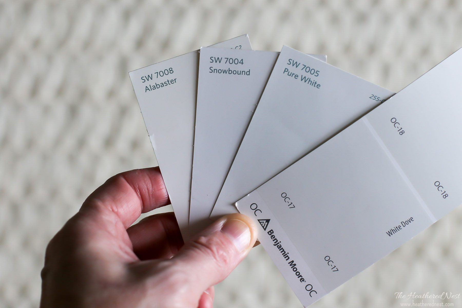
Where Should I Use Alabaster in My Home?
This paint shade be used beautifully not only as a wall color but also as ceiling paint, trim paint, exterior paint, and cabinet paint!
Consider this popular color for ANY room in your home! It’s a very versatile shade that can be an excellent choice for the:
• Kitchen
• Cabinets
• Bedroom
• Bathroom
• Living room
• Dining room
• Laundry room
• Playroom
• Basement
• Exterior
• Home office
In addition, this color’s versatility makes it a great fit for any home and decor style!
Great Coordinating Colors for Alabaster
Alabaster can be used as a trim color, but if you want to pick a trim paint with some contrast to this particular shade, consider Sherwin Williams Extra White, Benjamin Moore Super White, or Benjamin Moore Decorators White.
Another way to make your trim stand out? Use a different paint sheen! Trim is typically shinier/higher luster than wall paint. Opt for eggshell on the walls and a semi-gloss or high-gloss for your trim.
In addition, many colors look terrific with Alabaster, which only adds to its insane popularity. Need some ideas?
Here are some specific colors that play well with Sherwin Williams Alabaster:
- Naval
- Let It Rain
- Wall Street
- Oyster Bay
- Balanced Beige
- Bracing Blue
- Agreeable Gray
- Nomadic Desert
- Iron Ore
- Urbane Bronze
- Accessible Beige
- Thunderous
- Jasper
- Tricorn Black
- Eider White
- Revere Pewter
- Dorian Gray
- Repose Gray
- Sea Salt

Alabaster Color Recap
There you have it! Everything you need to know about Sherwin Williams Alabaster, plus seeing it in action in real homes.
If you’re in the market for a soft, warm white, give Sherwin Williams Alabaster a look. Its beautiful neutral nature and soft appearance make this one über popular white to use anywhere in the home!
Don’t forget to sample! My favorite way to sample is with these peel-and-stick samples. They are super easy to use, inexpensive, and very convenient.
More Colors to Consider
I know from experience how tedious choosing new paint colors can be! If you aren’t ready to commit to Alabaster yet, check out these other beautiful shades. Each of these posts breaks down everything you need to know about the shade, plus gives several examples of how it looks in real homes!
- Drift Of Mist (Sherwin Williams) – a medium to light greige
- Benjamin Moore Simply White – another gorgeous creamy white option
- Silver Satin (Sherwin Williams) – a gray-tinted off-white paint color
- Shoreline (Benjamin Moore) – a light gray-leaning greige
- Silver Drop (Behr) – a pale gray with a hint of beige
- Worldly Gray (Sherwin Williams) – a popular mid-toned greige
- Swiss Coffee (Benjamin Moore) – a rich, sophisticated, off-white
- Greek Villa (Sherwin Williams) – a warm color off-white
- Creamy (Sherwin Williams) – as the name says…a creamy white paint
- Seapearl (Benjamin Moore) – a versatile, warm off-white with slight gray undertones
- Super White (Benjamin Moore) – a brilliant, sparkling, bright white
- Swiss Coffee (Behr) – a cream color paint that’s never too yellow
- Kilim Beige (Sherwin Williams) – beautiful, creamy shade with beige undertones that looks like a yummy iced latte
- Oyster White (Sherwin Williams) – a pretty light greige paint
- 5 Best White Paint Colors from the Sherwin-Williams Company
- 5 Best Benjamin Moore White Paint Colors
Pin this post for later! And if you use this shade, leave a comment (or, better yet, a photo) on the pin! That helps others know whether they want to try this color, too!
Ready to show those boring, bland walls who’s the boss at home? This no-cost guide will help you sidestep mistakes that almost everyone makes when it comes to picking paint! You’ll be on your way to perfect paint promptly…pinky swear.


Amy says
I’m between SW 2123-30 Sea Star and SW 9133 Jasper Stone for a shutter color on a brick (alabaster painted) French Country home. Would you advise one of these 2 colors over the other?
Thank you for any guidance you are able to offer.
Leslie ANNE Lausten says
I want to use this for my foyer. What color should I paint the baseboards? Also Alabaster? or is there another complimentary white?
Heather Thibodeau says
Hi Leslie – lots of people love the simplicity of all one shade for walls and trim, so that’s certainly an option. I mentioned in the article three options for complementary trim colors that I really like. These are: Sherwin Williams Extra White, Benjamin Moore Super White, or Benjamin Moore Decorators White. And of course, you could go for a dark trim color as well, which would make for a beautiful palette, too!
Jackie says
I’m looking to paint my walls alabaster but was wondering what paint I should do for white cabinets. I’m wanting to use Benjamin Moore advance for cabinets.
Heather Thibodeau says
Hi Jackie, That’s a tough question to answer online. Do you want white? Black? Something that pops? Alabaster works great with SO many colors. It will honestly be hard to pick something that doesn’t look good!