Read all about Sherwin Williams Naval, plus see 20 real homes that use it!
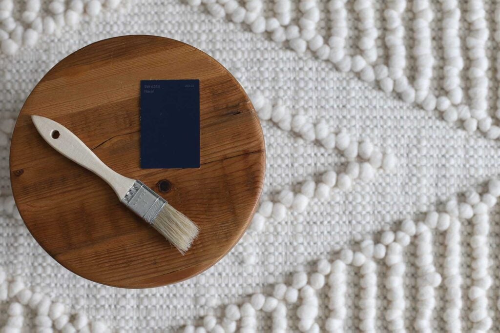
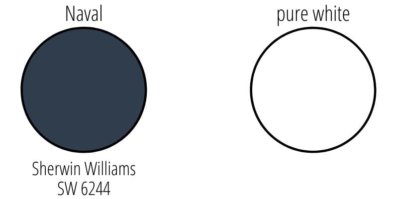
Sherwin Williams Naval (SW 6244) is rich and sophisticated navy blue that Sherwin Williams says is reminiscent of the midnight sky.
A great navy is timeless. It adds a pop of deep, dramatic, neutral color without taking away from the rest of the decor. Dark, moody paint colors are very popular right now, and I think this color is a prime example of why.
I am personally drawn to blues because they project peacefulness and serenity, similar to the way that the sky and water do. For many people (me included!), blue paints help to create feelings of groundedness and tranquility.
It was no surprise to me when Naval was chosen as the Sherwin Williams 2020 Color of the Year. If you’re looking for a color that can instantly transform a room and add that perfect bold touch you’re going for, give SW Naval a look. Let’s investigate this paint to determine whether it’s right for your home.


What color is Naval Sherwin Williams?
Even though it’s very dark, there’s no doubt that Naval is a deep blue neutral color that leans just a tad cool. And as is the case with many colors, this one can appear quite different depending on the surrounding decor and the type of light that hits it.
In a warm, yellow, west-facing, or south-facing light, Naval will appear brighter and bluer. In cooler, north-facing rooms, it will read as much more of a very dark blue that looks just a teensy bit gray.
Where should I use SW Naval?
This rich color looks incredible in many different applications and areas of the home. Use it on walls, ceilings, doors, kitchen islands, vanities, furniture, and even the exterior of the home!
What are the undertones in Sherwin Williams Naval?
Naval by Sherwin Williams is really a true blue. By that, I mean that it doesn’t have any green or purple undertones, which are common with different shades of blue. Although it does have just a teensy bit of teal, it rarely shows its face.
Naval, however, does have slight gray undertones that come out more often, but they are only enough to slightly mute the color, so it isn’t too bright. You would never look at this color and think it’s gray.
If undertones make your head ache, you’re not alone! Grab your no-cost copy of “5 Biggest Paint Choice Mistakes” Click here or enter your email below. I’ll send the tips right away!⤵️
This color really shines when you pair it with natural items such as greenery, woven rugs or blankets, warm leather, and stone.
As a color inspired by nature, use it with other nature-inspired shades of beige, brown, gold, cream, off-white, and white. Here are a few examples:
- Snowbound
- Eider White
- Tarnished Trumpet
- Ripe Olive
- Touch of Sand
- Soothing White
- Storm Gray
- Ramie
- Roycroft Suede
- Icicle
NOTE: Unless you want to end up with colors that show undesirable undertones and clash (and no, I’m not talking about the rock band), use paint swatches of every color you think you want to use and test out the various combinations around your home. Check the lighting and how the colors look together. Promise me, k?
My favorite type of sample? These re-positionable, re-usable peel and stick paint samples👇.

It’s time to use numbers to take a quick objective look at the shade of Naval paint. Hello, LRV.
LRV (Light Reflectance Value) is a numerical value between 0 and 100 that indicates how much light a color reflects. Zero is the darkest color because it reflects zero light, and 100 is pure white because it reflects all light. Lower numbers correspond with darker colors and vice versa.
Sherwin Williams Naval LRV = 4
With an LRV of 4, this color reflects hardly any light, making it a VERY dark navy blue. This is an accent shade – don’t go crazy and paint your entire home Naval, okay?

LRV…what? Don’t worry, I’ve got you! This no-cost guide will help you avoid the paint color picking mistakes most people make! Click here or enter your email below. I’ll send the tips right away!⤵️
Looking at similar colors side by side is really the best way to evaluate their similarities and differences. Let’s check out how Naval compares with some other popular colors.
Wow, there’s no doubt these two colors are super similar. They have identical LRV values, so they’re equally dark. The main difference between In The Navy and Naval is the undertones. In The Navy has green undertones compared to Naval’s gray.

These two navy colors also have identical LRVs of 4, so they are equally dark. However, the green undertones in Anchors Aweigh make this navy shade look darker than Naval. Naval ends up looking bluer and slightly brighter than Anchors Aweigh.

Salty Dog (also by Sherwin Williams) looks quite a bit different than Naval. It has an LRV of 5, which is just a teensy bit brighter, but its teal undertones (and lack of gray) make Salty Dog look bluer and brighter than Naval.

Personally, I love Salty Dog as more of a bright, true blue. You can see it used here as an exterior accent color on two of our camper renovations (see more about these projects on Instagram)…

Hale Navy by Benjamin Moore is a very popular shade of navy that is often used and cited when discussing dark blue paint. Seen together, these two are quite different shades.
Hale Navy is more muted, with grayer undertones when compared to Naval. It’s a little more subdued as compared to Naval’s true blue look.

We’ve used Hale Navy in our own home. You can see it here in our dressing room used as an accent color inside the ceiling ring…

More Colors To Consider
Not sure if Naval is the right shade for you? Check out some of these other beautiful, punchy color options!
- Wrought Iron (Benjamin Moore) – a dark, rich neutral that’s almost black
- Chelsea Gray (Benjamin Moore) – a velvety medium gray
- Peppercorn (Sherwin Williams) – a rich, creamy dark gray
- Light French Gray (Sherwin Williams) – not too warm or too cool
- Iron Ore (Sherwin Williams) – a very dark rich charcoal shade
- Aegean Teal (Benjamin Moore) – a dark blue-green with strong gray undertones
- Pewter Green (Sherwin Williams) – a soft, muted dark green paint
Feeling lost? I gotcha, boo! Get a zero-cost copy of my new guide to avoid the paint color picking mistakes people make! Click here or enter your email below. I’ll send the tips right away!⤵️
Now it’s time for the good stuff! Let’s check out how this color seems to change in different settings when surrounded by varying decor and lighting. Here are 20 real homes using Sherwin Williams Naval paint.
A quick note here: don’t forget to consider picking the right paint finish…it’s not only about getting the color right! We have an in-depth explanation of choosing sheens here.
1. Living Room in SW Naval Paint
Talk about dramatic – but also serene! This living room from Room for Tuesday is dark but elegant, and the white and brown accents help to lighten it up.

2. Built-Ins Painted Dark Navy
Naval looks terrific on furniture too! In bright natural light, this color shows its beautiful navy qualities. It’s a rich blue, but it looks lighter and bluer in bright light than it does in low light.
In a bright room like this basement (believe it or not) from Construction 2 Style, Naval exudes luxury and serenity.

3. Navy Master Bedroom Accent Wall
I am feeling those coastal vibes in this bedroom from The Tarnished Jewel Blog! The dark wall is lovely against the white furnishings, and the pops of turquoise and pink brighten up the room.

4. Naval with Shades of Gray
With the light bouncing off of it, the paint looks more like a blue-gray. You can see how the color in the shadowy areas is a true navy blue. The different blues in the decor tie everything together.
5. Boy’s Room Celestial Navy Ceiling
Well, Naval WAS inspired by the midnight sky, right? It seems a fitting use of color to make naval the night sky in a child’s room like this one from Little Bits of Home, and it looks fantastic. FYI, the wall color here is “Gray Screen”.

6. Sherwin Williams Naval Bedroom
The low, cool natural light and gray headboard pull out the gray undertones, and this color looks so dark it’s almost black in this bedroom from Everyday-Reading.
But the navy accents in the pillow draw your eyes downward and make the wall seem brighter than it is.

7. Naval Bedroom Accent Wall
Orange, yellow, gray, and white play well with Naval. The board and batten on the wall add fun visual interest for such a deep, rich color.
8. Bedroom with SW Naval Walls
The bright light in this room from Thistlewood Farms highlights the different ways that Naval can read in a short space.
Above and to the left of the window, the paint is dark and reads slightly gray. To the right, where the light is shining on the paint, you see the beautiful, classic navy blue.

9. Small Vanity in SW Naval Paint
If you just glance at this vanity from The Tarnished Jewel Blog, you might think it’s black. Then look a little deeper, and you’ll see that this vanity is actually a deep navy. It looks stunning and also pulls the blue undertones out of the wall paint.

10. Kitchen Island Painted Naval
Naval shows its playful side on this island from Crazy Life with Littles when paired with the brass, sand, and coral colors.
The color varies depending on how the light hits it: in the light, it reads slightly teal, and in the shadows, it reads as almost black.

11. Wine Cabinetry in Sherwin Williams Naval
In such a bright room like this gorgeous one from Dina Holland Interiors, Naval looks bright and very blue. The small blue vase and hydrangeas next to the bowl of lemons add a nice touch to play with the color!

12. Navy Lower Kitchen Cabinets
Keep your kitchen light while also adding some fun dramatic flair by painting your lower cabinets a bold color like Naval, and keeping the upper cabinets light and bright like here in this space from The Grit and Polish.
And check out the gold hardware…always a great combination with dark blue.

13. Dining Room with Naval Blue Walls
When you want to create an elegant and timeless room like this dining room from Thistlewood Farms, all it takes is crisp, bold colors like Naval walls and bright white trim. White and navy curtains tie it all together.

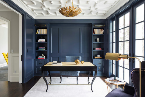
14. Naval Home Office Built Ins
Many people go for crisp white built-ins, but I happen to like the bold look of these Naval shelves from Seattle Staged to Sell. The color is stunning in the artificial light of this downstairs office.

15. Calming Living Room Retreat
Moody and calming… I love how the beige and brown accents in the room bring to mind sandy beaches, ocean waves, and serenity (even if you don’t live near the ocean).
16. Blue Accent Wall Home Office
This home office belonging to Krista Demcher has lots of natural light during the day, as you can see in the second picture of this IG post, the paint color changes as the brighter light wanes.
As the day progresses, the color shifts from navy with just a touch of gray to a bluer deep navy. In case you’re curious, the other walls in this room are painted SW City Loft.

17. Captivating on a Cape Cod
There are plenty of exterior house colors that I wouldn’t recommend putting on a house, but Naval isn’t one of them. This rich, neutral blue pops on almost any house when paired with white trim.
18. Playhouse Painted SW Navy
This navy paint is meant to be out in nature. A playhouse (like this one from Vintage Revivals), shed, or gazebo will all look incredible in Naval, especially with some white accents.

19. Stairwell Painted in Sherwin Williams Naval
Simple elegance. Like a good tuxedo, the elegance shines through whenever Naval and white are paired together.
You don’t need much in terms of surrounding decor for this stairway because this color combo does all the heavy lifting (via Earnest Home Co.- website is no longer active so link has been removed).

20. Small Dresser in Sherwin Williams Naval
Naval doesn’t just work for walls and cabinets or even large pieces of furniture, it works for accent pieces too! I’m definitely feeling those beachy vibes in this room from City Farmhouse…

21. Naval Paint Home Gym
There’s a reason why gyms use a lot of neutral colors such as gray and navy. Not only are they easy for decorating purposes, but they also project calming vibes to help promote focus.
Painting the ceiling of a home gym in Naval like this one from Inspired by Charm is brilliant (and beautiful)!

22. Rich Blue Paint Color on a Sliding Door
I love, love, love the pop of blue in this farmhouse decor. It’s colorful but also subtle… a perfect addition to farmhouse decor!
23. Blue Molding
SW Naval is being used again as an all-over paint color for this home office by City Homes LLC…walls, trim, doors, built-ins, and the elegant board and batten, too. It’s dramatic, bold, and looks like a GREAT place to get some work done, right?
Can you now see why Sherwin Williams Naval is such a popular color and the choice for Sherwin Williams 2020 Color of the Year? A color with this much depth AND neutrality has a lot going for it, indeed!
I hope you enjoyed this in-depth look at Naval by Sherwin Williams, plus real homes that use it in beautiful ways.
Don’t forget! If this is a color that you’re strongly considering, get a sample!👇
Pin this paint color for later! And if you use this paint shade, leave a comment on the pin! That helps others decide if they want to try this color, too!

Ready to show those boring, bland walls who’s the boss at home? This no-cost guide will help you sidestep mistakes that almost everyone makes when it comes to picking paint! You’ll be on your way to perfect paint promptly…pinky swear.


Lainey savenko says
I’ve never felt so disappointed. I wanted a navy blue deck. After doing my research and how this paint will never look grey. I had my deck painted using two coats of paint. This paint looks grayish purple blue. Its not Dark it doesn’t look much different than the old paint that was gray. I called shermin Williams where it was bought. He said that’s why you should bring a sample paint home. I said I had the sample card. I laid it on. My deck. The associated said. We don’t remedy paint problems. I said okay what color would you suggest for a real navy look and he said we have this paint called NAVAL. I said that’s what I bought!!! I expected navy blue. He said call back when the manager is in.
I don’t think I did anything wrong. I have bought paint every where I was off colors but it I bought black it was black. Yellow was different shades of yellow. The Navy uses navy not purple grayish blue. This was a lot of money for me. Any suggestions???