

Read our ultimate review of Benjamin Moore Chelsea Gray, plus see 25+ real homes that use it!
Benjamin Moore Chelsea Gray (shade #HC-168) is a warm and velvety rich gray that is heading toward charcoal territory.
The medium-dark gray shade looks fantastic on cabinets, bathroom vanities and kitchen islands (especially when paired with white countertops and gold hardware), and works really well as a wall color when paired with trim, wainscoting, and ceilings in an array of white and off white shades. It’s also great as an exterior paint choice.
As we all know, Benjamin Moore has a way with words, so I’d be remiss to omit what the website has to say about Chelsea Gray paint color: “Like a well-dressed gentleman, this gracefully urbane shade of gray adds a sophisticated, scholarly quality to a den or library.” Actually, I’m pretty sure my husband has a cardigan in this same color (we call it the grandpa sweater).

Chelsea Gray by Benjamin Moore is sophisticated. Seasoned. It has an air of wisdom to it. It’s also a unique color that has to be used in the right way, because of its warm nature and specific undertones.
Want to learn more about Chelsea Gray paint color? Read on! But first, a little video montage of some Chelsea Gray highlights…in real homes!

Chelsea Gray Video Highlights
So welcome to another edition of our paint series exploration series! Today we’re all in on Ben Moore Chelsea Gray:

FAQs About Chelsea Gray
What color is Chelsea Gray by Benjamin Moore?
While Chelsea Gray might sometimes look like a deep greige or taupe, it’s definitely gray, leaning into the depths of charcoal. There’s a little bit of brown mixed in, which warms up the shade.
Is Benjamin Moore Chelsea Gray a warm or cool paint color?
Chelsea Gray paint color is a slightly warm gray. Why slightly?
It has a lot of cool characteristics, including some secondary undertones, but since there is some brown in it, it’s much warmer than grays containing more obvious blue undertones.
What are the undertones of Chelsea Gray?
While we’ve established that Chelsea Gray paint has some brown mixed in, you may detect green in its undertone makeup. It has been known to show a subtle hint of purple or blue in some lighting environments.
If using Chelsea Gray paint as an exterior color, be mindful of southern exposure or western light (as in the golden afternoon). Because such strong, warm lighting can bring out the green undertones, you’ll want to be sure you’re happy with the way light reflects on the shade.
Remember to check sample swatches at different times of the day, in the exact environment where you want to use it.
My recommendation for samples? These re-usable, re-positionable peel and stick samples.
Want the cliff notes for choosing the perfect color every time? Grab a FREE copy of my guide to help you avoid the paint color picking mistakes most people make!

LRV of Chelsea Gray paint (shade #HC-168)
Let’s get into the “numerical” details of Chelsea Gray paint, or the LRV:
CHELSEA GRAY LRV = 22.16
LRV = Light Reflectance Value: Rated 0-100 with 0 being pure black, and 100 being pure white. Lighter paint shades REFLECT more light from them and therefore have a HIGHER LRV, and vice versa for darker shades). In other words, the higher the LRV number, the lighter the color is. Conversely, the lower the LRV, the darker the color is.
Below, see Chelsea Gray (22.16) side by side with pure white (100):

Chelsea Gray paint compared to other colors
Choosing the right gray paint color for your home can be fun, but it can also be frustrating. Sometimes, it’s really hard to decide what you like and if it will work best for your needs.
Let’s look at Chelsea Gray next to a few other similar gray paint colors to give you a better idea of how it compares.
Benjamin Moore Chelsea Gray vs Kendall Charcoal
All the things that Chelsea Gray is (a medium-dark warm gray with some brown mixed in), Kendall Charcoal is all of those things too, but more of it. It’s darker (LRV 12.96) and has more brown. I would say the amount of brown is pretty well correlated with how much darker Kendall Charcoal is than Chelsea Gray.
When looking at Chelsea Gray by Benjamin Moore, it absolutely looks like a gray, but Kendall Charcoal has definitely crossed into the smokey charcoal territory (hence the name) and is overall a richer color.

Chelsea Gray vs Amherst Gray
With an LRV of 17.12, Amherst Gray is absolutely darker than Chelsea Gray, though they are similar. What else is different between the two paint colors?
Amherst Gray is heading further down the road to charcoal. Overall, though it also has some brown to it, Amherst Gray is cooler than Chelsea Gray and doesn’t have the same green undertones in its makeup. It can at times be too heavy as a wall color, especially in rooms lacking a lot of natural light. Amherst Gray works great for accent walls.

Benjamin Moore Graystone vs Chelsea Gray
Let’s turn around and head down the other direction of the color spectrum for a moment. Benjamin Moore Graystone (also known as Galveston Gray) is lighter than Chelsea Gray, with a Light Reflectance Value of 29.88.
It still has about the same amount of brown to keep it feeling warm, and while still firmly rooted as a gray, has some taupe tendencies that make it a great neutral paint color that stays cool. Like Chelsea Gray, Graystone has some subtle green undertones.

More Gray Paint Colors to Consider
Still don’t know if you’ve found The One? Check out some of these other pretty grays!
- Iron Ore (Sherwin Williams) – a dark, stormy gray
- Peppercorn (Sherwin Williams) – a pigmented, deep gray that’s close to charcoal
- Dorian Gray (Sherwin Williams) – mid-toned, warm gray
- Mindful Gray (Sherwin Williams) – a warm gray that leans taupe
- Light French Gray (Sherwin Willaims) – a balanced gray shade that’s not too warm
- Gray Owl (Benjamin Moore) – unassuming light, classic gray
- Sherwin Williams Anew Gray – an interesting, warm greige
- Wrought Iron (Benjamin Moore) – a rich, dramatic charcoal tone
- Revere Pewter (Benjamin Moore) – a medium to dark-toned, popular greige
- Gauntlet Gray (Sherwin Williams) – a moody warm gray with subtle undertones
Want the cliff notes for choosing the perfect color every time? Grab a FREE copy of my guide to help you avoid the paint color picking mistakes most people make!
25+ Real Life Homes Using Chelsea Gray
Are you ready to see Benjamin Moore Chelsea Gray in action? Let’s see real homes using Chelsea Gray paint!
First, an important reminder…
The best way to be sure of any shade is…drumroll…to sample it! (Did you see that coming?) My recommendation for samples is using these re-usable, re-positionable, peel and stick samples that won’t damage your walls, and you can easily move around your room to see what the paint looks like on each wall ⤵
Chelsea Gray Living Rooms
1. Living Room Accents in Dark Gray
Benjamin Moore Chelsea Gray is great for accentuating unique or elaborate architectural details in your home.
In this cozy living space, the shade adds interest to a wall with a fireplace and built-in shelving, while keeping the vibe feeling grounded. Because of the plentiful natural light in the room, the paint color reads taupe and appears somewhat brighter, revealing subtle green undertones.
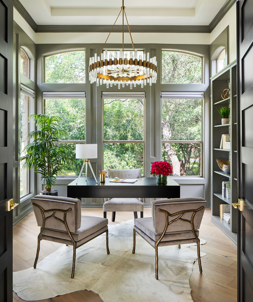
2. Buddies up with Built-Ins
In this sophisticated home office, Chelsea Gray appears cooler as a deeper gray color. Again, it’s a wonderful shade for built-in shelving and cabinets.
A rootsy color that encourages concentration, it’s a perfect pick for built-in writing desks.
3. Grounded Paint Shade
It can be tricky to select a paint color for a wall that has very little surface area visually exposed. In this room, the wall is mostly taken up by large windows, and otherwise covered by furniture, which is actually a great opportunity to experiment with some color.
Chelsea Gray complements the neutral color palette, while still playing a support role as a dark, grounded base.
4. Chameleon Color
Truly a chameleon paint color, Chelsea Gray reads as a medium-toned true gray in this cozy room with off-white trim and furniture, red natural brick and simple decor accents.
It’s showing its cooler side here, and is dark enough for interest, yet not too dark that it makes the room feel small.
5. Benjamin Moore Chelsea Gray Sitting Room
Here are some of the purple undertones I mentioned earlier. Chelsea Gray looks deep, rich and moody in this vintage-inspired sitting room belonging to Brooke Shields shared on Instagram, and featured in print and online at Architectural Digest. The shade makes for a dramatic contrast with the wide, off-white trim.
Chelsea Gray Dining Rooms
6. Moody Dining Room Shade
Out with the stripe running through the middle of the wall and in with faux wainscoting!
Chelsea Gray is lovely as a semi-dark upper wall color, paired with bright white lower wall and trim here in this dining room from Oak House Design Co.

7. Classic Chelsea Gray Dining Room
Nathan and Allie from The Adored Adobe painted this dining room three times before landing on their winner…drumroll…you guess it! HC-168 Chelsea Gray!
It gives this room a cozy, stormy feel that will be inviting to guests and great conversation.

8. Benjamin Moore Chelsea Gray Dining Space
The golden sun streaming into this dining room from The Daily Haley reveals more of the brown in its color makeup, but Chelsea Gray still holds steady as a medium-deep shade with just a hint of purple undertones.

Bedrooms Painted Benjamin Moore Chelsea Gray
In general for bedrooms, and low-traffic areas, flat paint is fine. If you like something with a bit of shine (and more ease of cleaning) opt for eggshell or satin.
9. Great with a Gallery Wall
Chelsea Gray serves as a stunning background for the gallery wall in this cozy bedroom. Some of those green undertones are peeking through, allowing for a bit of contrast with the light gray upholstered headboard.
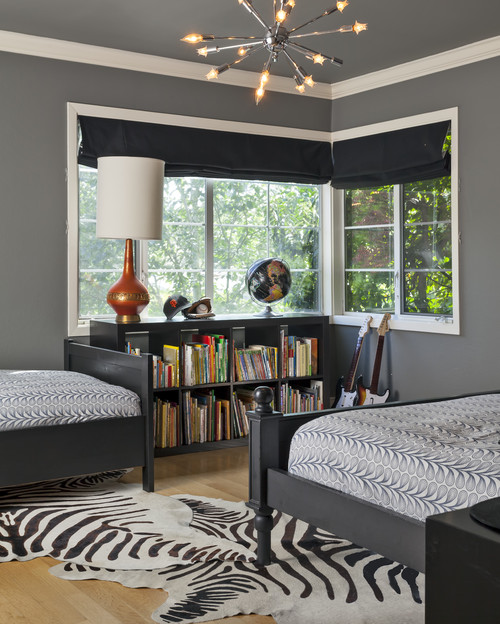
10. Boys’ Bedroom in Chelsea Gray
If you’re looking for a wall and ceiling color that contrasts somewhat dramatically with white trim and crown moulding, Chelsea Gray is a great choice.
The shade delivers that sharp, crisp contrast but is still soft enough to be carried around the entire room (Design from Holly Bender Interiors via Houzz).
11. Chelsea Gray Master Bedroom
Chelsea Gray works great as a wall color in rooms with bug tray ceilings like this one seen at Home Bunch (Design by Grace Hill Design).
The emphasis of the room is on the ceiling, so the darker wall paint plays more of a supporting or background role.

12. Dark Bedroom Walls
Chelsea Gray is pretty and just dark enough behind Chris Loves Julia’s bedroom gallery wall. It has enough weight for all furniture and decor accents to be lighter in color.

Other Interior Spaces with Benjamin Moore Chelsea Gray
13. Lovely in a Landing Zone
At the opposite end of the spectrum, Chelsea Gray works beautifully with minimalist decor styles, as an accent color in this mudroom against a background of crisp, bright white.
14. Chelsea Gray Office
Using a dark shade like Chelsea Gray (seen on the window frames and trim details) in an office like this one with so many windows need not be scary!
Rich hues like this one are great for focus, and when coupled with a light, bright and warm off-white like Benjamin Moore Swiss Coffee, as seen here for the ceiling and walls, the combination is remarkable!
15. Taking Command in a Command Center
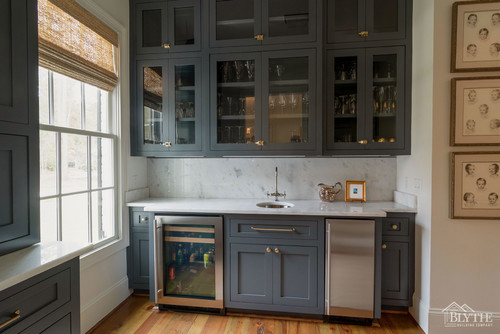
Chelsea Gray helps set this dramatic kitchen office space from The Creativity Exchange apart from the white walls behind it, and pairs beautifully with brass hardware.

16. Bourbon Room
Yep, you read that correctly. Check out this amazing lounge-y, study/bourbon room belonging to @bluegrass_traditional_home painted in our favorite deep gray.
I don’t even like bourbon, but I think I could learn to if I had this room! (Photo credit: @ericalee_photo)
Chelsea Gray Bathrooms
Don’t forget the finish! For bathrooms the perfect sheen is either an eggshell or satin. Why? We’ll tell you in this post about paint sheen.
17. Timeless & Sophisticated Paint Choice
Chelsea Gray adds the illusion of depth to this small, narrow bathroom, but sharing half of the wall with white subway tile prevents the space from feeling too closed in.
I love the warm look of the shade in this lighting, with very subtle undertones peeking through.
18. Great Gray Paint
Chelsea Gray adds a classic touch to this traditional style bathroom seen at Studio McGee. In this lighting, it has some coolness to the color, with very slight purple undertones.

19. Pairs well with Marble
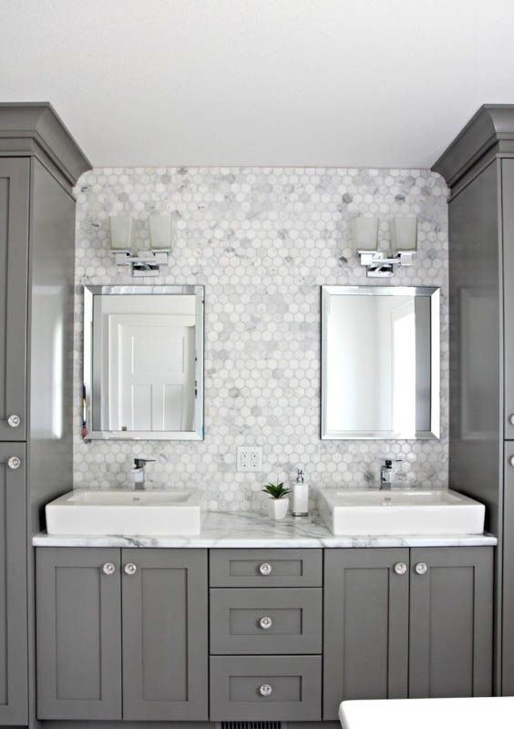
Chelsea Gray really is the perfect gray for bathroom cabinets. It has just enough warmth to add a touch of softness so that it’s not all drama. This space from Kylie M Interiors is a stunner.
20. Green Undertones in Artificial Light
SBK Living did an awesome job on this bathroom remodel, and Chelsea Gray did wonders to make over this double vanity.
In the artificial light here, you can see some of those green undertones pulling through. Gives this color a good boho, and/or farmhouse vibe.

21. Chelsea Gray with Gold Accents
There is just no denying that Chelsea Gray looks amazing as a bathroom vanity color, particularly when paired with warm brass hardware as seen here in this space from Elements of Style.
Wall color here is Eider White.

Benjamin Moore Chelsea Gray Exteriors
22. Faithful Front Door Color
If you’re not into that colorful front door trend, Chelsea Gray is a good contender, offering just enough color interest. It complements the off-white painted brick perfectly without too much contrast.
23. Chelsea Gray and White Dove
Shuman Mabe Interiors showing that Chelsea Gray makes a great exterior siding color, paired here with trim in White Dove.
On cloudy days, it morphs into a deep, stormy gray with virtually no taupe or brown undertones detected.

Chelsea Gray Kitchens
Quick note: Don’t forget the finish! Learn all about paint sheen here.
For kitchens, eggshell or satin are popular finish choices for walls. For cabinets consider semi-gloss or high gloss for the most durable finish (and a gorgeous glow).
24. Benjamin Moore’s Chelsea Gray with Farmhouse Sink
Although I said Chelsea Gray looks stunning as a kitchen cabinet color when paired with gold and brass hardware, it takes on a soft persona in this bright, white kitchen from My Uncommon Slice of Suburbia with more subtle cabinet knobs.

25. Benjamin Moore Gray Kitchen
If you’re a sucker for before and after interior design stories, check out this post from Dear Lillie.
Chelsea Gray was a perfect choice as a wall color in this classic kitchen, contrasting nicely with white trim and low wainscoting.

26. Chelsea Gray Kitchen Cabinets
Natural stone tiled backsplash and countertops with brownish shades can be tricky to match, but Chelsea Gray manages to pull down the color temperature, complementing these accents without adding to the yellowness of it here in this kitchen from Erin at Sunny Side Up.

27. Stately Shade
The builder described these cabinets as “stately” and I must say I very much agree. Another beautiful cabinetry win with Chelsea Gray.
Final Thoughts
That’s all, folks. I hope you enjoyed this post about Benjamin Moore Chelsea Gray. As you can see this Benjamin Moore paint is one that can be used in many different ways to give your home a fresh look with beautiful results.
It’s a shade with great depth of color and can add a lot of visual interest to a space where it is used. Would you consider Chelsea Gray paint in your home?
And if this is a color you’re seriously considering, remember paint-sampling is better than ending up paint-sorry! I highly recommend these peel and stick samples because they are inexpensive, re-usable and re-positionable…
Pin this post for later! And if you decide to use this color, leave a comment (or better yet, a photo) on the pin! That helps others know whether they want to try this color, too!

Pssst…before you go, I sure would love to hang out with you again really soon! And before you’re on your way, make sure you grab your free copy of the 5 Biggest Mistakes People Make When Picking Paint, so you can avoid the heartache (and hole in your wallet) when your paint choices don’t quite work out! Click here, and I’ll send your free copy right now!


Julia says
Hi,
Will Chelsea Gray coordinate with benjamin moore smokey taupe painted furniture with dark walnut floors? Thank you very much!
Julia