


Read all about Benjamin Moore Wrought Iron, plus see real homes that use it!
Benjamin Moore Wrought Iron (2124-10) is a rich, dark neutral that’s almost black, but not quite. It’s a surprisingly complex paint color that has some influence from navy blue and brown, making it an incredibly versatile choice for accent walls, kitchen islands, built-in cabinetry, exterior shutters, and even exterior siding.
With a bit of a charcoal gray characteristic, Wrought Iron paint is great if you’re looking for drama without the harshness of pure black.
Let’s go deep into the dark and mysterious world of Benjamin Moore Wrought Iron and enjoy looking at real homes that use it!

Here’s what’s on tap in today’s Wrought Iron discussion:
FAQs About Wrought Iron Paint
Is Wrought Iron the right color for my next project?
It all depends on what you are painting! There’s no denying that Benjamin Moore Wrought Iron is an incredibly dark color, much like its material namesake.
As such, it wouldn’t be my top pick for a wall color in an interior room unless being used as an accent wall, in which case, it’s one of the best colors out there for that purpose. 
What color is Wrought Iron, and what are its undertones?
It’s hard to peg exactly how to describe Wrought Iron. This paint color falls into several categories: almost black, soft/muted black, dark neutral [gray], and deep charcoal. It’s highly influenced by navy blue, but since it’s so dark, I wouldn’t go so far as to call it a navy.
However, in some lighting conditions, you can certainly detect strong navy, brown, or gray undertones. These undertones actually add a considerable degree of warmth and softness to temper the harshness that a pure black would provide. 
Quick note…
The best way to be sure of any shade is…drumroll…to sample it! (Did you see that coming?) My recommendation for samples is using these re-usable, re-positionable, peel and stick samples that won’t damage your walls, and you can easily move around your room to see what the paint looks like on each wall ⤵
LRV of Benjamin Moore Wrought Iron (2124-10)
Curious about the “numerical” details or the LRV of Wrought Iron? Wonder no more!
Wrought Iron LRV = 6.16
LRV = Light Reflectance Value: Rated 0-100 with 0 being pure black and 100 being pure white. Lighter paint shades REFLECT more light from them and therefore have a HIGHER LRV (and vice versa for darker shades).
The LRV of Wrought Iron is 6.16, so it’s pretty dark but not quite pure black (which, as you know, is 0). Even without placing it next to pure black, you can tell by the swatch that Wrought Iron is not quite black. There is some definite softness to it, thanks to its gray and brown tendencies.
Below, see Wrought Iron (6.16) side by side with pure white (100). The outside of the circle is in black (LRV 0).

LRV…what? Don’t worry, I’ve got you! This no-cost guide will help you avoid the paint color picking mistakes most people make! Click here or enter your email below. I’ll send the tips right away!⤵️

Wrought Iron Paint Compared to Other Colors
Dark colors can be very difficult to compare. So, let’s take a look at Wrought Iron next to a few shades in dark gray, charcoal, and black families to better understand its color profile.
Wrought Iron vs Iron Mountain
Benjamin Moore Iron Mountain is brighter than Wrought Iron, with an LRV of 9.13. It’s more of a charcoal than Wrought Iron, which definitely has some charcoal tendencies but leans closer to a soft black. Iron Mountain also seems to have a little more brown mixed in for added warmth.
You really can’t go wrong with either one as an accent wall or cabinet color, and both look great paired with white trim. The difference really lies in how much softness or drama you’re looking for. Iron Mountain will be a touch softer than Wrought Iron.

Wrought Iron vs Cheating Heart
Like Wrought Iron, BM Cheating Heart is a navy-inspired dark neutral. Either one could either be described as charcoal or soft black at heart; it really just depends on how you like to look at them.
These two colors are incredibly close. Cheating Heart is barely brighter than Wrought Iron, with an LRV of 6.89.
The most notable difference is Cheating Heart leans a little more into its cool blue undertones, making it appear more of a muted navy in some lighting.
While Wrought Iron also has this tendency, it’s slightly more obvious with Cheating Heart. It’s almost like it’s cheating on black with navy! Ha!

Wrought Iron vs Black
I’d be remiss if I failed to compare Wrought Iron with good old-fashioned Black. Yep, Ben Moore has a color simply named “Black” with an LRV of 2.48.
That’s not too much brighter than the darkest possible black in a paint deck (which would have an LRV of 1), so it’s pretty safe to say this is the blackest, darkest color in the Benjamin Moore collection.
Side by side with Ben Moore’s Black, Wrought Iron looks more charcoal gray than ever. If you’re looking for the punchiest, most dramatic black out there, Black is the way to go.
However, if you need something a bit softer, Wrought Iron may be the direction you should seriously consider.

More Colors to Consider
Not sure if Wrought Iron is the one? Try one of these saturated colors and other bold hues:
- Chelsea Gray by Benjamin Moore – a sophisticated gray shade
- Iron Ore by Sherwin Williams – a dark stormy, moody gray
- Peppercorn by Sherwin Williams – a true, deep, dark, gray
- Mindful Gray by Sherwin Williams – a lightened up, unassuming gray shade
- Urbane Bronze by Sherwin Williams – dark, moody and Sherwin Williams “2021 Color of the Year”
- Pewter Green by Sherwin Williams – a dark, cool-leaning muted green
- Naval by Sherwin Williams – consider a rich shade of navy blue?
- Hale Navy by Benjamin Moore – another highly popular shade of dark blue
- 15 BEST Brown Paint Colors For Rich, Velvety Warmth
Are you already feeling a little lost? Let me help you get back on track. Grab a free copy of my guide to help you avoid the same paint color picking mistakes most people always make!
Real Homes Using Benjamin Moore Wrought Iron
By now, I think we have a good understanding of Benjamin Moore Wrought Iron and its color profile. So let’s get to the good stuff – seeing it in all its glory in 30 real homes!
Sheen note: Picking the right color is only winning the battle, not the war. Remember to pick the right paint finish, or sheen, also! Read up on what you need to know about picking the perfect paint sheen.
Wrought Iron Entryways
1. Wrought Iron Interior Door
We’ll start this round up strong by highlighting a use for Wrought Iron that really lets it shine: doors! This paint color is such a perfect pick for interior doors, as you can see in @basicbluehouse‘s entryway.
You get the punchiness of black but with a little softness, giving it just a touch of drama while still feeling homey.
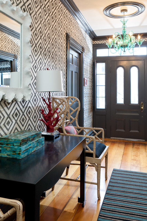
2. Benjamin Moore Wrought Iron Door and Trim Entryway
In this bold entryway designed by Reider and Co, the geometric wallpaper catches the eye. Wrought Iron paint on the trim and interior doors pulls the look together with just the right amount of drama, allowing the bright colors in the decor to pop without overwhelming the space.
Living Rooms in Wrought Iron
3. Living Room Accent Color
The clean and classic look of Blesser House‘s cozy living room is just ripe for holiday decorations! Thanks to the bright white paint and curtains and the soft colors of the decor, this space feels bright and airy. Using Wrought Iron on the French door trim makes a statement and makes the room look polished.
4. Dramatic Fireplace
Let me just say: WOW. The fireplace accent wall in this sitting room from @katiebowlinghome is simply stunning. Wrought Iron highlights the architectural details on the wall and adds the perfect level of drama. Gorgeous!
Kitchens Painted Wrought Iron
For kitchens, eggshell or satin are popular finish choices for walls. For cabinets consider semi-gloss or high gloss for the most durable finish (and a gorgeous glow).
5. Classic Combo
Kate Marker Interiors does amazing work, and this kitchen with its classic color palette is a case in point. The gold hardware is such a great contrast with the Wrought Iron cabinets and window trim. (Photo credit: (Photo Credit: @stofferphotographyinteriors Builders: @tartanbuilders)
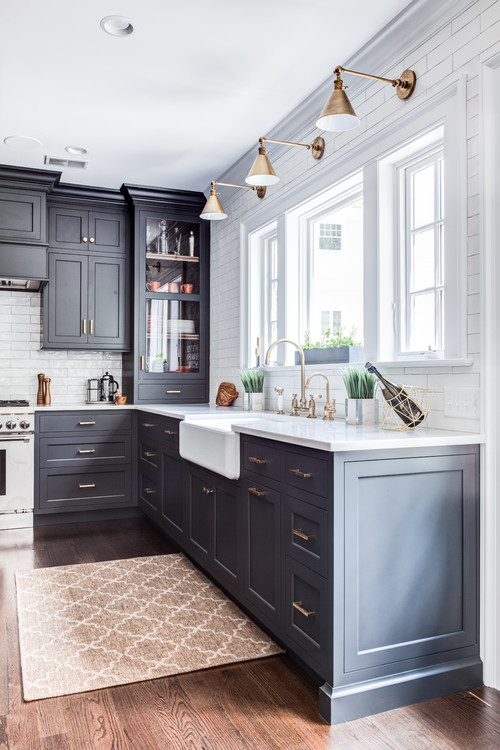
6. Extraordinary Color in the Kitchen
This open space living area from @gravelle_woodworking really made the most out of their Wrought Iron paint, using it as an accent wall color, trim color, cabinet color, AND kitchen island color, surrounded by an otherwise all-white kitchen.
Impressive! The paint color reads as a creamy dark gray with slight blue undertones in this brightly lit space.
7. Wrought Iron Cabinets
Here’s another winning use of Wrought Iron as a kitchen cabinet and island color from RailiCA Design. I love how the paint color contrasts with the white and is accented by wood ceiling beams and brass hardware.
You can certainly detect some navy undertones showing through, and I think it looks quite beautiful in this space.

8. Cabinets Painted Wrought Iron
Using Wrought Iron as a matte color on flat cabinets such as shared by Paper Moon Painting has a very sleek and modern effect. There may be the slightest hint of inky purple undertones showing through in this lighting, adding some color interest beyond basic black.

9. My Favorite Benjamin Moore Colors
An elegant spin on Wrought Iron cabinets, this stately and polished kitchen from Stonington Cabinetry shines proudly with gorgeous antique brass sconces and cabinet hardware.
10. Wrought Iron Kitchen Island
You really can’t go wrong with a kitchen island that pops, especially when the perimeter cabinets are bright white. Wrought Iron paint adds some depth against the light colors of the rest of this kitchen from The Creativity Exchange.

11. BM Wrought Iron Cabinets
I may just be in love with this black and white kitchen with butcher block countertops by Wit & Delight! All the black accents are tied together with a wall of Wrought Iron cabinets. C’est chic! (Photos by Wing Ho for Domino of Kate Arends home).

12. Wrought Iron on Beautiful Built-Ins
Dark, dramatic hues are such a great choice for stand-out pieces of furniture, moldings, etc. They immediately draw the eye to whatever you want to highlight in a space. That’s certainly the case in this kitchen on the gorgeous Amish cabinetry.
13. Beautiful Bar
Personally, I love a dark and dramatic bar…and if you don’t, I bet this design will make you change your mind! (Photo Credit: @tracywind_photography Design: @laurenvallario.designs Construction: @executivecraftsman)
Benjamin Moore Wrought Iron Exteriors
14. Great Porch & Patio Paint Color
There’s no shortage of fall vibes on this cozy front stoop belonging to @blessed_ranch, with steps painted in Wrought Iron! What a great use for this versatile paint color.
15. Uber Cool Cabin
Using Wrought Iron as an exterior siding color in a matte finish has a stunning effect on this cozy cabin shared by @premierpropertybuyers.
16. Mid-Century Modern Exterior
Dark colors work great on angled, mid-century homes. Here, Wrought Iron is used to accentuate the lines of the unique architecture (shared by @modernhive).
17. Popular Paint Color: Benjamin Moore Wrought Iron
Against the white siding of this farmhouse-inspired home, a Wrought Iron front door makes quite the statement on this home by M House Development. The matte finish looks especially elegant. (Photo credit: @stofferphotographyinteriors)

Laundry Cabinets in Wrought Iron
18. Laundry Room BM Wrought Iron
Wrought Iron makes a wonderful trim and cabinet color in this sleek, farmhouse-meets-modern laundry room from Dear Lillie. The cabinetry and trim both use Wrought Iron, while the walls are painted Ben Moore Simply White.

Bathrooms Painted BM Wrought Iron
Don’t forget the finish! For bathrooms the perfect sheen is either an eggshell or satin. Why? We’ll tell you in this post about paint sheen.
19. Wrought Iron Vanity
Wrought Iron as a bathroom vanity cabinet color? Yes, please! I love the simplicity of this soft black and white bathroom with sleek chrome finishes shared by @roserock918.
20. Brilliant in a Bathroom
This bathroom from Our Humble Abode is so moody and dreamy! With lots of natural light, Wrought Iron looks great as a matte wall color and contrasts dramatically with white wainscoting. The same color pairing is even reflected in the clawfoot tub.

21. Charcoal and White Bathroom Palette for the Win
Wrought Iron looks sophisticated coupled with white tile and the natural wood tones in this bathroom space. Here, it’s looking more black than gray, but that most certainly changes with varied light, as we’ve seen. (Photo credit: @christinahussey)
22. Great, Gray Shiplapped Bath
As opposed to the bathroom just above, check out how gray (but still LOVELY) Wrought Iron looks in this beautiful bathroom with its shiplapped walls and herringbone brick flooring accent.
Other Spaces Painted Wrought Iron
23. Dark Board & Batten
This sweet French country-inspired dining room from @railviewhome flips the script and uses Wrought Iron as a trim and wainscoting color. The peg detailing on the wall and built-in bench, also in Wrought Iron, adds to the room’s charm. Overall, I think this space looks quite fabulous!
Pssst…if you’re digging that board and batten look, check out this post with more board & batten inspo!
24. Wrought Iron Dining Room
This clean and minimal dining room from Sherry Hart gives off definite Scandi vibes. The dark upper walls are not too much when paired with so much bright white and light-colored wood in the decor.

Bedrooms Featuring Wrought Iron
In general for bedrooms, and low-traffic areas, flat paint is fine. If you like something with a bit of shine (and more ease of cleaning) opt for eggshell or satin.
25. No Darkening Shades Required
Yes, Jess (@thejessstyle)! Wrought Iron is the perfect color for a dark, dreamy accent wall in this bedroom, filled with white and neutral tones. Those cognac leather throw pillows add a punch of warm color.
26. Dark and Dreamy Ceiling
This Wrought Iron ceiling, coupled with Silver Satin walls looks like the perfect recipe for a restful nights’ sleep.
Isn’t Benjamin Moore Wrought Iron just a fabulously rich and versatile color? You’ve seen it used many different ways here with beautiful results. Where would you use it in your home?
And if this is a color you’re seriously considering, remember paint-sampling is better than ending up paint-sorry! I highly recommend these peel and stick samples because they are inexpensive, re-usable and re-positionable…
Pin this paint color for later! And if you use this paint shade, leave a comment on the pin! That helps others decide if they want to try this color, too!

Ready to show those boring, bland walls who’s the boss at home? This no-cost guide will help you sidestep mistakes that almost everyone makes when it comes to picking paint! You’ll be on your way to perfect paint promptly…pinky swear.


Leave a Reply