


Read all about Silver Satin by Benjamin Moore, plus see 20 real homes that use it!
Today we’re going to talk about Silver Satin by Benjamin Moore, (OC-26). I’m excited to dive into this one, because the name may not be immediately obvious as to what color it actually is.
Silver Satin Benjamin Moore a soft, grayish off-white, and is part of Benjamin Moore’s Off-White Color Collection. It plays the role of a white or neutral shade while having some warm grayness to it.
Because of this, it’s great for wall shades and lends a perfectly subtle amount of contrast against white trims. In some lighting, it can give off a beautiful, silvery iridescence.

Here’s a preview of this paint shade as seen in various rooms and spaces…

What color is Silver Satin Benjamin Moore (shade OC-26)?
Silver Satin Benjamin Moore is a grayish off-white that leans warm but has slight purple undertones. It is decidedly an off-white, neutral shade, but it has enough translucent gray to it to make it its own unique color.

Is Silver Satin Benjamin Moore warm or cool?
Silver Satin Benjamin Moore is a warm, gray off-white with some purple undertones to it. Because of this, it has a slight silvery iridescence in some lighting.
Silver Satin paint will appear warmer in south-facing rooms, and its grayness will show up in north-facing rooms.

Before we dig in, if you are the type of person who never feels completely confident in choosing paint colors, then grab a free copy of “5 Massive Paint Picking Mistakes” to help you avoid the pitfalls! Click here or enter your email below. I’ll send the tips right away!⤵️

LRV of BM Silver Satin Paint
First, here’s the “numerical” details, or the LRV:
SILVER SATIN LRV = 76.35
LRV = Light Reflectance Value: Rated 0-100 with 0 being pure black, and 100 being pure white. Lighter paint shades REFLECT more light from them and therefore have a HIGHER LRV, and vice versa for darker shades). Below, see Silver Satin (76.35) side by side with pure white (100):

LRV…what? Don’t worry, I’ve got you! This no-cost guide will help you avoid the paint color picking mistakes most people make! Click here or enter your email below. I’ll send the tips right away!⤵️
BM Silver Satin Paint Compared to Other Colors
The LRV range of off-white shades is generally between 73-82. Silver Satin Benjamin Moore sits right in the middle of this range at 76.35. Can you believe there are 152 off-white colors in the BM Off-White collection?
Here’s what Ben Moore has to say about it: “Inherently sophisticated and endlessly versatile, the Off-White collection offers subtle nuances of whites that suit tranquil, serene environments as well as creates color-enhancing accents for dynamic spaces.”
Because there are so many off-white shades to sift through, it’s helpful to compare Silver Satin against a few other similar shades from Benjamin Moore to fully understand how it might work in your space.

Classic Gray vs Silver Satin
Classic Gray is by Benjamin Moore also considered an off-white. All of the characteristics that Silver Satin has seem to be slightly more exaggerated with Classic Gray. With an LRV of 74.78, it’s slightly darker than Silver Satin.

It’s also slightly warmer and appears to have more complex undertones. While it does have a little bit of the purple that Silver Satin has, it can also sneak in some warm pink and cool blue undertones depending on the lighting.
To the naked eye, Classic Gray appears to be a warm gray, almost greige, but it still sits within the range that classifies it as an off-white.
Silver Satin vs Gray Owl
Since Gray Owl has an LRV of 65.77, we’re now venturing out of off-white territory and into gray. Gray Owl, also by Benjamin Moore, sits right in the middle of warm and cool but is decidedly cooler than Silver Satin with some green undertones to it.
Since Silver Satin has the slightest hint of gray and contrasts subtly with white, if you’re looking for a little bit more of that same body and interest, Gray Owl delivers.

Pale Oak vs Silver Satin
Let’s swing over into the world of beige with Benjamin Moore Pale Oak. It’s noticeably warmer than Silver Satin, and with an LRV of 69.89, no longer in the off-white range. It’s a warm and creamy beige with some gray undertones and is sometimes considered a greige. In some lighting, you can almost pick out a hint of green undertones.

Other Colors To Consider:
Not sure Silver Satin is your shining star? That’s ok! There are so many other beautiful paint shades to consider. Here’s a couple of other shades to check out:
Feeling lost? I gotcha, boo! Get a zero-cost copy of my new guide to avoid the paint color picking mistakes people make! Click here or enter your email below. I’ll send the tips right away!⤵️
Real Life Homes Using BM Silver Satin
Let’s take a look at how Silver Satin looks in some real homes! Remember, this is just to give you an idea of if you might like the color.
The best way to be sure of any shade is…drumroll…to sample it! (Did you see that coming?) My recommendation for samples is using these re-usable, re-positionable, peel and stick samples that won’t damage your walls, and you can easily move around your room to see what the paint looks like on each wall ⤵
Living Spaces Using Silver Satin Benjamin Moore
A quick note here: don’t forget to consider picking the right paint finish…it’s not only about getting the color right! We have an in-depth explanation of choosing sheens here.
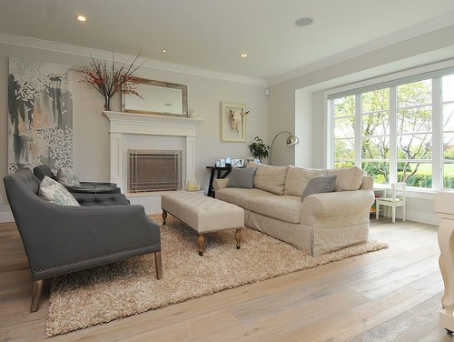
1. Silver Satin – A Super Sitting Room Shade
This sitting room shared by Kit’s Construction features a palette of gray and beige decor, showing that Silver Satin plays well with both of these shades. It also adds a nice touch of contrast against the white trim.
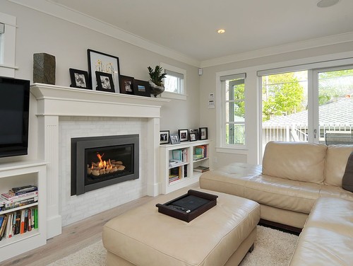
2. Light and Airy Living Room Paint Color
This space, also shared by Kit’s Construction, has lovely white trim and black accents to contrast with Silver Satin paint. The palette is neutral and calming.
It also surprisingly works quite well with a beige sectional couch.
3. Hint of Color
Silver Satin Benjamin Moore offers a tiny hint of color and feels light and airy room featured at The DIY Playbook. It’s the perfect neutral backdrop that complements virtually any decor style and lets your favorite decor pieces stand out.

Kitchens Using Silver Satin Benjamin Moore
For kitchens, eggshell or satin are popular finish choices for walls. For cabinets consider semi-gloss or high gloss for the most durable finish (and a gorgeous glow).
4. Silver Satin Kitchen Cabinets
This kitchen from Vanessa Francis Design proves that Silver Stain is the way to go if you’re looking for a little more depth and interest than just “white on white.”
The shade looks lovely on the kitchen cabinets and contrasts the white countertops and subway tile backsplash just ever so slightly. (Photography credit: Stephani Buchman)

5. Silver Satin as a Cabinetry Color
Here’s another stunning example, this one from Pure Wow, of Silver Satin paint on kitchen cabinets. It’s neutral enough to lay back and let the dramatic, marbled center island and gold hood range be the stars of the show. Photo credit: Daniel Wang; Design credit: Natalie Chianese.

6. Farmhouse-Friendly
I love this modern update on farmhouse-chic decor from Saw Nail and Paint! A fresh, clean color palette with silver accents keep this kitchen looking light and bright. The only wall surface in this space is the small sliver above the cabinets, and Silver Satin is the right color for the job.

7. Off-White Cabinet Color
A fresh coat of Silver Satin paint was all that was needed to brighten up the cabinets in this kitchen by 2 Cabinet Girls. Check out the before and after photos!

8. Keeping it Light and Bright
Another gorgeous space from Vanessa Francis. And in this sun-drenched spot, those cabinets appear white, but they are in fact our paint shade du-jour! I love the pairing of the light blue kitchen island and Silver Satin kitchen cabinets. (Photography credit: Stephani Buchman)

9. Marvelous Monochromatic Palette Paint Color
If farmhouse style is your vibe, don’t look now, you’re about to fall in love! In this kitchen, the walls and cabinets are both painted in Silver Satin, but the look is far from boring…it’s downright beautiful! Check out the shadows in this space to see how the color reads in the darker spots versus the lighter.
10. Painted Cabinets for the K.O.
Check out these knockout cabinets…scroll through to see the before and the after, and you won’t believe what a difference this paint color makes in this kitchen space. It’s impressive, to say the least, and makes what what felt like a tiny cave look much bigger, brighter, and all-around better!
Bathrooms Using Silver Satin Benjamin Moore
Don’t forget the finish! For bathrooms the perfect sheen is either an eggshell or satin. Why? We’ll tell you in this post about paint sheen.
11. Beautiful Bathroom Color
This bathroom from Studio Envie is absolutely beautiful! The combination of Silver Satin walls and Chantilly Lace trim plays perfectly with the light gray pattern of the mosaic floor tile.
The way the light streams in illuminates everything so softly, creating an absolutely serene spa vibe.

12. Soft, Neutral Backdrop
I love when homes have a subtly coastal feel without going overboard on the theme. In coastal decor, seafoam green or light turquoise touches are a must, like on this bathroom vanity in a space designed by Jamie Keskin.
Silver Satin makes for a softer, neutral backdrop as opposed to pure white.

13. Looking Light Gray
Benjamin Moore Silver Satin definitely looks gray in this cool-toned bathroom shared by Jen Libutti Home (site no longer operational). It complements the stoneware tiled look of the lower wall and contrasts with the white bathtub and vanity cabinets.

Bedrooms Using Silver Satin Benjamin Moore
In general for bedrooms, and low-traffic areas, flat paint is fine. If you like something with a bit of shine (and more ease of cleaning) opt for eggshell or satin.
14. Dreamy Off-White Bedroom Option
This might be my favorite look for BM Silver Satin: a soft, dreamy, creamy off-white, paired with white trim and white and off-white furniture. The black picture frames and gold bedside sconces serve as accent pieces that pop, in this lovely bedroom from The DIY Playbook.

15. Sleep Under the Silver Satin Stars
Here’s Silver Satin paired with a gorgeous ceiling accent color…Benjamin Moore Wrought Iron. I can imagine lying in this bed, you could feel like you’re sleeping under a dark sky.
See how well this shade pairs with grays AND beige neutrals in this room…and the palette comes together to create a restful look that’s not dull or boring.
16. Another Look At A Restful Silver Satin Space
Here’s another view of Neeta’s bedroom, seen above. Here you can see that darker ceiling and what a beautiful look it creates paired with the Silver Satin walls.
Personally, I’m always a fan of good ceiling design ideas. It’s always a better design when that fifth wall isn’t ignored!
17. Parisian Pretty
This lovely bedroom from Finding Beauty Mom (site no longer active so link has been removed) feels like a Parisian flat.
Silver Satin complements the high ceilings, making the space feel open and airy without the starkness of pure white. It contrasts with the white trim and works with the pale decor palette.

18. Whole Home Headliner
Designer Lori Nothwang of Last Stile Design used a combination of Silver Satin and Super White for the trim color throughout her entire home. And here’s a good example of the shade in the master bedroom.
It feels light and airy, but not totally white, and not completely devoid of depth. It’s definitely one of those shades (and they aren’t easy to find) that really could be used all over the house with a beautiful result.
Dining Rooms Using Silver Satin Benjamin Moore
19. Bringer of Brightness
Again, Benjamin Moore shows that Silver Satin wins at bringing a bright airiness to a space without being white-white. And again, it adds beautiful contrast to the darker board and batten, which here is painted in Benjamin Moore Collingwood. Great pairing, right?
It’s lovely how this dining room feels so fresh and open. And these shades together can complement virtually any neutral color palette containing beige, off-white, and wood shades.
More Spaces Using Silver Satin Benjamin Moore
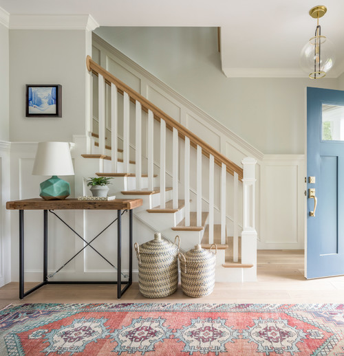
20. Happy Sight in Hallways
It’s helpful to note that in spaces like hallways without much direct natural light, Silver Satin tends to read more towards off-white with beige tendencies as opposed to a bright off-white. That’s very evident in this photo.
The shade really helps to break up the high wainscoting that surrounds this lovely staircase shared by Prime Coat Painting (website no longer operational, but they retain a presence on Pinterest), and provides just enough contrast to make the moldings pop without being visually jarring.

21. Silver Satin Color Inspiration
This lovely, lovely entryway from Jamie Keskin Design plays with colors in such a beautiful way. Silver Satin paint on the walls adds a nice contrast to the white trim, complements the wood accents, and is neutral enough to let the colorful accents pop.
Note that above the staircase, there’s almost a greenish undertone peeking through in the paint shade.
22. Family-Friendly Foyer Shade
Silver Satin is a smart choice for a foyer, and here’s some proof. This shade has enough saturation that lil fingerprints won’t immediately pop out like they may on a lighter shade, but it’s not so dark that it gives the feeling of walking into a cave. It’s an inviting, welcoming paint color for an entryway.
23. Empty Home, Excellent Paint
This example may show an empty home, but the walls still look lovely. And it really shows how Silver Satin adds some elegance, and a good amount of contrast against white trim throughout the home.
Whether you’ve always known that off-white is the way to go for your home, or have been convinced for the first time, Benjamin Moore Silver Satin is a great choice.
Did you enjoy seeing real-life homes using Silver Satin paint? Which room in your house would you use BM Silver Satin?
Seriously considering this shade? Make sure to sample first! I highly recommend these re-usable, re-positionable peel and stick samples👇
Pin this post for later! And if you decide to use this color, leave a comment (or better yet, a photo) on the pin! That helps others know whether they want to try this color, too!

Pssst…before you go, I sure would love to hang out with you again really soon! And before you’re on your way, make sure you grab your free copy of the 5 Biggest Mistakes People Make When Picking Paint, so you can avoid the heartache (and hole in your wallet) when your paint choices don’t quite work out! Click here, and I’ll send your free copy right now!


Leave a Reply