


Read all about Sherwin Williams Passive, plus see 21 real homes that use it!
Sherwin Williams Passive (#SW 7064) is a light gray with cool undertones. It’s a great shade for those looking for a crisp, clean look in any interior room.
In darker spaces, you can really see its true gray nature, but in rooms filled with lots of bright, natural light, it can look almost white. Specific lighting brings out icy blue undertones, and occasionally green or purple undertones might peek through.
While it is a bit of a chameleon, Passive will rarely appear too warm.
By this point, we can all agree that gray is a versatile color that works for many homes. It’s a neutral background but adds more interest and color than plain white. You can even pair two different shades of gray together for added dimension (we’ll see some examples later)!
The trick is to find the right shade of gray that will complement your decor and the unique lighting of your room.

What color is Passive?
This cool-toned light-medium gray isn’t cool enough to feel cold. Instead, it feels unobtrusive and chic on walls and offers a soft sophistication that few other shades can do.
In other words, it will not stand out as a bold color choice. Instead, it will add modern elegance while seemingly fading into the background.
So, is Passive the right shade of light gray for your bedroom, bathroom, kitchen, or living room? Let’s explore it together!

I’m not gonna lie – choosing the PERFECT paint color isn’t as easy as seeing what you like online and simply adding it to your space. There’s an entire science behind it! Grab a FREE copy of my new guide to avoid the paint color picking mistakes people make! Click here or enter your email below. I’ll send the tips right away!⤵️

FAQs about Sherwin Williams Passive
What other colors are similar to Passive?
Finding color equivalents is often tough to do well because paint colors have subtle nuances that can create highly perceptible shifts in undertones, depth, and temperature.
What may seem like barely noticeable differences on your computer screen (or a tiny paint swatch) can translate into significant (and often unpleasant) differences on your walls.
If you want something similar in the Benjamin Moore brand, check out Benjamin Moore’s Perspective for a relatively close match.
Ben Moore’s Stonington Gray could be another possible match, but it can lean a little more into its green undertones.
Is Sherwin Williams Passive warm or cool?
Thanks to its cool blue undertones, Passive is a cool-leaning light-medium gray. Although it doesn’t feel cold (in fact, it often reads neutral), it offers a touch of coolness that balances out warm lighting.
Where should I use Sherwin Williams Passive?
The sky’s the limit! Use Passive anywhere you desire because this beautiful soft gray is endlessly versatile. And because it’s such a great shade that’s not too light or too dark, it can work as a whole house anchor color for some homes!
Consider Passive for your:
• Entryway
• Staircase
• Hallway
• Laundry/mud room
• Living room
• Nursery
• Bathroom
• Bedroom
• Playroom
• Home office
• Kitchen
• Dining room
• Cabinets
Passive is a paint that will naturally create beautiful modern, traditional, transitional, and modern farmhouse-style homes.
And to move you quickly from paint zero to hero, I have a great, free resource for you. Grab a copy of 5 Massive Paint Mistakes to Avoid…because when all else fails, as long as you stay away from these 5 cardinal painting sins, you’re probably doing A-OK!
Sherwin Williams Passive Undertones
Passive is a mid-toned gray with mild blue undertones and a hint of purple and green. Often, this shade will appear neutral gray. However, this hue is easily influenced by lighting and surroundings. You’ll likely notice the blue undertone most often, but be aware that purple, green, and beige CAN show up.
Since grays like Passive can shimmy and shift a great deal, I have a special tool that I use (and highly recommend) to help you confidently choose or pass on paint colors.
Many homeowners dread picking paint because they worry they’ll pick the wrong color, but that’s not a problem with Samplize peel-and-stick paint swatches.
They’re worth every penny and then some! With these paint swatches, you won’t have any surprises after you commit to a shade and paint it all over your walls!
And you’ll LOVE how easy these swatches are to remove and reposition on a different wall without damaging your drywall or current paint.

How Different Types of Lighting Affect Sherwin Williams Passive
The moving sun changes natural lighting temperature and exposure, which is one of the major influences on how paint appears.
Pro Tip: Don’t expect ANY paint color to appear the same at two different times of the day or on other walls because it is just not possible.
Here’s how you can expect Passive to act in your home based on various types of natural lighting.
- North-facing light – cool, blue-tinted northern light will cause Passive to appear darker, grayer, and often bluer. Stormy would be a good adjective for Passive in this lighting.
- South-facing light – consistently warm, yellow-tinged southern light will lighten this shade and make it look chic and unobtrusive.
- East-facing light – eastern light has warm yellow tones in the morning and appears cooler and shadowier in the afternoon. The significant shifts will cause Passive to shift. Expect it to read light and more beige in the morning. The evening will bring a grayer and cooler appearance.
- West-facing light – cool, shadowy light in the morning shifts to ultra-warm light later in the day, bringing out shifting undertones in Passive. It will appear cool and gray (maybe with a hint of blue) in the mornings and more neutral (or perhaps a hint of purple) in the evenings.
When to Avoid SW Passive
In many spaces, Passive looks like a true gray. Since it’s on the cooler side, there may be better shades for a room with very cool, shadowy lighting.
Also, take care in a room with a lot of warm tones. In the right lighting, Passive will read neutral and play well with some warm tones. In cool lighting, the opposite can be true.

Great Coordinating Colors for Passive
Grays can either play nice or be a little picky, and it all depends on their undertones. SW Passive tends to play well with a large variety of shades. Check out Passive with crisp whites, creamy whites, greens, pinks, pale glues, navy blues, dark grays, and black.
If you’re searching for some inspiration and specific hues, try pairing Sherwin Williams Passive with:
- Pure White
- Shell White
- Nebulous White
- Green Onyx
- Grizzle Gray
- Iron Ore
- Snowbound
- Whirlpool
- Palladian Blue
- Practical Beige
- Sea Salt
- Trade Winds
- Tricorn Black
- Cityscape
- Classic Gray
- Hale Navy
- High Reflective White
Want the cliff notes for choosing the perfect color every time? Grab a FREE copy of my guide to help you avoid the paint color picking mistakes most people make!
LRV of Sherwin Williams Passive (SW 7064)
First, here are the “numerical” details about this shade.
LRV = Light Reflectance Value: Rated 0-100, with 0 being pure black, and 100 being pure white. The lower the number, the more light the paint absorbs, and the darker it will look. The higher the number, the lighter the shade will appear.
The LRV of Sherwin Williams Passive = 60
With an LRV of 60, Passive is about as dark a neutral as I would personally go. It’s still considered a light gray but with plenty of body.
Below, you can see Passive (60) compared to pure white (100).

LRV…what? Don’t worry, I’ve got you! This no-cost guide will help you avoid the paint color picking mistakes most people make! Click here or enter your email below. I’ll send the tips right away!⤵️
Passive Compared to Other Colors
Now it’s time to get down to the nitty-gritty. Gray is a timeless neutral, sure to stand the test of time in almost any home. The tricky part is finding the perfect light gray for your home.
At first glance, Sherwin Williams’ Passive looks like a versatile, true gray. However, to really understand its color profile and undertones, we must compare it to other shades.
Let’s take a closer look at Passive.
Sherwin Williams Passive vs. Repose Gray
Passive and Repose Gray are very close in LRV: Passive is 60, and Repose Gray is 58. This makes the pair great for comparison since they reflect about the same amount of light and appear to be about the same weight on the walls.
The difference lies in their undertones. Repose Gray leans toward greige (a blend of gray and beige) compared to Passive’s cool light gray. As a result, Repose Gray is warmer than Passive and has taupe undertones.
If you have any warm white or off-white furnishings in your home, remember that these shades tend to bring out Passive’s cool blue undertones. If this is not your thing, you may consider Repose Gray as a warmer fit that’s still super close on the LRV scale.

Sherwin Williams Passive vs. Light French Gray
Passive and Light French Gray look pretty similar. Light French Gray is just a hair warmer, thanks to its purple undertones. At 53, it’s a few points darker on the LRV scale, but depending on the light in your space and your personal preference, that might work for you.
While both of these shades can brighten up considerably in rooms with a lot of natural light, Passive can sometimes read closer to off-white.
Light French Gray has enough body to retain quite a bit of that gray hue, making it a better shade for exteriors because it won’t wash out.

Sherwin Williams Passive vs. SW On the Rocks
Passive and On the Rocks are closer in LRV than Passive and French Gray but differ from each other in a similar way. On the Rocks has an LRV of 62, but to the naked eye, it only appears slightly lighter than Passive.
The difference is that it’s just a tiny bit warmer with some taupe undertones. It’s still on the cooler side of greige but doesn’t have the iciness that Passive can show in some lighting.

More Colors to Consider
Not quite ready to give Passive the “green light” yet? Check out these other lovely paint shades.
- Gray Owl (Sherwin Williams ) – a light-toned, cool-leaning gray with mild blue-green undertones.
- Big Chill (Sherwin Williams) – a cool, blue-toned, light-medium gray.
- Worldly Gray (Sherwin Williams ) – a chameleon greige with green undertones.
- Silver Drop (Behr) – a pale and flexible greige.
- Mindful Gray (Sherwin Williams ) – a warm greige that leans taupe.
- Lazy Gray (Sherwin Williams) – mid-toned gray with beautiful blue undertones.
- Silver Satin (Sherwin Williams) – a warm off-white with a touch of gray.
- Shoreline (Sherwin Williams ) – a light tone gray-leaning greige.
- Alpaca (Sherwin Williams ) – a cool, taupe-leaning gray or greige.
Feeling lost? I gotcha, boo! Get a zero-cost copy of my new guide to avoid the paint color picking mistakes people make! Click here or enter your email below. I’ll send the tips right away!⤵️
21 Real Life Homes Using Sherwin Williams Passive
Now for the fun part. The only way to really get a feel for the way Passive looks in a home is to see it in action!
You already know that any paint color can transform dramatically from room to room and at different times of day as the lighting changes. This is especially true for gray paints!
While you’ll definitely want to try out a swatch in the actual room you want to paint in your home, here are some real-life examples of Passive to inspire you.
The best way to be sure of any shade is…drumroll…to sample it! (Did you see that coming?) My recommendation for samples is using these re-usable, re-positionable, peel and stick samples that won’t damage your walls, and you can easily move around your room to see what the paint looks like on each wall ⤵
Bathrooms that use Sherwin Williams Passive
Passive is a great light gray shade for bathrooms because it’s crisp, clean, and super versatile. It fits right in with modern, farmhouse, and classic decor styles.
Another factor that makes it perfect for bathrooms is that it complements pure white shades in your vanity and trim.
Let’s take a look at some gorgeous bathrooms painted in Sherwin Williams Passive!
1. Light Hue in a Space with Much Light
Here’s a great example by @astoldbyjennyann of how SW Passive can look like a very light (almost white) neutral; in bright lighting.
The result is fresh and clean and creates a perfect backdrop for these stunning, natural wood shelves.
2. Cool Gray Paint Color
This bathroom from @shawniasellssunshine creatively plays with different white and gray shades, as well as varied textures.
Passive ended up being a sound choice for the half wall. It’s neutral enough to let the backsplash tile detail and chalk-painted gray vanity be the stars of the show.
3. Hints of Purple Undertones
@reneetrentkraft‘s bathroom proves that even neutrals can be beautiful! Here, you get a feel for how Passive looks in artificial lighting – it brings out the slightest purple undertones.
The black-and-white framed art adds a sleek urban feel to the space.
4. Wonderful Choice for Vanity
Laura Beverlin made an inspired choice here for a clean, fresh, modern look in this small bathroom. I can’t quite tell in the photo, but the interior door would also look amazing in Passive (if it isn’t painted that color already!).

5. Popular Gray Paint Color
Against a pure white trim, Passive looks like a true light gray. The variations of light in @hydrangeas_on_ladonia‘s bathroom show off the beautiful versatility of its shading.
6. A Bit More Punchy Than Pure White
Similar to @astoldbyjennyann’s bathroom above, Passive takes on a very light, almost white, neutral role in this stunning master bath from Flourish Interiors. The result is clean and sophisticated but with a little more interest than pure white.

Living Rooms that use Sherwin Williams Passive
You’re sure to swoon over these beautiful living spaces using Passive on the walls!
A quick note here: don’t forget to consider picking the right paint finish…it’s not only about getting the color right! We have an in-depth explanation of choosing sheens here.
7. Cool Gray Paint Color for a Soothing Living Space
Wow, check out the amazing lighting in this gorgeous living space from Erica at Designing Vibes!
Again, in this bright lighting, Passive looks almost white but adds just the right amount of dimension against the white trim and built-in shelving.

8. Cozy Looking Gray Color for a Living Room
This room from Alair Homes Decatur via Houzz has great natural light. In fact, it’s just the right amount and temperature to let Passive shine without being washed out.
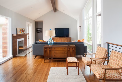
Photo by Alair Homes Decatur – Browse living room photos
9. Cool Color to Balance Warmth
I’m totally digging the fun nautical theme in this comfy living space from DIY Playbook.
In this room, Passive emulates the crisp coolness of a gray morning sky at sea. It also helps tone down the warmth of the wood floors.

10. Marvelous in Modern Spaces
This modern, minimalistic vibe is so chic! In this room from @liminalcollective, Passive takes on an icy cool color with blue undertones.
Notice how the color deepens in the corner and subtly morphs with the light, creating an ombre effect over the slanted wall.
11. Warmed Up Fireplace Brick
If you’ve ever wondered if a light shade can make a good accent color, let this fireplace from Less Than Perfect Life of Bliss be your resounding YES! It adds just the right amount of visual interest in this small room.

Gorgeous Kitchens using Sherwin Williams Passive
These kitchens using Passive as a wall color are particularly interesting. Many of them have pure white cabinetry that takes up a lot of wall space, leaving Passive as an accent color. Check out the way the following kitchens creatively used this shade!
For kitchens, eggshell or satin are popular finish choices for walls. For cabinets consider semi-gloss or high gloss for the most durable finish (and a gorgeous glow).
12. Works Well with White Cabinetry
Ideally, a kitchen looks light and bright with lots of space. Unfortunately, some kitchens like this one from @myfarmhouselakehouse need some help to achieve that look. Passive works wonders on the walls to open it up and avoid weighing the room down.
13. Awesome Pairing for Bold Accent Colors
Need a nice middle-ground shade to bridge the gap between white and a bold color? Gordon Dunning LLC via Houzz used Passive on the walls here, and I couldn’t love it more!
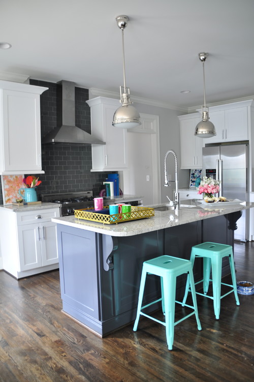
Photo by GordonDunning, LLC – Look for kitchen design inspiration
14. Fresh Look for a Kitchen Remodel
How amazing is this modern kitchen from Restoration & Development Contractors? It’s not often you see two different shades of gray next to each other like this.
I happen to really like the way the warmer gray subway tile backsplash looks next to Passive’s cooler shade on the wall. It really helps to jazz up the classic white cabinets.

15. Paired with Darker Gray
Another gray-on-gray combo for the win! This Sherwin Williams-painted kitchen from @heeringhaven features Passive on the walls and the darker Dovetail on the cabinets. What do you think of this pairing?
Dining Rooms Painted Passive Gray
16. Beautiful in a Bright Bedroom
This dining space in @the.eclectic.cottage may be my favorite look for Passive: bright lighting, white trim, and black-and-white art. It is soft, clean, crisp, and cool.
17. STUNNING and Perfectly Pigmented
When you want a subtle touch of comfortable elegance (you know, elegance that doesn’t feel stuffy), consider Passive. I love this gorgeous dining room from @emilywoodsathome!
Bedrooms that use Sherwin Williams Passive
Gray is a wonderful choice for bedrooms thanks to its calming nature. Take a look at these serene bedrooms using Sherwin Williams Passive.
In general for bedrooms, and low-traffic areas, flat paint is fine. If you like something with a bit of shine (and more ease of cleaning) opt for eggshell or satin.
18. Balancing Between Cool & Warm
You may not realize it at first glance, but Passive is working HARD in this bedroom from @livingonlee to balance warm and cool tones as well as light and dark shades. The result: a stunner of a bedroom. #win
19. Gender-Neutral Nursery
Passive is a perfect choice for a gender-neutral nursery, like this one shared at The Artisan Project. Its light gray shade creates a calming environment for a sleeping baby.

20. Rich Gray Bedroom
It’s really amazing how pigmented Passive can look in certain rooms! In this bedroom from the Flashner Fitzgerald Design Group on Instagram, this gray shade looks rich and beautiful.
21. Can Make for a Moody Bedroom Palette
This color-blocking concept is so cool! Passive fits right in the middle between the striking black accent wall and white trim.
The darker paint color here? SW Peppercorn.
And that’s a wrap! I hope you enjoyed exploring Sherwin Williams Passive with me and seeing real examples of it in over 20 beautiful homes. Do you think Passive can be the right shade for your next paint project?
Remember that photos on a computer screen are in no way a substitute for seeing an actual sample on your own wall, but I think it can be conducive to at least rule colors “in” to buy samples for or “out” to just scratch completely.
Seriously considering this shade? Make sure to sample first! I highly recommend these re-usable, re-positionable peel and stick samples👇
Pin this paint color for later! And if you use this paint shade, leave a comment on the pin! That helps others decide if they want to try this color, too!

Pssst…before you go, I sure would love to hang out with you again really soon! And before you’re on your way, make sure you grab your free copy of the 5 Biggest Mistakes People Make When Picking Paint, so you can avoid the heartache (and hole in your wallet) when your paint choices don’t quite work out! Click here, and I’ll send your free copy right now!


Bradi says
What color (SW) would you paint your pool deck with house exterior being Passive?