


Read all about Benjamin Moore Hale Navy, plus see 25 real homes that use it!
In this paint color series, I’ve covered many different shades of white, off-white, beige, greige, and gray. That’s because they’re some of the most popular and versatile paint colors.
But I have a special place in my heart for blues. Maybe that’s because studies have shown that the color blue is calming, relaxing, and reduces stress levels. That’s certainly the case for me if you caught our blue bedroom makeover! 😉
And although blue is a lovely color, when it comes to paint even blue can quickly transition from beautiful, calming, and serene to downright offensive, if the wrong shade is chosen.
That’s why I love Benjamin Moore Hale Navy (HC-154).
Hale Navy is like a favorite pair of jeans. It goes with almost ANYTHING. It’s a true blue navy hue that leans gray, making it more of a neutral.
If Hale Navy were a person, it would be a naval commander…or even presidential. It has a gravitas about it that’s alluring and even inspiring while still being approachable and well-regarded by almost all who know it.
Once you see this color in action, I’m pretty sure you’ll be joining the Hale Navy fan club, too! Are you ready? It’s time to check out BM Hale Navy.

What color is Benjamin Moore Hale Navy? Is HC-154 blue or gray?
Hale Navy is most definitely a blue. That said, if you line up a bunch of navy blue shades of paint, Hale Navy will look more comfortable toward the charcoal gray end of the spectrum than it will toward the royal blue side of the scale.
That’s what makes this color so widely appealing as a paint. People love neutrals, and this paint shade is the best of both worlds: instead of more traditional white, beige, or gray neutral paint colors, hale navy is an actual color color. But its gray streak keeps it from looking too bright, bold, or rainbow-y on the wall.
Where should I use BM Hale Navy?
Try using this hue anywhere! It looks incredible in:
Bedrooms
Bathrooms
Living rooms
Family rooms
Nurseries
Laundry rooms
Kitchens
And exteriors, too!
Is Hale Navy warm or cool?
Hale Navy is a cool paint shade, but it’s very inviting rather than cold and off-putting. It’s a calming, tranquil shade that has appeal when used in a multitude of ways.
What is the Sherwin Williams equivalent to Ben Moore Hale Navy?
Currently, there isn’t a Sherwin Williams paint shade that is super close to Hale Navy. But Dunn Edwards Deepest Sea and Behr Midnight Blue are close. Also similar? Benjamin Moore’s own Mysterious and Blue Note are two to take a look at.
Can Sherwin Williams color match Hale Navy?
All paint retailers color match shades from other paint companies. So Sherwin Williams will happily color match Hale Navy for you. And the converse is also true should you find a Sherwin Williams shade you love, but only have a Ben Moore store nearby.
The caveat here is that sometimes, color matching doesn’t go quite as planned. I’ve heard horror stories of color matching gone wrong. Personally, I’ve had many, many shades color-matched over the years, and never had an issue. But it’s not out of the realm of possibility that paint problems could arise.
Never try to color match something that is already on your walls. It will almost never work. The best time to color match is when you’re starting fresh on a completely new painting project.
ALL paint colors have undertones. There’s no escaping them! So, as a homeowner and decorator, what you need to do is to work WITH them. And the only way to do that is to be aware of what they are.
Blue shades can have gray, green, or purple undertones, which can affect the way colors appear in different types of lighting.
Hale Navy has gray undertones, giving this shade an almost universally-pleasing vibe that is versatile and easy to get along with.
If it were a high school student, it would be voted “most popular”. Indeed, it’s so likable that it could almost be annoying if it weren’t so just so irritatingly awesome.

Here’s a basic guide to how different lighting situations will impact how this color reads.
- North-facing light – northern light is the coolest light which will pull out those cool blue-gray undertones and make the color look darker (but never black).
- South-facing light – this warm lighting will balance out the coolness of the color and help it read as “true” as possible.
- East-facing light – warm, yellow eastern light will make this color look a smidge warmer (but still blue) in the morning light and darker, cooler in the afternoon.
- West-facing light – western light is rich orangey red which will make Hale Navy look a bit lighter, but it will still retain the overall blue tone.
NOTE: Paint colors hardly ever look the same on a device screen as they do on walls in different lighting situations. If you want to know what a paint shade will REALLY look like, use paint samples, to check out how a paint color behaves in your home with your lighting and decor.
As far as sampling goes, I highly recommend these non-messy, re-usable, re-positionable peel and stick paint samples ⤵
If undertones make your head ache, you’re not alone! Grab your no-cost copy of “5 Biggest Paint Choice Mistakes” Click here or enter your email below. I’ll send the tips right away!⤵️

This hue coordinates well with many colors, from white to deep hues. Try pairing it with some of these shades to create the perfect paint palette:
Ok, time to get a bit technical. Paint can be a chameleon because it changes the way it looks based on the influences of lighting and nearby decor. So how it looks can end up being pretty subjective depending on all kinds of factors. That’s why it’s important to look at some more objective data…i.e. numbers.
Light Reflectance Value (LRV) is a number ranging between 0 and 100 (0=pure black while 100 is pure white). Every color has an assigned LRV number that indicates how much light it reflects. Darker shades have lower LRV numbers (because they reflect less light), while lighter shades have higher LRV numbers (because they reflect more light).
The LRV of BM Hale Navy = 6.3
This low LRV puts Hale Navy squarely in the dark paint color category.

LRV…what? Don’t worry, I’ve got you! This no-cost guide will help you avoid the paint color picking mistakes most people make! Click here or enter your email below. I’ll send the tips right away!⤵️
Here’s how Benjamin Moore Hale Navy stacks up against several popular, and several very similar navy paint colors.
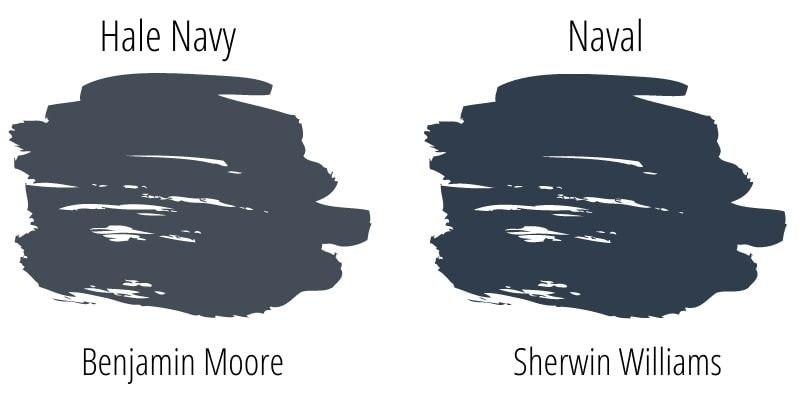
Sherwin Williams Naval (SW 6244) is often compared with Hale Navy, but it’s not because these two look super similar. They are, however, both exceedingly popular colors.
While Hale Navy leans toward gray, Naval is all blue, all the time. There’s not much nuance to Naval. It’s an in-your-face true navy blue. It’s also just a hair darker than Hale Navy, with a lower LRV of 4.
Another popular navy blue from Sherwin Williams is Indigo Batik, though it somewhat straddles the navy blue – regular-old-blue line. Indigo Batik is a bit lighter/brighter than Hale Navy, having an LRV of 8.

I’m personally a big fan of Indigo Batik. We’ve used it in several of our own rooms here, including my youngest son’s bedroom, where we applied it using a classic denim faux paint technique. This makes it look like grasscloth wallpaper instead of plain, old paint.

Dunn Edwards Deepest Sea is overall very similar to Hale Navy. Their LRV’s are almost identical, with Deepest Sea coming in at 7, versus Hale Navy’s 6.3. The biggest difference is that Deepest Sea takes Hale Navy’s gray tones just a half step further.

In it’s own collection, Benjamin Moore has two shades that are very comparable to Hale Navy. The first being Mysterious AF-565, with a nearly identical LRV of 6.81. On the walls, Mysterious can lean a teensy bit purplish with its undertones, while Hale Navy never seems to go that route.

With an LRV of 7.14, BM Blue Note is just barely a touch lighter than Hale Navy. It looks QUITE similar to Hale Navy, but with just a hint of green undertones in the right lighting conditions.

Midnight Blue from Behr (N480-7) has an LRV of 9, so a smidge lighter/brighter than Hale Navy. On the walls, in the examples I’ve seen (since I have never personally used this color) this color looks VERY similar to our shade du jour.
If I had to say something about the difference between the two, I’d say that Midnight Blue appears to lean more to a true blue, and less to the gray side than Hale Navy does.

More Colors to Consider
If you aren’t quite feeling the pull to push the go button on Hale Navy yet, check out these other bold, deep shades that may give you butterflies…
- Iron Ore (Sherwin Williams)
- Krypton (Sherwin Williams)
- Wrought Iron (Benjamin Moore)
- Tricorn Black (Sherwin Williams)
- Kendall Charcoal (Benjamin Moore)
- Pewter Green (Sherwin Williams)
- Aegean Teal (Benjamin Moore)
- Peppercorn (Sherwin Williams)
- Urbane Bronze (Sherwin Williams)
- 13 Perfect Blue-Gray Paint Colors
Feeling lost? I gotcha, boo! Get a zero-cost copy of my new guide to avoid the paint color picking mistakes people make! Click here or enter your email below. I’ll send the tips right away!⤵️
Ok, we are done with all the techy info and ready to jump in to see how this color behaves in real life! Let’s see how Hale Navy ebbs and flows in real homes with different lighting and decor styles. Here are real-life homes using BM Hale Navy paint!
Sheen note: Picking the right color is only winning the battle, not the war. Remember to pick the right paint finish, or sheen, also! Read up on what you need to know about picking the perfect paint sheen.
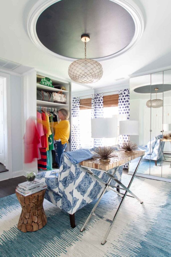
1. What a Feeling – Hale Navy on Our Ceiling
We’ll start in my own home! Here you can see Hale Navy used on our dressing room ceiling as an accent color drawing the eye up, and making the space look a little taller and grander than it otherwise would! A great (and inexpensive) interior design trick!
Want to know how to install your own ceiling ring like that one? Check out this tutorial. Wall color in this space is Blue Opal by Behr.
For kitchens, eggshell or satin are popular finish choices for walls. For cabinets consider semi-gloss or high gloss for the most durable finish (and a gorgeous glow).
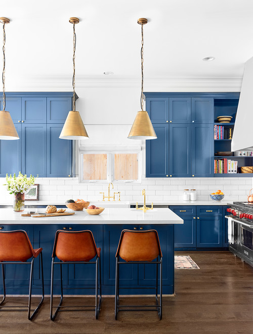
2. Hale Navy Cabinetry
Gutsy kitchens make me smile. And this one is fabulous because it’s a little bit gutsy, but also quite classic thanks to Hale Navy as a cabinetry color choice.
Definitely blue, but the gray undertones keep the tone more traditional. And take notice of how beautiful it looks with brass! Trish Ireland Interiors (via Houzz)
3. Hale Navy Kitchen Cabinets
I’ve read many accounts of people warning that color-matching Hale Navy can go wrong, so think twice before trying it.
That said, it seemed to turn out pretty well in this kitchen with both upper and lower cabinets in BM Hale Navy. – Kountry Kraft via Houzz
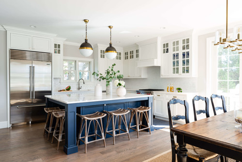
4. Hale Navy Island
If you’re a little gun shy to paint all your cabinets in a dark hue, then choosing a navy island can be a great option, like this stunning example from Topnotch Design Studio via Houzz.
In general for bedrooms, and low-traffic areas, flat paint is fine. If you like something with a bit of shine (and more ease of cleaning) opt for eggshell or satin.
5. Girl’s Room in Benjamin Moore Hale Navy
Here’s Hale Navy in a bedroom. Blue is always a popular choice for bedrooms because of its calming, soothing nature.
You can see in this example how dark this shade can appear in shadows, and how the overall tone of Hale Navy is a cool blue. This image is originally from a blog called the Nesting Game that I do not believe is currently active.

6. Nice for Nautical
Lehman Lane uses Hale Navy in her son’s room, and this is another example of a color-matched version (meaning she had the paint mixed at a store other than Ben Moore, so the paint is actually a different brand). In this space, the paint looks a smidge more gray than it did in the example above.

7. Hale Navy Ceiling
Bower Power chose to use Hale Navy to highlight their beautiful coffered ceiling. The walls in this room are Metropolitan (Ben Moore).

8. Navy Accent Wall
Hale navy makes an awesome accent wall, as seen in this stunning, neutral (but not boring) bedroom.
Other things to love in here? Those beams! If you decide you need more beam inspiration or other painted accent wall ideas, we’ve got you covered!
9. Navy Nursery
Blue isn’t just for boys! This space shows how gender-neutral navy can be! Like a good pair of jeans, blue is for everyone and looks lovely in this nursery as a perfect accent wall color choice.
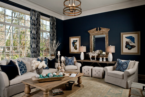
10. Living Room Accent Wall
Hale Navy can also be a great backdrop for other pops of color as you can see here in this example from Young House Love. The shade looks great with the crisp white mantle, marble fireplace surround, and the fun, pop art picture.

11. Blue and White Living Room
In this space from LGB Interiors (via Houzz), you can see the depth of Hale Navy.
Even with the natural light from the large windows in this space, Hale Navy reads dark blue and even darker in the shadows. But the tone stays true blue not purply or overly grayed-out.
12. True Blue Opulant Bar/Library
Isn’t this space from Cindy Witmer Designs a stunner?! This is one of those rooms you couldn’t walk in without your jaw dropping.
Hale Navy was a bold choice as an all-over color here, but it doesn’t flatten out the room or cause it to lose any appeal thanks to the depth from the moldings, ceiling beams, niches and nooks in this fancy but inviting space. (Photo credit: Kerry Kirk)

Don’t forget the finish! For bathrooms the perfect sheen is either an eggshell or satin. Why? We’ll tell you in this post about paint sheen.
13. BM Hale Navy and Subway Tile Bathroom
Hale Navy is used above the chair railing in this bathroom from Christina Maria Blog. Notice her choice of gray grout for the subway tiling…a color that works well with Hale Navy and its gray undertones.

14. Buffalo Check in Navy Blue
Personally, I’m a smitten kitten for this buffalo check paint treatment from Jaime Costiglio – the plaid is done with a combination of Hale Navy at full strength + the lighter blue which is Hale Navy mixed at 25%.

15. Hale Navy Vanity
Hale Navy looks great in bathrooms on cabinetry, too as shown here in a project from Studio McGee. As seen in several of the kitchen examples, Hale Navy works well with Carerra marble countertops.

16. Hale Navy Laundry
We just saw Hale Navy working well with walnut, but in this laundry room, it looks wonderful with all kinds of wood tones, including this light blonde example! Notice again how the shade works well with the penny tile and gray grout, and the gray flooring.
Love the butcher top countertops? Ditto! We have a whole post about the pros and cons of this type of counter if you want to check it out!
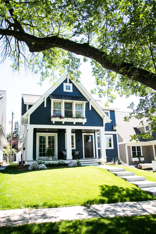
17. Modern Cape Cod
When you want to paint your home blue, but are scared of it looking like something that belongs in the Smurf Village, Hale Navy is a great solution, as you can see here in this beautiful exterior example from Bria Hammel Interiors via Houzz (Builder: Copper Creek, Architect: David Charlez Designs, Photographer: Laura Rae Photography)
18. Craftsman
Different style of home, same beautiful results! The trim on this craftsman home is BM Indian White.

19. Hale Navy Front Door
Does Hale Navy look good as a door color? Hale yes! Check out this beauty from Allison Merritt Designs (photographer Ryan Garvin).
Again, this shade always looks great with cool grays, as seen on the house siding/shingles in this shot (trim color: Chantilly Lace).

20. French Door in HC-154
And Hale Navy doesn’t only work on front doors, it works on back doors, too! Check out this lovely french door looking delightful in blue from Melanie Gowen Designs (photo credit: Michael Lewis)
21. HC-154 Colonial
Navy’s not just for cape cods! No! Check out how fabulous Hale Navy holds up on this traditional colonial exterior, too!
22. In case you were mistaken that blue and black don’t pair well…
Then check out this example that will have you re-thinking that notion entirely! Black doors are always en vogue. But that doesn’t mean blue can’t be an exterior option, too!
Other Spaces Painted in HC-154
23. Focus-Friendly Home Office
Blue isn’t only calming and soothing, it’s a great shade for focus. Which makes it not only a lovely choice for a home office but a smart one, too.
Check out this dreamy space from my friend Sarah at Life on Virginia Street. The warmth in the wall color (Simply White) looks fabulous with this shade of navy blue.

24. Benjamin Moore Hale Navy Dining Room
If you’d like to try using a dark shade of paint but aren’t sure which room to try it in, look to your dining room.
Dark and moody colors often look GREAT in formal dining rooms, like this one seen at House of Navy. A deep shade of paint can create a cozy, inviting ambiance, perfect for sparking interesting conversation around the dinner table.

25. Lovely in a Library
In this spectacular library/home office from Bria Hammel Interiors, Hale Navy is showing off its muted gray mood. This is what makes this color so appealing.
It can be such a perfect neutral, which really says something special for a blue paint (Photo credit: Spacecrafting; Builder: DeWitt Homes)
This Benjamin Moore paint is a stunning, rich dark blue with cool undertones and a gray leaning that makes it a fabulous neutral, as well as a navy. It’s a timeless classic, for sure.
So what do you think? Is it the perfect navy for your home and decor? I hope you’ve been able to see how amazing this color can look.
And if this is a color you’re seriously considering, remember paint-sampling is better than ending up paint-sorry! I highly recommend these peel and stick samples because they are inexpensive, re-usable and re-positionable…
Pin this paint color for later! And if you use this paint shade, leave a comment on the pin! That helps others decide if they want to try this color, too!

Ready to show those boring, bland walls who’s the boss at home? This no-cost guide will help you sidestep mistakes that almost everyone makes when it comes to picking paint! You’ll be on your way to perfect paint promptly…pinky swear.


Leave a Reply