


Read all about Benjamin Moore Revere Pewter, plus see 23 real homes that use it!
Revere Pewter, by Benjamin Moore (AKA HC-172), is one of the most textbook examples of what is commonly called “greige” paint. Wildly popular, it is a shade that is truly revered (pun intended).
Truth be told, Revere Pewter is a shade I personally struggle with a bit. Its popularity cannot be argued, but honestly, I think it’s a color that is also highly over-utilized.
That said, there are plenty of spaces where Revere Pewter looks absolutely perfect. Is your home one of them? Hopefully, our exploration of this specific paint color will get you a step closer to that answer.

Do you know how you hear a phrase and sometimes wonder how on Earth that came to being? Well, if you’ve ever shopped for gray paint, then you understand completely how “it’s a gray area” or “shades of gray” came about.
Shopping for grey paint (and greige, for that matter) is a challenge, to say the least! But it’s not an insurmountable or even unenjoyable task. We just have to follow a process.
About greige….have you heard the term “greige” before? “What exactly is greige?” you may have wondered.
Greige paint is any shade achieved by blending gray + beige.
Often thought of as the supreme neutral paint color, greige tones have become quite popular in recent years. They are warmer than true grays but cooler than the beige tones, which were so pervasive in the 80s and 90s (and now often thought of as passe).

FAQs about BM Revere Pewter
What color is Benjamin Moore Revere Pewter?
Revere Pewter by Benjamin Moore is a classic and lovely warm gray that leans greige and gives an earthy or natural vibe.
It’s a very popular and versatile shade that shifts quite a bit in different lighting situations.
Is Revere Pewter more gray or beige?
Revere Pewter sits in the greige category and straddles both gray and beige fairly equally. In rooms with cool or low natural light, it will appear gray (and maybe a touch green), while brighter rooms will draw out its neutral warmth.
Is Benjamin Moore Revere Pewter cool or warm?
Revere Pewter has green and beige undertones, which makes it lean toward the warm side of the spectrum. It’s not overly warm, though, so cool or low natural light can neutralize its warmth.
Where should I use BM Revere Pewter?
Consider this color for ANY room in your home, but proceed with caution! It’s a versatile shade that can look beautiful in your:
Living room
Kitchen
Dining room
Bedroom
Bathroom
Laundry room
Hallway
Entryway
Revere Pewter may work best with traditional, transitional, and industrial decorating styles. 
If undertones make your head ache, you’re not alone! Grab your no-cost copy of “5 Biggest Paint Choice Mistakes” Click here or enter your email below. I’ll send the tips right away!⤵️

Benjamin Moore Revere Pewter Undertones
Undertones are sometimes seen as a challenge to overcome when choosing paint colors. However, since they directly result from the paint-mixing process, there’s no way to avoid them.
Combat that “problem” by arming yourself with the knowledge necessary to make the process of choosing new paint colors easier and more efficient. If this helps you avoid randomly picking a color you end up hating, studying undertones will save you time!
Let’s take a look at BM Revere Pewter’s undertones. This hue lives in the gray color family, but it has strong beige undertones. As a result, it often looks greige but can appear gray in low or cool lighting.
But that’s not all! Revere Pewter also has some green undertones that will show up from time to time! You won’t ever look at this color and think you’ve painted your walls green, but the undertones are there.
And together, the beige and green undertones can even make Revere Pewter look taupe once in a while.
NOTE: NO paint colors will look the same at varying times of the day or in two different locations.
The best way to be sure of any shade is…drumroll…to sample it! (Did you see that coming?) My recommendation for samples is using these re-usable, re-positionable, peel and stick samples that won’t damage your walls, and you can easily move around your room to see what the paint looks like on each wall ⤵

How Different Types of Lighting Affect BM Revere Pewter
Different lighting situations can cause colors to vary wildly. Here’s a basic idea of how you can expect Revere Pewter to appear based on natural lighting so that you don’t love it in the morning and hate it in the afternoon!
- North-facing light – northern light is cool and blue-tinted, which will cool down the warmth. Revere Pewter will appear gray and could have a wink of green.
- South-facing light – warm light from the south will draw out its beige side.
- East-facing light – an east-facing room has warm yellow light in the morning and shadowy, passive light in the afternoon. Revere Pewter will lean into its beige or taupe side in the morning then shift towards gray later in the day.
- West-facing light – west-facing light is the opposite of eastern light since it’s passive and cool-leaning in the morning but very warm in the evening. Revere Pewter will likely appear gray in the morning and shift to greige, beige, or even taupe in the late afternoon.
Great Coordinating Colors for Revere Pewter
As a well-balanced, timeless greige, Revere Pewter looks incredible with bright colors like coral as well as soothing colors like teal and green.
This popular shade has remained a favorite thanks to its versatility. Here are some specific colors that look great with Benjamin Moore Revere Pewter:
- Decorator’s White
- Simply White
- Extra White
- Smoke
- Galveston Gray
- Shadow Gray
- Fog Mist
- Chelsea Gray
- Kendall Charcoal
- Buxton Blue
- Quiet Moments
- Stonington Gray
- Briarwood
- Mediterranean Sky
- Alaskan Huskey
- Hale Navy
- Wrought Iron
- Palladian Blue
- White Dove
LRV…what? Don’t worry, I’ve got you! This no-cost guide will help you avoid the paint color picking mistakes most people make! Click here or enter your email below. I’ll send the tips right away!⤵️

LRV of Benjamin Moore Revere Pewter (HC-172)
So let’s get into analyzing whether Revere Pewter is the right paint shade for your home. Step one? Let’s see what Benjamin Moore has to say…
LRV = Light Reflectance Value: Rated 0-100 with 0 being pure black and 100 being pure white. Lighter paint shades REFLECT more light from them and therefore have a HIGHER LRV, and vice versa for darker shades.
The LRV of BM Revere Pewter = 55.51

Revere Pewter is a medium greige color that provides just the right amount of saturation in many rooms.
Benjamin Moore provides this explanation of this popular shade on their website: “A light gray with warm undertones, this classic shade creates a unifying look that calms and restores. A great transitional color, it’s perfect for an open floor plan.”
My own feeling about Revere Pewter is that it’s a shade too many real estate agents learned the name of and never let go. They got turned onto this shade en masse and steered a lot of people the wrong way when they’d recommend it to sellers.
Don’t get me wrong. Painting your home a neutral color if you’re looking to sell is a good idea. But this particular neutral? While it has its place, that place is NOT on the walls in MOST homes.
Why? Because it’s dark. Deceptively dark. While it may not appear dark to you on the paint swatches here, when it’s placed in a room without a LOT of natural light, it can quickly make a pretty space feel rather cave-like.
Want more info? Check out this post I wrote for people looking to sell their homes. House already on the market? You may want to read this brutally honest post about 11 reasons your home may not have already sold.

Revere Pewter Compared to Other Colors
Comparing similar shades against each other is a reliable way to determine how undertones affect them. Here’s how Benjamin Moore Revere Pewter appears when we compare it against three other similar hues.
Benjamin Moore Revere Pewter vs. BM Edgecomb Gray
Boasting an LRV of 63.88, Edgecomb Gray is quite a bit lighter than Revere Pewter’s deeper saturation. Edgecomb Gray also appears more beige next to Revere Pewter’s deeper brown and green undertones.

Benjamin Moore Revere Pewter vs. Collingwood
Like Revere Pewter, Collingwood sits in the middle range on the LRV scale with a value of 62.
Although both shades are lovely greiges, Benjamin Moore classifies Collingwood as off-white and Revere Pewter as light warm gray. Revere Pewter is a bit darker with deeper brown undertones.

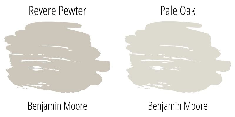
Benjamin Moore Revere Pewter vs. Pale Oak
Pale Oak has an LRV of 69.89, making it read significantly lighter than Revere Pewter does. Further, its pink, purple, and green undertones give it a little more depth, in my opinion, than Revere Pewter has.
More Colors to Consider
I know from experience how challenging choosing new paint colors can be! If you aren’t ready to jump on board with Revere Pewter yet, check out these other similar and popular shades:
- Drift Of Mist (Sherwin Williams) – a warm-leaning light beige
- Silver Satin (Benjamin Moore) – a gray-tinted off-white
- Shoreline (Benjamin Moore) – a light gray-leaning greige
- Silver Drop (Behr) – a pale gray with a hint of beige
- Calm (Benjamin Moore) – a balanced light greige
- On The Rocks (Benjamin Moore) – a mid-toned greige with a slight green undertone
- Worldly Gray (Sherwin Williams) – a mid-toned warm-leaning greige
- Snowbound (Benjamin Moore) – a slightly cool, yet very livable, white
- Gray Owl (Benjamin Moore) – one of Ben Moore’s most popular grays
- Accessible Beige (Sherwin Williams) – a popular beige that’s not too warm or dated
- Repose Gray (Sherwin Williams) – is a warm-leaning gray-greige paint color
- Moonshine (Benjamin Moore) – soft light gray that leans green
- Perfect Greige (Sherwin Williams) – a medium greige with warm undertones
Feeling lost? I gotcha, boo! Get a zero-cost copy of my new guide to avoid the paint color picking mistakes people make! Click here or enter your email below. I’ll send the tips right away!⤵️
Real Life Homes Using Revere Pewter
Now that we’ve taken a close-up look at the swatches and made some comparisons, let’s take a look at where the rubber meets the road. Or, in this case, where the paintbrush meets the wall.
We’ll check out how Revere Pewter looks in some real spaces under lots of different lighting situations and with lots of other “things” in the rooms (furnishings, countertops, etc.) that the paint can play off of.
Remember that photos on a computer screen are in no way a substitute for seeing real paint samples on your own wall, but I think it can be really helpful to at least rule colors “in” to buy samples for or “out” to just scratch completely.
If you decide you are strongly considering this shade, get a peel and stick sample here.
Revere Pewter Kitchens
1. Perfect Neutral Cabinet Paint
I love the neutral and layered look that Brett & Kara Phillips created in this incredible kitchen!
Painting the kitchen cabinets Revere Pewter gives the perfect backdrop for that beautiful backsplash and natural wood tone island to shine.
2. Timeless Classic Cabinet Color
While it’s true that Revere Pewter and I don’t always see eye to eye, sometimes it surprises me in the BEST of ways.
Like in this kitchen renovation seen on the Emtek blog. In this kitchen, this cabinet color is so rich…it’s like a delectable latte. Not too light, not too dark. It’s perfection.

3. Light and Airy
Here is another great example of how layering similar tones create a rich and balanced look! I love how the Revere Pewter lower cabinets look against the light walls in this beautiful kitchen from Saffron Avenue.
The contrast really brings out the greige tones and makes the cabinets pop!

4. Moody – Not Too Dramatic
I want to give you an example of a kitchen with its walls painted Benjamin Moore’s Revere Pewter instead of its cabinets.
You can see by this photo from Veronika’s Blushing that Revere Pewter can create a beautiful look, whether it’s on cabinetry or walls.

5. HC-172 Cabinets in Low Light
In this kitchen designed by Anna Lattimore, the roman shade is pulled down as that is the feature she is highlighting in this shot. But it gives us a great look at how the Revere Pewter cabinets may look in your own home with lower natural light.

Dining Rooms using BM Revere Pewter
6. Beautiful on Built-Ins
Steph of @HenrikJuneHome painted her stunning dining room DIY Billy bookcase hack Revere Pewter, and I’m a big fan.
It’s just enough contrast with the wall color (Benjamin Moore Simply White) to make the incredible storage stand-out, without being jarring.
7. Leaning Cool Next to Black and Blue
The walls look so crisp and clean in this beautiful dining room with the contrasting white trim around the room. This is another well-executed play with Revere Pewter and dark tones from Am Dolce Vita.

8. Welcoming Dining Room Color
It’s beginning to look a lot like…Revere Pewter in every room of the house! Oh wait, is that not how the tune goes?
Oh well, I like my version because this dining room from @cottagebythecreek_ is looking merry with Revere Pewter coating the walls, picking up the grey tones from the dining room set, and making the whole room twinkle (or is it just the Christmas lights?).
Revere Pewter Living Rooms
A quick note here: don’t forget to consider picking the right paint finish…it’s not only about getting the color right! We have an in-depth explanation of choosing sheens here.
9. A Favorite Cozy Gray Neutral
Hymns and Verses shows us how green Revere Pewter can look. It’s just the faintest hint of green that perfectly contrasts the curtains and other design elements in this room.

10. Bridge Between Brown and Gray
Wow! Check out that view…err, I mean paint color! It’s hard to get past the breathtaking windows but when you do, you are in for a treat!
A bigger living room, like this one shared by @rowehousedesign, with tall ceilings and lots of windows can definitely handle a moodier paint color like Revere Pewter.
And you can see the shade creates a nice bridge between the coolness of the stone fireplace and the warmth in the wood beams.
Revere Pewter Bedrooms
In general for bedrooms, and low-traffic areas, flat paint is fine. If you like something with a bit of shine (and more ease of cleaning) opt for eggshell or satin.
11. The Perfect Master Bedroom
Welcome to my new bedroom! Just kidding! It belongs to @athomewithheidirhome. I wish it were mine, though! This room is perfect, with Revere Pewter just adding to the glam and sophistication of the room!
12. Vintage and Chic, All at Once
Even though this is just a corner of a bedroom, it was too darling not to show. Plus, I really liked seeing Revere Pewter sharing a space with coastal blues.
This combination from Maison de Cinq is really stunning and adorable all at the same time.

Benjamin Moore Revere Pewter Bathrooms
Don’t forget the finish! For bathrooms the perfect sheen is either an eggshell or satin. Why? We’ll tell you in this post about paint sheen.
13. Pairs Great with Patterns
Check out these stenciled floors in this powder room from Young House Love using Revere Pewter. So creative!

14. Custom Mix on Board and Batten
Did you know that you can take any paint color, in this case Revere Pewter, and create a custom mixture from it? If you don’t love how dark it is, you can have it lightened, like Erin from @oliveandmax did here in this fabulous bathroom.
She had the paint lightened, so it’s only 60% of it’s usual formulaic strength. Personally, I often find Revere Pewter too dark for spaces it is used in, so I love this solution (and her beautiful board and batten accent wall)!
15. Awesome Accent Color
Ashlynn of @bragetdsign nails her bathroom color palette. Revere Pewter looking beautiful on the vertical shiplap.
It would likely be a bit much for the entire wall, so using it as an accent here was a great way to use the color without overdoing it. The accompanying white paint chosen for this space was Behr Ultra Pure White.
Revere Pewter in Entries and Hallways
16. Warm and Welcoming
I’ve never wanted to live in an entryway more than this one from Wilshire Collections. The white bench, throw cushions, cute decor, and wood tones all match perfectly to the Revere Pewter painted walls.

17. Buddied up with Board and Batten
DIY Playbook has made this hallway look sophisticated, but also cozy and inviting thanks to the paint palette. HC-172 definitely provides a great contrast with the bright trim color and white ceiling in this hall.
Love board and batten? We’ve got lots more inspiration here.

18. Perfect Accent Paint Shade
Lindsay’s entrance (@countrygirlhome) is warm and welcoming, using Chantilly Lace on the board and batten feature, and Revere Pewter on the wall above.
Using Revere Pewter as an accent instead of the entire wall will always be my favorite application of this color.
Revere Pewter Exteriors
19. Mid Century Before and After
I think I am actually dying over @ashleydelapp‘s house. The mid-century home with those colors is one of the best transformations I’ve seen in a while!
It’s a Revere Pewter masterpiece! And check out how much brighter this shade looks in a situation with so much light.
20. Unexpectedly Bright Exterior Paint
After seeing how dark this shade can be in certain interior situations, isn’t it a tad surprising to see how light and bright Revere Pewter can be as an exterior color? @houseofbluehues‘ shutters are Ben Moore Graystone.
If you scroll through the photos in her IG post, she shares one that has not been edited, which is really helpful for you to be able to see the true color of her siding in natural light.
21. All Over House Color
Jennifer of @makingprettyspaces made a HUGE impact on her home’s exterior with Revere Pewter paint. Make sure to swipe through to the before picture.
Other Homes Using Revere Pewter
22. A Refreshing Classic
Here’s a laundry room from Lavin Label sporting Revere Pewter on its cabinets. I think this is such a good way to bring color to a small space without overwhelming it!

23. Perfect in a Screen Porch
This sunroom, another one from @houseofbluehues, is stunning with Revere Pewter on its walls. It’s amazing how light this color can look with so many windows!
Final Thoughts
If you’re in the market for a timeless and classic greige paint color, consider Benjamin Moore Revere Pewter. True, I have personal reservations about this shade, but here you have seen it used over and over beautifully in many homes. So judge for yourself…it can be a lovely shade that certainly deserves a chance.
That brings us to the end of this color study! I hope that this has helped you decide whether or not this popular color is one that you’d like to try in your own home!
And if this is a color you’re seriously considering, remember paint-sampling is better than ending up paint-sorry! I highly recommend these peel and stick samples because they are inexpensive, re-usable and re-positionable…
Pin this BM Revere Pewter paint exploration post for later!

Ready to show those boring, bland walls who’s the boss at home? This no-cost guide will help you sidestep mistakes that almost everyone makes when it comes to picking paint! You’ll be on your way to perfect paint promptly…pinky swear.


Crystal Brown says
Interesting. Both Revere Pewter and Edgecomb Gray leave me Meh… I did like a couple of the rooms you showed, but neither of these colors, worked for me, in fact they both looked “dirty” on my walls. Love the paint series tho!!
Heather says
I’m with you, Crystal! Revere Pewter is a super popular shade, but personally, I don’t love it. It almost always reads too dark for my liking b/c 9 people out of 10 don’t have rooms that can be so drenched with light to make it read that light and beautiful color that it can be.