


Read all about Benjamin Moore Moonshine, plus see real homes that use it!
Benjamin Moore Moonshine is currently one of the most popular shades that Benjamin Moore has to offer. It’s numbered OC-56, meaning it is part of the Benjamin Moore off-white collection of paint colors.
No, Moonshine isn’t that stuff you brewed up in the back shed (well, it could be, but that’s not what I’m talking about today at least!). Instead, Moonshine is a very beautiful pale gray color that adds timeless sophistication to any room.
It’s the latest color that I’m shining the spotlight on in my paint color series. My goal is to offer a helpful tool that shares detailed information about the ins and outs and subtle nuances you need to be aware of for each shade we cover. I want to make the task of choosing your next paint color easier.

To really help you get a clearer picture of BM Moonshine, we’ll study a few of its defining characteristics, check out coordinating colors, and compare it to other similar colors. Then the real fun begins when we see it in real-life homes.
So, bust out the moonshine, and let’s get this party started! Just kidding – don’t do that, or you won’t be able to tell BM Moonshine from any other color. 😂
Here’s our in-depth color study of Benjamin Moore Moonshine so you can determine if it is a great fit for your home.

Moonshine in the Wild: Video Sneak Peek
FAQs about Moonshine
What color is Benjamin Moore Moonshine?
BM Moonshine is a soft light gray. It’s a beautiful neutral that will never look too dark, even in a room with little natural light.
Is Benjamin Moore Moonshine cool or warm?
By itself, gray is neutral. Whether a color is warm or cool is based on its undertones. Red, orange, or yellow undertones will lend warmth to a shade, while blue, green, and purple will lend coolness.
Moonshine has some subtle blue undertones, which make it lean cool.
Where should I use BM Moonshine?
Consider this shade for ANY room in your home! It’s a terrific choice for rooms where you have low levels of light or want to add timeless elegance. Use it for:
• Kitchens
• Cabinets
• Bedrooms
• Bathrooms
• Basements
• Living rooms
• Dining rooms
• Laundry rooms
• Hallways
This chic shade is endlessly versatile, which makes it perfect for any style of home and decor too!
If undertones make your head ache, you’re not alone! Grab your no-cost copy of “5 Biggest Paint Choice Mistakes” Click here or enter your email below. I’ll send the tips right away!⤵️

Benjamin Moore Moonshine Undertones
People often view undertones as a nuisance because they can cause paint colors to appear differently than you expected them to on the wall. However, since they’re caused by the paint-mixing process, there’s no avoiding them.
Instead of cursing and trying to avoid them, take the time to understand the undertones of your favorite paint shades. Arming yourself with knowledge will prevent you from choosing a color that you end up hating because you didn’t know about potential undertones!
Let’s study BM Moonshine’s undertones. This hue is part of the gray color family, but it has blue undertones. Moonshine will usually read as a true gray paint, but occasionally, you may notice a wink of blue peeks through.
Also, when yellow-tinted light is present, you may see the light play with the blue undertones to appear slightly green.
NOTE: NO paint colors will look the same at varying times of the day or in two different places. Use paint swatches (these peel and stick samples are the ones I’d highly recommend) on your wall to help you know EXACTLY how your lighting and nearby decor will impact the appearance of your favorite colors.

How Different Types of Lighting Affect BM Moonshine
Different lighting situations can cause paint colors to shift and shimmy in how they read – sometimes significantly!
So here’s a general guide to how you can expect Moonshine to appear based on types of natural lighting.
- North-facing light – northern light is cool and blue, which will enhance the blue undertones of Moonshine. They aren’t so strong that the color will appear to be true blue, but they are there.
- South-facing light – warm light from the south is yellow light which will warm up the shade and cause it to appear grayer and less blue.
- East-facing light – an east-facing room has warm yellow light in the morning and cool, passive light in the afternoon. That shifting light will cause Moonshine to lean into its gray side in the morning but shift to it’s cooler blue side later in the day.
- West-facing light – west-facing light is the opposite of east-facing light since it’s cool and passive in the morning but very warm in the evening. Moonshine will likely read gray-blue in the morning and shift to neutral gray in the afternoon.
LRV of Benjamin Moore Moonshine (2140-60)
Looking at paint involves many subjective interpretations based on how shades change due to nearby influences. Let’s briefly go over a more objective method for evaluating paint colors.
Light Reflectance Value (LRV) is a number on a scale between 0 and 100 that each color has assigned to it based on how much light it REFLECTS. A lower number means the color reflects less light, while a higher number means it reflects more light.
The LRV of BM Moonshine = 68.28
Moonshine is a medium-light color. It’s light enough that it will prevent a small room from feeling dark and closed in. And it’s got enough saturation that it won’t completely wash out in a bright room.

LRV…what? Don’t worry, I’ve got you! This no-cost guide will help you avoid the paint color picking mistakes most people make! Click here or enter your email below. I’ll send the tips right away!⤵️
Moonshine Compared to Other Colors
Comparing similar shades against each other is a reliable way to determine how undertones affect them. Here’s how Benjamin Moore Moonshine behaves when we compare it to three other popular shades.
Benjamin Moore Moonshine vs. Gray Owl
These two colors are so similar that, at first glance, it might be tough to tell the difference between them. Benjamin Moore Gray Owl has a slightly lower LRV of 65.77, so it’s just a tad darker.
Other than that, the main difference is that Gray Owl leans more gray while Moonshine leans slightly more into its blue-green undertones.

Benjamin Moore Moonshine vs. Revere Pewter
With an LRV of 55.51, Revere Pewter is quite a bit darker than Moonshine (it falls in the mid-range). These colors also differ in that Benjamin Moore Revere Pewter has strong beige undertones that make it read warm – especially next to Moonshine’s coolness.

Benjamin Moore Moonshine vs. Silver Satin
Silver Satin has an LRV of 76.35, so it will appear noticeably brighter than Moonshine. Further, BM Silver Satin behaves more like an off-white or light greige, so Moonshine’s blue-green undertones will seem much stronger in comparison.

More Colors to Consider
I know from experience how challenging choosing new paint colors can be! If you aren’t ready to “push the button” on Moonshine at this point, check out these other shades worth consideration.
- Sea Salt (Sherwin Williams) – soft light to mid green with gray undertones
- Shoreline (Benjamin Moore) – light gray-leaning greige
- Silver Drop (Behr) – pale gray with a hint of beige
- Light Pewter (Benjamin Moore) – crowd-pleasing light gray with greige undertones
- On The Rocks (Benjamin Moore) – mid-toned greige with light green undertones
- Snowbound (Benjamin Moore) – slightly cool, yet very livable white
- Classic Gray (Benjamin Moore) – light, greige-leaning off-white
- Calm (Benjamin Moore) – soft, light off-white with purple undertones
- Repose Gray (Sherwin Williams) – warmer gray to greige; a richer hue than Moonshine
- Rainwashed (Sherwin Williams) – serene, light blue-green
- Pigeon (Farrow & Ball) – a cozy, calming blue-gray paint color.
Feeling lost? I gotcha, boo! Get a zero-cost copy of my new guide to avoid the paint color picking mistakes people make! Click here or enter your email below. I’ll send the tips right away!⤵️
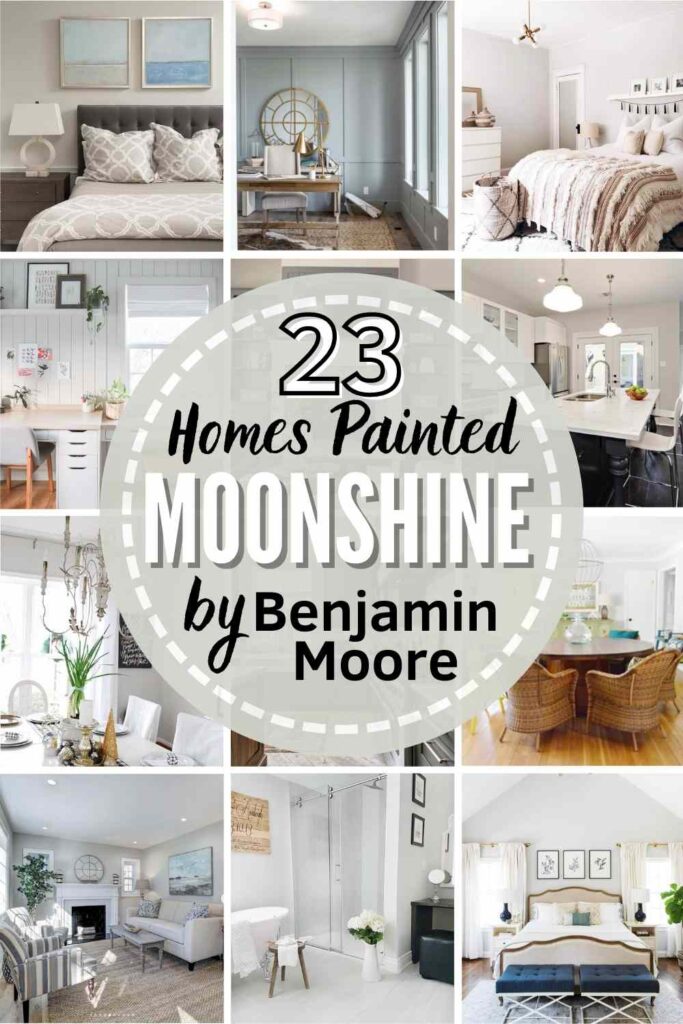
25 Real Life Homes Using Benjamin Moore Moonshine
Good news: the information session is over! Let’s get to the fun part of this tour and see how gorgeous (and different!) Benjamin Moore Moonshine looks in homes. Here are real houses that use Benjamin Moore Moonshine paint to their advantage.
A quick note here: don’t forget to consider sheen! We have an in-depth explanation of choosing sheens here.
BM Moonshine Used in Bedrooms
1. Perfect Gray for a Casual Space
Looking for the ideal shabby chic shade? The bright light in this bedroom from Trim Design Co makes Moonshine read as the ideal neutral backdrop.

2. Sophistocated and Modern
Casual sophistication and elegance. Is that a phrase? If not, it is now! Two Carolina Nesters hit a homerun with the color choice in this bedroom.
The lighting draws out the blue undertones to create a tranquil retreat.

3. Reads Considerably Green
The warm artificial light plays with the blue undertones to make the paint appear green in this beautiful bedroom from Chris Loves Julia.

4. Wall Color for the Win
At first glance, you might think the walls are painted white, and you’re just seeing shadows, but what you’re really seeing is Moonshine!
It’s tranquil enough to create a serene room yet versatile enough to bring together all the different decor pieces that Ohi Design Studio uses in this beautiful master bedroom (Photo credit: Joyelle West).

5. Neutral Nursery
The green and blue undertones of Moonshine are peeking out in this adorable kids’ space, and that is what really makes it the perfect paint choice for this wall as it looks so great with the orange in the wallpaper.
6. Straight Out of a Model Home
Ever walk into a model home and think, “Wow, I wish I could bottle this room and take it home.” That often starts with a great, neutral wall color…like our light gray color du jour, Moonshine.
7. Takes Off An Orange-y Edge
In this bedroom nook, you’ll see Moonshine paired with a very standard stain for oak flooring and molding that often gets a bad rep…the orange tones of this stain can often be off-putting to people, but re-staining, or renovating can be $$$. Choosing a gray with cool undertones like Moonshine takes off the orange-edge though. So if you want to underplay some similar flooring or trim, give Moonshine a serious look.
Living Rooms Featuring Moonshine Paint
8. A True Gray Living Space
Love! When you pair Benjamin Moore Moonshine with a pop of color, like the blues and greens in this living room from Young House Love, the end result will be a true neutral gray. Look at those ceiling beams!

9. Complements Brown Tones
The wood tones and warm lighting in this living room from @grayoakstudio warm up the cool tones so that you’re left with a lovely neutral backdrop for the rest of your decor. But that baby is the real star of this room!
10. A Little Gray, But Not Gloomy
In Colleen’s home (@clauzier) you’ll see a great example of this neutral hue used on a living room wall with a lovely gallery wall, and against a gorgeous wood sofa table. In this natural light, the shade looks true gray.

11. Wonderful for a whole home
Searching for a shade that would work not just in one space, but in your whole home? Check out how Moonshine is used beautifully in this whole house.
It’s neutral, and beyond non-offensive, it’s downright lovely. Cool but not cold. Sophisticated but not stuffy. (Via Lisa Stransky; Design credit: Potomac Design & Renovation – Kenny King)
Kitchens Painted Moonshine by Ben Moore
Sheen note: Learn all about paint finishes in this article. In high traffic areas like kitchens, opt for either the slight sheen of eggshell, or if you like a little more glow, go for satin (it’s even more cleanable, and durable than eggshell).
12. A Balanced Gray with Bright White
The Estate of Things knows how to make a small, dark kitchen feel as large as possible! Pair Moonshine walls with white cabinets for a winning combination that looks great with any kitchen style.

Dining Rooms Using BM Moonshine
13. Slight Blue Tones
Young House Love made a brilliant choice with Moonshine here. The blue undertones complement the adjacent blue room, and blue decor accents perfectly. Yet, the color reads very soft and neutral – it’s the perfect bridge hue.

14. Great All-Around Gray
This dining room from 11 Magnolia Lane wows. This space could feel cramped and uncomfortable with another color, but Moonshine provides the perfect neutral background while also making the space larger.

Benjamin Moore Moonshine Bathrooms
Sheen note: For bathrooms, do NOT use flat paint. Higher levels of sheen are best for areas with moisture.
15. Furniture-Friendly Paint Shade
Here’s a lovely bathroom designed by Liz Williams Interiors (photo credit: Emily Followill). Moonshine is used as the paint color for the vanity, and coordinates perfectly with the lovely curtains for a neutral, polished palette.

16. Bright for Small Spaces
Lively Green Door picked a perfect choice with BM Moonshine in this bathroom. I’d go as far as to call it an unsung hero because it shines against the bright accent pieces, and yet, most people probably don’t even notice it.

17. Crisp Color for a Clean Look
Lindsay Connell‘s bathroom design is subtle, soft, and stunning. Here, Moonshine partners beautifully with a popular white on the shiplap, Benjamin Moore Chantilly Lace.
18. Warm Gray in Morning Light
If you have a room with very warm lighting like For the Love of a House does in this bathroom, Moonshine might be the perfect choice. Notice how the color shifts a little between the light and the shadows.

19. Slightest Hint of Spa Green
Moonshine can be great in a bathroom if you want that spa blue-green vibe, but aren’t a big fan of color. Moonshine has an air of that look, without as much pigment thanks to its subtle green undertones.
Offices Spaces with Benjamin Moore Moonshine Paint
20. Nice Backdrop for an Eclectic Space
DIY Playbook has a small space without a lot of natural light here. Moonshine is the perfect choice because it keeps the room feeling spacious and also provides a neutral palette for flexibility in the room’s decor and use.

21. Creamy Gray Paneling
Hydrangea Treehouse shows us how amazing Benjamin Moore Moonshine looks on texture. I want my office to look like this!

22. Almost Steely Blue
Isn’t Moonshine gorgeous in this bright and airy home office? Thanks to all that incoming (and I’m guessing cool morning) natural light, the look of Moonshine here is almost a subtle steel blue.
BM Moonshine in Other Homes
23. Works with Wood Tones and Whites
Some grays are too cool to bridge the gap between white and warm wood tones. But Dear Lillie Studio knew that Moonshine would be light enough for this space and neutral enough to handle the challenge like a champ. Moonshine looks great with these warm wood floors, doesn’t it?

24. Leans Green in this Entry
Neutrals like grays and whites tend to mirror the surrounding decor, and that’s what’s happening in this entryway from @honed.interiors. The light is bouncing off the dark green door (and window plants) and causing Benjamin Moore Moonshine to lean heavily into its green undertones.
25. Gray Hallway
Last but not least, look at how Moonshine looks in this hallway lit with recessed can lights. It appears as a true gray in the brightest spots, while it’s cooler blue undertones greet you in the more shadowy zones. Either way, it’s a pretty shade.
If you’re searching for versatile neutral paint colors to give a room, or your whole house a fresh look, definitely consider this beautiful Benjamin Moore paint. No matter what room you use Moonshine in, it will add timeless elegance and create a perfect backdrop for the rest of your decor.
Don’t forget to try a sample before spending money on a gallon (or more)! My favorite option is a peel and stick sample that you can move around a room (or your whole home) without damaging your walls!
Pin this paint color for later! And if you use this paint shade, leave a comment on the pin! That helps others decide if they want to try this color, too!
Ready to show those boring, bland walls who’s the boss at home? This no-cost guide will help you sidestep mistakes that almost everyone makes when it comes to picking paint! You’ll be on your way to perfect paint promptly…pinky swear.


Leave a Reply