


Read all about Benjamin Moore Chantilly Lace, plus see 15+ real homes that use it!
Benjamin Moore Chantilly Lace is one of the most popular shades of white paint, but is it the perfect white paint for you?
Do you find yourself staring glassy-eyed at those tiny bits of colored paper, wondering how on Earth you’re supposed to figure out how it will look on a whole wall? Or a whole house?
If you struggle to decide on paint colors in your home, you are not alone! Picking the best shade of paint is difficult! And one reason is that there are just SO. MANY. CHOICES. Too many choices, right?
This is one post in a series about specific, popular paint colors. It’s my hope that these paint exploration posts will give you the information you need to help you pick that perfect paint shade and more easily visualize how a color may look on your own walls.

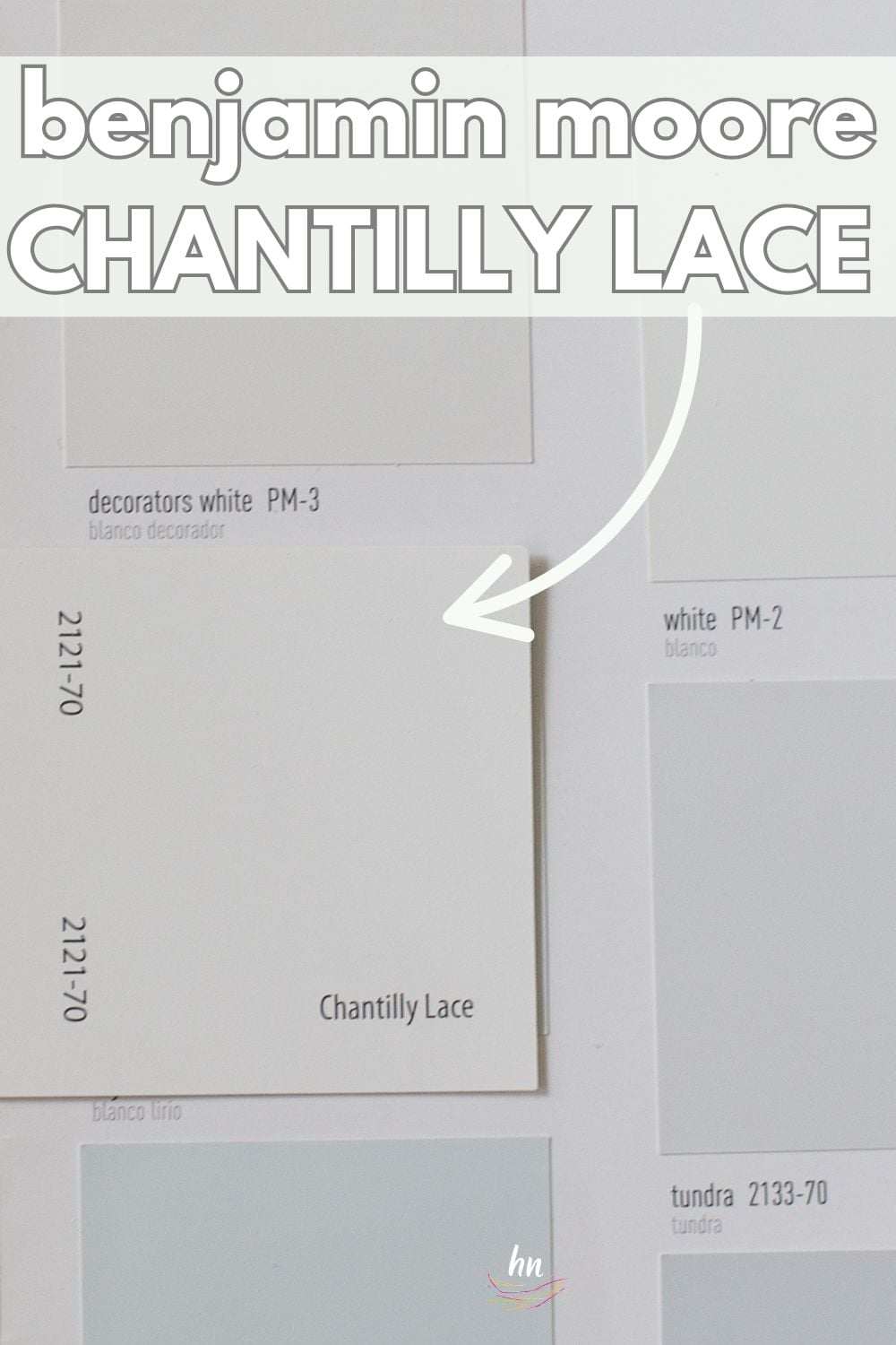
What color is Chantilly Lace?
To put it simply, Chantilly Lace is white. But unfortunately, there’s no “simple” when it comes to white paint!
Ever go to a fancy restaurant and hear people talking about their wine selection? “This one is very oaky and earthy.” “I taste hints of charcoal.” “This one has complex chewy tannins.”
Do you sometimes wonder if these people know what the he$% they are talking about? I sure do!
It’s a lot like that with paint, too. People seem to see ALL kinds of things in a gallon of paint. And they very well MAY be seeing all these different things.
And white paint, in particular, is one of those colors where people can see ALL sorts of different nuances.
So before we muddy the waters (or paint ;)… let’s hear it right from the horse’s mouth first.
“As delicate and refined as the lace it was named after, this crisp, clean white evokes images of pure silk, soft linen and simpler times.”
Benjamin Moore
OK, so that may not be too helpful, but it’s quite flowery and nice-sounding, no?
Well, let’s clear up any confusion over this color’s nuances as we dive in and take an in-depth look at Benjamin Moore Chantilly Lace.


Chantilly Lace in the Wild: Video Overview
FAQs about BM Chantilly Lace
Chantilly Lace is VERY white. In fact, it’s one of the lightest white paints you can buy. Sherwin Williams High Reflective White is just slightly brighter, but not much.
Is it too white? Well, friends, the answer to that question will vary depending on how you want to use it. If you have a very dark room and you want to make it feel bigger and brighter, Chantilly Lace may be exactly what you need. However, if you have a very well-lit room, it might be too bright.
Is Benjamin Moore Chantilly Lace cool or warm?
Chantilly Lace is a bright, crisp white. In fact, it’s such a clean white that it sits pretty much in the middle of the spectrum and doesn’t lean either way.
That said, it IS white, so it can be easily influenced by its environment and lean warm or cool based on lighting exposure and nearby decor.
Where should I use BM Chantilly Lace?
Consider this color for any part of your house! Since it’s so clean and neutral, it’s extremely versatile and can look terrific for your:
Trim
Ceiling
Cabinets
Kitchen
Dining room
Laundry room
Hallway
Entryway
Bedroom
Bathroom
Exterior
Thanks to its perfectly neutral nature, Chantilly Lace can be an excellent choice for any house style and decor.

We have lots more in the nitty-gritty paint detail realm for you (if you’re into that stuff) later in the article. But for now, let’s get into the fun stuff and save the dry (but admittedly important) factoids for a bit later, k?

Real Life Homes Using Benjamin Moore Chantilly Lace
I’ve scoured the web looking for all kinds of spaces where Benjamin Moore Chantilly Lace has been used so that you can get a better idea of how it looks in different spaces!
We’ll see how Chantilly Lace looks in some real houses under a wide variety of different lighting situations and with lots of other “things” in the rooms (furniture, countertops, etc.) that the paint can play on.
Remember, though, that no home is the same. All homes have different amounts of natural light, colors of flooring, and other decor items that will offset the paint and make it look different.
Sheen note: Picking the right color is only winning the battle, not the war. Remember to pick the right paint finish, or sheen, also! Read up on what you need to know about picking the perfect paint sheen.
Chantilly Lace in Kitchens
Chantilly Lace is frequently used as a kitchen cabinet color! In the images below, see it used on both cabinets and kitchen walls.
For kitchens, eggshell or satin are popular finish choices for walls. For cabinets consider semi-gloss or high gloss for the most durable finish (and a gorgeous glow).
1. Modern Farmhouse Perfection
Love! This kitchen from @blackard_modernfarmhouse uses wood shelving to add a soft, warm tone to Chantilly Lace despite the cool natural light. You can also see how nicely the Chantilly Lace cabinets work with the quartz countertops. Spoiler alert: this paint also looks great with carrara marble.
2. A White That Isn’t Blinding
No sunglasses needed in this kitchen from Designing Vibes! The subtle gray undertones in Chantilly Lace keep the room from looking stark and too bright with such a large amount of natural light.

3. Warm Touch with Wood Tones
Can your walls match your kitchen cabinets? Here’s a stunning example from @texasforeverfarmhouse of just that – and it’s not too much. All Chantilly Lace, all-the-time.
4. OC-65 Cabinetry Color
@lillytaylorinteriors shows the beauty of an all-white kitchen that is inviting, not industrial. Clean Chantilly Lace cabinets looking lovely alongside white tile, and pops of color in the black window trim and schoolhouse style sconce. A classic, winning color palette, I’d say. Photography: @paigerumorephoto Design: Lilly Gianikas.
Chantilly Lace in Bathrooms
Going white in a bathroom can be a beautiful decision, especially in situations where there isn’t a lot of natural light. But these spaces show the versatility of this Benjamin Moore shade in almost any situation.
Don’t forget the finish! For bathrooms the perfect sheen is either an eggshell or satin. Why? We’ll tell you in this post about paint sheen.
5. Undertones Are Next to None
Chantilly Lace is used on all the walls/doors/etc. in this space (and throughout @sionnach_dalur_house‘s home). As Ruthie, the homeowner & designer, describes, “I researched for months and finally settled on that one. It had just the tiniest base of gray, but no yellow, pink, or green undertones. It’s not a warm white, but not stark and sterile either. Who knew whites would be so hard?? 😱😂”
6. Shiplap Star
The talented couple from @texasforeverfarmhouse uses Chantilly Lace throughout their amazing home, including this fantastic bathroom. It is used on the cabinetry, shiplap, and moldings..
7. Pulling Pinks
In the bathroom below from @laurenlefevre, to my eye the paint appears warmer than in other shots, likely because it’s playing off the golds and pinks in the room.
Living Rooms with Chantilly Lace Paint
8. Painted Brick Fireplace
Chantilly Lace can really brighten up brick, as seen here in this lovely living room from @leclairdecor.
9. Monochromatic, but not “Meh”
Another Chantilly Lace space in this beautiful modern farmhouse from Kristyn, whose kitchen we saw in #1. She also runs the company/Instagram account @violetvintagerugs. This space may be monochromatic, but it is certainly NOT boring!
10. Great Supporting Actor Paint Shade
I love how Chantilly Lace lets the stars of this living room shine, while brilliantly playing the part of a supporting actor on the walls. The stone and wood tones really stand out against the white paint in this bright, cheery rustic space from @chloemarie.interiors.
Bonus: you could stay in this space, too! It’s an Airbnb. Check out @beachhouseniagara for details and more photos.
11. A Color that Nails “Au Natural”
@kimpowerstyle nails the au natural palette in this stunning family room space. The Chantilly White walls look gorgeous against the wood mantle, table, and that pop of green from the branches is the icing on the cake.
12. Marvelous for a Motorhome
We’ve done several camper renovations, and Chantilly Lace is my go-to paint color for the interiors of these traveling homes because it makes the space feel large and spacious. Here it is in our camper kitchen/living area!
Ben Moore Chantilly Lace Bedrooms
In general for bedrooms, and low-traffic areas, flat paint is fine. If you like something with a bit of shine (and more ease of cleaning) opt for eggshell or satin.
13. White Molding Accent Wall
Often, people think that a contrasting color is the best way to get dimension and visual appeal in a space.
But this monochromatic board and batten accent wall from Clipper City House shows off how much depth and interest can be achieved with just a simple white paint shade, like Chantilly Lace, against beautiful molding details.

14. Bright, but not Blinding Bedroom
This bedroom from Plank & Pine Interior Design proves that bright white can be brilliant in a bedroom.
15. Beautiful for a Bunkroom
Here’s Chantilly Lace paired with some bright, bold primary tones in the bunk room of one of our camper renovations…
Dining Rooms using BM Chantilly Lace Paint
16. Cozy Pairing on This Accent Wall
Oh my, oh my! I can’t stop staring at this gorgeous dining room from Farmhouseish Blog! Chantilly Lace is the perfect neutral to bridge the cool green with the warm peach and wood tones.

17. Magic for a Modern Dining Room
You’ve got to check out these before and after pics from @moore.house (photography: @zackdezon) to see how powerful paint can truly be!
Chantilly Lace completely updates this dining room and brings it not only up to date, but brightens it and makes it a cheerier space, for sure.
Benjamin Moore Chantilly Lace on Exteriors
18. Casual White on a Stunning Lakehouse
Look how incredible this bright white can look on a more beachy/coastal home, as well! @curlsandcashmere made the perfect choice.
19. Southern Stunner
Coastal farmhouse perfection from @jacksonbuilt_custom_homes. Farmhouse styles embrace bright whites, and this coastal-vibed beauty is no different. It looks like this color was custom-made just for this exterior.
Benjamin Moore Chantilly Lace Undertones
I’m afraid to tell you we are now done with the eye candy portion of our discussion. We are now back to the boring, but oh so important paint color basics.
Do you know what people mean when they talk about a paint’s “undertones?” If you already know, then just skip down to the info about Chantilly Lace’s undertones. However, if you hear that word and start to retract a bit because you just DON’T get it, I got your back.
“Undertones” versus “Mass Tones”
First of all, have you heard the term “mass tone?” That’s a fancy way of describing the main color you see when a paint swatch is thrown in front of you. So, green, blue, yellow, red…those are mass tones.
But there are a gazillion shades of red, right? Yep. And that’s where undertones come into the painted picture.
Paint colors and color, in general, are complex. Just like a wine connoisseur can pick up that bottle of Pinot Noir and taste hints of apricot, a trained eye can detect a little bit of yellow or a tiny bit of blue in a shade of white paint.
It may seem like witchcraft at first. But after you’ve stared at enough paint swatches, your eyes will begin to see the most subtle of differences between one shade of paint and another.
In short, an “undertone” is your eyeball’s way of detecting the slight differences in a paint recipe.
Let me explain it this way: A baker makes (2) batches of cake batter. In the first batch, she uses 1 cup of sugar. In the second batch, she uses 1.5 cups of sugar. When the cake is baked, and you try a bite, you’ll describe cake #1 as being “sweeter” than cake #2.
THAT is exactly how it works with paint undertones. The formula for paint shade #1 has more yellow in it than shade #2. This means that shade #1 will have “yellow undertones.”

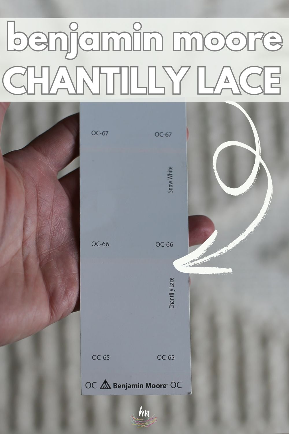
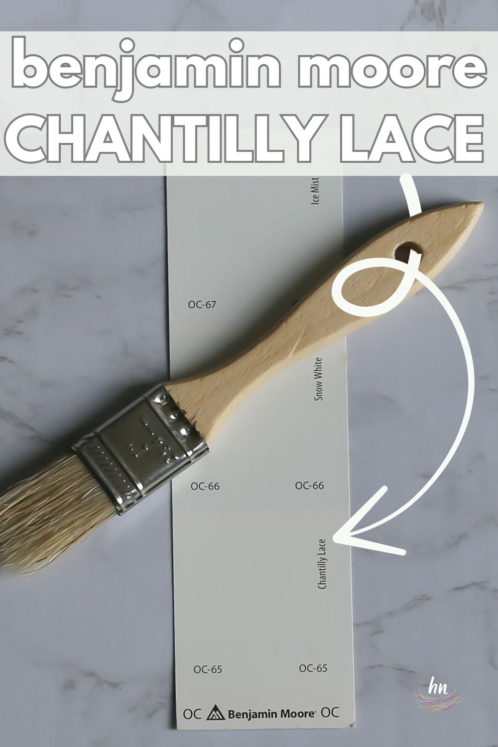
What are Benjamin Moore Chantilly Lace’s undertones?
Chantilly Lace is usually described as a clean and crisp bright white that has very little undertone. Because it can appear crisp, some people will say it has slight gray or blue undertones to cool it down.
Let’s compare it to some other popular white paint colors and see if that helps us visualize those undertones.
NOTE: NO paint colors will look the same at varying times of the day or in two different locations. Paint swatches can give you a strong idea of EXACTLY how your lighting and neighboring decor will impact the appearance of your paint. Please use paint samples (peel and stick sheets are even better) before you commit to a paint color!

How Different Types of Lighting Affect BM Chantilly Lace
If there’s one thing I know, it’s not all about the paint…it’s also about the LIGHTING where the paint lives…
What makes the situation trickier is that paint will play off of elements in your home…the color of your trim, your countertops, furniture, carpet, the natural light from outside, the kind of lightbulbs you have and make a color look much different to the eye as these conditions vary.
Here’s a basic idea of how you can expect Chantilly Lace to appear based on natural lighting!
- North-facing light – northern light is cool and blue-tinted, which will give Chantilly Lace a subtle gray or blue tint.
- South-facing light – warm light from the south will make Chantilly Lace lean just a tad warm without looking as warm as truly warm whites.
- East-facing light – an east-facing room has warm yellow light in the morning and shadowy, passive light in the afternoon. Chantilly Lace will shift a little through the day, but not much.
- West-facing light – west-facing light is passive in the morning but very warm in the evening. Chantilly Lace will shift slightly throughout the day, but don’t expect a large variance.

Great Coordinating Colors for Chantilly Lace
As a well-balanced white, Chantilly Lace works well with most colors but sometimes prefers the cooler shades. However, it can look terrific with beige, cream, and tan.
This white is an extremely popular offering from Ben Moore. If you’re looking for a few specific shades to pair with it, check out these specific colors that look great with Benjamin Moore Chantilly Lace:
- Decorator’s White
- Hale Navy
- Romantic Pink
- Grant Beige
- Gray Owl
- Providence Blue
- Chelsea Gray
- Lake Placid
- Stonington Gray
- Saybrook Sage
- Coventry Gray
- Kendall Charcoal
- Ice Formations
- Deep Space
- First Light
- Shadow Gray
LRV of Benjamin Moore Chantilly Lace (OC-65)
LRV = Light Reflectance Value: Rated 0-100 with 0 being pure black and 100 being pure white. Lighter paint shades REFLECT more light from them and therefore have a HIGHER LRV, and vice versa for darker shades).
The LRV of Chantilly Lace = 92.2
Chantilly Lace light – VERY light. In fact, it’s the lightest white that Benjamin Moore offers and one of the brightest whites available in paint colors.

Chantilly Lace Compared to Other Colors
Comparing similar shades against each other is a reliable way to determine how undertones affect them. Here’s how Benjamin Moore Chantilly Lace appears when we compare it against three other similar white paints.
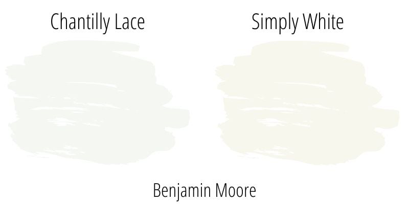
Chantilly Lace vs. Simply White
First, let’s look at Chantilly Lace next to another popular white paint from the same brand, Benjamin Moore Simply White (OC-117).
Although Simply White’s LRV of 91.7 makes it about as light as Chantilly Lace, it has yellow undertones, which makes Simply White naturally read much warmer than Chantilly Lace.
Benjamin Moore Chantilly Lace vs. SW Pure White
Sherwin Williams Pure White has an LRV of 84, making it read darker than Chantilly Lace does. Further, it has sight gray undertones which give the shade a soft quality that Chantilly Lace doesn’t have.
Although it isn’t a stark white, Chantilly Lace will look clean and crisp next to Pure White.

BM Chantilly Lace vs. Benjamin Moore White Dove
The LRV for White Dove (OC-17) is 85.38. Still not dark, by any means, but definitely darker than Chantilly Lace, and these two look wonderful together.
While White Dove can read warm and a smidge greige-y, Ben Moore Chantilly Lace is definitely a shade of white that reads closer to a true white. If you are looking for a white that will be crisp and almost pure white, Chantilly Lace may be the shade you are looking for.

More Colors to Consider
I know from experience how challenging it is to choose new paint colors! If you aren’t ready to commit Chantilly Lace yet, check out these other similar and popular shades.
- Calm (Benjamin Moore) – a soft and airy off-white.
- Polar Bear (Behr) – a bright white paint color with little to no undertones.
- Eider White (Sherwin Williams) – a warm off-white with greige undertones.
- Creamy (Sherwin Williams) – a very warm, creamy off-white.
- Paper White (Benjamin Moore) – a cool-leaning off-white with slight green undertones.
- Silver Satin (Benjamin Moore) – a gray-tinted off-white.
- White Duck (Sherwin Williams) – a creamy off-white that leans greige.
- City Loft (Sherwin Williams) – a creamy off-white with light gray undertones.
- White Dove (Benjamin Moore) – a light white with a little bit of warmth & creamy undertones.
- Snowbound (Benjamin Moore) – a slightly cool, yet very livable, white.
- Super White (Benjamin Moore) – a brilliant, sparkling white paint.
- Cloud White (Benjamin Moore) – a soft, creamy & warm white paint.
- Top 5 Benjamin Moore whites – want to narrow things down? Here are my top 5 BM faves
- 5 Best Sherwin Williams White Paint Colors
And that’s a wrap! I really hope that this paint review has made it easier for you to decide whether Chantilly Lace will be a good paint choice for your home!
It is a beautiful white that looks beautiful in so many spaces. If you’re looking for a “neutral” white without heavy warm or cool undertones, I think it’s a great paint to consider!
Pin this Benjamin Moore Chantilly Lace paint color exploration post for later!

Ready to show those boring, bland walls who’s the boss at home? This no-cost guide will help you sidestep mistakes that almost everyone makes when it comes to picking paint! You’ll be on your way to perfect paint promptly…pinky swear.


Robyn says
I’m planning on using simply white in satin and semi gloss on the trim the house for a small cottage I’m working on. There will be shiplap on the bottom of the bar area that wraps around and will be major design feature of the space ( living / kitchen combo- very small space with beautiful restored wood floors!)
I’m trying to decide if I should paint the shiplap a lighter color so it will stand out, or paint it simply white like the walls and trim. There are a lot of windows so there’s a lot trim !
Sharon Harrison says
I am having a new house built. Chantilly Lace is what I want for the inside wainscoting and ship lap. Our cabinet island is navy blue. I want a paint that will make the wainscoting and ship lap pop so I am looking for a contrasting color or the very slightest hint of blue. Your thoughts?
Sharon says
I am getting ready to paint my bedroom and bathroom Chantilly Lace. What kind of finish is recommended? Matte, eggshell finish, satin finish?
Heather says
Hi Sharon! This post goes through all of the paint sheen choices and which ones are recommended for each type of room in your home: https://heatherednest.com/how-to-choose-a-paint-sheen/