


Read all about Benjamin Moore Stonington Gray HC-170, plus see 25 real homes that use it!
Stonington Gray by Benjamin Moore (AKA HC-170), is a color “steeped in tradition” (or at least Benjamin Moore says so)! I would have to agree with them based upon the number of gorgeous homes painted in Stonington Gray that can be found on the internet.
Stonington Gray can be seen on both the interior and exterior of homes from all eras. You’ll see the color pinned on Pinterest and posted with pride on many an Instagram feed.
Do you know how you hear a phrase and sometimes wonder how on Earth that came to being? Well, if you’ve ever shopped for gray paint, then you understand completely how “it’s a gray area” or “shades of gray” came to exist.
Shopping for grey paint is a challenge, to say the least! But it’s not an insurmountable or even unenjoyable task. We just have to take it step-by-step.
And step one? To use another popular, although definitely more puzzling phrase, we’ll start by going straight “to the horse’s mouth” for an explanation of the color.
Benjamin Moore put this shade in their Historic Color collection and described this collection as: “A collection of 191 time-honored hues that comprises our most popular palette.
Steeped in tradition, the refined, elegant colors of the Historical Collection deliver timeless colors that can be used in traditional as well as contemporary spaces. Unveiled in 1976 to celebrate the US bicentennial, it’s a collection of 191 colors inspired by America’s historic landmarks.”
That definitely gives you a sense that Stonington Gray is a color that has withstood the test of time and is a color with some gravitas to it. Let’s take an even closer look at this classic gray!

What color is Stonington Gray?
This cool-toned medium silvery gray has relatively neutral undertones and offers a soft and refined elegance that few other shades can match.
Let’s dive in and figure out if Stonington Gray could be the right paint shade for your home, ok?

FAQs about Benjamin Moore Stonington Gray
What other colors are similar to Stonington Gray?
Finding color equivalents can be challenging because paint colors have very subtle nuances that often create really noticeable shifts in undertones, depth, and temperature.
What may seem like barely perceptible differences on a tiny paint swatch (or your computer screen) can translate into major differences on your walls.
If you want something similar in the Sherwin Williams brand, check out Sherwin Williams Sweater Weather. If you prefer Behr, I recommend Behr Paving Stones.
Is Benjamin Moore’s Stonington Gray warm or cool?
Thanks to its cool blue undertones, Stonington Gray is a cool-leaning mid-toned gray.
It’s not overly cool (usually reads neutral) but instead offers that touch of coolness that can balance out warm lighting.
Where should I use Benjamin Moore Stonington Gray?
Anywhere and everywhere you want because this beautiful soft gray is endlessly versatile.
Consider Stonington Gray for your:
Laundry/mud room
Hallway
Entryway
Staircase
Home office
Living room
Bedroom
Bathroom
Playroom
Kitchen
Cabinets
Dining room
Trim
Exterior
Stonington Gray is a hue that will help create a timeless look in traditional, transitional, modern, and modern farmhouse-style homes.
I’m not gonna lie – choosing the PERFECT paint color isn’t as easy as seeing what you like online and simply adding it to your space. There’s an entire science behind it! Grab a FREE copy of my new guide to avoid the paint color picking mistakes people make! Click here or enter your email below. I’ll send the tips right away!⤵️

Benjamin Moore Stonington Gray Undertones
Stonington Gray is gray with mild blue undertones. Usually, this shade will appear neutral gray, but there are times (especially in cool lighting) when that blue undertone will make its presence known.
Since grays can appear to shift quite a bit, I have a special tool that I use (and you’ll love) to help you confidently choose or reject paint colors. Peel-and-stick paint samples take the fear out of making a bad paint choice because they show you clearly how shades will look in YOUR home.
With paint swatches, you won’t have any surprises after you commit to a shade and paint it all over your walls! And this type of sample is a snap to remove and reposition on a different wall without damaging your drywall or current paint. Win-win!
If undertones make your head ache, you’re not alone! Grab your no-cost copy of “5 Biggest Paint Choice Mistakes” Click here or enter your email below. I’ll send the tips right away!⤵️
How Different Types of Lighting Affect Benjamin Moore’s Stonington Gray
The moving sun changes natural lighting temperature and exposure, which is one of the major influences on how paint appears.
Pro Tip: Don’t expect ANY paint color to appear the same at two different times of the day or on different walls because it just won’t happen.
Here’s how you can expect Stonington Gray to act in your home based on various types of natural lighting.
- North-facing light – cool, blue-tinted northern light will cause Stonington Gray to appear grayer, darker, and sometimes bluer than other types of lighting.
- South-facing light – consistently warm yellow-tinged southern light will lighten this shade and make it look beautifully elegant.
- East-facing light – eastern light has warm yellow tones in the morning and appears cooler and shadowier in the afternoon. The large shifts in this light will make Stonington Gray appear light and neutral in the morning and grayer and cooler in the evening.
- West-facing light – cool, shadowy light in the morning shifts to ultra-warm light later in the day, causing Stonington Gray to appear cool and gray (maybe with a hint of blue) in the mornings and neutral and balanced in the evenings.
When to Avoid BM Stonington Gray
Rooms with little or no natural light can be problematic for Stonington Gray because it has enough saturation that it can appear too dark for many people.

Great Coordinating Colors for Stonington Gray
Greige shades tend to play well with a large number of shades, which is part of their appeal. Stonington Gray tends to look great with dark sage green, crisp white, royal blues, and even black.
If you’re searching for some inspiration and specific hues, try pairing Benjamin Moore Stonington Gray with:
- Pure White
- Puritan Gray
- Lychee
- Decorator’s White
- Chantilly Lace
- Amherst Gray
- Woodlawn Blue
- Hale Navy
- White Dove
- Winter Lake
- Smoke
- Palladian Blue
- Charcoal Slate
- Louisburg Green
- Rainwashed
- Timber Wolf
- Kendall Charcoal

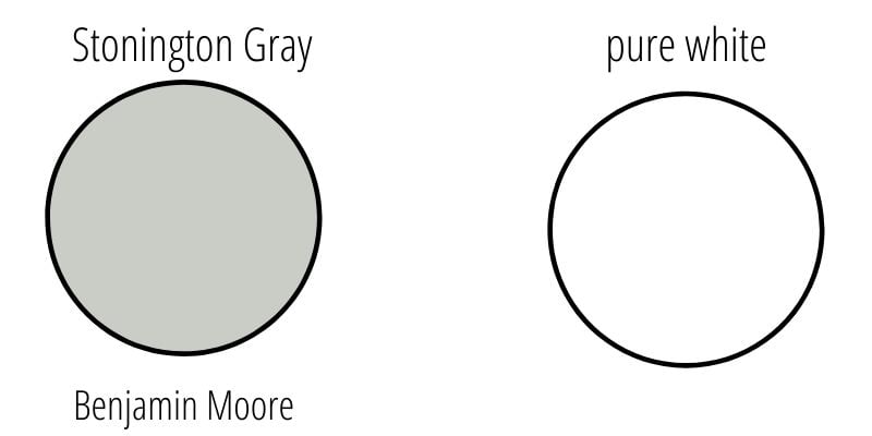
LRV of Benjamin Moore Stonington Gray (HC-170)
First, here are the “numerical” details about this shade.
LRV = Light Reflectance Value: Rated 0-100, with 0 being pure black and 100 being pure white. Lighter paint shades REFLECT more light from them and therefore have a HIGHER LRV, and vice versa for darker shades. Below see Stonington Gray (59.75) side by side with pure white (100):
The LRV of Benjamin Moore Stonington Gray = 59.36
This LRV value means that BM Stonington Gray is a medium shade that has enough saturation to hold its own quite well in bright light but could feel too dark in some rooms with little or no natural light.
Feeling lost? I gotcha, boo! Get a zero-cost copy of my new guide to avoid the paint color picking mistakes people make! Click here or enter your email below. I’ll send the tips right away!⤵️

Stonington Gray Compared to Other Colors
To understand the Stonington Gray undertones and overall color profile a bit more, let’s look at Stonington Gray next to several other popular Benjamin Moore colors.
Stonington Gray vs. Wickam Gray
When comparing the classic Stonington Gray to Wickham Gray, you’ll see just why Stonington Gray has a place in the more traditional gray family.
It has a much truer gray undertone than Wickham Gray, which reads more of a blue/green-gray.

Stonington Gray also is a darker shade (with an LRV of 59.75) than Wickham Gray (with an LRV of 68.94), so go with Stonington if you are looking for a richer tone on your walls.

Benjamin Moore Stonington Gray vs. Revere Pewter
Oh, Revere Pewter, how you are so loved by many, many home decorators. You’re dark and moody but not overpowering, which makes you a great fit when you don’t want the gray to sit back as a silent backdrop.
In comparison, Stonington Gray is more like a tween in its moodiness compared to the high school level of Revere Pewter (do people get any moodier than as a teen?!).
Stonington Gray is lighter and airier and will likely blend in with your home decor rather than stand out.

Benjamin Moore Stonington Gray vs. Gray Owl
We’ve done an in-depth look at Benjamin Moore’s Gray Owl.
However, it’s worth another look here in comparison with Stonington Gray. Gray Owl is on the lighter and brighter side, which makes it so popular in basically any room.
It doesn’t require a ton of natural sunlight to allow it to brighten up a space.

In comparison, Stonington Gray is darker and may not be your choice if you are looking for a paint color to brighten up your home.

More Colors to Consider
Not quite ready to give Stonington Gray the “go-ahead” yet? Check out these other lovely paint shades.
- Gray Owl (Benjamin Moore) – a light-toned, cool-leaning gray with mild blue-green undertones.
- Worldly Gray (Benjamin Moore) – a chameleon greige with green undertones.
- Lazy Gray (Sherwin Williams) – mid-toned gray with beautiful blue undertones.
- Anew Gray (Benjamin Moore) – a soft, light to medium, warm greige.
- Mindful Gray (Benjamin Moore) – a warm greige paint color that leans taupe.
- Paper White (Benjamin Moore) – an off-white with very subtle blue-gray undertones.
- Shoreline (Benjamin Moore) – a light-toned, gray-leaning greige.
- Light French Gray (Sherwin Williams) – a mid-toned neutral, balanced gray.
- Alpaca (Benjamin Moore) – a cool, taupe-leaning gray or greige.
- Silver Satin (Benjamin Moore) – a neutral to warm light greige with mild green undertones.
- Coventry Gray (Benjamin Moore) – a moody gray paint color with subtle undertones
Ready to grab the cheat sheet to choosing the perfect color every time? Grab a FREE copy of my new guide to avoid the paint color picking mistakes people make! Click here or enter your email below. I’ll send the tips right away!⤵️
Real Life Homes Using Benjamin Moore Stonington Gray
Now that we’ve taken a close-up look at the swatches and made some comparisons, let’s take a look at where the rubber meets the road. Or, in this case, where the paintbrush meets the wall.
We’ll check out how Stonington Gray looks in some real spaces under lots of different lighting situations and with lots of other “things” in the rooms (furniture, countertops, etc.) that the paint can play on.
Remember that photos on a computer screen are in no way a substitute for seeing a real sample on your own wall, but I think it can be really helpful to at least rule colors “in” to buy samples for or “out” to just scratch completely.
Stonington Gray Kitchens and Dining Rooms
Sheen note: Picking the right color is only winning the battle, not the war. Remember to pick the right paint finish, or sheen, also! Read up on what you need to know about picking the perfect paint sheen.
For kitchens, eggshell or satin are popular finish choices for walls. For cabinets consider semi-gloss or high gloss for the most durable finish (and a gorgeous glow).
1. Great Neutral Backdrop
What a beautiful example of Stonington Gray actually taking the back seat to beautiful woodworking details in this room from @dakota.street.design.
This just goes to show that a darker color in the right setting can still be bright!
2. Gorgeous in Lower Light
For some people, this family room from Home Sweet Spena could be an example of Stonington Gray looking too dark. I, on the other hand, think it looks rich and elegant!

3. Works in All Kinds of Homes
Stonington Gray works for every style, like in @mandy.gladden‘s more rustic chic dining room. I am dying over the peek of the old wooden front door just outside the dining room that adds a lot of warmth to the room.
The use of brown tones throughout definitely brings out the soft side of this paint color. Slow. Clap.
4. Warm Gray Dining Space
There is just something that stole my heart with this simple minimalist antique dining room from @erin_vt (how’s that for an explanation of a room?!).
It is just darling with the light wood tones juxtaposed against a more modern light fixture with the true classic paint color of Stonington Gray.
Living Spaces Painted with Benjamin Moore Stonington Gray
5. Beautiful Contrast to a Bright White
Sometimes it is that close-up shot that really helps you see a paint color shine!
The bright white fireplace versus the beautifully clean and fresh-looking Stonington Gray in this room from @lauriespraguedesigns shows how with white and natural light, Stonington Gray can be bright and beautiful!
6. Gray on Gray
Sometimes making one corner finished and perfect in your house gives you the strength to keep going on the rest.
This beautiful corner of @lauraf1285‘s home shows how Stonington Gray can work with gray furniture too!
7. Subtly Complex Shade of Gray
All hail the power of neutrals! This living room from @belovedhomedecor shows how perfect styling paired with the right neutrals creates a room with lots of depth.
Stonington Gray is the gorgeous backdrop to the lighter furnishings and curtains, making it a very polished place to sit down and let your troubles be washed away in this comforting oasis.
8. Blues Pull Out Slight Undertones
This is where you see gray and blue come together in perfect harmony. Sometimes it can be hard to find the right shades of blue and gray that play well together and do not make the room feel too cold.
This living room from @belovedhomedecor is a great example of how blue and gray can be cozy and warm together.
Stonington Gray Bedrooms
In general for bedrooms, and low-traffic areas, flat paint is fine. If you like something with a bit of shine (and more ease of cleaning) opt for eggshell or satin.
9. Goes Well with Wood Tones
The warm wood tone of the door and trim play well with the gray paint color on the walls of this boy’s room from Lemons, Lavender and Laundry.

10. Rustic Chic Color Choice
Miss Mustard Seed shares a stately and charming bedroom featuring our favorite classic color – Benjamin Moore’s Stonington Gray! The antique accents in the lines of the bed and the chandelier play perfectly with this dignified color.
Stonington Gray complements the room and adds just a little “oomph” to the walls.

11. Leaning Slightly Cool
I think the first thing that comes through when looking at this example from Elizabeth Joan Designs is the cool tone of this bedroom. However, it’s not cold, just cool enough to give it a crisp, gorgeous appearance.

12. Gray, But Not Dreary
I mean, who wouldn’t want a bedroom that was this beautiful? Amanda Eno of @mandyenohome has Stonington Gray painted walls in her bedroom, and it looks picture perfect.
Notice how greige/warm the paint looks on the wall behind the bed thanks to the incoming natural light. And on the opposite wall, the paint appears much cooler and reliably gray in the shadows.

13. Superb Style, Thanks Stonington Gray
Here’s another bedroom that’s sure to grab your attention. “Is gray out?” people often ask. But how can a neutral like this one ever be “out” when it creates such inviting spaces? Stonington Gray looks beautiful in rooms with a lot of natural light, and this bedroom is a perfect case in point.
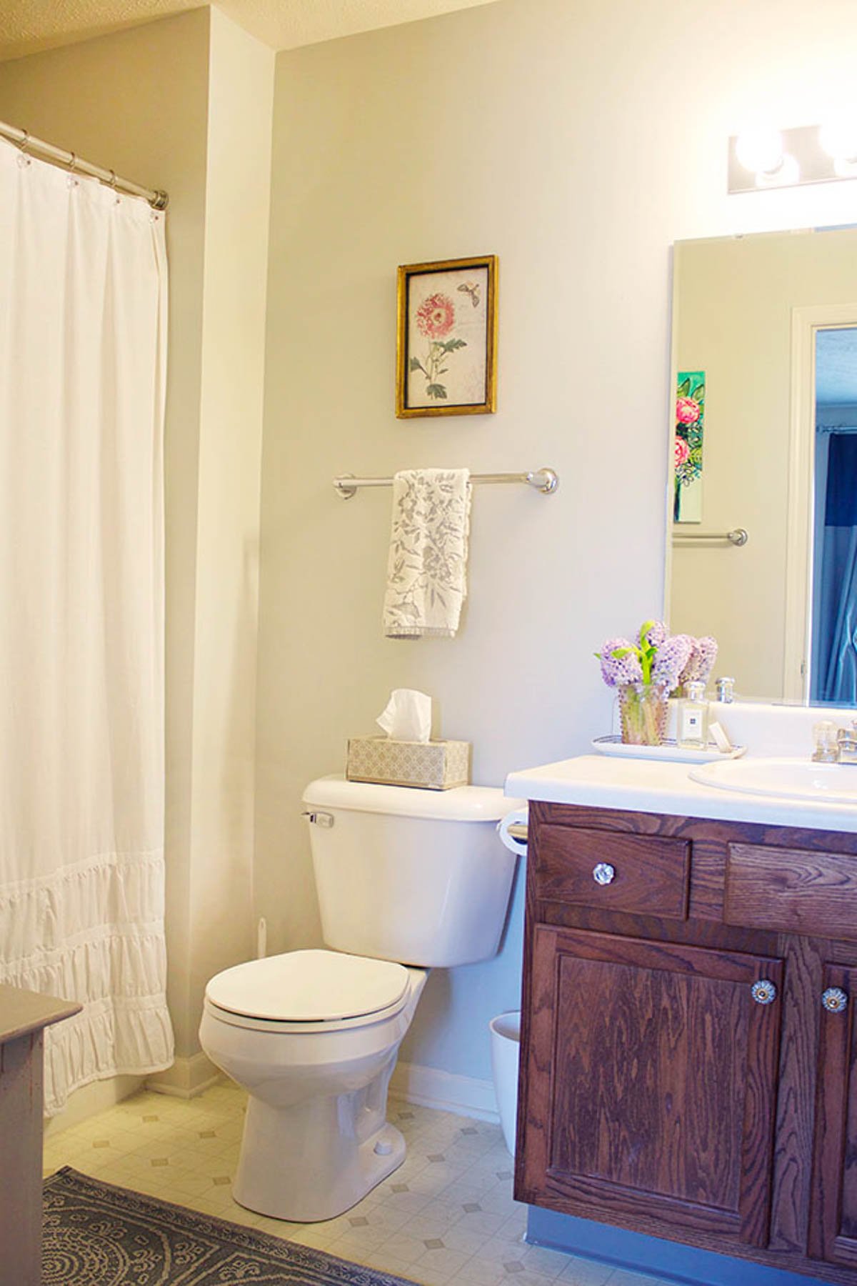
Benjamin Moore Stonington Gray Bathrooms & Laundry Rooms
Don’t forget the finish! For bathrooms the perfect sheen is either an eggshell or satin. Why? We’ll tell you in this post about paint sheen.
14. Lighting Influences Make a Difference
Wow, it’s amazing how colors can change based on their environment. The influences in this bathroom from @therealizedhomellc include no natural light, plenty of artificial light, and lots of neutrals.
Together, they almost make this bathroom look like it has pink undertones on the wall!
15. Surprisingly Cool
This bathroom from At Ashley’s Place brings together the beauty of Stonington Gray and marble to create a very elegant bathroom space.
The gray of Stonington Gray works well with the white and gray marble, perfectly complementing each other and elevating the bathroom to a grandiose look.

16. Perfect Pairing with White
I’m sensing a pattern the more I look at Stonington Gray and bathrooms: it seems to be just the right shade of gray when using a lot of white (like a porcelain tub or marble tile) in a bathroom.
The two seem to go together like peanut butter and jelly – always a classic, and you can never go wrong, as this example from @walczak_design_build shows! (Photo Credit: Jeremiah True Photography)
17. Sweet and Simple
This bathroom from Michaela Noelle Designs shows Stonington Gray as warm as it will probably ever appear.
The warm tones and warm artificial lighting almost make this look like a completely different color!
18. Small yet Cozy Bath
This bathroom from @bethduc has a little more rustic vibe, bringing in wood tones and natural textures with some distressing right around the corners.
Even with no natural light, this bathroom works with Stonington Gray because of all the different textures breaking up how much of the dark wall you actually see.
19. Nice and Neutral
Stonington Gray walls and a darker gray vanity are paired for a neutral look that feels very relaxing, and cool, but not cold. Look how great these two grays work with the marble countertop.
BM Stonington Gray Exteriors
20. Simply Great Exterior Paint
I am sold on Stonington Gray for the exterior of a home! @eleven_ford‘s quaint home looks like she just got all dressed up with her best outfit for date night with a new dress (Stonington Gray) that makes all her jewelry pop and shine. Maybe that was a little much, but you get my drift.
This house looks so bright and happy with Stonington Gray on her!
21. Buddied up with Brick
Stonington Gray is looking more washed out in the bright, cool sunlight. Paired with popular BM Chantilly Lace as the trim paint here, the color combo works well with the exterior brick, too.
Stonington Gray in Other Places and Spaces
22. Fun, Contrasting Door Color
Love! Benjamin Moore Stonington Gray has enough saturation to allow it to hold its own in bright natural light, as you can see on these doors from Blesser House. What a great interior door color option.

23. Just the Right Amount of Drama
Hello Stonington Gray, in all its high school moodiness! Yet, I love the muddy undertones here that are making this entryway dramatic.
You can see how not as much natural light really changes the feel of this room from @ourwelldesignedlife in a delightfully dramatic way!
24. Relaxing Sunroom Color Choice
This example from Uniquely Yours or Mine just might be one of my favorite uses of Stonington Gray.
It’s neutral but doesn’t stand out. Instead, it allows all the other colors to shine while it enhances them.

25. Crisp and Clear
Stonington Gray is making this office from @in.style.design shine in all the right ways!
The white and natural fibers of the baskets and wood floor and desk play together well to make an open and airy space. I could also see this color palette working perfectly in a beach house!
26. Undertones Come Through due to Moody Influences
The angle is funny because, as the caption says, it is the view from the La-Z-Boy. This room from @stolensyndicate definitely has a more blue/green hue, which may be due to the fact that this is a darker-looking space that doesn’t seem to have a ton of natural light.
The lack of light really seems to bring out the moody undertones, and I’m here for it. Also, Moody Undertones would be a GREAT band name!
After seeing this shade in action, do you see the appeal of Stonington Gray? This cool-toned gray certainly has a lot going for it since it provides that beautifully neutral shade that so many people want in gray paint.
Go grab some a sample of this timeless hue to see how if it could be the perfect paint color for your own home 👇
Not painting soon? Pin this Ben Moore Stonington Gray color exploration post for later!

Pssst…before you go, I sure would love to hang out with you again really soon! And before you’re on your way, make sure you grab your free copy of the 5 Biggest Mistakes People Make When Picking Paint, so you can avoid the heartache (and hole in your wallet) when your paint choices don’t quite work out! Click here, and I’ll send your free copy right now!


Sue osborne says
Heather,
What an incredible job you did here, all that research, finding so many grey/gray options, all done well.
But it just reinforces my life long hate of grey/gray/greige, whatever.
I long for rich primary colors, plus those oranges and shades of yellows, but please don’t head me towards those awful lilacs and purples being perpetrated in the online and paper magazines now.
I would be happier with true, clear whites and some oatmeal, tan tossed in. But grey/gray is way too awful and depressing now.