

Read about Benjamin Moore Wickham Gray, and see 17 real homes that use it!
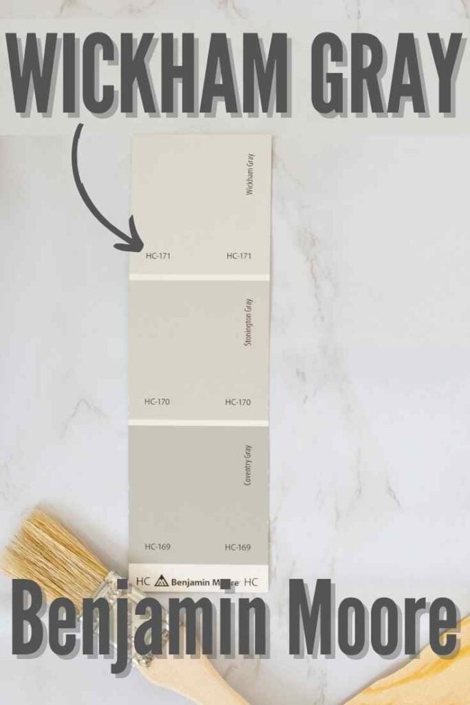
Benjamin Moore Wickham Gray (HC-171) is a cool gray paint that has blue-green undertones with a silvery quality that makes a space look gorgeous and sophisticated.
I see comments from readers ALL. THE. TIME. about choosing gray paint for their homes. Sometimes they want clarification about undertones. But often, the comments are related to feeling overwhelmed by the sheer number of gray paint options.
Yep, there are a lot of options – something for literally everyone, I like to say!
If you’re considering painting a new color in your home and feel overwhelmed at the thought of choosing a color, start by checking out the shades of gray I have reviewed in my paint color review post series. Each post features one single hue, and I explain all the pros and cons and details you need to know.
I know how challenging it can be to choose only one gray paint from such a wide range of choices! I hope these color reviews give you the information you need to add a shade to your shortlist or eliminate it from your list.
It’s time to welcome Benjamin Moore Wickham Gray as the newest addition to the paint color review series “family!”

What color is Wickham Gray?
Wickham Gray (HC-171) is a light-medium gray with blue-green undertones. Thanks to its undertones, it’s the ultimate flexible gray that can shift in different situations (more on that below!).
This shade offers depth and interest, making it a staple in Ben Moore’s line of paint colors for many years now. However, it’s not a simple classic gray that looks very similar no matter the lighting or surrounding decor.
This shade is a chameleon – let’s dive in and find out more!

FAQs about Benjamin Moore Wickham Gray
What other colors are similar to Wickham Gray?
Please don’t try to match a color in the Benjamin Moore paint line to the Sherwin Williams paint line. Thanks to differences in color blending techniques, the shade you receive won’t be the one you expect!
If you want a close match to Wickham Gray in Sherwin Williams color options, I recommend Sherwin Williams Silverpointe, SW Passive, or SW Reflection, although all of these options have slightly different undertone combinations.
Behr’s Curio could be another close color option to consider.
Is Sherwin Williams’s Wickham Gray warm or cool?
Wickham Gray is a very cool (read that as icy) gray. It won’t seem as cold in warm lighting, but cool lighting will bring that icy quality forward.
Where should I use Benjamin Moore Wickham Gray?
Wickham Gray is one of those subtle shades that looks chic and sophisticated almost anywhere, including:
Entryway
Playroom
Nursery
Dining room
Kitchen
Bathrooms
Bedrooms
Laundry room
Living room
Exterior
Wickham Gray fits well in traditional, coastal, minimalist, modern farmhouse, contemporary, and transitional homes. 
If undertones make your head ache, you’re not alone! Grab your no-cost copy of “5 Biggest Paint Choice Mistakes” Click here or enter your email below. I’ll send the tips right away!⤵️

Benjamin Moore Wickham Gray Undertones
Wickham Gray has a medium gray base with blue-green undertones, and most often, you’ll notice its silvery appearance. This shade’s blue undertones will frequently show up, and in the right lighting, Wickham Gray will read more blue-green-gray (even “stormy”).
And every once in a GREAT while, you may notice more green undertones than blue. This color has some flex!
Do you want to know my secret for avoiding terrible-looking colors in your home? Check out these peel-and-stick paint samples. They’re a no-fail way to make sure you get beautiful results when you select interior paint colors.
How Different Types of Lighting Affect Sherwin Williams’s Wickham Gray
Paint colors seem to shift through the day as the sun moves across the sky because the natural changes in lighting impact their appearance.

EVERY paint color will have some amount of variation in different rooms or on different walls throughout the day. And Wickham Gray’s appearance DEFINITELY changes through the course of the day based on lighting scenarios.
Here’s what you can expect from Benjamin Moore Wickham Gray solely based on different types of natural lighting:
- North-facing light – this shadowy cool lighting will make Wickham Gray appear as cool and as dark as it can look. I recommend avoiding this type of lighting because, at times, this shade can seem icy cold.
- South-facing light – the warmth of southern lighting makes hues appear light and bright. In southern light, Wickham Gray will often wash out, and its undertones will come forward.
- West-facing light – expect dim, passive lighting exposure in the morning before shifting to ultra-warm lighting in the late afternoon. Wickham Gray will seem cold and gray in the morning, and you may notice more of its undertones (especially the green ones) later in the day.
- East-facing light – warm yellow-tinted light in the morning shifts to passive lighting later in the day. Wickham Gray will appear light and probably a little minty in the morning light and then look grayer and cooler in the afternoon.
When to Avoid BM Wickham Gray
Wickham Gray can look very cold – even downright ICY – in north-facing rooms. Unless you really want that vibe, I recommend steering clear of this shade in rooms with northern lighting.
Also, Wickham Gray can be a great balancing shade for warm climates but is just too cool to use in cold climates.
Finally, I would steer clear of pairing Wickham Gray with Creamy or other creamier off-whites because the temperature difference is just too much.

Great Coordinating Colors for Wickham Gray
Wickham Gray is gorgeous when you use it in a way that highlights its attributes (aren’t we all like that?). However, this shade can be finicky because it won’t play well with many warm-toned colors.
I recommend sticking to crisp whites, slightly warm off-whites (but avoid the creamy ones), some warm-leaning grays and greiges, and some fun colors such as blush, purple, navy, taupe, and beige.
One of my favorite qualities about Wickham Gray is that its cool tones enhance the natural beauty of wood, stone, and leather!
If you need specific color ideas that work with Benjamin Moore Wickham Gray, try pairing it with:
- Palladian Blue
- Hale Navy
- Templeton Gray
- Thunder
- Coventry Gray
- Edgecomb Gray
- Woodlawn Blue
- Tissue Pink
- Kensington Blue
- White Dove
- Mt. Ranier Gray
- Flint
- Revere Pewter
- Pearly White
- Boothbay Gray
- Kendall Charcoal
- Aegean Teal
- Tricorn Black
- Amherst Gray
- Storm Cloud Gray
- Burnt Ember
- Pashmina
For trim colors to pair with Wickham Gray, I recommend Chantilly Lace, Cloud White, Oxford White, or Simply White.
LRV of Benjamin Moore Wickham Gray (HC-171)
What the heck is LRV, and why should I care about it? LRV stands for “light reflectance value” (although sometimes you’ll hear it called the light reflective value, too). To put it in terms that homeowners who aren’t interior design experts can relate to, it’s a scale that indicates how light or dark a paint color will likely appear on your walls.
Light reflective values range from 0 – 100. A color with an LRV of 0 is pure black, with higher numbers indicating lighter hues until you reach 100 (shockingly bright white).
The LRV of Benjamin Moore Wickham Gray = 67.87
That means BM Wickham Gray is a medium to light gray. It basically sits just on the darker side of the border between medium and light.
It has enough saturation that it won’t wash out to look off-white in bright light. And it’s not dark enough to make poorly lit rooms feel dark and cramped.

LRV…what? Don’t worry, I’ve got you! This no-cost guide will help you avoid the paint color picking mistakes most people make! Click here or enter your email below. I’ll send the tips right away!⤵️
Wickham Gray Compared to Other Colors
It’s now time to compare this hue with similar shades to see how Wickham Gray stands apart from the crowd.
Benjamin Moore Wickham Gray vs. Gray Owl
This session of comparing and contrasting begins with looking at Wickham Gray next to Ben Moore’s Gray Owl (2137-60).
Gray Owl has an LRV of 65.77, so it’s just a wink darker than Wickham Gray. Both of these shades have similar blue and green undertones mixed into a gray base, but it’s the exact blend of these undertones that create the differences in these two hues.
Gray Owl’s undertones are more subtle, making this shade read as a truer gray, which many people like. However, if you want a cooler vibe, go with Wickham Gray.

Benjamin Moore Wickham Gray vs. Healing Aloe
Healing Aloe (1562) by BM has roughly the same reflectivity as Wickham Gray thanks to its LRV of 69.66. Plus, with similar undertones, these two colors are VERY close in appearance.
From what I can see, Healing Aloe is slightly less gray and just a tad more green than Wickham Gray. But unless you have them so close to each other that they’re touching, you may not be able to easily notice the difference.

Benjamin Moore Wickham Gray vs. Olympus White
Sherwin Williams Olympus White (SW 6253) is another very close color match. Its LRV of 68 puts it at a nearly identical depth to Wickham Gray, but Olympus White leans more toward blue undertones than green ones.

More Colors to Consider
I gotta know – are you ready to commit to Wickham Gray? If you aren’t there YET, check out these popular paint color options!
- Calm (Benjamin Moore) – a light, off-white with pale purple undertones
- Gray Cashmere (Benjamin Moore) – a mid-light blue-green with gray undertones
- Big Chill (Sherwin Williams) – a beautiful gray with mild beige undertones
- Paper White (Benjamin Moore) – an off-white with gray undertones and a hint of green
- Oyster White (Sherwin Williams) – off-white with beige-leaning greige undertones
- Sea Salt (Sherwin Williams) – a mild blue-green with gray undertones
- Eider White (Sherwin Williams) – a cool off-white with gray undertones
- Passive (Sherwin Williams) – a crowd-pleasing silvery light gray
- White Duck (Sherwin Williams) – an off-white with greige undertones
- Classic Gray (Benjamin Moore) – a light greige-leaning off-white
Feeling lost? I gotcha, boo! Get a zero-cost copy of my new guide to avoid the paint color picking mistakes people make! Click here or enter your email below. I’ll send the tips right away!⤵️
Real Homes Using Benjamin Moore Wickham Gray
Let’s get to the fun stuff – seeing what this color REALLY looks like in real-life homes! Check out these drool-worthy examples!
Living Rooms Painted Wickham Gray
A quick note here: don’t forget to consider picking the right paint finish…it’s not only about getting the color right! We have an in-depth explanation of choosing sheens here.
1. Light Blue-Green-Gray
Wickham Gray looks pale and gorgeous in this image from Simply Home Decorating (photo credit: @traceyaytonphotography.
Can you see the faint blue-green undertones coming through? If not, compare the walls to the gray bricks around the fireplace, and you’ll see the difference. They aren’t strong, but they’re there!

2. Cool and Refreshing
See those green undertones coming through for a subtle minty vibe?
Looking at this room from Mustard Seed Interiors gives me all the feels of drinking a glass of minty cucumber water. It’s cool and refreshing and just what you need on a hot (or stressful) day!

3. Mid-Toned and Flexible
One glance at this image from The Old Post Road Blog, and I bet you don’t even realize that the paint on the gray-looking walls and the closer green-gray wall with the fireplace are the same. But it is!
That’s how much Wickham Gray can shift simply based on lighting influence.

4. Clean and Neutral
If that vase of flowers and the blue throw blanket weren’t in the picture, it would be tempting to believe this image from Jordecor was a black-and-white photo!
The lighting and decor in this room are the perfect elements to let Wickham Gray show off a silvery, softly polished glow without the undertones.

BM Wickham Gray Kitchen & Dining Spaces
For kitchens, eggshell or satin are popular finish choices for walls. For cabinets consider semi-gloss or high gloss for the most durable finish (and a gorgeous glow).
5. Subtle and Chic
This kitchen from @marco_paints_perfection_htx might be small, but its visual impact is huge! Wickham Gray is the perfect shade to pull together all the elements into one design, while the warm wood tones balance out the paint’s coolness.
Pro Tip: If you paint your cabinets in a dark kitchen, use a satin sheen to reflect more light and create an easy-to-clean surface!
6. Mid-Toned but Not Too Dark
This room from Posie Gets Cozy lacks natural light, but that actually is a good thing!
Wickham Gray makes a statement as a beautiful neutral gray, thanks to the creamy white trim and warm artificial lighting that keep it from looking icy cold.

7. A Modern Farmhouse Staple
If you have modern farmhouse decor, take a page from @cmhinteriors‘ book and check out Wickham Gray.
Those blue-gray undertones are subtle, but they lend just enough color to this room to give it depth and sophistication. Love!
8. Provides Balance
A word of caution: when you pair Wickham Gray with cool tones, it can feel cold.
Kenorah Design-Build-Renovate avoided that scenario with all the stainless steel in these two rooms by choosing a warm-leaning white paint. The creamy countertops and warm wood floors also help to balance out the paint’s natural coolness.

Wickham Gray in Bedrooms
In general for bedrooms, and low-traffic areas, flat paint is fine. If you like something with a bit of shine (and more ease of cleaning) opt for eggshell or satin.
9. Effortlessly Glam Retreat
Cool and restorative is how I would describe the way Wickham Gray appears in this bedroom from Sita Montgomery Interiors.

10. Watch Those Undertones Fade Away
The natural lighting and warm decor in this room from @pebblesnixinteriors balance out this shade’s coolness and let its gray base shine through as the undertones take a backseat (photo credit @jeffherrphoto).
11. Just a Hint of Blue-Green
I’ve said it before, and I’m sure I’ll say it again: your decor influences the way paint looks on your walls. The plants in this room from The Wicker House pull forward a hint of those blue-green undertones.

Bathrooms using Ben Moore’s Wickham Gray
Don’t forget the finish! For bathrooms the perfect sheen is either an eggshell or satin. Why? We’ll tell you in this post about paint sheen.
12. Achieving Balance
I love the use of brown and beige tones with Wickham Gray in this bathroom from Nina Hendrick!
They expertly balance out the paint color’s icy tendencies for a bathroom that looks effortlessly chic and gives the walls an almost iridescent quality.

13. Never too Dark
There may not be a lot of natural light in this bathroom from Simply Organized, but Wickham Gray doesn’t look too dark. I love the subtle color it provides in this minimalist space.

14. Gorgeous Backdrop with a Touch of Glam
This bathroom from House of Jade Interiors expertly highlights Benjamin Moore Wickham Gray’s brilliance!
The cool marble flooring and counters harmonize well with the paint’s cool tones and draw out the blue-green undertones, while the colorful accents lend warmth and fun pops of color.

Wickham Gray Paint Spotted in Other Homes
15. Hallway
There isn’t much natural lighting in Old Town Home‘s hallway, but the warm wood tones and artificial lighting are enough to balance out the paint’s cool tones.

16. Dreamy Laundry Room
Look at this McDreamy laundry room from Classic Casual Home!
It’s casually sophisticated, and I love the subtle depth that Wickham Gray adds to the design.

17. Blue-Gray and Gorgeous
Rachel Parcell used Wickham Gray on this custom vanity, and I’m loving how much those blue undertones are coming through in the bright warm lighting!

I hope Benjamin Moore Wickham Gray catches your eye as much as it catches mine! Don’t forget to grab some peel and stick paint samples to vet this gray color in your home before spending your hard-earned money!
This shade could be a timeless color that gives your space a fresh look…but then again, if you don’t actually try it on your walls, you may end up blue (and that’s probably not the color you’re hoping for).
Pin this paint color for later! And if you use this paint shade, leave a comment on the pin! That helps others decide if they want to try this color, too!
Ready to show those boring, bland walls who’s the boss at home? This no-cost guide will help you sidestep mistakes that almost everyone makes when it comes to picking paint! You’ll be on your way to perfect paint promptly…pinky swear.


Leave a Reply