Read all about Sherwin Williams Olympus White, plus see 17 real homes that use it!
I could talk about paint colors all day long. And if you’ve taken some time to read all the paint color review posts I have on this site, you might think I DO talk about paint all day!
I love paint colors because they offer a world of possibilities for your home design. When you want to make an affordable change that has a big impact on how a room looks, changing the paint color is the best way to do that.
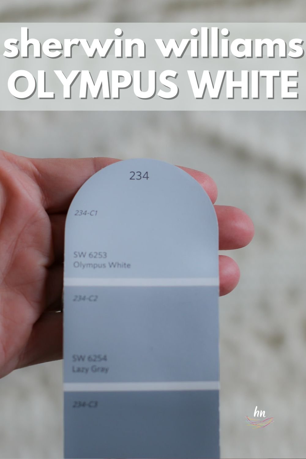
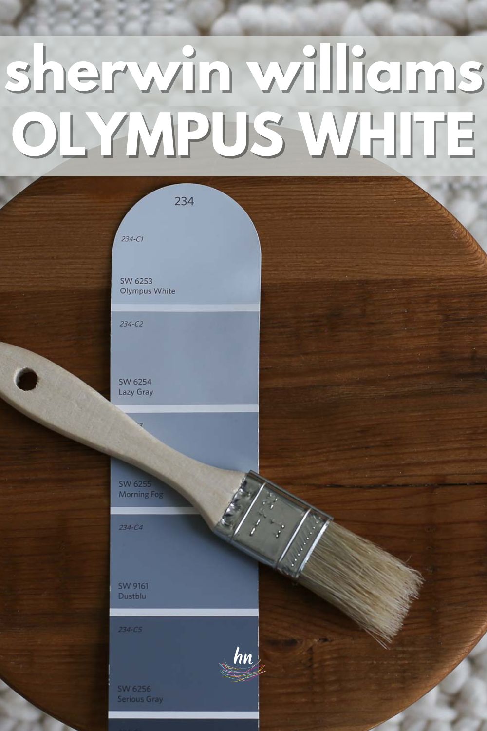
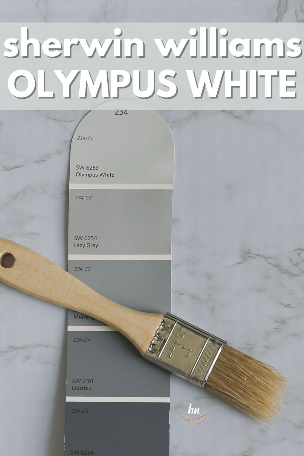
In this paint color series, I’ve covered a large selection of colors, including many neutrals and a few moody colors. Today I’m shining the spotlight on another neutral: Sherwin Williams Olympus White (SW 6253). This light, cool blue-leaning gray stuns anywhere you want to use it.
If you’re on the hunt for a new neutral with just enough color to have a little personality, keep reading. After you learn all the details about Sherwin Williams Olympus White, I’m confident you’ll consider using it in your next remodel!

FAQs about Olympus White
What color is Sherwin Williams Olympus White?
Olympus White is a beautiful light shade in the gray family. It has just enough saturation in it that it won’t read as off-white, even in bright rooms. And yet it also contrasts well with white trim.
Is Sherwin Williams Olympus White cool or warm?
Olympus White is a cool-toned gray with blue undertones. It’s a lovely light gray that will cool down a warmly-lit room to make it read more neutral.
Where should I use SW Olympus White?
This shade can be the highlight of any area in your home! Give Olympus White a chance in:
Kitchens
Bathrooms
Living rooms
Bedrooms
Nurseries
Playrooms
Hallways
Laundry rooms
Staircases
Basements
And more!
Thanks to this shade’s lovely light and neutral nature, it looks wonderful in nearly every style of home!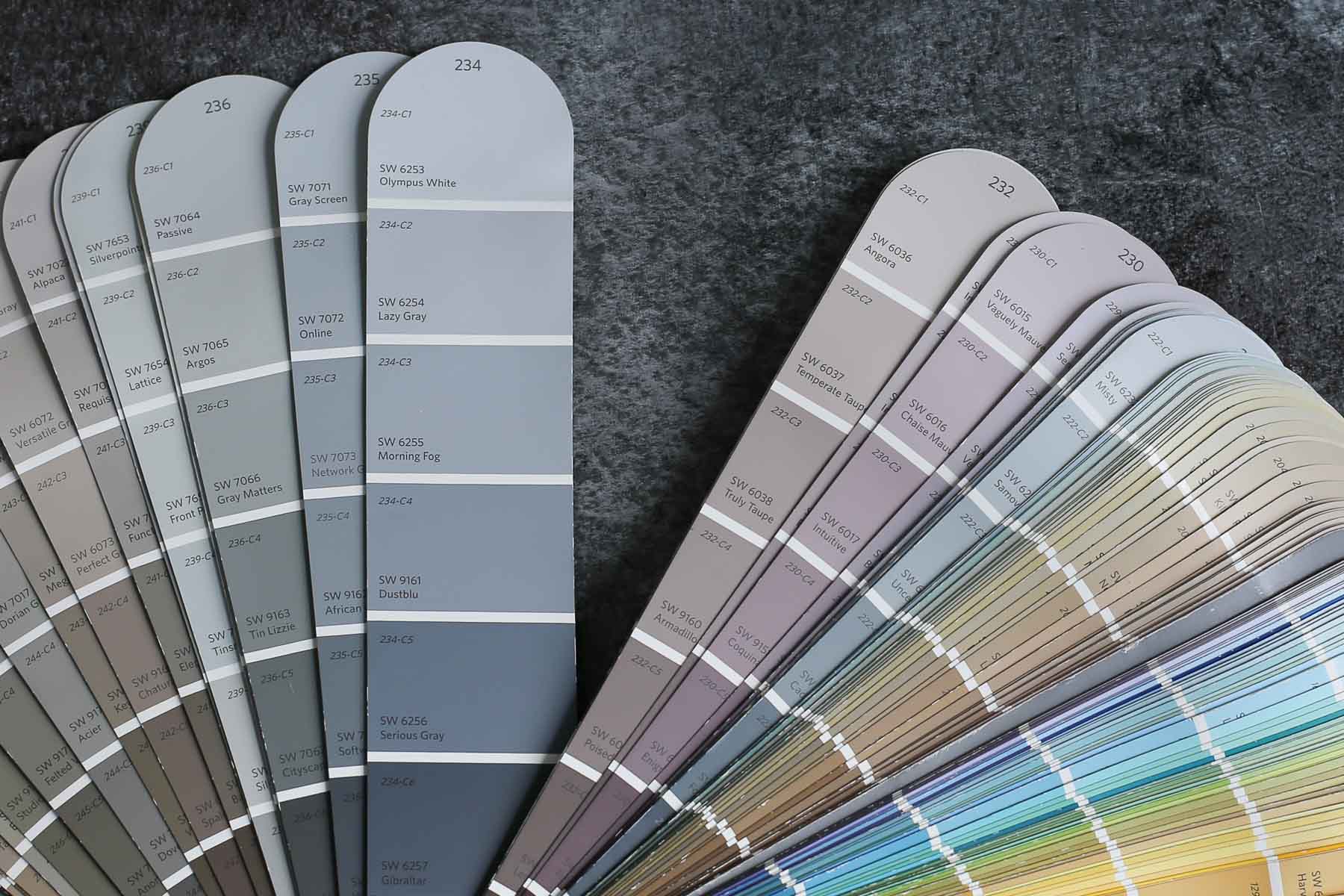

Olympus White in the Wild: Video Sneak Peek
Sherwin Williams Olympus White Undertones
Due to the process of blending colors in differing amounts to create a new color, every single shade of paint has undertones.
Knowing what colors a shade of paint is likely to display is helpful so that you can effectively choose a color that will look incredible with your home and decor.
That’s why I can’t recommend using paint swatches strong enough as you search for new paint colors. Doing this one extra step can potentially save you hours of time (and frustration) and hundreds of dollars!
Let’s investigate SW Olympus White’s undertones. This color lives in the gray family, but it has some very noticeable blue undertones.
In fact, the blue can come through so strongly at times that, given the right circumstances, you might think you painted your walls light blue instead of light grey.
In general, Olympus White is a light, neutral gray. But, it is helpful to know its blue side can peek through pretty convincingly sometimes.

NOTE: All paint colors have a little bit of a chameleon quality to them due to the influence of lighting and decor. That means that they almost never look the same in two different places or in the same place at two different times of the day.
Use paint swatches to help you get a clear picture of how your lighting and surrounding decor will change the way your favorite shades appear in your home.
My favorite type? The peel and stick samples are super easy to use, and can be moved around to different locations in a room to really test out the color without painting it onto your wall! Get your own peel and stick sample⤵.
If undertones make your head ache, you’re not alone! Grab your no-cost copy of “5 Biggest Paint Choice Mistakes” Click here or enter your email below. I’ll send the tips right away!⤵️

How Different Types Of Lighting Affect SW Olympus White
Shades with strong undertones can change a little dramatically in different lighting situations. Here’s a basic idea of how you can expect Olympus White to read.
- North-facing light – northern light is blue-tinted, making it the coolest natural lighting. That will play into this color’s cool tendencies and draw out the blue undertones even more.
- South-facing light – warm southern lighting will tone down Olympus White’s cool side and make it read more neutral and gray.
- East-facing light – eastern light is a warm yellow light in the morning and cool light in the afternoon. That means that Olympus White will read more neutral and gray in the morning and shift to a cooler gray-tinged blue later in the day.
- West-facing light – western light is the warmest natural light (late in the day), but it’s cool-leaning early on. This shade will appear cool gray-blue the first part of the day until the rich, red nature of western light takes over in the late afternoon. At that point, it will neutralize the cool blues and read more neutral.

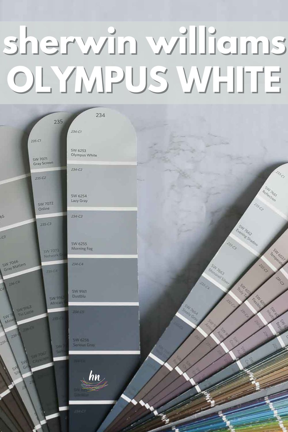
Great Coordinating Colors for Olympus White
Even though this shade has strong blue undertones, it often behaves in a very neutral way and will pair well with many darker shades.
If you want a few ideas of complementary colors to pair with Sherwin Williams Olympus White, try starting with:
- Extra White
- Let It Rain
- Lazy Gray
- Perle Noir
- Ice Cube
- Serious Gray
- Abalone Shell
- Accessible Beige
- Gibraltar
- Reflection
- Virtual Taupe
- Sea Serpent
- Double Latte
- Kilim Beige
- Monorail Silver

LRV of Sherwin Williams Olympus White (SW 6253)
Looking at paint involves a lot of subjective interpretation based on how shades change due to nearby influences. Let’s briefly cover an objective method for evaluating paint colors.
Light Reflectance Value (LRV) is a number on a scale between 0 and 100 that’s assigned to each paint color based on how much light it REFLECTS. A lower number means the color reflects less light, while a higher number means it reflects more light.
The LRV of SW Olympus White = 68
Olympus White is firmly in the “light” range, which means it offers color without appearing too dark in rooms with low natural light.

LRV…what? Don’t worry, I’ve got you! This no-cost guide will help you avoid the paint color picking mistakes most people make! Click here or enter your email below. I’ll send the tips right away!⤵️
Olympus White Compared to Other Colors
Comparing similar shades against each other is a reliable way to determine how undertones affect them. Here’s how Sherwin Williams Olympus White looks when we compare it to three different (and similar) popular shades.
Sherwin Williams Olympus White vs. Agreeable Gray
Since SW Agreeable Gray has a lower LRV than Olympus White, sitting at a value of 60, it makes it a bit darker. In addition, it’s a greige that leans toward the beige side of life, which makes it read warmer and far more brown than Olympus White reads.

Sherwin Williams Olympus White vs. Reflection
Sherwin Williams Reflection has an LRV of 66, which makes it nearly identical to the level of Olympus White. It’s also gray with blue undertones, but it also tends to have just a wink of purple that peeks through from time to time. Reflection will often read more neutral gray than Olympus White.

Sherwin Williams Olympus White vs. Passive
With an LRV of 60, Passive is noticeably darker than Olympus White is. Although it’s darker, it also leans toward the cooler side of the spectrum and has blue undertones. Unlike Olympus White, Passive can look icy and occasionally even slightly purple in certain lighting situations.

More Colors to Consider
I get it: choosing colors can be a challenge! If you aren’t ready to commit to Olympus White quite yet, check out these other shades of gray – I’m confident you’ll find one (or more!) to fall in love with!
- Anew Gray (Sherwin Williams) – a light to medium warm greige.
- Stonington Gray (Benjamin Moore) – a rich, mid-toned and balanced gray.
- Wickham Gray (Benjamin Moore) – a mid-toned gray with blue undertones.
- Revere Pewter (Benjamin Moore) – a warm, mid-toned greige.
- Light Pewter (Benjamin Moore) – a popular light gray with greige undertones.
- Repose Gray (Sherwin Williams) – a warm-leaning, mid-toned greige.
- Mindful Gray (Sherwin Williams) – a warm greige falling in the light to medium range.
- Light French Gray (Sherwin Williams) – a light, neutral gray.
- 13 Perfect Blue-Gray Paint Colors – need a few good options? We got ’em!
Feeling lost? I gotcha, boo! Get a zero-cost copy of my new guide to avoid the paint color picking mistakes people make! Click here or enter your email below. I’ll send the tips right away!⤵️
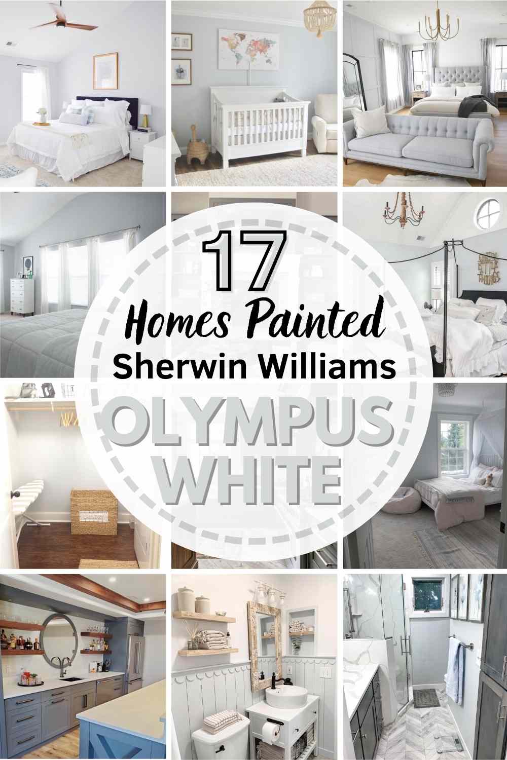
17 Real Life Homes Using Sherwin Williams Olympus White
Ok, information overload is over! Let’s see how Sherwin Williams Olympus White shines and sparkles in different homes as lighting situations and decor try to influence it.
Here are 17 real houses that use Sherwin Williams Olympus White paint.
Living Rooms Painted SW Olympus White
A quick note here: don’t forget to consider picking the right paint finish…it’s not only about getting the color right! We have an in-depth explanation of choosing sheens here.
1. A Cozy Gray Paint Color
In this example from Restyle it Wright (link removed as site is no longer active), this shade strikes that ideal balance between too much and too little color. Olympus White creates a cozy space in a low-lit room.

2. Leans Cool with Blue Accents
Waldron Designs got playful by using Olympus White on the walls and a darker gray-blue on the ceiling. This hue pairs well with blues, and the combination here is a natural fit!

3. Subtle Gray in Natural Light
If you want a bold gray with blue undertones, a different color such as Krypton may be a better fit. This room from Delish and Decor highlights the beautiful soft yet nuanced qualities of this hue.

4. Great Neutral for Any Decor Style
Notice how the bright warm lighting in this living room from @comfortandgracehomedesign draws out the gray in this paint.
By contrast, you can see some blue undertones peeking through on the left side of the picture, where the paint is in the shade and has a blue throw blanket nearby.
Olympus White Bedrooms
In general for bedrooms, and low-traffic areas, flat paint is fine. If you like something with a bit of shine (and more ease of cleaning) opt for eggshell or satin.
5. Pairs Well with Bright Whites
This bedroom from Delish and Decor is calling my name! It’s soft and light with just a hint of blue to create a tranquil space.

6. A Cool Gray in this Master Suite
I love gray, and I love blue, and I think combining them into one light, neutral color is a recipe for relaxation!
This bedroom from One Kindesign shows how a bedroom doesn’t need to be a cave to be a peaceful retreat from the stress of the world.

7. Warmer in the Shadows
SW Olympus White leans cool thanks to its blue influence, but it doesn’t feel as cool when it’s in the shadow. This room from Linen and Ivory reads as balanced and beautiful.

8. Light and Airy Gray Bedroom
I mentioned earlier that this color is light enough that it can wash out in bright lighting.
This bedroom from Whit Speaks (link removed as site is no longer active) is an ideal example of how light you can expect Olympus White to read in a bright room. It still has enough saturation to contrast against the white.

9. Blue Undertones in this Neutral Nursery
Forget about pink, blue, yellow, or green for the nursery! As Meghan Mosakowski shows us here, light cool gray is the perfect neutral backdrop to provide a serene space.

10. Bright Light Gray Bedroom
In this bedroom with lots of natural light pouring in through its many windows, Olympus White is living up to its “white” moniker and truly looks the part.
Here, you can see those blue notes pulling through just a bit, for a lovely, sophisticated, and restful look in this traditional bedroom.
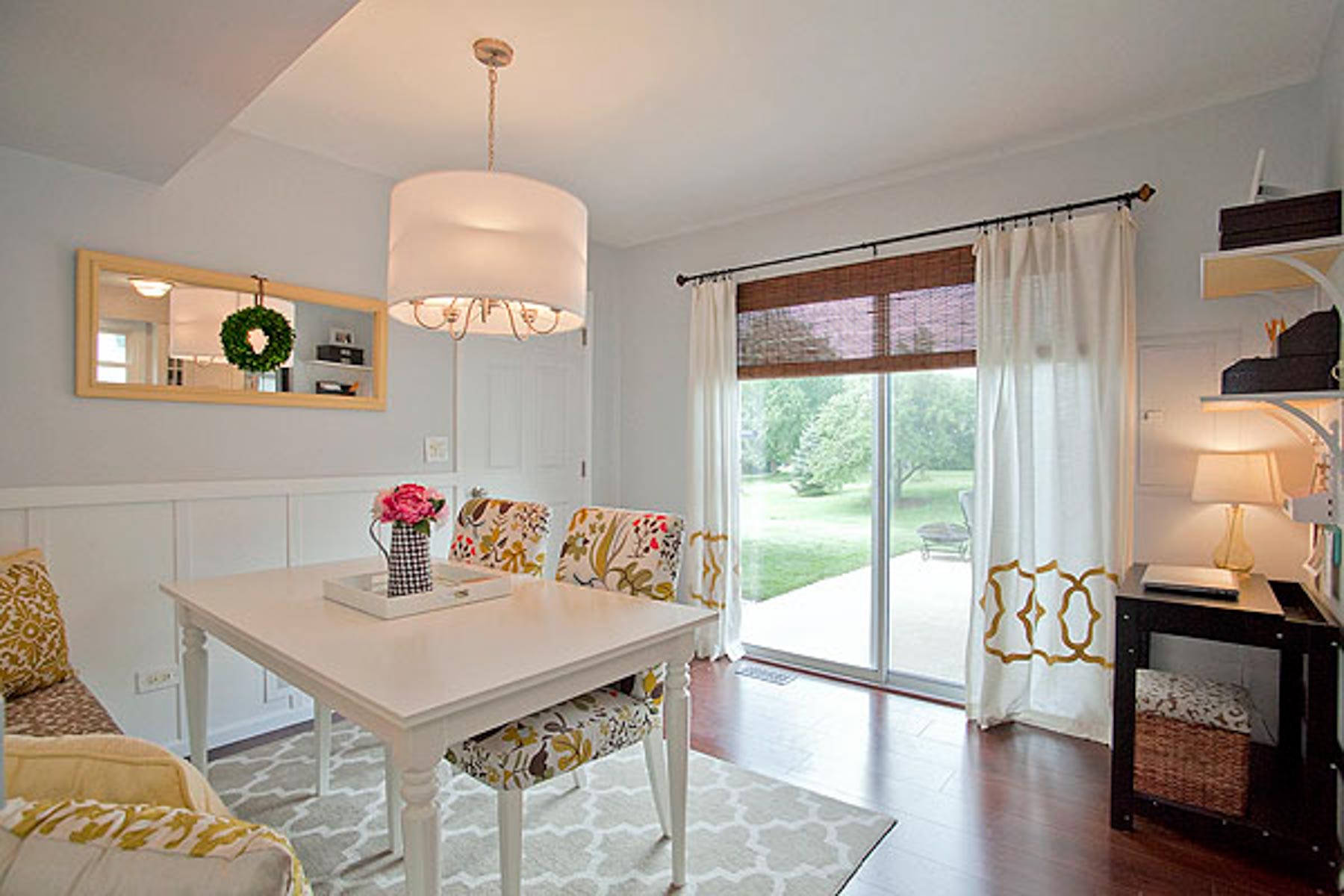
Kitchen and Dining Spaces Featuring Olympus White
For kitchens, eggshell or satin are popular finish choices for walls. For cabinets consider semi-gloss or high gloss for the most durable finish (and a gorgeous glow).
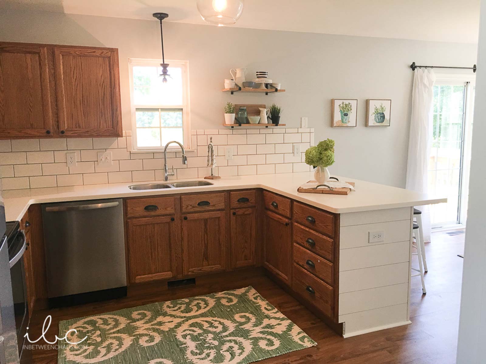
11. Goes Well with Wood Tones
Even though there are blue undertones, Olympus White is a neutral color that In Between Chaos pairs well with many different colors, including wood tones.
12. Great Neutral Backdrop for Bright Decor
In this example from Restyle it Wright (link removed as site is no longer active), this shade reads as the ideal lovely pale gray that many people crave.
It has just enough saturation to contrast with the white trim and doors, but it’s light enough to stay light in the low lighting.
13. Almost White in Artificial Light
Olympus White was a nice choice for this space from Dreambook Design because this shade can bridge that span of very light to very dark gracefully.
14. Coordinates Well with Blue Cabinetry
In this basement kitchenette/bar with the lovely smoky blue-gray cabinetry, Olympus White SW 6253 is a great choice for the wall color.
It has a tiny bit of complimentary color but doesn’t compete. It’s a great supporting actor in this space.
Bathrooms in SW Olympus White
Don’t forget the finish! For bathrooms the perfect sheen is either an eggshell or satin. Why? We’ll tell you in this post about paint sheen.
15. Coastal Vibes with Blue Gray Paneling
If you’re working with coastal decor like Haus and Hand was, you might find that Olympus White fits the bill! It’s subtle, neutral, and pairs well with sand-toned shades.

16. Appears Blue Against Truer Grays
If you try to pair Sherwin Williams Olympus White with more neutral grays as It’s a Southern Thing (link removed as site is no longer active) did here, you’ll see its blue peek through more strongly.
Incorporate some blue in the decor, and you’ll have a winning combination.

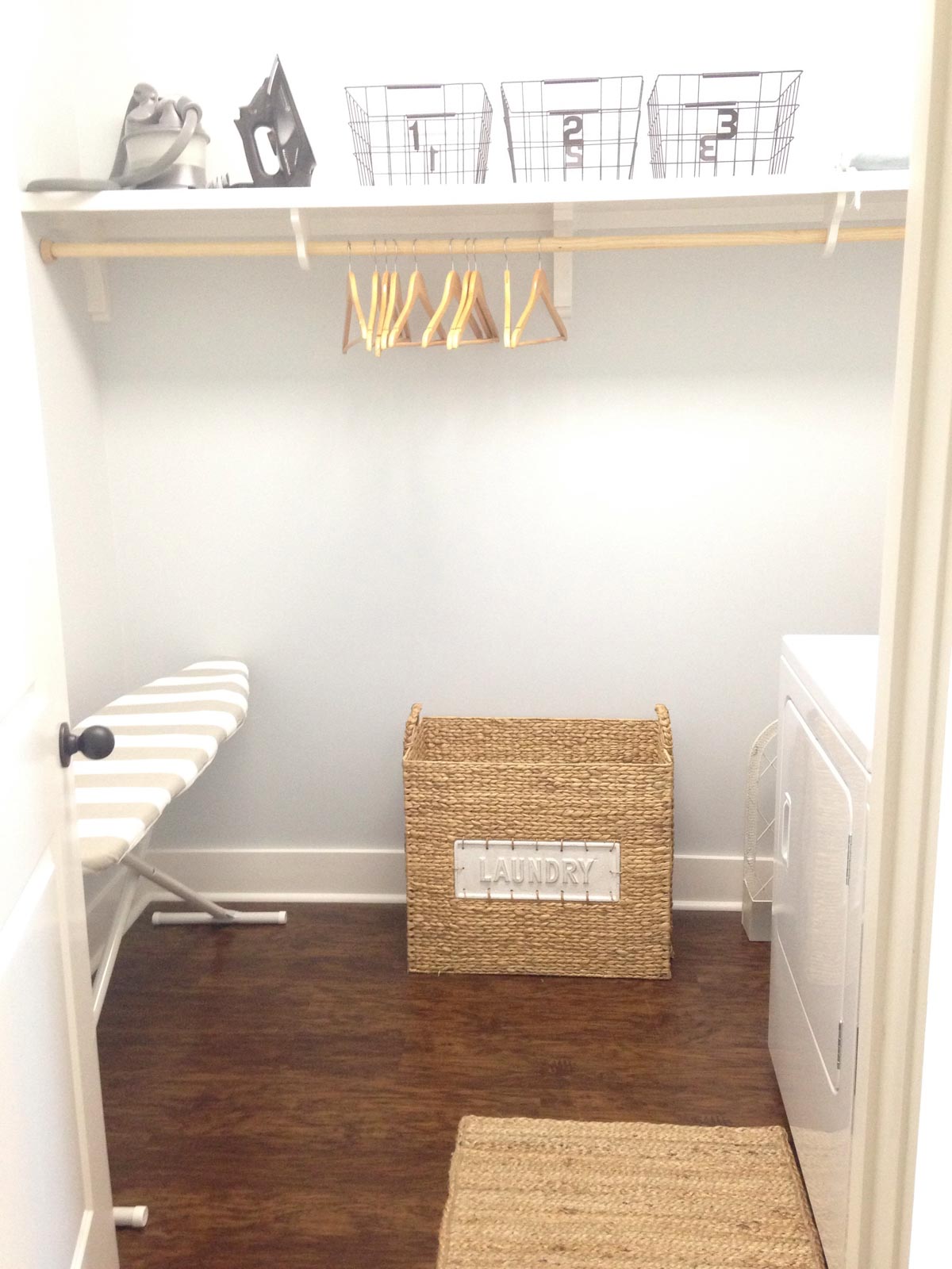
Olympus White Laundry Rooms
17. Best Gray for a Clean Look
This shade can provide a very clean and neutral backdrop when it’s in the ideal lighting. Artificial light like in this laundry room from The Gatlin’s Blog is the perfect example!
Final thoughts – If you love shades of gray, check out Sherwin Williams Olympus White. This stunning, light, cool-leaning, blue-tinged gray paint looks lovely in almost every room of the house. Its timeless nature (with a hint of personality!) makes it a clear contender for any home remodel project!
And if this is a color you’re seriously considering, remember paint-sampling is better than ending up paint-sorry! I highly recommend these peel and stick samples because they are inexpensive, re-usable and re-positionable…
Pin this paint color for later! And if you use this paint shade, leave a comment on the pin! That helps others decide if they want to try this color, too!

Ready to show those boring, bland walls who’s the boss at home? This no-cost guide will help you sidestep mistakes that almost everyone makes when it comes to picking paint! You’ll be on your way to perfect paint promptly…pinky swear.


Leave a Reply