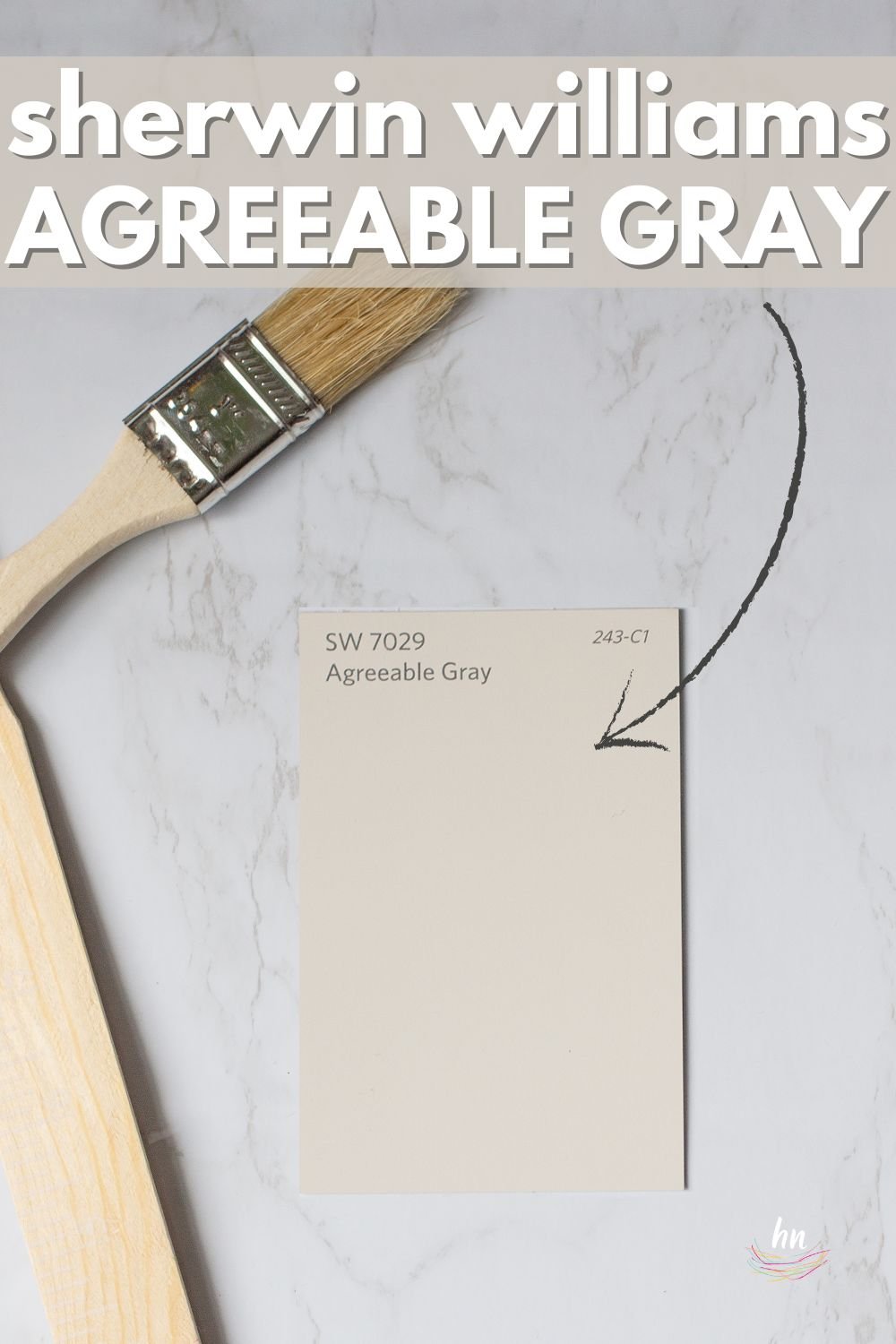


All about Sherwin Williams Agreeable Gray, plus see it used in real homes…
Sherwin Williams Agreeable Gray #7029 is a warm greige that works well in almost any space.
You know how there’s just that one person in your life that is super sweet and loved by basically every person they meet? Think of Agreeable Gray as her.
It’s not a statement color but rather a soothing shade that can easily fade into the background and let your furnishings take center stage.
I’ve got a lot of information for you in this post. We’ll compare Agreeable Gray to some other popular greiges and see how real homes use it.

Agreeable Gray at a Glance
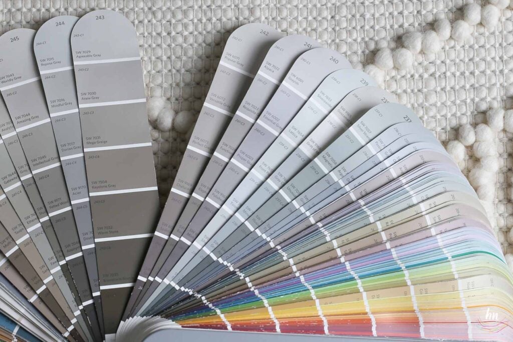
For such a popular color, Sherwin Williams is fairly tight-lipped about this shade on their website. I guess they are kind of like a mama who loves all of her children equally—no special treatment for this shade.
I, on the other hand, will break this baby down and give you all the info you need to decide if Agreeable Gray is right for your home. Here are the basics:
The Quick & Dirty Details on Agreeable Gray
- Classic greige color with a slight warmth from beige undertones.
- Gorgeous neutral known for its versatility, allowing your home decor to shine.
- Transforms from warm to cool based on your lighting conditions.
- Popular paint color that is amongst Sherwin Williams’ best-sellers.

Real Homes Showcasing Agreeable Gray
We have a lot more in the “nitty gritty” details department to share with you. But I like to have dessert first, so let’s get to the good stuff and then we’ll go back to the textbook info.
But remember, even if you end up loving how this shade looks in one of these examples, that doesn’t mean the look will transfer perfectly to your own home. Try our Paint Perfect System to learn my easy way to test your paint colors at home and ensure you won’t end up with paint you hate! Here’s more info 👇

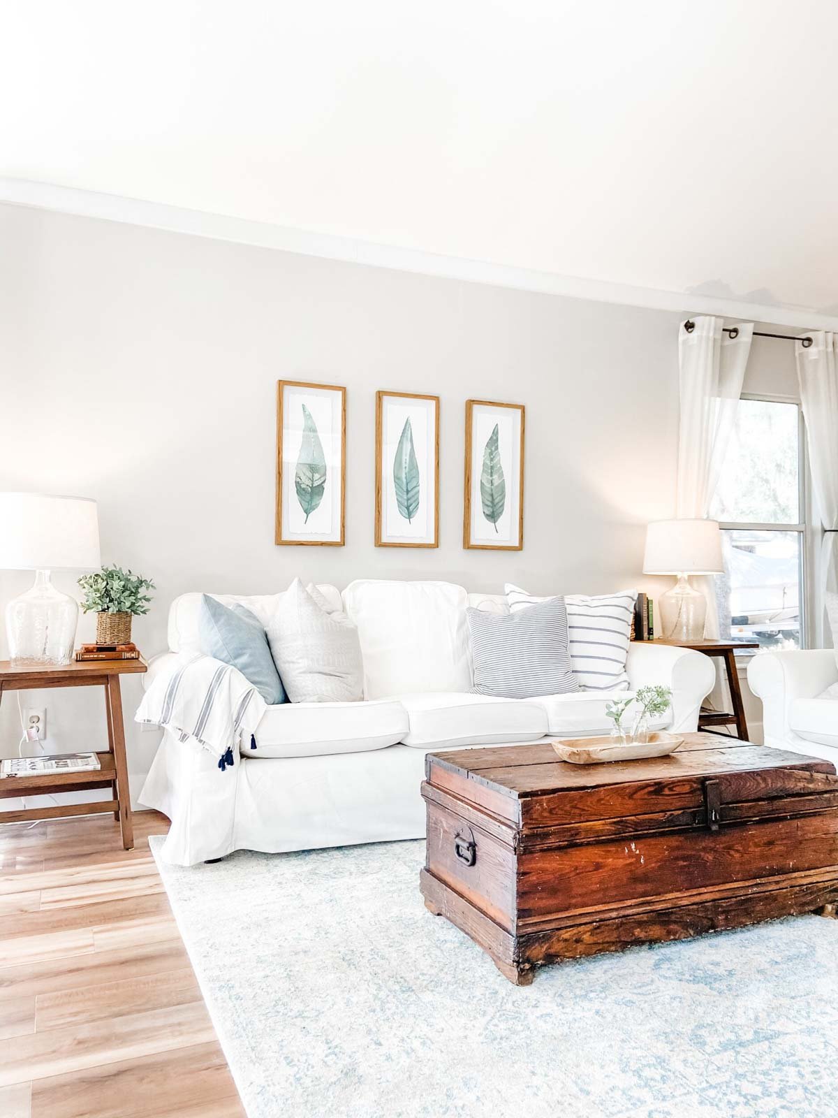
SW Agreeable Gray in Living Spaces
The living room is the hangout zone of your home. If you’re anything like me, you’ll spend a good amount of time staring at the walls, so make sure they are coated in a shade that works!
Here’s how Agreeable Gray looks in real living rooms.
A quick note here: don’t forget to consider picking the right paint finish…it’s not only about getting the color right! We have an in-depth explanation of choosing sheens here.
1. Bright White Trim with Agreeable Gray
This image from Inspired by Charm gives you a great idea of how Agreeable Gray looks in a room with plenty of natural light. Plus, you can really see the shade pop against the white trim below!

2. With Warm Wood Tones
Again, this is a fantastic example from @creeksidefarmhouse of how light and bright this paint shade reads when it’s in a room with plenty of natural light. At first glance, the walls almost look white, but you can see the contrast between the ceiling and trim.
3. Balanced Neutrals
I love how the fireplace really pops with this shade. You can see how warm SW Agreeable Gray is here against that gray stone in this image from @homeof4inthewoods.
4. Seamless Backdrop
Similarly, Agreeable Gray also works well with a whitewashed fireplace like this one. I think it would also look fantastic with a DIY German Smear fireplace too!
5. Ample Natural Light
This photo from @kkddesignco shows you how Agreeable Gray looks when flooded with pretty natural light (that view!!), but also how artificial lighting can change the color.
Take a look at the color variation between the light from the chandelier and the wall right next to it—it’s a pretty major difference.
6. Creamy Dreamy
In Living Simply by Design Co’s home (link removed as site is no longer active), the paint shade takes on an almost creamy oatmeal shade that’s very pretty with all the white furniture.
7. A Touch of Green
Here’s a great example of when Agreeable Gray can pick up just a teeny bit of a green undertone.
8. Playing with Color
I love this shade in an entryway or foyer! It can set the tone for your entire home by creating a soothing scene.
9. Friend to White Furniture
If you are a fan of white furniture, Agreeable Gray may be just the shade you are looking for! It helps white furniture pop without detracting from it.
SW Agreeable Gray in Bathrooms
Bathrooms can be notoriously tricky when it comes to picking paint. This is because most bathrooms have very little (if any!) natural light, and the wrong paint can leave your walls looking muddy and flat.
Agreeable Gray may be just the shade you need—here are a few examples.
Don’t forget the finish! For bathrooms the perfect sheen is either an eggshell or satin. Why? We’ll tell you in this post about paint sheen.
10. Clean and Natural
This bathroom gets a decent amount of natural light, but if you look at the corners of the room, you can get an idea of how SW Agreeable Gray will look when light isn’t hitting it. (Project credit: @craftandtradenc @craftandtradestudio, photography: @tiffanyringwald).
11. High-Contrast Fixtures
I love this shade with white cabinets. Just like it did with the furniture, it helps them pop and keeps the room from being too monochromatic.
12. Hint of Violet Undertone
Despite the large windows in this space, all the natural light is directing down towards the floor. This is a great example of how Agreeable Gray might look when it has less natural light.
It’s still very pretty but those purple undertones start to peek out a bit more.
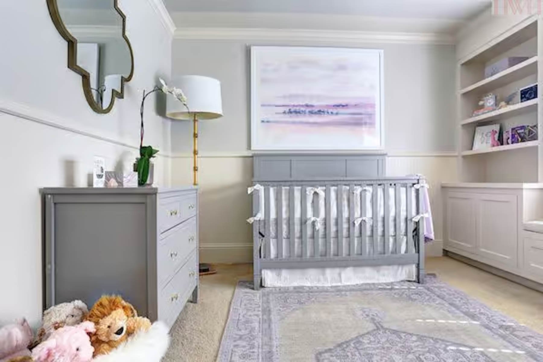
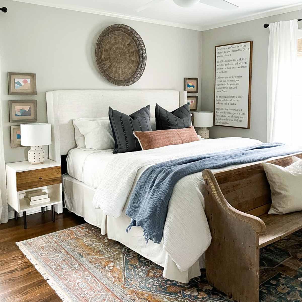
Bedrooms with SW Agreeable Gray
In general for bedrooms, and low-traffic areas, flat paint is fine. If you like something with a bit of shine (and more ease of cleaning) opt for eggshell or satin.
13. Statement Wood Ceiling
Paired with the dramatic wood ceiling, this shade fades into the background in a really good way.
14. A Lesson in Textiles
Again, the neutralness of this tone works really well in this bedroom. The paint color compliments rather than competes with the patterns and colors.
15. Lavender (and Gray) Dreams
This nursery from Honey We’re Home shows the versatility of Agreeable Gray, pairing with cool-toned gray and lavender just as well as it works with warmer colors.
16. Pulling Beige
This bedroom with SW Agreeable Gray shows how the hue can pick up hints of creamy taupe.
17. Natural Features
If you scroll through the photos of this adorable nursery below, you’ll notice how the paint picks up a green undertone. This is likely due to the green trees reflecting light through the window.
18. Light and Feminine
Here’s another beautiful nursery with Agreeable Gray on the walls. If you want a chic, pretty shade that will grow with your child, this is a great option!
19. Seeing Green…Undertones
The green undertones really shine in this room from Mindfully Gray. It really suits the nature-inspired decor.
Agreeable Gray in Other Spaces
Thinking about adding Sherwin Williams Agreeable Gray to your entryway, laundry room, kitchen or dining space? Here are a few examples to show you want this paint looks like in those spaces!
20. Soft Bohemian
Could this view be any more serene? You can see on the left-hand side where the light reflects off the greenery and those green undertones in the paint start to come out a bit more.
21. A Contemporary Welcome
This entryway console gets a bit less natural light so the shade is slightly darker, but still welcoming.
22. Laundry in Style
Laundry is one of my least favorite chores, but if I had a serene, pretty space like this laundry room with Agreeable Gray, I may feel differently!
23. Bright Breakfast Nook
Looking for a pretty neutral that you can use in your kitchen then wrap around to your eat-in dining space? This shade may be just the thing!
24. Moody and Violet in Low-Light
If you’re wondering how Agreeable Gray looks at night or in a space with no natural light at all, here’s a great example. This space has warm lighting so it pulls those warm purple undertones out.
25. Welcoming Open-Concept
If you have a great room where your dining, living, and entry are all open to each other, Agreeable Gray can be a great option.
26. Pure White Cabinets
Agreeable Gray in a kitchen works so well, particularly if you have white cabinets. This gives you the look of an all-white kitchen but with more depth.
27. Elegant Cool-Tones
You can dress it up or dress it down – either way, Agreeable Gray in a dining room looks fantastic!
More Important 7029 Details
How’d you like those examples of this shade in action?! Lovely, no?
Now we are diving into the world of paint and color theory – hold your hats! If all of this makes you scratch your head a bit, I’ve got the perfect resource for you 👇
SW Agreeable Gray FAQ’s
Agreeable Gray is a warm-toned greige, with primarily beige and green undertones. It can, however, lean cool when used in north and east-facing rooms.
Bright white trim colors go best with Agreeable Gray. Avoid cream shades; they’ll look pretty drab when paired.
SW Pure White is a tried-and-true trim shade that looks wonderful with greige paint colors.
Agreeable Gray’s Undertones
There’s WAY more to a paint shade than a single color. When colors are broken into categories like “whites” or “greens,” this only refers to the mass tone. Beyond that, different hues lying beneath the surfaces make a color unique.
This is what we call undertones.
Agreeable gray is technically a gray paint color, though its strong beige undertones have most calling it a “greige.” It also has distinct green undertones that add to its warmth.
In addition to warm undertones, this shade has just a hint of violet undertones that show up under specific lighting conditions.
How Different Types of Lighting Affect Sherwin Williams Agreeable Gray
Have you ever seen a paint shade look completely unrecognizable from room to room? Well, that’s lighting in action!
Lighting changes how we perceive a color, even more so in complex shades like SW Agreeable Gray. Here’s what you can expect from the shade based on your lighting conditions.
- North-facing light – a north-facing room will get cooler, blue light, taking the warmth of Agreeable Gray, making this shade appear more gray with slight violet undertones. It looks chic with lots of natural light, though borders on dingy in low-light conditions.
- South-facing light – warm southern light shows Agreeable Gray at its best – a warm, light color that reads like a greige-taupe.
- East-facing light – east-facing rooms have more warmth in the mornings and Agreeable Gray may skew beige. This will balance as the day goes on, becoming more cool-toned. The color risks looking slightly flat in these spaces.
- West-facing light – west-facing rooms have lower light conditions in the morning, with lots of warm light shining through in the afternoon. Agreeable Gray will transform with the day, moving from soft and subtle to a gorgeous warm greige.
Great Coordinating Colors
As a neutral neutral paint color, Agreeable Gray has a ton of potential when choosing a color palette. Still, it can be a bit finicky when pairing with coordinating colors.
It is a shade that looks great with soft, balanced colors. Off-whites look lovely with Agreeable Gray, as long as you’re staying away from cream and other yellow-based neutrals.
It also suits earth tones exceptionally well, from sage greens to stormy blues.
Here are some specific colors that look great with Sherwin Williams Agreeable Gray:
- Extra White (Sherwin Williams)
- Pure White (Sherwin Williams)
- Incredible White (Sherwin Williams)
- Snowbound (Sherwin Williams)
- Naval (Sherwin Williams)
- Sea Salt (Sherwin Williams)
- Coral Rose (Sherwin Williams)
- Clary Sage (Sherwin Williams)
- Retreat (Sherwin Williams)
- Hale Navy (Benjamin Moore)
- Rainwashed (Sherwin Williams)
LRV (Light Reflectance Value)
Agreeable Gray is one of the most popular colors Sherwin Williams offers. Part of that may have to do with the LRV number.
LRV stands for light reflective value, which is basically just a fancy-schmancy way of saying how dark or light a color feels based on the light reflections.
The higher an LRV is, the lighter the color is. It’s done on a scale of 1 – 100, so think of 1 as pitch black and 100 as a bright white.

While there are some people who love extremes, most of us are perfectly happy and content to stay in the middle lane. This is particularly true when it comes to paint colors!
For me, an LRV right around 60 seems to be the happy spot when you’re looking for a good neutral. It’s not too light but it’s certainly not dark. Coincidentally, Agreeable Gray has an LVR of 60. Perhaps that’s why they call it “agreeable”? 😉
This Shade vs Similar Paint Colors
It often helps to see the undertones of a shade when it’s compared with similar colors. Here’s how Sherwin Williams Agreeable Gray stacks up against three other popular paint colors.

Comparison to: Repose Gray
Both of these Sherwin Williams shades are neutral warm grays. However, with an LRV of 58, Repose Gray is a touch darker than Agreeable Gray. If you don’t want a greige, you probably wouldn’t be happy with either of these colors!
Between the two, Repose Gray is more of that classic gray shade than Agreeable Gray, but it’s still warm. It also can have green undertones in some low-light situations, which you may or may not love.

Comparison to: Accessible Beige
Similarly, Accessible Beige has an LRV of 58, so slightly darker than Agreeable Gray. Where I would call Agreeable Gray a gray shade (albeit a warm one!), Accessible Beige, on the other hand, is called beige for a reason.
This shade is definitely more taupe than gray, and quite a bit warmer than Agreeable Gray.

Comparison to: Revere Pewter
With an LRV of 55, Benjamin Moore’s Revere Pewter stands out as the darkest in this group. This shade is an incredibly popular one that you’ve probably seen on your internet feed at some point.
Compared to Agreeable Gray, Revere Pewter is much warmer of a shade. To me, it almost looks like tan or beige.

If this is a color you’re seriously considering, remember paint-sampling is better than ending up paint-sorry! I highly recommend these peel and stick samples because they are inexpensive, re-usable and re-positionable.
Paint Color Recap
So, there you have it – everything you need to know about SW Agreeable Gray. I hope this in-depth paint color review has given you some clarity on whether it’s the perfect shade for you.
And if you’re still loving this one and considering using it at home, remember to sample before you swipe your credit card! My favorite way to do that is buying one of these peel-and-stick samples that doesn’t leave actual paint on your walls! Totally commitment-free!
More Paint Colors to Consider
If you aren’t sure whether this color is the right paint for you, I’ve got plenty of other options for you to check out:
Pin this Agreeable Gray paint exploration post for later!

Pssst…before you go, I sure would love to hang out with you again really soon! And before you’re on your way, make sure you grab your free copy of the 5 Biggest Mistakes People Make When Picking Paint, so you can avoid the heartache (and hole in your wallet) when your paint choices don’t quite work out! Click here, and I’ll send your free copy right now!


Mary says
So pretty all these samples and great information. I was wondering about doing Agreeable Gray on my bathroom cabinet and Chantilly Lace on the walls. Wondering what you thing]k about it as a cabinet color?
Thank you for all your great advice!