


Cozy, creamy, and balanced—if these adjectives are calling your name, you’ll love Drift of Mist from Sherwin Williams! Read all about it, plus see 25+ real homes that use it!
Neutral paint colors have long been lord and master of the paint world. Their ability to look amazing in different lighting situations, as well as their tendency to play nice with a large variety of paint colors, makes the choice to “go neutral” easy for many people.
But what isn’t easy is actually picking out your neutral shade. That job is the opposite of easy. Ask me how I know! That’s why today we are taking a deep dive into Drift of Mist, a poetic-sounding warm shade from Sherwin Williams.
This color is special. It’s a warm-toned, light gray that practically sparkles as it fades into the cozy background it helps create.
Sure, Drift of Mist sounds cool, and it looks nice on the swatch card – but is it right for YOUR home?
Well…maybe. That’s what you’re going to find out in today’s paint post adventure! 🙂 Used correctly and in the right spaces, it’ll be gorgeous. But, with some tricky undertones that can peek through, it is definitely not a one-paint-fits-all type of situation.

Drift of Mist (SW 9166) at a Glance
- SW Drift of Mist is cozy, warm, creamy (but not too creamy), light gray. Although it’s warm-toned, it somehow feels rather balanced and can pair well with both warm and cool colors.
- Like many other timeless off-whites (such as SW Snowbound and SW Greek Villa), Drift of Mist plays with lighting and undertones in its own unique way.
- This shade is not for everyone or every room! Drift of Mist has green undertones that can be pretty but also tricky to contend with.

Sherwin Williams Drift of Mist Undertones
Here’s the thing about Drift of Mist and its undertones. While they aren’t usually overt, there are some green undertones to deal with. They don’t show up all the time, but if you aren’t a fan of green undertones, then please do yourself a favor.
Carefully check this paint in your home in small doses before you go all out and buy 6 or 8 gallons and decide you hate it. It’s not just a standard warm gray paint color – it’s a bit more nuanced.

If undertones make your head ache, you’re not alone! Grab your no-cost copy of “5 Biggest Paint Choice Mistakes” Click here or enter your email below. I’ll send the tips right away!⤵️

How Different Lighting Affects Drift of Mist
As you’ll see in the images below, lighting plays a HUGE part in how this shade looks on your walls.

Take a look at which direction your lighting comes in from to learn a bit more about what to expect from this shade.
- West-facing rooms are blessed with a flood of warm sunshine in the afternoons and early evenings. This lighting really makes the warm undertones of this shade sing. The shade will look like a warm greige with pops of green here more than anywhere!
- East-facing rooms are the opposite. They get their burst of sun in the mornings, and it cools off throughout the day. Here, you’ll see those warm undertones in the earlier hours (but not as much as you will in a west room!).
- North-facing rooms tend to have the coolest natural lighting of any space. In this scenario, you will see more of the crisp cream tones come through.
- South-facing rooms have consistent, filtered, warm light. Here, Drift of Mist’s warm undertones show, but subtly so.
NOTE: Paint colors often look totally different on a screen than how they look in your home. If you want to know exactly what a paint color will look like, you need to use paint samples to check out each and every color you may want to use.
Grab the samples, and check out each hue against your decor and in your particular lighting situations throughout the day.
As far as sampling goes, I highly recommend these non-messy, re-usable, re-positionable peel and stick paint samples ⤵
Real Homes Using Sherwin Williams Drift of Mist
I don’t know about you, but I’m ready to have some fun with this hue! Seeing how a color looks in actual homes is a helpful way to help you see how it REALLY behaves.
Let’s check out some real-life homes to see how this paint appears on real walls under various lighting conditions.
Living Rooms in SW Drift of Mist
A quick note here: don’t forget to consider picking the right paint finish…it’s not only about getting the color right! We have an in-depth explanation of choosing sheens here.
1. Drift of Mist in Light-Filled Living Room
Drift of Mist is used brilliantly in this super bright room from @homestylelove43 on Instagram. At a quick glance, you can see the soft off-white color.
Closer inspection shows how the paint can look gray in low light and even greige in certain lighting (bottom left of the picture against crisp white trim).

2. Living Room Painted Light Greige
Don’t you love this chic room by A La Maison Home & Lifestyle seen on Houzz?
The gray ceiling beams, gray stone, and decor pieces draw out the gray undertones in Drift of Mist. The walls are light and bright but definitely lean gray and slightly cool in the natural light.
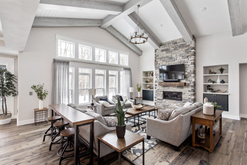
3. Vaulted Family Room in SW Drift of Mist
Ah, a perfect blend of chic and cozy from My Texas House. The greige decor and wood pieces pull out the warm tones and creamy nature of Sherwin Williams Drift of Mist.
Note that it’s also just dark enough to avoid blending in with the brighter white decor items.

4. A Warmer Look at SW Drift of Mist
Here, you can see how Drift of Mist looks against wood.
This living room from Curio Design Studio is light-filled and gorgeous, making this paint look fresh and slightly warm.

5. Drift of Mist with Cool Wood Tones
Alternatively, you can see here how Drift of Mist plays against a lighter wood shade.
It’s bright enough to make darker spaces feel light and spacious while still having some creamy color. And one reason its SO bright in this space? Yes, there’s a ton of gorgeous natural light streaming in, but the homeowner also chose to us the shade at 50% (only half the pigment was added to the paint, making it brighter/whiter).
Drift of Mist Kitchens
For kitchens, eggshell or satin are popular finish choices for walls. For cabinets consider semi-gloss or high gloss for the most durable finish (and a gorgeous glow).
6. Timeless Gray & Bright White Combination
If you’re dreaming of a classic white kitchen but with a bit of a subtle twist, take a look at this farmhouse-style kitchen.
I love how well the painted walls work with the countertops, making the whole room feel warm vs stark.
7. Kitchen with Greenery
Kitchens don’t get any more timeless than the one in this home! Let’s see…adjectives that come to mind are bright, soft, creamy, inviting, and beautiful. And yet, even in a bright space like this, Drift of Mist isn’t too bright.
The chairs and stove hood add a nice natural pop of color, and that pretty greenery outside makes those undertones pop.
8. Kitchen with a Brick Backsplash
When you’re working with earthy tones in bricks or in wood, a cool-leaning white or off-white will make you cringe every time you see it.
The warm tones in Drift of Mist often make it an ideal color, and this kitchen shows how it can even bring these two elements together in a natural fit.
9. Painted Kitchen Cabinets in Drift of Mist
Sherwin Williams Drift of Mist reads as crisp white against the dark gray walls and black counters in this example from 2 Cabinet Girls. It expertly bridges the gap between dark gray walls and warm wood floors.

10. Painted Kitchen
If you love weathered wood and reclaimed wood, Sherwin Williams Drift of Mist is one hue to put on your shortlist of possibilities.
Drift of Mist walls feature them beautifully in this kitchen (cabinet color here is SW Repose Gray)!
Drift of Mist Paint in Dining Rooms
11. Chic Light Gray Dining Space
This dining room from The Southern Source is exactly the type of place that I want to linger in after a long meal.
The paint makes the space look peaceful and clean, with just the right amount of contrast against the trim.

12. Dining Room Walls in SW Drift of Mist
This room from What Jess Wore shows off the paint’s gray-leaning greige qualities perfectly.
If you don’t see it right away, just look at it compared with the crisp white shelves and trim.

13. Drift of Mist in Low Light
Low light brings out the gray in Drift of Mist and makes it look much darker. T
he walls in this dining room by @heien.design read soft light gray, and the slats add a nice texture to keep the paint from looking dingy or too flat.
14. Drift of Mist Farmhouse Dining Space
The bright light washes out the gray tones here in this dining room from My Texas House.
However, you can see them in the shadows, which allows the paint to contrast against the bright white trim.

15. Drift of Mist with Warm Artificial Lighting
In this room the low, warm yellow lighting combined with the beige decor and wood tones work to draw out the greige side of Drift of Mist.
Even though beige is the dominant read here, there’s still some gray and just a hint of green poking through.
Bedrooms Painted with Drift of Mist
In general for bedrooms, and low-traffic areas, flat paint is fine. If you like something with a bit of shine (and more ease of cleaning) opt for eggshell or satin.
16. Kid’s Bunk Room Painted Greige
This room from Marnie Homes (see their work here on Instagram) is adorable – a perfect beach house room for kids!
Drift of Mist is a brilliant choice for this space because it keeps the room feeling cozy and comfortable while pairing perfectly with the wood tones (Photographer: Dana Jeffery Hoff).

17. Bedroom Walls Painted SW Drift of Mist
A bedroom should envelop you in comforting vibes.
Drift of Mist expertly does that while, at the same time, fading into the background so that your eye is drawn to the colorful decor as shown in this example from Darling Down South.

18. Sherwin Williams Drift of Mist Guest Bedroom
The wood flooring and large beige rug tone down the gray and pull out the beige with just a hint of green undertone in different areas in this bedroom from Southern Hospitality Blog.

19. Large Master with Drift of Mist Paint
I am consistently amazed at how effortlessly this color excels as an off-white shade at letting a room stay bright without being uncomfortable.
This space is the perfect example of why I recommend Drift of Mist for consideration in many bedrooms.
It looks great in so many (but not all, so check color swatches!).
Sherwin Williams Drift of Mist Bathrooms
Don’t forget the finish! For bathrooms the perfect sheen is either an eggshell or satin. Why? We’ll tell you in this post about paint sheen.
20. Drift of Mist in Stylish Bath Space
Hello, beautiful! You can see those green undertones are alive and well and looking quite fresh in this bathroom from LF Designs (photo credit: @_alyssawagner).
Drift of Mist pairs perfectly with the warm wood and pops of turquoise!

21. Master Bath Walls in Light Gray
This hue helps bathrooms achieve a timeless look.
Here, in this example from Blackline Renovations, the low lighting draws out the gray with just a hint of a green undertone.

22. Vanity Painted Sherwin Williams Drift of Mist
This hue is on the light-medium end of the brightness spectrum, so it has a good amount of pigment.
However, it shines as a light contrasting color with darker neutrals in this space shared by 2 Cabinet Girls.

23. Drift of Mist with Painted Green Vanity
Drift of Mist has just enough color to contrast with the bright trim here in this girl’s bathroom design.
Plus, the light gray steps back expertly to let the green vanity catch your eye.
Entry and Hallways Painted Drift of Mist
24. One Color – Two Sheens
This is a fascinating visual shows us just how much the paint sheen matters! Believe it or not, the hallway walls and trim are both painted Drift of Mist, but in different sheens!
25. Stairwell Featuring SW Drift of Mist
Unfortunately, gray and wood don’t always come together well.
However, it takes two qualities (creamy and ultra-light gray) to make it possible for gray and wood to coexist in visual harmony, like here in this stairwell from Kind Home Painting.

26. Gray Door and Trim Featured in Bright Entryway
Pairing this color against rich wood tones is one of my favorite ways to use it because both hues bring out the very best in each other. Here, the creaminess of Drift of Mist on that interior closet door and trim both calms and highlights the rich wood beadboard on the staircase. Love that serene, green front door color? It’s PG English Ivy.
SW Drift of Mist in Other Spaces
27. Mudroom with Drift of Mist
This mudroom (another space from @ivory.lace.farmhouse) is about the creamiest you will ever see Drift of Mist.
However, if you scroll to the second image, you can see that although the color is still soft and creamy, the reason it reads ALMOST yellow in the first image is due to the lighting.
28. Drift of Mist SW Home Office
Check out the luxurious look of this interior paint color in this lovely home office from Tracy Lynn Studio.
The shade is definitely an off-white here, and paired with those stunning wood beams, there’s a hint of warmth shining through.

Drift of Mist Compared to Similar Hues
As you can see from the photos above, undertones are a sneaky, ever-shifting thing! In fact, I often find that it can be challenging to detect the undertones in paint colors until I see a color side by side with other similar colors.
Here’s how Sherwin-Williams’ paint, Drift of Mist, stacks up against three different popular paint color choices.
Sherwin Williams Drift of Mist vs. City Loft
With an LRV of 69 (see more on this below!), Drift Of Mist is just a teensy bit darker than Sherwin Williams City Loft’s LRV of 70. At first glance, these two colors may look nearly identical.
However, if you look more closely, City Loft has warm beige undertones and looks just a hair warmer than Drift of Mist with its green undertones.

Sherwin Williams Drift of Mist vs. Agreeable Gray
Drift of Mist’s LRV of 69 is quite a bit brighter than SW Agreeable Gray’s LRV of 60. Both colors have strong gray and beige undertones. Although they’re both warm, Agreeable Gray reads as more gray and green than Drift of Mist does.
Make no mistake, both of these colors are stunners in the right environment!

Sherwin Williams Drift of Mist vs. Crushed Ice
With an LRV of 66, SW Crushed Ice is darker than Drift of Mist. They may both be neutral medium to light greige colors, but Crushed Ice leans more warm gray than Drift of Mist does.

LRV of Sherwin Williams Drift of Mist (SW 9166)
Ok, it’s time to get a tiny bit technical for a moment. Visually, color is a bit of a shape-shifter. It doesn’t look the same every time you see it because surrounding decor and lighting play a big part in the way it reads.
So, I like to add a method of evaluating colors that isn’t influenced by those shifting outside influences.
Light Reflectance Value (also sometimes called Light Reflective Value) or LRV, is a number ranging between 0 and 100.
Each color has an assigned LRV number to indicate how much light a color reflects. Darker shades have lower LRV numbers (because they reflect less light), and light colors have high LRV numbers (since they reflect more light).
The LRV of SW Drift of Mist = 69
This value is solidly in the medium-light category. This color reflects lots of light and is also dark enough to read as soft instead of bright white. Although it’s in the gray family, it’s light enough that it could be considered a darker off-white.

LRV…what? Don’t worry, I’ve got you! This no-cost guide will help you avoid the paint color picking mistakes most people make! Click here or enter your email below. I’ll send the tips right away!⤵️
FAQs About Drift of Mist
Is SW Drift of Mist warm or cool?
Drift of Mist is a warm, neutral, light gray color. And it’s light enough that many people often call it off-white.
Although it can read cooler in rooms with cool light, it will usually read warm next to a truly cool color. In addition, it’s not a hue that will ever look TOO warm or creamy in rich eastern or western lighting.
Where should I use SW Drift of Mist?
This hue is one versatile shade! So, try using it in any room of the house, including:
Bedrooms
Kitchens
Family rooms
Dining rooms
Living rooms
Bathrooms
Laundry rooms
Hallways
And even exteriors
Thanks to its adaptable nature, Drift of Mist is really a must-have in Modern, Contemporary, Transitional, Traditional, Scandanavian and even Modern Farmhouse style designs.
What trim colors pair well with Drift of Mist?
When it comes to this shade, I prefer colors that are soft without being overly yellow, so they play nicely with the green undertones in DOM. Snowbound and Pure White are two great options!
Is Drift of Mist gray or beige?
Drift of Mist is a neutral, light gray. It’s definitely NOT a beige paint color, though as you can see in many of the examples shared in real rooms, Drift of Mist leans warm and does have some greige vibes in certain lighting, for certain.
Great Coordinating Colors for Drift of Mist
Sherwin Williams Drift of Mist’s warm green undertones means that this color is a little particular about other colors that you’ll want to partner with it. It looks incredible with grays that have a blue-green undertone and soft whites.
If you’re looking to create a beautiful complementary color scheme, check out any on this list:
- Pure White
- Chantilly Lace
- Gossamer Veil
- Alpaca
- Polished Concrete
- Comfort Gray
- Caviar
- Mindful Gray
- Eider White
- Perle Noir
- Gray Clouds
- Oyster Bay
- Grizzle Gray
- Repose Gray
- Reflection
- Silver Strand
- Earl Gray
- Snowbound
- Moody Blue
- Biscuit
- Dorian Gray
More Colors to Consider
Not yet ready to take the plunge with Drift of Mist? I get it! Check out these ideas for gray paint colors, greige paint colors, and other neutral shades to see if one of them might be a better fit.
- Chantilly Lace (Benjamin Moore) – a crisp white that brightens any space
- Snowbound (Sherwin Williams) – a cool, lovely white
- Silver Satin (Benjamin Moore) – a gray-tinted off-white
- Dover White (Sherwin Williams) – a warm, creamy off-white
- Silver Drop (Behr) – a pale gray with a hint of beige
- Super White (Benjamin Moore) – a bright, neutral shade of white
- Accessible Beige (Sherwin Williams) – a cool, popular beige
- Light French Gray (Sherwin Williams) – a mid-toned neutral gray
- Simply White (Benjamin Moore) – a creamy white with yellow undertones
- Pure White (Sherwin Williams) – warm white that sometimes leans greige
- Repose Gray (Sherwin Williams) – a popular warm gray
- Top Five Sherwin-Williams Company White Paint Colors
Feeling lost? I gotcha, boo! Get a zero-cost copy of my new guide to avoid the paint color picking mistakes people make! Click here or enter your email below. I’ll send the tips right away!⤵️
So there you have it: absolutely everything you need to know about Sherwin Williams Drift of Mist! Even though this color is wonderful in many ways, it won’t work in every home since its often hidden green undertones can show up unexpectedly.
Make sure that you verify how this color will read in your home by using a paint sample before you commit to it!
Pin this paint color review for later! And if you use this paint shade, leave a comment on the pin! That helps others decide if they want to try this great color, too!

Ready to show those boring, bland walls who’s the boss at home? This no-cost guide will help you sidestep mistakes that almost everyone makes when it comes to picking paint! You’ll be on your way to perfect paint promptly…pinky swear.


Joan says
Hi Heather, we are trying to pick a color to brighten the exterior of our home and are considering SW Drift of Mist. Is this a good choice for exterior? Our trim is a dark grey/ brown and we are in a tree rich environment in the northwest
Heather Thibodeau says
Hi Joan, hmmmm Drift of Mist on an exterior. I definitely think it*could* be good, but it’s not a super common choice (in my experience) on exteriors. I’d definitely do some hunting to see if you can find some exterior examples, or use an online tool to do a mockup of the color before you commit. It does have some undertones that can be a bit tricky, so stay mindful of that.