

Read all about Sherwin Williams Silverpointe, plus see 19 real homes that use it!
Sherwin Williams Silverpointe (SW 7653) is a light, cool-leaning gray paint color that creates a tranquil and soothing atmosphere.
Ah, gray paint. Don’t you just imagine painting your walls with that perfect gray that will make your home look incredible and feel like the respite from the world that you crave?
If only it were that simple! With dozens (dare I say hundreds?) of shades of gray paint on the market, choosing just one can be daunting.
However, where others see obstacles, I see possibilities. 😉
Having so many gray paint color options provides the ability to find just the right gray. You know, the one that will make your home sparkle in exactly the way you want it to!
That’s my “why” behind publishing my comprehensive paint series of posts. I know from personal experience just how challenging AND rewarding picking paint colors can be. My hope for you is that spending hours picking a shade of paint will yield the shade you want.
Today I have a new shade of gray to study and share all the deets about. Let’s take a look at Sherwin Williams Silverpointe.

And to move you quickly from paint zero to hero, I have a great, free resource for you. Grab a copy of 5 Massive Paint Mistakes to Avoid…because when all else fails, as long as you stay away from these 5 cardinal painting sins, you’re probably doing A-OK!

What color is Silverpointe?
This is a beautiful light gray paint that is an overall terrific color. What it lacks in a “creamy” vibe, it more than makes up as a crisp, clean gray that can even appear silver at times.
Silverpointe makes a space feel airy, light, and tranquil and can even create the illusion of making your space look larger than it is. I love that this shade can act as the ideal neutral backdrop or base color in homes.
If you’re craving an elegant, timeless shade that you can use anywhere in your home, look no further than Silverpointe.

FAQs about Sherwin Williams Silverpointe
What other colors are similar to Silverpointe?
Finding color equivalents between brands isn’t as easy as it may sound because different paint colors have subtle variances that create impactful shifts in depth, temperature, and undertones.
If you want an equivalent to Silverpointe in the Benjamin Moore brand, I think the closest color match would be Benjamin Moore Gray Owl.
Is Sherwin Williams’s Silverpointe warm or cool?
Thanks to its blue and green undertones, Silverpointe is a cool-leaning light gray. The undertones are just enough to make this shade lean cool and crisp. However, they aren’t strong enough to give this hue an icy feeling.
At times Silverpointe can even appear to have a slight warmth to it, which makes this shade extra special.
Where should I use Sherwin Williams Silverpointe?
I can’t recommend using this versatile shade enough! Use it anywhere. It’s especially ideal for homes where you want a touch of coolness because it will help to make a warm room feel cooler and more balanced.
Consider it for your:
Entryway
Laundry/mud room
Living room
Family room
Playroom
Bedroom
Bathroom
Cabinets (including vanity and built-ins)
Kitchen
Home office
Basement
Silverpointe is a gorgeous crisp shade that will naturally fit in with modern, traditional, transitional, rustic, contemporary, and modern farmhouse-style homes.
Sherwin Williams Silverpointe Undertones
Silverpointe has blue and green undertones. They combine to lend a soothing, tranquil vibe to this color.
Thanks to these undertones, Silverpointe can act as a bit of a chameleon. In some homes, it will appear as a “true gray,” while in others, it can show off some deep blue or green undertones. It all comes down to lighting and surrounding decor.
I have an invaluable tool to help you choose paint colors that you’ll love with confidence. Peel-and-stick paint samples can clearly show how shades will look in your home.
With paint swatches, you can see for yourself how the light exposure and decor in your home will impact paint colors, so you don’t have any surprises after you commit to a shade and paint it all over your walls.
What’s more, peel and stick swatches are a snap to remove and reposition on a different wall without damaging your drywall.
If undertones make your head ache, you’re not alone! Grab your no-cost copy of “5 Biggest Paint Choice Mistakes” Click here or enter your email below. I’ll send the tips right away!⤵️
How Different Types of Lighting Affect Sherwin Williams’s Silverpointe
As the sun moves across the sky throughout the day, natural lighting temperature and exposure shift too. Since lighting makes such a strong impact on how paint reads, I strongly caution against expecting ANY paint color to appear the same in two different areas or at different times of the day.
Here’s how you can expect Silverpointe to look on your walls based on different natural lighting types.
- North-facing light – cool, blue-tinted northern light will create the darkest version of Silverpointe and draw out the blue undertones.
- South-facing light – warm yellow southern light will brighten this shade and make it seem warmer. It will have a tendency to wash out or flash those green undertones.
- East-facing light – eastern light is warm and yellow in the morning and cool, shadowier light in the afternoon. This shifting light exposure and temperature will bring out those chameleon qualities of Silverpointe, and you may notice different undertones throughout the day.
- West-facing light – expect cooler light in the morning and very warm light later in the day. Silverpointe will likely bounce between undertones as the light shifts.
Great Coordinating Colors for Silverpointe
Although Silverpointe is a light cool gray, it can shift a little and play well with some warm colors. However, this shade will generally look its best when paired with neutrals, blues, and greens.
Try checking out these shades to use with Sherwin Williams Silverpointe:
- Pure White
- Palladian Blue
- Magnetic Gray
- Eider White
- Tricorn Black
- Mystical Shade
- Thistle
- Snowbound
- Rain
- Web Gray
- Porpoise
- Cucumber
- Soulful Blue
- Adrift
- Coastal Plain
- In The Navy
- Waterloo
- Rainwashed
- High Reflective White
- Extra White
LRV of Sherwin Williams Silverpointe (SW 7653)
As a brief refresher, LRV is an abbreviation for “light reflectance value.” What does this number mean? Well, it offers an objective way of measuring how much light a shade REFLECTS. Or, put another way, it’ll give you a reliable way of guessing how dark or light a shade will appear in your home.
The LRV scale ranges from 0 (being pure black) to 100 (being pure white).
The LRV of Sherwin Williams Silverpointe = 64
This LRV value places SW Silverpointe on the medium-light end of the spectrum. Some people may say that it’s a medium shade, but I think it’s too bright to be a true medium shade since it can tend to look washed out in bright natural lighting.

LRV…what? Don’t worry, I’ve got you! This no-cost guide will help you avoid the paint color picking mistakes most people make! Click here or enter your email below. I’ll send the tips right away!⤵️
Silverpointe Compared to Other Colors
The best way to REALLY see undertones in paint is to compare two similar colors side-by-side. Let’s compare Silverpointe to three shades that look similar.
This section can be helpful if you’re stumped trying to decide between two close shades.
Sherwin Williams Silverpointe vs. Agreeable Gray
First up: Sherwin Williams Agreeable Gray (SW 7029). With an LRV of 60, the first thing you’ll notice is that Agreeable Gray is a little darker than Silverpointe. In fact, Agreeable Gray hits my ideal saturation level.
Although it has a mild green undertone, it reads warmer and cozier compared with Silverpointe’s clean, cool appearance.

Sherwin Williams Silverpointe vs. Silver Strand
Sherwin Williams Silver Strand (SW 7057) has an LRV of 59, making it a bit darker than Silverpointe. Although both of these shades have green undertones, Silver Strand also has some yellow undertones, while Silverpointe has blue.
Both grays are cool and crisp. Silver Strand will tend to lean toward its green undertones while Silverpointe leans toward its blue side.

Sherwin Williams Silverpointe vs. Fleur de Sel
Sherwin Williams Fleur de Sel (SW 7666) has an LRV of 72, which means it’s clearly lighter than Silverpointe. However, Fleur de Sel is light enough that it can appear off-white.
Both of these cool-toned grays have blue and green undertones, so they both provide a soothing atmosphere.
I recommend using Fleur de Sel in darker rooms and leaning towards Silverpointe for brighter rooms. But that’s just a general recommendation based on their LRV. Always check paint swatches in your own home before committing to a hue!

More Colors to Consider
Picking paint colors takes time – sometimes more time than you really realize! If you just aren’t ready to give Silverpointe the “green light” at this point, check out these other lovely neutral shades.
- Gray Owl (Benjamin Moore) – a light, cool-leaning gray with subtle blue-green undertones.
- Shoreline (Benjamin Moore) – a light-toned gray-leaning greige.
- Worldly Gray (Sherwin Williams) – a popular mid-toned greige.
- Paper White (Benjamin Moore) – an off-white with very subtle blue-gray undertones.
- Moonshine (Benjamin Moore) – a timeless cool-leaning green-grey.
- Alpaca (Sherwin Williams) – a cool, taupe-leaning gray or greige.
- Anew Gray (Sherwin Williams) – a soft, light to medium warm greige.
- Drift Of Mist (Sherwin Williams) – a lovely medium to light greige.
- Alabaster (Sherwin Williams) – a soft, creamy, greige-leaning off-white.
- Drift Of Mist (Sherwin Williams) – a medium to light greige.
- Silver Satin (Sherwin Williams) – a gray-tinted off-white.
- Repose Gray (Sherwin Williams) – a neutral gray that still has some warmth.
Feeling lost? I gotcha, boo! Get a zero-cost copy of my new guide to avoid the paint color picking mistakes people make! Click here or enter your email below. I’ll send the tips right away!⤵️
Real Life Homes Using Sherwin Williams Silverpointe
Ok, it’s time to move on from the information tutorial and head to the fun part of this paint review! The background information helps you confidently make an informed choice. However, once you have that foundation, it’s time to SEE how it really appears in real-life examples.
Here are real-life homes and spaces using Sherwin Williams Silverpointe to show you all the beautiful chameleon qualities of this gray!
Silverpointe Bedrooms
Sheen note: Picking the right color is only winning the battle, not the war. Remember to pick the right paint finish, or sheen, also! Read up on what you need to know about picking the perfect paint sheen.
In general for bedrooms, and low-traffic areas, flat paint is fine. If you like something with a bit of shine (and more ease of cleaning) opt for eggshell or satin.
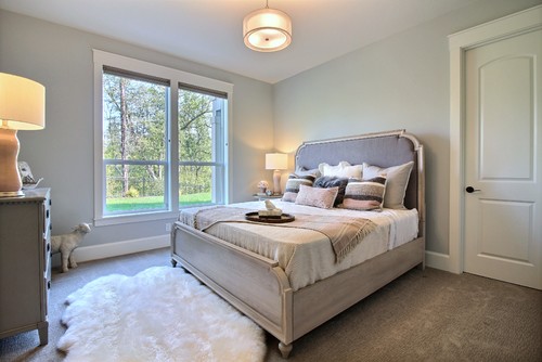
1. Perfectly Neutral Guest Room
This room from Sunny Circle Studio looks crisp, clean, and perfectly neutral so that both cool tones and warm tones have a place at the table and fit in.

2. Serene with a Hint of Green
I’ve said it once, and I’ll say it many more times, I’m sure. Surrounding decor impacts your paint colors.
At Home Arkansas shared this lovely space from Kevin Walsh of Bear-Hill Interiors (story by Paulette Pearson, styling by Mandy Keene) which has green tones in the curtains and furniture, pulling out the mild green undertones in Sherwin Williams Silverpointe.

3. Cool Against Blue Decor
The same goes for the blue undertones that Silverpointe likes to display.
This room from A Blissful Nest puts bold blue front and center and lets those blue undertones peek through.

4. Greenish Gray in this Space
As you can see in this example from Cascade West Development (via Houzz), artificial lighting can impact paint appearance just as much as natural light exposure can. The yellow-tinted lights draw out the green undertones in this gray.
5. Shabby Chic Neutral
And when you want to play with neutrals, Silverpointe can be a go-to color, as you can see in this bedroom from Segreto Finishes!

6. So Cool and Serene
Becky of @VintageHappie says of this shade, “We have SW Silverpointe in our master bedroom and bath and I just love it. So cool and serene…not really gray, not really blue, but so perfect.”
You’ll see her beautiful bathroom shortly, as well. Trim in this space is SW Westhighland White.

Livings Rooms with SW Silverpointe
7. Balanced Gray alongside Brown Tones
Warm wood tones work to balance out the cool undertones in this room from @realtor_cts. I still see a hint of blue peeking through!
8. Perfectly Understated
Room for Tuesday used Silverpointe as a beautiful neutral backdrop in this room.
I love the amount of contrast between this shade and the crisp white trim.

9. Just Enough Contrast
Thanks to its medium-light saturation level, Silverpointe maintains enough depth in this brightly-lit room from Tate Interiors (via Houzz) to stand out against the white trim.
Sherwin Williams’ Silverpointe Kitchens
For kitchens, eggshell or satin are popular finish choices for walls. For cabinets consider semi-gloss or high gloss for the most durable finish (and a gorgeous glow).
10. Works Well with Farmhouse Style
Although many grays look terrific in farmhouse-style homes, few are able to balance between warm wood tones and crisp accents as expertly as Silverpointe does in this room from Sima Spaces.

11. Subtly Bold Island Color
Bold is beautiful, and it doesn’t have to be a deep shade. Haute House Love made great use of Silverpointe on the kitchen island, so it stands out in a subtle way.

12. Clean Pairing with White Cabinets
I love this kitchen from @alwayslindseyxoxo! The wall paint is the perfect depth to look gorgeous and airy too.
13. True Gray in this Classy Design
The surrounding light, white paint, and warm accent tones make Silverpointe look “true gray” in this gorgeous kitchen from The Fashion House Mom.

Silverpointe Bathrooms
Don’t forget the finish! For bathrooms the perfect sheen is either an eggshell or satin. Why? We’ll tell you in this post about paint sheen.
14. Light Gray Walls, Warm Gray Vanity
Since Silverpointe is only slightly cool-leaning, the warm lighting in this bathroom from Tracy Lynn Studio makes this shade appear warmer on the walls than it often does.
The vanity color here is SW Online (Photo Credit: Zack Benson).

15. Creates a Spa-Like Feel
When you want a peaceful retreat, go with a cool-leaning color as CASS Design Co. did in this bathroom. It would be hard to pull me out of that tub!

16. Coastal Cues for a Spa Feel
This heavenly bathroom from Ally Whalen Design has coastal vibes, but in the most subtle, beautiful way. In this space, the paint is reading with just the barest hint of gray-blue.
17. A Color That Calls for Relaxation
I mean, you don’t get much more relaxing than this calming space from Becky of @VintageHappie.
She painted the walls with Silverpointe, and the white trim is Westhighland White (SW 7566).

Other Homes using Silverpointe Paint
18. Leans Green in Home Office
Warm lighting and green plants draw out those subtle green undertones in this space from Stay Home Style. Stunning!

19. Classic and Inviting Entry Color
Silverpointe is a terrific choice when you want to create a balanced neutral backdrop for colorful decor pieces, as @janeendolaninteriors did in this entryway.
20. Silverpointe Spaces Mega-Montage
Janene of Champagne and Sawdust says of Silverpointe, “I’ve used it in many projects, both personally and professionally. It’s on the cooler side, so I love to contrast it with warm wood tones.” She calls this shade her “favorite go-to hue.” High praise, indeed.
Ok, isn’t Silverpointe amazing? This cool-toned light gray has it all and adds a peaceful ambiance to any room.
Go grab a paint sample of this elegant shade to see if it just may be the perfect paint color for your home!
Pin this paint color for later! And if you use this paint shade, leave a comment on the pin! That helps others decide if they want to try this color, too!

Ready to show those boring, bland walls who’s the boss at home? This no-cost guide will help you sidestep mistakes that almost everyone makes when it comes to picking paint! You’ll be on your way to perfect paint promptly…pinky swear.


Leave a Reply