Read about Sherwin Williams Clary Sage, and see 15 real homes that use it!
Sherwin Williams Clary Sage (SW 6178) is a beautiful and soothing sage green with mild yellow undertones. This popular gray green makes a room feel calming and brings to mind your favorite garden or outdoor space.
Homeowners and interior designers frequently choose safe, neutral beiges, grays, and greiges for interior spaces. And although they look beautiful and play well with many color schemes, I, for one, am THRILLED to see interior palettes introducing a little more color as go-to choices.
Now, don’t worry because I’m not saying that everywhere you look, you’ll see rooms painted in bright, bold canary yellow, fire engine red, or lilac purple.
If you favor neutrals, you can now add a subtle amount of color to them (think: gray-blues and gray-greens) to break up the monotony while creating a restful retreat you want to come home to!
Does your house need a design refresh, but the thought of picking colors makes your stomach knot up and gives you a pounding headache?

My extensive paint color review post series will make the process of finding your perfect paint color easy peasy! Each post spotlights one hue in a deep-dive fashion to spill all the details you need to make a stress-free decision.
There is also a growing library of “best of” posts to help you narrow down the abundance of choices!
Spoiler alert: Clary Sage is one of my favorite sage green paint colors. It’s time to get all the deets on this shade.
What color is Clary Sage?
Clary Sage (SW 6178) is a serene, medium gray-green with yellow undertones. This shade is all about adding a tranquil yet refreshing nature-inspired vibe.
Since it has yellow undertones, you may expect this hue to appear as a muted olive shade. However, those strong gray undertones keep it looking neutral, while the mild yellow undertones give a dose of warmth.
The end result: a wonderfully chameleon sage color that works everywhere!
Is Clary Sage right for your home? Let’s find out!

FAQs about Sherwin Williams Clary Sage
Due to color blending differences between each paint company, matching paint colors across paint brands is nearly impossible and will result in extreme levels of frustration (think: red face with smoke blowing out of your ears).
If you want a similar shade to Clary Sage from a different brand, I recommend Benjamin Moore’s Herbal Escape or Behr’s Sage Wisdom (or even Behr Bay Water).
Is Sherwin Williams’s Clary Sage warm or cool?
How about a little of both? Clary Sage has both cool (gray) and warm (yellow) undertones to create a balanced shade that has some flex. You’ll notice it looks warmer in bright, warm-toned lighting and cooler in shadowy lighting.
Anywhere! Let Clary Sage add beauty and a zen feel to your:
– Walls (in ANY part of the house)
– Accents (board and batten, shiplap, built-ins, etc.)
– Bathroom vanities
– Trim and molding
– Interior doors
– Kitchen or laundry cabinets
– Kitchen islands
– Front doors
– Exteriors
Thanks to its versatility, Clary Sage successfully works in ANY style of home, including Minimalist, Traditional, Contemporary, Transitional, Coastal, Caribbean, Spanish-style, and more.
Sherwin Williams Clary Sage Undertones
Most people hear yellow undertones and run (or back away quickly) from them. However, when utilized well, yellow adds much-needed warmth and coziness.
SW Clary Sage has the ideal amount of yellow to add another layer of depth and keep this hue from feeling ice cold.
Are you looking to avoid unexpected undertones? Take advantage of my (not so) secret way to prevent dreaded paint color regret:these peel-and-stick paint samples. No other tool is better for vetting paint shade undertones!
If undertones make your head ache, you’re not alone! Grab your no-cost copy of “5 Biggest Paint Choice Mistakes” Click here or enter your email below. I’ll send the tips right away!⤵️
How Different Types of Lighting Affect Sherwin Williams’s Clary Sage
As sure as the sun comes up in the morning and sets in the evening, the appearance of its light changes throughout the day. And that constantly shifting appearance massively impacts the way actual paint colors appear.
Trust me on this: EVERY paint color will display some amount of variation during the course of the day. It’s your job to figure out which variations work for you and which ones turn you off. (Here’s where a peel & stick paint sample works its magic!)
Let’s take the mystery out of how different natural light exposures will influence this Sherwin-Williams paint color’s appearance here and now.
- North-facing light – Say hello to gray! Shadowy, indirect northern lighting will pull those gray undertones forward for a cooler, darker version of Clary Sage.
- South-facing light – Say hello to warmth! Warm, bright southern lighting will make Clary Sage look light and warm as it pulls those yellow undertones forward.
- West-facing light – Here’s where you’ll see this shade’s flexible nature. Clary Sage will look darker and cool-leaning in the morning exposure before appearing warmer and lighter in the afternoon light.
- East-facing light – Expect the same shift but in the opposite order. Clary Sage will read warmer and softer in the morning light exposure before shifting to look darker and cooler in the afternoon.
When to Avoid SW Clary Sage
There are many reasons to love this shade – including the fact that there are few times to avoid it!
I have two recommendations for choosing a shade other than Clary Sage. First, if you want a color that will appear “true” as much as possible, this shade has too much flex. Find one that lacks undertones.
Also, while many whites look wonderful with Clary Sage, avoid the ones that have strong gray or yellow undertones if you want Clary Sage to look its best. True whites will be your friend.

Great Coordinating Colors for Clary Sage
Oh, the possibilities! There are only a few shades that don’t play well with Clary Sage, thanks to its flexible and versatile nature.
You can’t go wrong when SW Clary Sage pairs with:
- Creamy whites
- True whites
- Beiges
- Taupes
- Gray-blues
- Darker or lighter greens
- Grays (lighter OR darker)
- Navy blues
- Browns
- Earthy shades
And when choosing hardware or accents, this shade looks ah-mazing with brass, copper, brushed nickel, and matte black finishes! And you won’t regret pairing it with dark woods, either.

If you need some specific winning ideas to pair with Sherwin Williams Clary Sage, try these lovely paint colors:
- Dover White
- Sagey
- Tumblin’ Tumbleweed
- Naval
- Dried Lavender
- Burnt Caramel
- Agreeable Gray
- Silver Mist
- Softened Green
- Spiced Cider
- Tricorn Black
- Antique White
- Hale Navy
- Natural Linen
- Svelte Green
- Dutch Tile Blue
- Quietude
- Snowbound
- Halcyon Green
- Likeable Sand
- Roycroft Vellum
- Black Magic
- Nomadic Desert
For trim and ceiling paint colors to pair with Clary Sage (if you aren’t using this shade FOR the trim or ceiling), Pure White, Greek Villa, Alabaster, Grecian Ivory, and Shoji White are terrific white paints that look great.
Paint Sheens and Finishes
From repainting low-traffic bedrooms to the rooms where you spend the most time, finding the right paint finish is crucial anytime you coat a surface.
Here’s what you need to know about the different paint finishes available on the market to help you achieve the perfect interior paint job every time.
- High gloss -High gloss paint is shiny and shows less-than-perfect surfaces but provides an easy-to-clean surface.
- Semi-gloss – Use this sheen in small spaces, rooms with low light levels, and high-humidity environments (ex: bathrooms).
- Satin – This finish falls right in the middle of the sheen spectrum, making it the most popular one. Use it on a wide variety of surfaces, in high-traffic areas, and rest assured of its color rub-off resistance when you use soap and water to wash away grime.
- Eggshell – More durable than a flat paint, the slight sheen of eggshell is appealing to many people and can withstand minimal GENTLE scrubbing.
- Flat (or matte) – A luxurious matte finish is a draw for many people. Although its shine-free appearance provides excellent hiding abilities for imperfections, it’s really only ideal for low-traffic areas because it will lose paint coverage if you wash it.
Pro Tip: Finding the perfect sheen will help you achieve your precise paint needs and goals! Read more on picking the perfect paint finish here.
LRV of Sherwin Williams Clary Sage (SW 6178)
LRV (or “Light Reflectance Value” but also sometimes called “Light Reflective Value” – potato, potatoh 😉) is a scale that measures the reflection of light a color has, with 0 being totally black and 100 being totally white.
The LRV of Sherwin Williams Clary Sage = 41
So, what does that mean? SW Clary Sage falls on the medium end of the spectrum. It may be too much for some people in small, darker spaces. And it has enough saturation to prevent washing out and looking pale in bright lighting.

LRV…what? Don’t worry, I’ve got you! This no-cost guide will help you avoid the paint color picking mistakes most people make! Click here or enter your email below. I’ll send the tips right away!⤵️
Clary Sage Compared to Other Colors
How does Clary Sage stand out from other sage green colors on the market? Let’s find out!
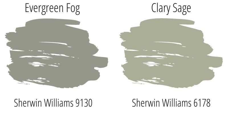
Sherwin Williams Clary Sage vs. Evergreen Fog
I’m starting this little comparison game off by putting Clary Sage up against Sherwin Williams Evergreen Fog (SW 9130). SW Evergreen Fog hails from the position of Sherwin Williams 2022 Paint Color of the Year, so you know it’s a tried and true fav.
With its LRV of 40, it has about the same depth as Clary Sage, but it lacks those yellow undertones to provide a reliably cool-toned green-gray shade. Both are popular sage green paint colors…and are gorgeous – when used to their strengths.

Sherwin Williams Clary Sage vs. October Mist
Benjamin Moore’s popular October Mist (#1495) and 2022 Color of the Year has an LRV of 46.54 and is similar to Clary Sage. While you may not notice their differences clearly on a computer screen (Clary Sage is just a tad more olive), they will make a significant difference on your walls.

Sherwin Williams Clary Sage vs. Weekend Getaway
Benjamin Moore’s Weekend Getaway (#473) makes for another good comparison couple. Coming in with an LRV of 38.79, it reads a little darker and more green (less olive) than Clary Sage. Even if you love it for nothing other than its name, it’s a great shade.

More Colors to Consider
Can you see why Clary Sage is a popular contender for adding bold richness? If you aren’t sold on this shade yet, check out these popular alternatives!
- Moonshine (Benjamin Moore) – a lovely gray with cool green undertones.
- Oyster Bay (Sherwin Williams) – a medium gray-green with blue undertones.
- Silver Satin (Benjamin Moore) – a light greige with green undertones.
- Retreat (Sherwin Williams) – a dark green with mild gray undertones.
- Comfort Gray (Sherwin Williams) – a medium gray with strong green undertones.
- Rainwashed (Sherwin Williams) – a mid-toned moody blue-green shade.
- Repose Gray (Sherwin Williams) – an uber-popular shade of gray.
Feeling lost? I gotcha, boo! Get a zero-cost copy of my new guide to avoid the paint color picking mistakes people make! Click here or enter your email below. I’ll send the tips right away!⤵️
15 Real Life Homes Using Sherwin Williams Clary Sage
It’s time for my favorite part of the post – watching this color show off! Here are 15 examples of Clary Sage curated specifically to demonstrate this shade’s range so you can see just how it REALLY looks.
Living Spaces Using SW Clary Sage
1. Serene Accents
For most of this post, I’ve talked about this shade as a main color (because it excels there!), but it also makes a gorgeous accent color, as you can see in this example from @ourhuntingtonhome.
Scroll through the images and see for yourself – what’s better than Clary Sage with the wood tones? Not much!
2. Say “Ahhhh”
This room from House Homemade makes me want to sink into that chair with a book for the entire day. Interior walls, doors, AND ceilings painted in Clary Sage? Yes, please!
You can see in this shot how this shade behaves under different lighting conditions. In that corner where there is little light, this paint is showing up as more of a dark color (unsurprisingly).
Just a good reminder to evaluate a paint at different times of day before committing to make sure you understand the ins and outs of any particular shade.

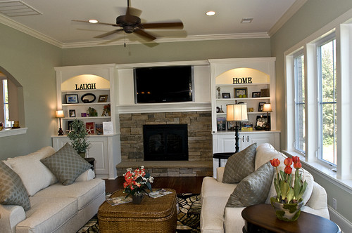
3. Cozy Elegance
This living room example from Blue Sky Building Co via Houzz is everything I want in a living room.
Fitting descriptors here include welcoming, comfortable, cozy, elegant, beautiful, and SO many more. I love the natural stone and wood paired with Clary Sage!
Clary Sage Kitchen & Dining Spaces
4. Great Saturation in Natural Light
Some shades with an LRV similar to Clary Sage look much darker than this shade does in this kitchen from Sarah Stacey Design. I love how this color on the cabinetry makes this kitchen inviting but still keeps it light.
And check out those natural wood window frames! An excellent choice when combined with the sage, I’d say.

5. Pair with Clean Whites
Clary Sage shines when paired with true whites that allow its muted nature to shine. This dining room from Donna Frasca via Houzz is effortlessly timeless.
6. Subtle Pop of Color
Want a pop of color without going too far? Paint those lower cabinets like @thegrayhousedesignco did. I love the added touch of the inside of the open cabinets. Gorgeous!
7. Works with Warm Tones
Clary Sage’s balanced nature means that it works well with warm or cool tones (depending on your lighting).
Estudio Uno a Uno brilliantly paired warm wood and brass accents with sage in this kitchen!

8. Rustic Decor Friendly
Do you have a farmhouse-style home? Consider Clary Sage because, as you can see from @eacinteriordesign, it’s a fabulous shade that works with white, wood, and other farmhouse go-to shades.
Bedrooms using Sherwin Williams Clary Sage
9. Serene Bedroom Vibes
THIS is why Clary Sage is one of my favorite bedroom paint colors! Take a page from @camiswisher‘s book and (liberally) use Clary Sage in a nursery for a needed cozy, tranquil ambiance. Using it on a portion of a wall like this board and batten treatment is a great way to add a more saturated tone if you’re nervous about using it on all four walls.
10. Peaceful Nursery Shade
The cool lighting in this nursery from Lexi Grace Design draws out the gray undertones of Clary Sage. Oh, the power of lighting! There is no hint of yellow undertones, even with the light brown accents. And I love the touch of the dark greenery (photo credit: @rennaihoefer).

11. Muted Green with Yellow Highlights
In contrast to the image above, this bedroom from @asanibrisanctuary has warm lighting, which pulls the yellow undertones forward (see the yellow flower art?) The walls look more olive than the sagey pillow on the bed (at least at this time of day).
Clary Sage in Bathrooms
12. Bridges Cool and Warm Tones
Check out all the tones going on in this bathroom from The DIY Playbook: warm wood, warm light fixtures, cool gray flooring, and black fixtures. Clary Sage expertly pulls everything together where other colors wouldn’t be able to.

Sherwin Williams Clary Sage Spotted in Other Homes
13. Forget about the Accent Wall
Who says accent walls can’t be only PART of the wall? I love Oleander and Palm‘s use of two colors on this beadboard wall. So fun!

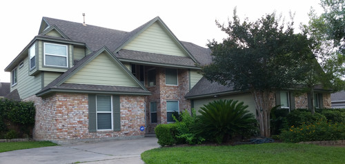
14. Beautiful with Brick
Yes! There are plenty of colors that don’t look good with brick, but Clary Sage delivers on this gorgeous home from Texas Home Exteriors via Houzz.
15. Laundry Room Magic
As anyone who does laundry knows, LOTS of magic happens in the laundry room. There’s more magic than just stain removal happening in this example from @alcinteriors!
Does Sherwin Williams Clary Sage make you say, “Ahhhhh,” too? I hope you love its restorative yet tranquil nature!
Don’t forget to grab those peel and stick paint samples to catch any surprises it might have up its sleeve before grabbing your paintbrush and coating your entire house with this seemingly perfect color.
Although it very well may be a great choice, the true color of a paint can never be assured by simply looking at it on a screen.
Pin this paint color for later! And if you use this paint shade, leave a comment on the pin! That helps others decide if they want to try this color, too!

Ready to show those boring, bland walls who’s the boss at home? This no-cost guide will help you sidestep mistakes that almost everyone makes when it comes to picking paint! You’ll be on your way to perfect paint promptly…pinky swear.


Leave a Reply