

Read about Benjamin Moore Horizon, and see real homes that use it!
Benjamin Moore Horizon (OC-53) is a neutral cool-leaning gray paint that lends a subtle soft color to any space.
Once you’ve seen one gray, you’ve seen them all, right? Wrong!
Of course, there are the obvious pale, light, medium, and dark versions of gray. But the term “50 shades of gray” was coined for a reason.
Once you consider depth and undertones, there are dozens of different gray paint options to choose from on the market. Agh!
What’s a gal (or guy!) to do?
If you’re considering giving your home a facelift, start by checking out the gray shades I have highlighted in my paint color review post series! For each post, I pick an individual shade and take a deep dive into it, explaining all the ins, outs, pros, and cons.
My goal is to give you the information you need in each post to either add that shade to your shortlist or eliminate it from consideration altogether. I know from experience just how overwhelming it can be to choose just one gray paint out of the sea of possibilities!
Today, let’s welcome Benjamin Moore Horizon to the “family” as the newest addition to my paint color review series.

What color is Horizon?
Picture yourself standing on the top of a tall mountain and looking into the distance. That pale gray you’d probably see at the horizon is the inspiration (both in color and name) for this shade.
Horizon is a soft, pale, barely-there gray that offers a fresh and timeless backdrop to any decor and creates a bright and airy space. You may even think this hue is a soft off-white in bright light because it’s light enough to wash out.

It’s a great color choice for the length of each wall when you want to create a uniform home decor design. Let it be your background while your decor pieces stand out.
Horizon is also a great shade for areas where you have less-than-perfect surfaces because it does a great job of hiding those imperfections.
Although BM Horizon may sound like a simple shade, it’s got more depth than you may realize.

Want the cliff notes for choosing the perfect color every time? Grab a FREE copy of my guide to help you avoid the paint color picking mistakes most people make!

Horizon vs Horizon Gray
That said, I LOVE Ben Moore’s Horizon, which is NOT to be confused with Benjamin Moore’s Horizon Gray. I know it’s baffling (who can explain paint color name choices?), but touching on the difference between these two shades is important because the only thing they really have in common is a gray base.
Horizon (OC-53) is a pale gray paint color with subtle blue undertones. On the other hand, Horizon Gray (2141-50) is a medium gray with strong sage undertones. The names may be (way too) similar, but these shades are NOT interchangeable!
Okay, now that THAT’S covered…let’s learn more about straight-up Horizon to see if it’s the perfect hue for your home!

FAQs about Benjamin Moore Horizon
What other colors are similar to Horizon?
Please don’t try to match a Ben Moore color in the Sherwin Williams line of paint choices. Thanks to differences in color blending techniques, you won’t get the shade you expect.
If you want a close match to Horizon in Sherwin Williams color options, I recommend Sherwin Williams Glacier Bay, although it won’t be as blue or cool-toned as Horizon. Behr’s Winds Breath could be another close color option to consider.
Is Sherwin Williams’s Horizon warm or cool?
Horizon lends toward the cool side of the spectrum. It lives in the gray family, but its blue undertones lend a soft coolness without making the color feel frosty. 
Where should I use Benjamin Moore Horizon?
Horizon is one of those subtle shades that looks chic and sophisticated almost anywhere. Let it add a new dimension of beauty to:
Entryway
Bathrooms
Bedrooms
Playroom
Nursery
Laundry room
Living room
Dining room
Kitchen
Exterior
Horizon fits well in traditional, modern farmhouse, mid-century modern, transitional, and coastal homes.
If undertones make your head ache, you’re not alone! Grab your no-cost copy of “5 Biggest Paint Choice Mistakes” Click here or enter your email below. I’ll send the tips right away!⤵️
Benjamin Moore Horizon Undertones
Horizon has a light gray base with very subtle blue undertones. Most of the time, Horizon will appear as a soft pale gray (or possibly as off-white), and you won’t notice the blue undertones. But they’re there, giving this shade a cool tint.
Do you want to know my secret for avoiding terrible-looking colors in your home? Check out these peel-and-stick paint samples! They’re a no-fail way to thoroughly vet any color you like to ensure it will shine and sparkle just as you want it to with your lighting and decor.

How Different Types of Lighting Affect Sherwin Williams’s Horizon
Paint colors seem to change through the day as the sun moves across the sky because the natural light shifts, which will impact any paint color’s appearance.
NO paint color will look the same in different rooms or walls or at varying times of the day.
Horizon will have some flex in its appearance based on different lighting scenarios.
Pro Tip: Since Horizon is a pale hue, surrounding decor can also impact the way it looks.
Here’s what you can expect from Benjamin Moore Horizon based only on different types of natural lighting:
- North-facing light – this shadowy cool lighting will bring out Horizon’s cool qualities, making it look its darkest. You’ll also notice its blue undertones the most in this passive lighting.
- South-facing light – consistent warm southern lighting draws forth hues’ soft and creamy side. Horizon will often wash out to a soft off-white in bright south-facing light.
- West-facing light – expect shadowy dim lighting exposure in the morning before shifting to warm red-tinged lighting in the late afternoon. Horizon could appear off-white in the late afternoon and early evening light.
- East-facing light – warm yellow-tinged light in the morning transitions to shadowy passive light exposure later in the day. Horizon will appear light and probably off-white in the morning light and then read darker and cooler later in the day.
When to Avoid BM Horizon
Horizon looks lovely with cool-toned colors and accents like quartz or marble countertops.
However, BM Horizon does NOT look good with brown or beige accents, such as granite countertops.
Also, I would avoid pairing Horizon with very creamy off-whites, such as Sherwin Williams Creamy, because they can both end up looking dirty or dingy (bleh!) next to each other.

Great Coordinating Colors for Horizon
Horizon is the ultimate natural-looking, pale and airy gray. This versatile and beautiful shade pairs well with whites and (not too creamy) off-whites, blues, greens, darker grays, blue-grays, and many blue greens.
Set it off with black hardware and accents for a bit of drama and sophistication!
If you need a few specific color ideas that work with Benjamin Moore Horizon, try pairing it with:
- White Dove
- Hale Navy
- Woodlawn Blue
- Balboa Mist
- Stonington Gray
- Amherst Gray
- Boothbay Gray
- Coventry Gray
- Kendall Charcoal
- Palladian Blue
- Tween Coat
- Flint
- Sea Salt
- Kensington Blue
For trim colors to pair with Horizon, I recommend Chantilly Lace, Pure White, Super White, or White Dove.
LRV of Benjamin Moore Horizon (OC-53)
What the heck is LRV, and why should I care about it? LRV stands for “light reflecance value” (though you’ll also often hear it called a “light reflectance value”. To put it in terms that people who aren’t interior designers understand, it simply indicates how light or dark a paint color may appear on your walls.
LRVs range from 0 – 100. A color with an LRV of 0 is pure black (no paint color is that dark). On the opposite end of the spectrum, an LRV of 100 is a glaringly bright white (no paint color is that bright).
The LRV of Benjamin Moore Horizon = 72.52
That means BM Horizon is a very light gray – you could even say pale gray. It’s light enough to wash out in bright natural light and read as off-white. It does have enough saturation, though, to contrast with white trim, even in the brightest lighting situations.

LRV…what? Don’t worry, I’ve got you! This no-cost guide will help you avoid the paint color picking mistakes most people make! Click here or enter your email below. I’ll send the tips right away!⤵️
Horizon Compared to Other Colors
Let’s compare this hue with similar shades to see how Horizon stands apart from the crowd.
Benjamin Moore Horizon vs. Gray Owl
This session of comparing and contrasting begins with looking at Horizon next to Ben Moore’s Gray Owl (OC-52).
Gray Owl has an LRV of 65.77, so it’s quite a bit more saturated than Horizon and offers a great depth of color. When you examine both of these colors side by side, you’ll probably notice that Gray Owl leans warm and has strong green undertones. It’s also important to note that it can occasionally flash a wink of blue.
When you want a color with more depth, check out Gray Owl. And go with Horizon for those rooms where you want an updated, fresh look and create an airy and spacious feeling.

Benjamin Moore Horizon vs. Shoreline
Benjamin Moore Shoreline (1471) has a lower higher LRV of 68.82 and basically falls between BM Horizon and Gray Owl. Shoreline is lighter than Gray Owl but darker than Horizon.
When you see Shoreline next to today’s shade, Horizon’s blue undertones stand out. In contrast, Shoreline shows off the teeniest hint of purple undertones.

Benjamin Moore Horizon vs. Silver Satin
Ah, Silver Satin (OC-26). With an LRV of 76.35, it’s close in depth to Horizon, but Silver Satin has a light, shimmery, almost iridescent quality that Horizon lacks.
If you crave elegant, chic sophistication, go with Horizon. However, if you prefer a lighter, almost sparkly shade, Silver Satin may be the better choice for your home.

More Colors to Consider
So, do you think Benjamin Moore Horizon is as fantastic as I do yet? If not, I’ve got some other options for light gray and greige shades that you may love! Check out these popular shades!
- Calm (Benjamin Moore) – a light, off-white with pale purple undertones.
- Paper White (Benjamin Moore) – an off-white with gray undertones and a hint of green.
- Oyster White (Sherwin Williams) – off-white with beige-leaning greige undertones.
- Sherwin Williams Eider White – a cool off-white with gray undertones.
- Benjamin Moore Light Pewter – a crowd-pleasing light gray with greige undertones.
- White Duck (Sherwin Williams) – an off-white with greige undertones.
- Classic Gray (Benjamin Moore) – a light, greige-leaning off-white.
- Benjamin Moore White Dove – a popular warm off-white paint shade with gray undertones.
- 9 Top Light Gray Paint Colors
- 5 Best Sherwin Williams White Paint Colors
- 5 Best White Benjamin Moore Colors
Feeling lost? I gotcha, boo! Get a zero-cost copy of my new guide to avoid the paint color picking mistakes people make! Click here or enter your email below. I’ll send the tips right away!⤵️
Real Homes Using Benjamin Moore Horizon Paint
What do you think of Horizon at this point? If you’re still deciding whether this color may be a great fit for your home, it’s time to SEE how it appears in real-life homes. Check out these beautiful examples!
Sheen note: Picking the right color is only winning the battle, not the war. Remember to pick the right paint finish, or sheen, also! Read up on what you need to know about picking the perfect paint sheen.
BM Horizon Living Rooms
1. Subtle and Chic
Don’t you just love all that warm natural light shining through those big beautiful windows?
If you can set your envy aside for a moment, you’ll notice that this sophisticated living room from Braun Adams has a softly polished glow with our effortless gray, Horizon, on the walls.
And that works perfectly with the crisp white trim details of the window frames and base moldings, and crown molding/ceiling paint.

2. Hint of Blue
This room from Lauren McBride Blog gives us a great example of Horizon’s blue undertones.
They’re subtle but obviously there, and I love the impact they have in the room to balance out the warm tones.

Horizon Bedrooms
In general for bedrooms, and low-traffic areas, flat paint is fine. If you like something with a bit of shine (and more ease of cleaning) opt for eggshell or satin.
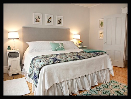
3. Airy and Spacious
Love! Horizon plays an important role in this bedroom from Jo Galbraith Designs via Houzz: the unobtrusive backdrop. And the blue accents pull the blue undertones forward, but they’re hardly noticeable.
4. Off-White Stunner
This space from Shannon Gold Design is awash with bright natural light, making Horizon appear off-white. I love the way this soft shade complements the soft decor in the room…what a perfect color choice for a master bedroom, or a guest room.

5. Timeless Respite from Daily Stresses
The cool-tinted light in this bedroom from My Old Country House (@lesli_devito_art) shows Horizon at its best.
You can always count on beautiful results with this color, and you won’t need to repaint the room for years to come because it’s timeless.

Kitchens using BM Horizon Paint
For kitchens, eggshell or satin are popular finish choices for walls. For cabinets consider semi-gloss or high gloss for the most durable finish (and a gorgeous glow).
6. Creates Balance
Normally I advise steering clear of pairing Horizon with warm or creamy shades. However, in this example from @april_e_bitter (and @beacon_pointe_homes), Benjamin Moore Horizon offers a balancing effect that keeps this kitchen from appearing overly warm.
7. Spacious and Airy Space
Even though this kitchen is large and spacious, it could easily look much smaller with the low levels of natural light and a darker paint color for the walls.
However, Less Than Perfect Life of Bliss kept it airy and open by painting the walls pale gray and the trim white.

8. Barely There Off-White
Gorgeous! This kitchen, belonging to Deena Knight Designs is ooh-la-la. Pairing Horizon walls with that blue interior door (painted in Benjamin Moore “Water’s Edge”) = design magic.

Ben Moore’s Horizon Bathrooms
Don’t forget the finish! For bathrooms the perfect sheen is either an eggshell or satin. Why? We’ll tell you in this post about paint sheen.
9. Timeless Bathroom
Palmerston Design created a design that will never go out of style by pairing Benjamin Moore Horizon with the cool-toned dark accents in this bathroom. And those yellow pops of color add a touch of playfulness!

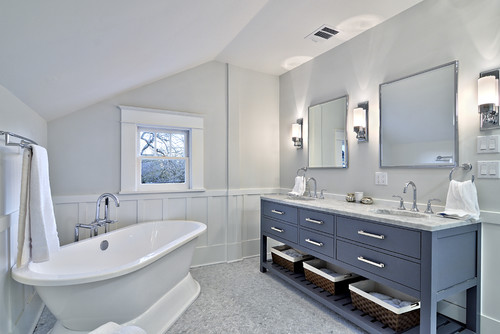
10. Spacious Stunner
I just got a case of bathroom envy! Avenue B Development via Houzz created a simple yet gorgeous design with Horizon walls, white trim, and that amazing blue vanity. And look at how Horizon pairs beautifully with the carerra marble floor tile!
Check out how this winsome shade works wonders when you have wall height differences in a room.
11. Soft Off-White Walls
This bathroom from Simply 2 Moms is flooded with bright natural light and appears soft off-white. I love this pairing with brushed nickel accent pieces and richer hues like the dark greige vanity.

12. Subtle Neutral
How about this bathroom from @sarahhayesdesign? If you want to create a bathroom that’s timeless, neutral, and effortlessly chic, turn to Horizon (photo credit @stylishproductions).
Other Spaces using Benjamin Moore Horizon
13. Perfect for Playrooms
Refined LLC chose Benjamin Moore Horizon for this fun kids’ space, and it really works. The pale gray walls take a backseat to let the fun colors catch your attention.

14. Inspired Choice for Hallways
If your home has lots of bright natural light, a true white paint can seem too bright.
Take inspiration from The Happy Housie and use a pale gray that washes out to a soft off-white for that perfect light (but not TOO light) look.

15. Not So Spacious Mudroom
The key to making small spaces feel larger than they are is to use light paint colors so they reflect more light and create a sense of spaciousness.
Horizon works wonders in this mudroom from Shannon Gold Design!

16. Perfect for a Dark Hallway
A hallway like this one from @reddesignky requires a light shade of paint unless you want it to feel small and dark.
This is the deepest I’ve ever seen Benjamin Moore Horizon appear, and it’s perfect!
I hope Benjamin Moore Horizon’s versatile beauty appeals to you as much as it does to me! Don’t forget to grab some peel and stick paint samples to check it out for yourself before fully committing to it!
Pin this paint color for later! And if you use this paint shade, leave a comment on the pin! That helps others decide if they want to try this color, too!

Ready to show those boring, bland walls who’s the boss at home? This no-cost guide will help you sidestep mistakes that almost everyone makes when it comes to picking paint! You’ll be on your way to perfect paint promptly…pinky swear.


Leave a Reply