


Learn all about Decorator’s White, plus see 20 real homes that use it!
Decorator’s White, by Benjamin Moore, is widely known as a bright, neutral white that leans slightly cool. At first glance, it looks like a pure white, but it has the faintest hint of gray and blue without giving off any obvious undertone color. It’s a versatile white shade that works beautifully on walls, trim, and cabinets. If you crave a crisp, clean look, Benjamin Moore Decorators White might be the right pick for you.
It’s a versatile white shade that works beautifully on walls, trim, and cabinets. If you crave a crisp, clean look, Benjamin Moore Decorators White might be the right pick for you.
Decorators White paint is a popular choice for trim because it lacks any yellow undertones (some warmer white shades run the risk of looking dingy). Decorator’s White is great for brightening up spaces that don’t have an excess of natural light, without giving off the stark, blinding effect that a pure white might have.
Because of its neutral nature, it plays well with virtually color scheme, but is especially perfect with gray, charcoal, and black.

Want to know what we’ll be covering in this post? Here’s the 411:
What Benjamin Moore says about Decorator’s White
Decorator’s White is part of both Benjamin Moore’s Designer Classics Collection (CC-20), as well as their off-white collection (OC-149). This means it’s timeless, versatile, and tried-and-true, and a longtime favorite of interior designers and DIYers alike.

I’m not gonna lie – choosing the PERFECT paint color isn’t as easy as seeing what you like online and simply adding it to your space. There’s an entire science behind it! Grab a FREE copy of my new guide to avoid the paint color picking mistakes people make! Click here or enter your email below. I’ll send the tips right away!⤵️

LRV of Benjamin Moore Decorators White (shade #CC-20 and OC-149):
First, here’s the “numerical” details, or the LRV:
DECORATOR’S WHITE LRV = 84.61
LRV = Light Reflectance Value: Rated 0-100 with 0 being pure black, and 100 being pure white. Lighter paint shades REFLECT more light from them and therefore have a HIGHER LRV, and vice versa for darker shades).
Below, see Decorator’s White (84.61) side by side with pure white (100):

LRV…what? Don’t worry, I’ve got you! This no-cost guide will help you avoid the paint color picking mistakes most people make! Click here or enter your email below. I’ll send the tips right away!⤵️
Decorators White Paint Compared to Other Colors
While it might seem silly to be so discerning about white paint, you’d be surprised at the sheer number of different shades there are out in the “wild.” White shades are incredibly complex, and the variety really all comes down to undertones.
To understand the undertones and overall color profile of Benjamin Moore Decorators White, let’s compare it with some other popular white shades.

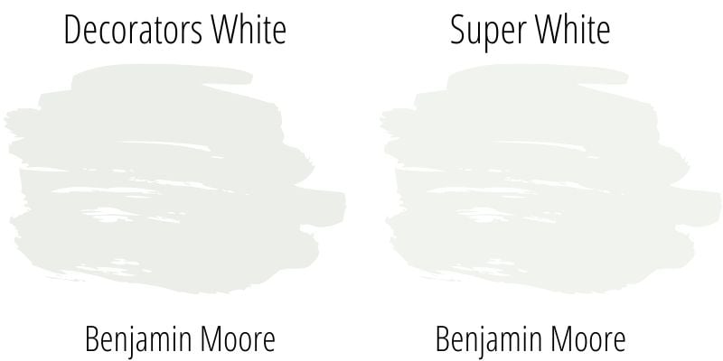
Super White vs Decorator’s White
With an LRV of 89.09, Benjamin Moore’s Super White is brighter and lighter than Decorator’s White (LRV 84.61). On the Benjamin Moore website, Super White is described as a “brilliant, almost sparkling white.”This crisp, bright white lacks any yellow or blue undertones, making it one of the “whitest” shades in Benjamin Moore’s collection.
Depending on the lighting, Benjamin Moore’s Super White can look stark in some spaces. It tends to highlight imperfections, so keep this in mind if you have any unevenness in your wall texture. Since Decorator’s White does have a hint of gray and blue undertones, it tends to not look quite as stark as Super White.
Chantilly Lace vs Decorator’s White
A very, very light white shade at 92.2, Chantilly Lace by Benjamin Moore (OC-65) is surprisingly delicate. Make no mistake: it is a crisp, clean white and considerably brighter than Decorator’s White (84.61).
Like Super White, Benjamin Moore Chantilly Lace really lacks any discernible undertones, making it incredibly neutral. That being said, since Decorator’s White does lean cool, Chantilly Lace will look warmer in comparison.

Decorator’s White vs White Dove
Benjamin Moore’s White Dove (LRV 85.38) is noticeably warmer to the naked eye than Decorator’s White (LRV 84.61). Described by Ben Moore as “classic and softly shaded,” White Dove (OC-17) is perfect for those looking for a slightly warm-toned, creamy white.
Because of its greige undertones, it’s not a great pick for trim as it runs the risk of looking dirty or dingy. However, it does look warm, soft and lovely as a wall shade in many homes.

More Colors Covered in our Paint Exploration Series
If you still aren’t sold on this color, or just want a few more options – here are several other whites and off-white options to check out…
- Swiss Coffee (Benjamin Moore) – an off-white with rich, creamy undertones.
- Silver Satin (Benjamin Moore) – a gray-tinted off-white
- Cloud White (Benjamin Moore) – soft, creamy & warm white paint
- Dover White (Benjamin Moore) – a warm, creamy off-white
- Linen White (Benjamin Moore) – a neutral light gray paint
- Alabaster (Sherwin Williams) – dreamy, creamy off-white paint
- Pure White (Benjamin Moore) – warm white that can lean slightly greige
- Snowbound (Benjamin Moore) – a slightly cool, yet very livable, white
- Simply White (Benjamin Moore) – warm and inviting white paint
- White Duck (Sherwin Williams) – a soft, light off-white with greige undertones
- Polar Bear (Behr) – a bright white paint color with little to no undertones.
Ready to grab the cheat sheet to choosing the perfect color every time? Grab a FREE copy of my new guide to avoid the paint color picking mistakes people make! Click here or enter your email below. I’ll send the tips right away!⤵️
Real Life Homes Using Decorator’s White
Alright, time to dig into the good part: all that eye candy! But first, a warning. Do NOT fall in love with one of these rooms, run out and buy 4 cans and start painting your space! Remember the cardinal rule of painting: sample before you swipe that paintbrush!!!
As far as sampling goes, I highly recommend these non-messy, re-usable, re-positionable peel and stick paint samples ⤵
Living Spaces Using Benjamin Moore Decorators White
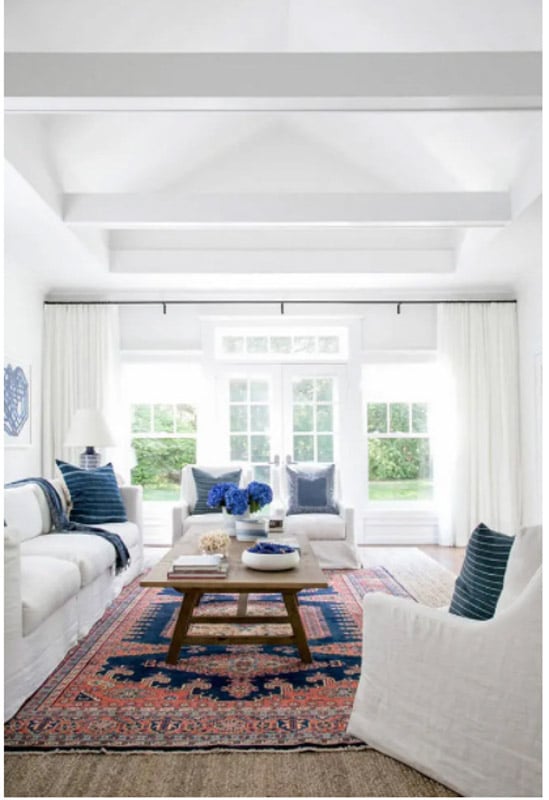
1. OC-149 Sitting Room
Brilliant, glowing light streams through the windows, illuminating this crisp, white sitting room from The Turquoise Home. Using the same shade of white on the ceiling, beams, walls and trim keeps everything looking clean, and allows the colors in the decor to warm up and add life to this space.
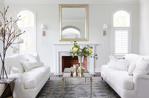
2. Bright, Crisp, Elegant Living Room
I’m starting to sense a trend here! Decorator’s White makes for an excellent backdrop for elegant, monochromatic decor styles. In this room from Shophouse Design via Houzz, the white couches seem to match the trim, a slightly warmer white shade.
Decorators White paint is used on the walls for just the slightest hint of contrast and depth, while still looking crisp, clean and neutral.
3. Bright Built-Ins
This happy, upbeat living space from Terra Cotta Design Build has lots of versatility thanks to the paint palette. With Decorators White, the room can be changed to achieve a whole new look with the decor, and the paint will never stand in the way. It’s a great backdrop every time. (Photo credit: Jeff Herr)
4. Ranch Style Living Room in Decorator’s White
This gorgeous, subtly Texas-themed ranch style living room from Run to Radiance pairs a palette of warm shades against a clean, white backdrop.
The brown color scheme is broken up beautifully with a variety of textures: leather, wicker, cow skin and brick. The coolness of Decorator’s White balances perfectly with the warmth of the decor.

5. Modern Farmhouse Family Room Shade
I love the classic-meets-modern feel of this stunning space from Life on Hill St (website no longer active) with vaulted wooden ceilings. The cool, white shade keeps everything feeling clean, calm and open, while contrasting nicely with the black, wrought iron chandelier and fireplace frame.

6. Home Office Hue
Nothing beats a clean and simple environment to inspire an unfettered workflow in your home office. Decorator’s White creates a calming backdrop for the bright white trim and office furniture in this peaceful, uncluttered workspace from Simply Organized.

7. Pretty Laundry Room Pigment
Nothing gives off fresh and clean vibes better than an all-white utility room. Keeping the color palette simple creates a calming effect, which is a must when you’re doing laundry (shared by Simply Organized)!

Kitchens Using Benjamin Moore Decorators White
A quick note here: don’t forget to consider picking the right paint finish…it’s not only about getting the color right! We have an in-depth explanation of choosing sheens here.
For kitchens, eggshell or satin are popular finish choices for walls. For cabinets consider semi-gloss or high gloss for the most durable finish (and a gorgeous glow).
8. Crisp White for a Kitchen Win
Navy, white and gold always has and always will be a surefire combo for elegance. Decorator’s White on the cabinets and range matches the subway tile and countertops and keeps everything feeling fresh and cool in this subtly coastal-feeling kitchen. The island is painted in Hale Navy.
9. True White Paint Color for a Tuxedo Kitchen Theme
The ceiling-high, dramatically marbled backsplash and matching island countertop make this kitchen an absolute stunner. With a bold statement like that, a cooler, understated white is a must on the cabinets and ceiling.
10. Amongst Favorite Whites for a Cabinet Color
Refinishing the cabinets in this large kitchen must have been a daunting job. When you’re working with this many cabinets, it’s best to choose a color that’s not overwhelming. Decorator’s White was a smart choice, because its coolness has a calming and neutral effect, allowing the rest of the decor to experiment with different colors and textures.
Dark gray as an island color is a popular choice. If you’re considering something similar, take a look at Chelsea Gray, Dorian Gray, or Iron Ore.
11. Classic Gray and White Kitchen Palette
The color palette in this urban-feeling kitchen is un-mistakingly cool, and kept simple with only a few different shades. As mentioned earlier, Decorator’s White pairs nicely with grays, and this is no exception.
A little bit of texture in the wood flooring and marbled backsplash is all that’s needed to add just a little bit of interest. The resulting effect is clean, simple and decidedly modern.
Bedrooms Using Benjamin Moore Decorators White
In general for bedrooms, and low-traffic areas, flat paint is fine. If you like something with a bit of shine (and more ease of cleaning) opt for eggshell or satin.
12. Good Night’s Sleep in a Bedroom with Neutral Hues
It’s funny how layering different shades of white can be construed as a bold design move! That’s because it’s not easy to pull off the monochromatic look when mixing and matching white shades.
This relaxing bedroom throws just a little bit of gray into the mix, adding extra depth and dimension while still maintaining a calming vibe.
ight: 0; border-top: 8px solid #F4F4F4; border-left: 8px solid transparent;”>
13. Works Well with Many Decorating Styles
This bedroom displays an incredibly rare pairing of Scandinavian and bohemian design. The two decor styles lie on opposite ends of the minimalism/maximalism spectrum, but here, the combination works harmoniously.
The result is clean but not at all simple, and I credit Decorator’s White for that. It creates a neutral backdrop for the carefully curated decor and lends just the right amount of coolness without coming off as stark.
14. Boho-Chic Beauty
Decorator’s White is used not only in this bohemian-style bedroom, but throughout this entire home as you’ll see when you scroll through this Instagram post. Decorator’s White is almost always a safe choice, and can yield truly beautiful results as you see here.
15. Happy to Play Second Fiddle
This light and airy space proves that white walls work well with kids too! The bright space lets the accessories be the star of the show.
16. Looks Like a Soft White in Certain Light
This gorgeous coastal bedroom shows that Decorator’s White can have a warm side when paired with warm accessories, and in certain types of light (think warm south-facing spaces, golden hour light, etc).
17. Lets Wood Tones Shine
I love how Decorators White allows the wood and leather in this bedroom space to take center stage.
Dining Rooms Using Benjamin Moore Decorators White
18. Cozy Dining Room Color
Interestingly, Decorator’s White looks almost warm in this elegant dining room, thanks to both the lighting and gold decor accents. This is a great example of how the paint shade can balance otherwise warm color palettes.
19. Beautiful on Board and Batten
I am all heart eyes for this sophisticated, Texas-chic dining room. I absolutely love the way the Decorator’s White wainscoting pairs with the warm and creamy shade of the textured walls (Gray Owl). The combination perfectly complements the warm, beige dining chairs and cool, sepia toned art.
Love the board and batten? More of those ideas are here.
20. Marvelous with Marble
Decorator’s White is a great match for the gray marbling in the fireplace in this understated, yet sophisticated, dining room. It balances the warm decor palette, and takes on the character of the lighting coming through the windows.
21. Crisp White For A Modern Aesthetic
This modern dining room is absolutely stunning! Decorators White paint brings a coolness to the clean lines of the decor and dramatic, vaulted ceilings without looking too stark.
22. Blank Canvas To Highlight Your Furnishings
If you want to wrap your floor in walls in a bright background to showcase your dining furniture, Decorator’s White may be just the shade for you! This loft is so light and bright – can’t you just picture lingering here with an espresso? Dreamy.
Bathrooms Using Benjamin Moore Decorators White
Don’t forget the finish! For bathrooms the perfect sheen is either an eggshell or satin. Why? We’ll tell you in this post about paint sheen.
23. Black and White Bathroom
They tell you that the world isn’t black and white – but this modern bathroom sure is! The black tile walls dramatically contrast against Decorator’s White walls and the white vanity and countertop.
Sharp, vertical lines play into the drama, and even the vanity lights are a part. The gold sconce mounts and pendant chandelier add the only touch of color and roundness to the space – and it works.
24. Cottage Color
Here, the decor pendulum swings in the other direction, revealing a warm, lived-in look in this country-chic bathroom. The weathered towel hook mount and framed art have warm white shades, but Decorator’s White has enough coolness to balance out the space and keep it from looking dingy.
25. Superb on Shiplap
For a classic look, it’s hard to go wrong with a mostly white space with black accents. Decorator’s White is a great choice for the shiplap walls, brightening up this bathroom that lacks a lot of natural light.
Final Thoughts
What do you think of Benjamin Moore Decorators White? I hope you enjoyed this paint review, and it helped you to decide whether or not BM Decorator’s White could be a shade you’d consider using in your own home.
And if this is a color you’re seriously considering, remember paint-sampling is better than ending up paint-sorry! I highly recommend these peel and stick samples because they are inexpensive, re-usable and re-positionable…
Pin this paint color for later! And if you use this paint shade, leave a comment on the pin! That helps others decide if they want to try this color, too!

Pssst…before you go, I sure would love to hang out with you again really soon! And before you’re on your way, make sure you grab your free copy of the 5 Biggest Mistakes People Make When Picking Paint, so you can avoid the heartache (and hole in your wallet) when your paint choices don’t quite work out! Click here, and I’ll send your free copy right now!


Leave a Reply