

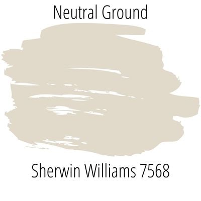
Read all about Sherwin Williams Neutral Ground and see it in real homes.
Sherwin Williams Neutral Ground is a warm off-white that could possibly work throughout your home. If you’re searching for a neutral with a little more “punch” than many of the off-whites that have saturated the market (minus the “saturation…get it? Paint humor). SW 7568 is a versatile neutral color that can make most any room feel homey and cozy.
Most homeowners gravitate toward neutral paint colors that will work well throughout the entire home. So we’ll show you this lovely shade of paint in multiple rooms to help you decide whether Sherwin Williams SW 7568 could give you the neutral walls you want…

What color is Neutral Ground?
Neutral Ground is an off-white paint color that is mixed with warm tones that come together to create a lovely khaki shade.
It is a beautiful neutral that may be a great backdrop to mix in other shades and colors with decor, built-ins, and cabinets to your home. Feel free to add in other neutrals or pops of colors.
On walls it brings brightness without being too harsh or bright white due to the warmness.
I’m not gonna lie – choosing the PERFECT paint color isn’t as easy as seeing what you like online and simply adding it to your space. There’s an entire science behind it! Grab a FREE copy of my new guide to avoid the paint color picking mistakes people make! Click here or enter your email below. I’ll send the tips right away!⤵️

FAQs about Neutral Ground
What colors are similar to Sherwin Williams Neutral Ground?
There aren’t exact matches across brands due to the subtleties of the color mixing process. If you want a color similar to Neutral Ground in the Benjamin Moore paint line, check out Benjamin Moore Spring in Aspen. Another option is Vintage Linen by Behr.
Is Sherwin William’s Neutral Ground a warm or cool color?
Cool colors are green, blue, and purple, while warm colors are red, orange, and yellow. Neutral Ground is definitely a warm color due to the khaki undertones coming from the warm side of the color wheel. Due to its warmth it doesn’t leave a room feeling to stark or overly bright white.
Where should I use Sherwin Williams Neutral Ground?
This is a neutral color that you can use practically anywhere. The warmth makes it especially appealing for adding a cozy feel to your walls. Consider Neutral Ground for:
Kitchens
Kitchen cabinets
Home exteriors
Laundry rooms
Bedrooms
Bathrooms
Living rooms
Dining rooms
Kids’ rooms
Playrooms
Basements
Hallways
Entryways
Throughout the entire home
Neutral Ground is a an off-white, khaki paint color that can look lovely in coastal, traditional, contemporary, transitional, and farmhouse style homes.

Sherwin Williams Neutral Ground Undertones
Neutral Ground is a soft white that is enhanced by the khaki undertones. It does have a slight yellow undertone with a touch of griege to the mix as well.
Some have noted it has a slight green undertone as well, but we mainly have noticed the yellows. It is good to be aware though of the possible green undertones.

If undertones make your head ache, you’re not alone! Grab your no-cost copy of “5 Biggest Paint Choice Mistakes” Click here or enter your email below. I’ll send the tips right away!⤵️
How Different Types of Lighting Affect Sherwin Williams’s Neutral Ground
Natural light exposure shifts throughout the day as the sun moves through the sky. Thanks to this shifting natural light, don’t expect ANY paint color to look the same in two different areas or at different times of the day (even sometimes in different places in the same room!).
Here’s an idea of how you can expect Neutral Ground to look based on different types of natural lighting.
- North-facing light – cool, blue-tinted northern light will tone down the warmth in this shade, so you’ll likely see Neutral Ground read as a soft muted off-white. This lighting will create the darkest Neutral Ground.
- South-facing light – warm yellow southern light will make this shade appear lighter, brighter, and warmer. It will have a tendency to look washed out so that it looks soft white.
- East-facing light – eastern light is warm and yellow in the morning and cool and blue-tinted in the afternoon. This shifting light exposure and temperature will cause some shifting with Neutral Ground so that it appears warm and bright early in the day and shifts toward looking more muted later in the day.
- West-facing light – expect cooler light in the morning and very warm light later in the day. Neutral Ground will bounce between showing off its muted side and looking warm white.
NOTE: Neutral Ground sits in the middle of cool and warm, although leans more toward warm. It has a yellow/green and griege undertone which can look warmer and slightly darker in a room with less natural light. The color may look more pale in a room with a generous amount of natural light.

Are you getting the feeling that what you see on the screen may not necessarily be what you end up with on your wall? If so, ding-ding-ding…you’re correct! Paints are tricky, which is why I always recommend sampling before you swipe your paintbrush!
My recommendation for samples is using these re-usable, re-positionable, peel and stick samples that won’t damage your walls, and you can easily move around your room to see what the paint looks like on each wall…no paintbrush required ⤵
Great Coordinating Colors for Neutral Ground
Neutral Ground is a great neutral that can be paired with a variety of shades in decor and other paint colors.
Use sage greens to bring out the undertones or pair with other lighter neutrals for a clean and classic look. We prefer it with warmer shades, but it can actually work well with cool tones too.
Check out these shades to safely pair with Sherwin Williams Neutral Ground for a little design inspiration:
- Alabaster
- Shell White
- Greek Villa
- Honed Soapstone
- Rockweed
- Sea Salt
- Iron Ore
- Peppercorn
- Oyster Bay
- Rainwashed
- Aegean Teal
- Truly Taupe
- Dried Basil
- Gris Morando
- Indigo Batik
- Rock Garden
LRV of Sherwin Williams Neutral Ground (SW 7568)
LRV is an abbreviation for “light reflectance value.” So why do we care about that number? It’s a helpful objective way to measure how much light a shade reflects (instead of absorbs). In other words, it’s a reliable indicator of how light or dark a shade will appear in your home.
LRV value ranges from 0 – 100. A color with an LRV of 0 is pure black. On the opposite end of the spectrum, an LRV of 100 is the brightest of all whites.
The LRV for Sherwin Williams SW7568 Neutral Ground = 70.

My LRV happy spot is an LRV of 70 (or higher), so SW Neutral Ground is in a good (subjective) zone.
Paints with an LRV around 70 hit that happy medium of having enough saturation to avoid washing out while also not being too dark for poorly lit rooms, keep that in mind with Neutral Ground. It might be a touch darker in rooms with less lighting.
LRV…what? Don’t worry, I’ve got you! This no-cost guide will help you avoid the paint color picking mistakes most people make! Click here or enter your email below. I’ll send the tips right away!⤵️
Neutral Ground Compared to Other Colors
It’s time to compare and contrast this hue with some similar paint colors to highlight unique qualities to love about each shade. Here we go!
Sherwin Williams Neutral Ground vs. Behr Vintage Linen
Behr Vintage Linen (PPU7-16) is very close to Neutral Ground but it has a touch more white to it with the slightly higher LVR of 72.
This color has grayish undertones. It might lean a little more gray than Neutral Ground. Consider that if you want more of the undertones to appear more gray than khaki.
It is a great option if you want a similar color to Neutral Ground in the Behr paint family.

Sherwin Williams Neutral Ground vs. Benjamin Moore Spring in Aspen
Benjamin Moore Spring in Aspen (954) is a creamy welcoming shade that is close to Sherwin Williams Neutral Ground. While neutral ground has more of green and yellow undertones, Spring in Aspen features reddish/brown undertones.
If you want to add in elements with a reddish or brown hue, it might be better to go with Spring in Aspen over Neutral Ground. This makes it appear more muted and heads more into the cream territory rather than off-white. The undertones seem to be the main difference as the LVRs are both 70.

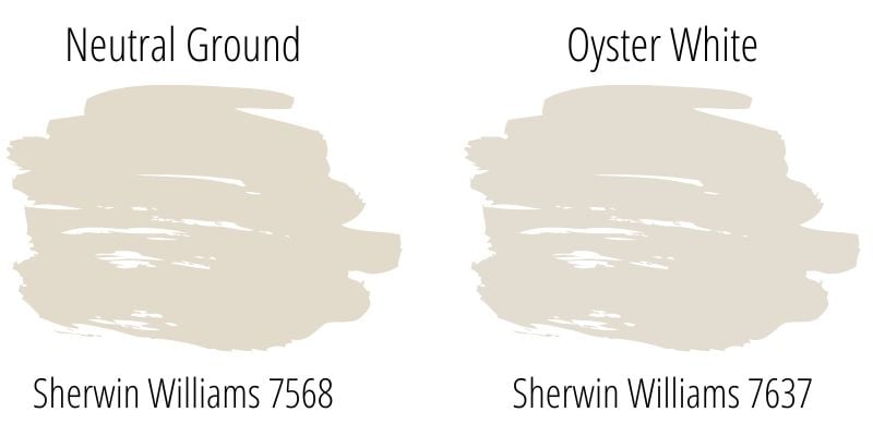
Sherwin Williams Neutral Ground vs. Sherwin Williams Oyster White
SW Oyster White (SW 7637) is a cooler toned greige. If you love Neutral Ground, but you want a slightly cooler paint color, consider Oyster White. It is a shade that can shift and appear different in a variety of rooms from gray to greige.
Oyster White is a soft greige that has soft green undertones. You can read all about this color in our Oyster White color profile.
More Colors to Consider
It can be hard to commit to a paint color. If you aren’t sold on Neutral Ground, then here are some other neutral (but not white) paint colors that could be your perfect color, too:
- Manchester Tan (Sherwin Williams) – a light tan/classic khaki
- Repose Gray (Sherwin Williams) – a warm gray to greige
- Agreeable Gray – a popular Sherwin Williams greige
- Accessible Beige (Sherwin Williams) – a welcome update to yellow, dingy buff paint shades of the past
- Modern Gray (Sherwin Williams) – a medium greige paint with slight brown undertones
- Pale Oak (Benjamin Moore) – a light, neutral greige with shifting undertones
- Alabaster (Benjamin Moore) – a soft, creamy off-white
- Chelsea Gray (Benjamin Moore) – a velvety rich medium to dark gray
- Dorian Gray (Sherwin Williams) – a warm, neutral medium gray
- Light French Gray (Sherwin Williams) – some call it the “perfect” gray color
Are you already feeling a little lost? Let me help you get back on track. Grab a free copy of my guide to help you avoid the same paint color picking mistakes most people always make!
Real Life Rooms using Neutral Ground
You made it to the fun part! We’ve covered all of the background info on this lovely neutral shade of paint. Now let’s take a look at how it behaves and displays in different areas of the home.
Take a peak at different real life homes using Neutral Ground in a variety of rooms and areas throughout the home.
Bedrooms using Neutral Ground Paint
A quick note here: don’t forget to consider picking the right paint finish…it’s not only about getting the color right! We have an in-depth explanation of choosing sheens here.
In general for bedrooms, and low-traffic areas, flat paint is fine. If you like something with a bit of shine (and more ease of cleaning) opt for eggshell or satin.
1. Calming Nursery Hue
Neutral colors are always great color schemes in kids’ rooms. They can easily grow with the child, and easily transform with decor over time as the child’s needs and tastes grow and change.
Lauren Rubin Architecture made a beautiful paint choice with SW 7568 this nursery.
2. Gender Neutral Nursery Color
This nursery in Amy and Peter’s Minimalist Home by Apartment Therapy (photo by Emily Billings). I love that they picked a neutral wall color for the nursery.
Then added in colorful touches like the crib and area rug. Later on this room could be easily changed up without having to paint.

Kitchens with SW Neutral Ground
For kitchens, eggshell or satin are popular finish choices for walls. For cabinets consider semi-gloss or high gloss for the most durable finish (and a gorgeous glow).
3. Warm White Cabinets
If you are ready for a nice white cabinet look, you can easily paint over outdated cabinets for a creamy and light touch to your kitchen cabinets.
Sarah of @homeonmagnoliahill used Neutral Ground in her new house…a beautiful color for cabinetry to be sure (and the rest of the space is pretty stunning, too)!
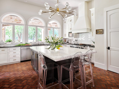
4. Modern Neutral Kitchen Color Scheme
Paper Moon Painting updated this space with Neutral Ground on the kitchen walls.
The cabinets are finished in Sherwin Williams Greek Villa, and a contrasting dark color (in this case SW Iron Ore) was chosen for the island. This paint palette is the perfect balance for the very warm brick flooring.
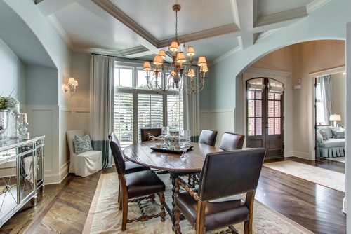
Neutral Ground Dining Spaces
5. Pairs Well with Wood Tones
Not every color can go well with wood tones, but this paint color is a good balance for warmer wood tones…it can update many of the warmer oak finishes that were really popular a few decades back.
Here in this open concept dining room belonging to @ASpicyPineapple, you can see how well this shade works with a variety of wood tones, both warm and cool.
In different lighting situations shown here, you can also see how this color acts in direct sunlight versus shadows. And you may even be able to see how it takes on a little bit of the green hues from the outdoors through the beautiful, big windows in this space.
6. Lighten it Up
This incredible space from O’Hara Interiors, featured on Houzz uses a custom 50/50 mix of SW Neutral Ground and SW Natural Tan.
In a grand space such as this with lots of natural lighting, this paint color can look like a light shade, but don’t be completely fooled…there is definitely some “kick” to this color. It’s not a white, by any stretch.
7. Pretty For A Coastal Dining Palette
In this dining area from Tennessee Valley Homes (via Houzz), Neutral Ground is the companion for a decidedly coastal color fave, SW Sea Salt. And it plays its role quite well on the board and batten and trim.
Living Rooms Featuring Neutral Ground by Sherwin Williams
8. Sitting Pretty in a Classic Room
A dining room turned sitting Room by Blooming Homestead shows this color can mix well with grey and tan tones.
Neutral Ground really is a color that could look great paired with so many different decor types and styles.

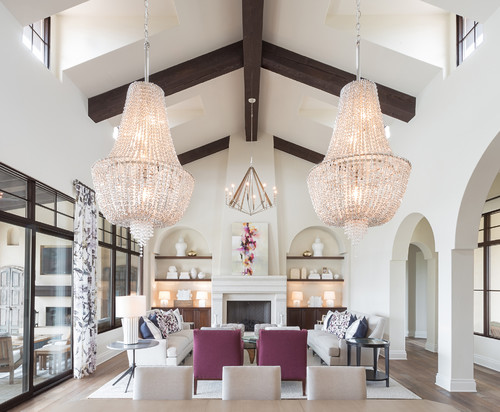
9. Elegant Cabin Chic
A shade like Neutral Ground can give a home with rustic roots depth, warmth, and visual appeal. Case in point, this incredible family room belonging to Angie from @oursliceoftexasheaven.
10. Pairs Well with White Molding and Built-Ins
Brin of My Messy Thrilling Life (IG: @balmandhoney) gave new life to her fireplace mantel and built-in bookcases thanks to some new paint. The white stands out against the light khaki tint of Neutral Ground on the walls.

Neutral Ground Paint in Bathrooms
11. Light, Bright, and Airy
This before and after by @LyndaBHome (and @burgebuilders) is pretty WOW. Neutral Ground certainly plays an important role in giving this space an updated, new look.
If your bathroom doesn’t get much natural light, remember that going brighter with your paint is usually better. Something like this shade is actually on one of the darkest shades I’d recommend in a situation with low natural light.
SW Neutral Ground Spotted in Other Spaces and Places
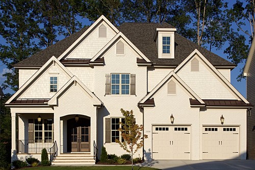
12. Great for Front Doors
Paint your front door with Neutral Ground like @Brittany.Countryman did.
It works great with muted blues, greens, and more. On exteriors, this shade (like most) will tend to look more white than it does on interior walls, but without looking stark.
13. Welcoming Entryway
Neutrals can sometimes be considered boring, but there are so many great ways to add visual interest while sticking to a more neutral color scheme.
@BuildingaCaseHouse shows how to add it with a board and batten element.
14. Try it out on Trim
Here in the home of Life Love Larson, Neutral Ground is the backup dancer to the Benjamin Moore Simply White main show.
Painting trim a darker color is an easy way to create big impact in a room. And it’s a great choice when you want the molding and small details to become more visually important.
If you want more ideas for awesome trim-wall complementary colors – check out our favorite trim-wall color combos here.

15. Wait, Is It White?
In this home office from Creative Homes (via Houzz) where the wall color is SW Stone Lion (#7507), a decidedly darker paint shade, the trim color, SW Neutral Ground, looks almost…white! But it’s not.
Neutral Ground certainly provides a contrasting second color to this space…and one that’s warmer and more saturated than many typical trim colors.

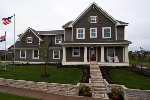
16. Warm, Not Bright White Exterior
Living Edge Interiors highlights this beautiful exterior on their Houzz profile, and it’s a great example of this shade, paired with warm browns to create an inviting exterior palette.
Both the brick and the cedar shake are SW Neutral Ground. The trim color is SW China Doll.
17. Terrific Exterior Trim
Flipping the script on the exterior paint scheme above, on this beautiful home from Robert Thomas Homes (via Houzz), Neutral Ground plays second fiddle as the trim color, with SW Brainstorm Bronze (SW 7033) being the main attraction.
If you’ve ever considered using Sherwin Williams Greek Villa, SW Oyster White, or Benjamin Moore Linen White in the past, I hope this post has also convinced you to add Neutral Ground to your shortlist.
Good luck in your perfect paint colour quest! May it be quick, painless, and end in the prettiest walls you could possibly imagine!
Seriously considering this shade? Make sure to sample first! I highly recommend these re-usable, re-positionable peel and stick samples👇
Pin this paint color for later! And if you use this paint shade, leave a comment on the pin! That helps others decide if they want to try this color, too!

Ready to show those boring, bland walls who’s the boss at home? This no-cost guide will help you sidestep mistakes that almost everyone makes when it comes to picking paint! You’ll be on your way to perfect paint promptly…pinky swear.


Leave a Reply