


Read all about Benjamin Moore Light Pewter, plus see real homes that use it!
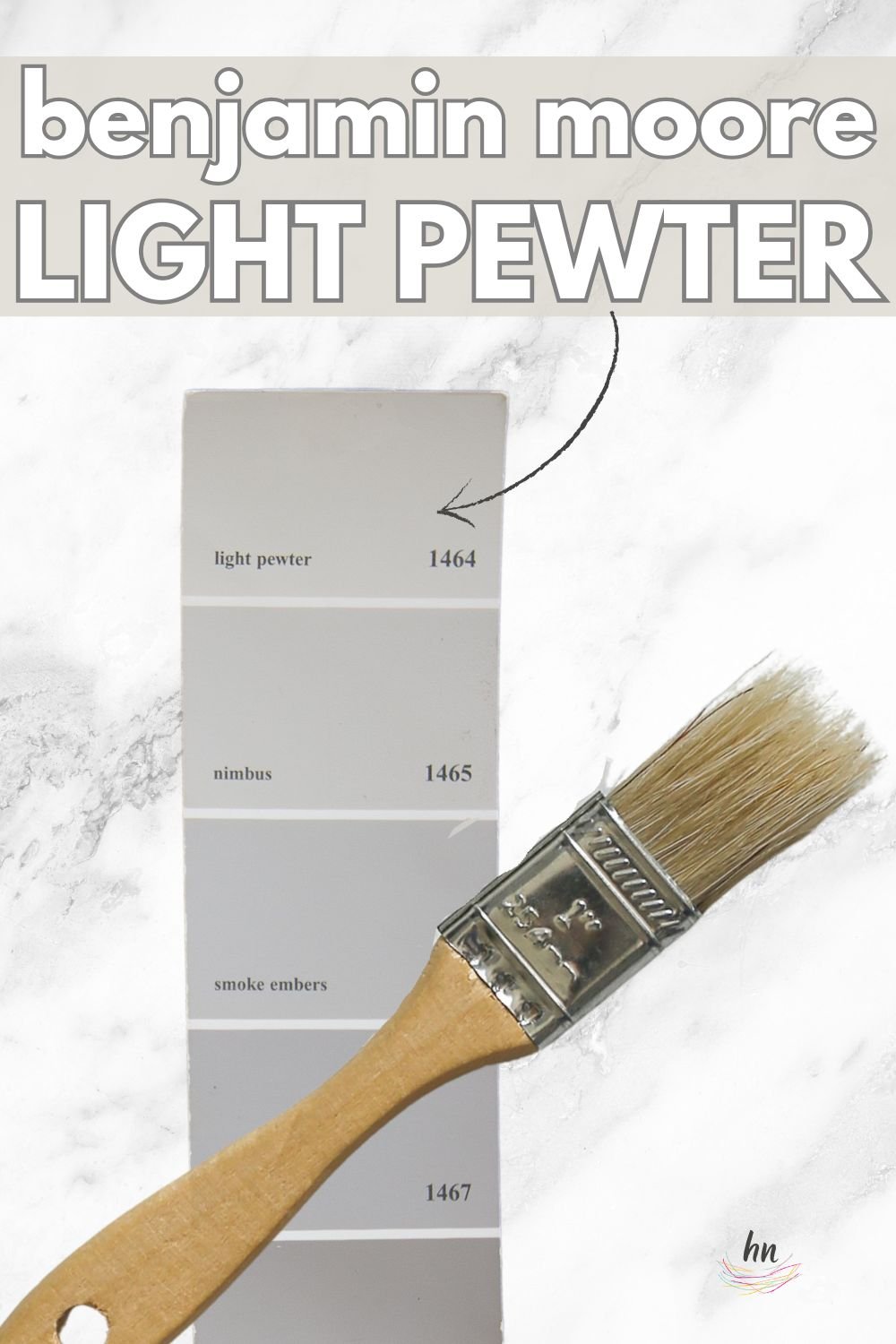
Light Pewter, by Benjamin Moore #1464 (also known as TH-260), is a crowd-pleasing, unoffensive, true greige paint shade that is part of the Benjamin Moore classic colors line.
More than that, I feel Light Pewter is one of the most underrated gray shades out there, and perhaps after reading this, you may agree with me.
Grossly defined as a light gray to greige, it’s a neutral that can look great in a home, as Ben Moore states, “all the time, every time.”
Also described by BM as “timeless,” Light Pewter is one of those colors that could be the right answer for a homeowner who loves neutral walls and/or is wary of painting too far “outside the box.”
But is it the right shade for your home? My comprehensive paint series of posts is designed to help you answer exactly that question. I know from experience just how time-consuming and challenging it can be to pick paint colors. I hope these posts help make the process just a little (ok, a LOT) easier.

What color is Light Pewter?
This color is a beautiful, warm light greige paint that is rich, classic, and endlessly chic. It typically leans more gray, but can show its welcoming greige nature with the right lighting.
And it offers a clean look without the risk of unpleasant or unwanted undertones.

Here’s a quick video compilation of this shade as seen in some real homes that we’ll take a closer look at later as well…

Benjamin Moore Light Pewter FAQs
What other colors are similar to Light Pewter?
Finding color equivalents is tough because paint colors have very subtle nuances that create noticeable shifts in undertones, depth, and temperature.
What may seem like hardly perceptible differences on a tiny paint swatch or your computer screen can translate into major differences on your walls.
If you want something similar but slightly different in the Sherwin Williams brand, check out Sherwin Williams Drift of Mist.
Is Benjamin Moore’s Light Pewter warm or cool?
Thanks to its warm beige undertones, Light Pewter is a warm-leaning, light-toned greige.
It’s not overly warm (so that it looks yellow), but instead offers that perfect cozy, welcoming vibe.
Where should I use Benjamin Moore Light Pewter?
Let your imagination guide you because this shade is endlessly versatile.
Generally, it’s a gorgeous shade that’s warmth can make a cool room feel more balanced.
Consider Light Pewter for your:
• Laundry/mud room
• Hallway
• Entryway
• Family room
• Staircase
• Home office
• Bedroom
• Bathroom
• Playroom
• Kitchen
• Dining room
Light Pewter is a hue that will help create drool-worthy traditional, transitional, modern, coastal, and modern farmhouse-style homes.
We have lots more in the nitty-gritty paint detail realm for you (if you’re into that stuff) later in the article. But for now, let’s get into the fun stuff and save the dry (but admittedly important) factoids for a bit later, k?

Real Homes Using Benjamin Moore Light Pewter
Now for the fun part. Let’s check out how Light Pewter looks in some real spaces under lots of different lighting situations and with lots of other “things” in the rooms (furniture, countertops, etc.) that the paint can play on.
Bedrooms Painted Light Pewter
A quick note here: don’t forget to consider picking the right paint finish…it’s not only about getting the color right! We have an in-depth explanation of choosing sheens here.
In general for bedrooms, and low-traffic areas, flat paint is fine. If you like something with a bit of shine (and more ease of cleaning) opt for eggshell or satin.
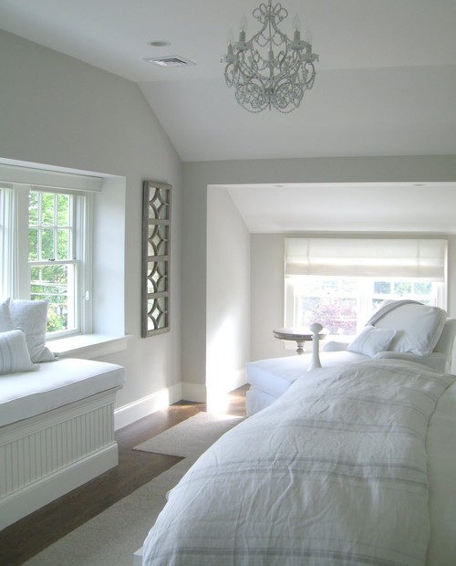
1. Cool, Calming Bedroom Color
In this bedroom from Molly Frey Design via Houzz, Light Pewter stuns here without anything but natural light. On these walls, it reads true gray to my eyes. How about yours?
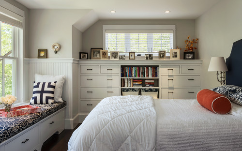
2. Warm and Creamy
Light Pewter looks beautiful in this bedroom next to white wainscoting in this space from Whitten Architects via Houzz. Do you see how it leans more greige here than it does in the image above?
Benjamin Moore Light Pewter Living Rooms
3. Warm (but not TOO Warm) and Welcoming Living Room
Gray can often seem cold, but Light Pewter isn’t one of those colors. Laura from @meadowhaus_design shows off beautiful spaces in her own home, like this living room painted with Benjamin Moore Light Pewter.
4. Warm & Welcoming Airbnb
This living room from R. Fogarty Design is light and spacious but offers lovely neutral color and a nice contrast to the white trim.

5. From Too Beige to Perfectly Balanced
Check out this incredible transformation from @comfortandgracehome – thanks to the power of paint!
Lots of natural light in this space, and the cool-toned incoming light helps Light Pewter read as a true (light) gray.
6. Cool Feeling Gray
Here’s a beautiful example from @bkhomestagers of how Light Pewter looks in a space flooded with natural light.
You may notice the subtle blue undertones – they’re the result of reflecting the blue accents.
7. Super Stylish Neutral
Light Pewter looks like a sophisticated paint color in this posh and stylish space from @embarcdesign.
Kitchens in BM Light Pewter
For kitchens, eggshell or satin are popular finish choices for walls. For cabinets consider semi-gloss or high gloss for the most durable finish (and a gorgeous glow).
8. Great Greige Qualities
Here’s another space from Laura Murphy of @meadowhaus_design where she uses Benjamin Moore Light Pewter in her own lovely home.
Here you can see how beautifully this paint shade plays in the stunning little corner of her kitchen.
9. Still Offers Contrast in Bright Light
This kitchen space from R Fogarty Design shows how bright Light Pewter can appear.
It’s very light but still offers a contrast with the white trim.

BM Light Pewter Dining Spaces
10. Modern Farmhouse Neutral
The bright cool-tinted light in this home from @kristynhomeinteriors causes Light Pewter to appear gray in the natural light but greige in the artificial light.
11. Just Bold Enough against White Trim
Light Pewter is looking gorgeous and elegant in this farmhouse glam dining room from @harrydoodle next to lots of white trim work.
12. A Balanced Gray
In this space from @myctcasa photographed in purely natural light, Light Pewter appears light gray without significant blue, purple, yellow, or other undertones.
13. Cozy with Wood Tones
Looking a bit warmer/more greige coupled with warm wood elements like the wall decor and beam, as well as the brass pendant light. Thanks, @basedindesign!
14. Light & Airy Dining Space
A gorgeous, true gray in a very light space from @grayoakstudio with lots of natural light (and a bit of overexposure in the shot from the windows).
Light Pewter in Other Spaces
15. Where Revere Pewter’s Too Dark – Try Light Pewter!
Light Pewter is seen below in a playroom painted by @primecoatpainting (presumably without a ton of natural light in it). Sometimes, people choose Revere Pewter for basements/playrooms, etc., and it’s in those situations that I’d say definitely give Light Pewter a try instead.
Where Revere Pewter looks very dark without a lot of natural light, Light Pewter can still look bright and cheerful.
16. Stunning in Very Low Light
This entryway from Home with Keki offers little natural light and warm-tinted artificial light. Light Pewter appears in its darkest form in this example.

I’m afraid to tell you that this concludes the eye candy portion of our discussion. We are now back to the boring, but oh so important paint color basics. Let’s do this!
Benjamin Moore Light Pewter Undertones
Light Pewter leans gray and has mild beige undertones. This shade lacks blue, pink, purple, or green undertones so that it looks classically neutral in every type of lighting.
Since greige colors tend to shift quite a bit, I have a special tool that I use (and you’ll love) to help you confidently choose or reject paint colors. Samples. With paint samples (I recommend the peel and stick variety), you won’t have any surprises after you commit to a shade and paint it all over your walls!
How Different Types of Lighting Affect Benjamin Moore’s Light Pewter
Have you ever noticed how natural lighting changes throughout the day? The moving sun changes natural lighting temperature and exposure, which makes a huge difference in how paint appears.
Don’t expect ANY paint color to appear the same at two different times of the day or on different walls because you’ll be very disappointed.
Since Light Pewter is a blend of gray and beige, expect some shifting in changing situations (although it won’t shift as much as a shade like Benjamin Moore Pale Oak). At times it will appear true gray, while at others, it will seem creamier.
Here’s how you can expect Light Pewter to act in your home based on various types of natural lighting.
- North-facing light – cool, blue-tinted northern light will cause Light Pewter to appear in its grayest, darkest form.
- South-facing light – warm, yellow, southern light will brighten this shade and draw out its creamy undertones and subtle warmth.
- East-facing light – eastern light has warm yellow tones in the morning and appears cooler and shadowier in the afternoon. This shifting light will highlight Light Pewter’s chameleon qualities, so you will notice some slight shifting throughout the day.
- West-facing light – cool, shadowy light in the morning shifts to very warm light later in the day, causing Light Pewter to appear differently as the light shifts.
When to Avoid BM Light Pewter
Rooms with very bright natural light can be problematic for Light Pewter because it’s not saturated enough to hold its own.
Also, because it’s so light, it will reflect surrounding colors. If you have a room with a lot of incoming colors (ex: green reflecting from the trees or grass), you will likely see those colors on the wall.
They aren’t undertones – just reflected color since Light Pewter doesn’t have more depth.
Great Coordinating Colors for Light Pewter
Greige shades tend to play well with a large number of shades, which is part of their appeal. Light Pewter will look great with Dark sage green, crisp white, royal blues, and even black.
If you’re searching for some ideas of specific hues, try pairing Benjamin Moore Light Pewter with:
- Pure White
- Oxford White
- Sage Mountain
- Chantilly Lace
- Shadow Gray
- Dorian Gray
- Sea Salt
- White Dove
- Pewter Green
- Hale Navy
LRV of Benjamin Moore Light Pewter (#1464)
LRV = Light Reflectance Value: Rated 0-100, with 0 being pure black and 100 being pure white. Lighter paint shades REFLECT more light from them and therefore have a HIGHER LRV, and vice versa for darker shades).
The LRV of Benjamin Moore Light Pewter = 67.52
This LRV value means that BM Light Pewter is a light shade that has enough saturation to contrast with bright whites. It’ll wash out quite a bit in bright light, but, in contrast, it’ll make small spaces feel much more spacious.
Below see Light Pewter (67.52) side by side with pure white (100):

Light Pewter Compared to Other Colors
To understand Light Pewter’s overall color profile a bit more, let’s look at this shade next to several other popular and similar colors.
Let’s compare Light Pewter to a few of these colors…
Benjamin Moore Light Pewter vs. Revere Pewter
There are few paint colors known as well as Benjamin Moore Revere Pewter. Used here, there, and everywhere as a popular greige color choice, this hue gets a LOT of press. In my opinion? Probably a bit TOO much.
I can’t tell you how many real estate agents, stagers, and the like spit out “Revere Pewter” when a client asks what color they should paint their home in preparation to sell. Good advice? Maybe yes. Maybe no.

So while Revere Pewter won’t be offensive, it’s important to know that it has an LRV of 55 – that’s pretty dark. I wouldn’t use Revere Pewter in a dark room if you paid me, but I’d turn to Light Pewter in a heartbeat.
Additionally, Light Pewter has a little less greige and a little more true gray in it.

Light Pewter vs. Balboa Mist
Benjamin Moore Balboa Mist is similar to Benjamin Moore Light Pewter in terms of its LRV (how dark it is). While Light Pewter is rated a 68, Balboa Mist is just one step darker at a 67.
That said, Balboa Mist definitely reads a bit browner, while Light Pewter tends to read grayer. Sometimes Balboa Mist is mentioned in discussing gray paint options, but it really isn’t gray. It’s neutral, for sure. But it’s more of a taupe-y, beige-y neutral.

Benjamin Moore Light Pewter vs. Classic Gray
Classic Gray is a lighter shade than Light Pewter per its LRV of 74. Compared to Light Pewter (LRV 68.39), Classic Gray is similar with its warmer gray tone, also tending toward a greige. It’s almost a lighter version of Balboa Mist, seen above.

Light Pewter vs. Nimbus
Benjamin Moore Nimbus is the shade directly below Light Pewter in the fan deck. Given that positioning, you’d think that the two colors had very similar undertones to them, and they ARE similar, but only in natural light.
In natural light, Light Pewter usually reads true gray. But some warm lightbulbs or artificial light can cause Light Pewter to lean more greige than Nimbus does under similar conditions.
Nimbus is most definitely darker than Light Pewter, with an LRV of 60.23. And Nimbus is a TRUE gray. In fact, it’s probably my personal favorite TRUE GRAY. It’s truer than true. A reliable gray, for sure. I’ve used Nimbus many times over the years.

More Colors to Consider
Not quite ready to give Light Pewter the “green light” yet? Check out these other lovely paint shades.
- Gray Owl (Benjamin Moore) – a light, cool-leaning gray with subtle blue-green undertones.
- Worldly Gray (Sherwin Williams) – a chameleon greige with green undertones.
- Anew Gray (Sherwin Williams) – a soft, light to medium warm greige.
- Mindful Gray (Sherwin Williams) – a warm greige that leans taupe.
- Paper White (Benjamin Moore) – an off-white with very subtle blue-gray undertones.
- Shoreline (Benjamin Moore) – a light tone, gray-leaning greige.
- Alabaster (Sherwin Williams) – a soft, creamy, greige-leaning off-white.
- Moonshine (Benjamin Moore) – a timeless, cool-leaning green-gray.
- Alpaca (Sherwin Williams) – a cool, taupe-leaning gray or greige.
- Silver Satin (Benjamin Moore) – a neutral to warm light greige with mild green undertones.
- Repose Gray (Sherwin Williams) – a popular warm greige.
And that brings us to the end of this paint color study!
After seeing this shade in action, do you love Light Pewter as much as I do? This warm-toned light greige has it all and adds its special cozy and inviting ambiance to any room.
Grab a peel and stick paint sample of this timeless hue to see how it will appear in your home!
Pin this paint color for later! And if you use this paint shade, leave a comment on the pin! That helps others decide if they want to try this color, too!

Pssst…before you go, I sure would love to hang out with you again really soon! And before you’re on your way, make sure you grab your free copy of the 5 Biggest Mistakes People Make When Picking Paint, so you can avoid the heartache (and hole in your wallet) when your paint choices don’t quite work out! Click here, and I’ll send your free copy right now!


Brooke says
What’s is your thought on Light Pewter for an exterior whole house/brick paint color? Thanks!
Joan says
I’m going to paint main living space in a craftsman bungalow and NEED to brighten it up due to much medium tone wood trim, doors, railing etc. thinking about light pewter or gray owl. . Do not wish for anything taupy. No photos shows homes without all trim painted white. HELP!!